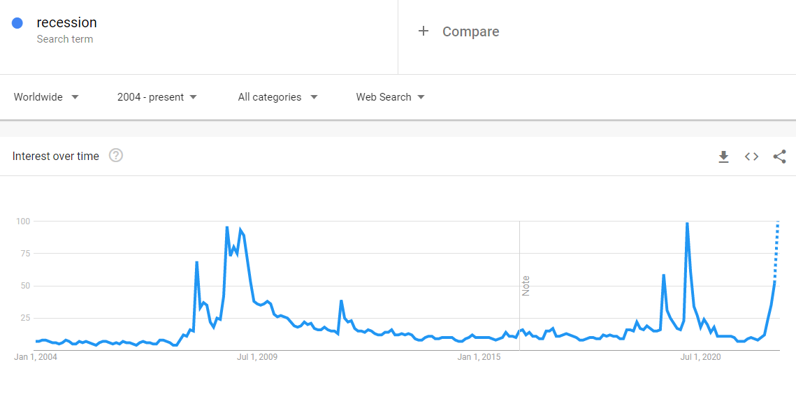
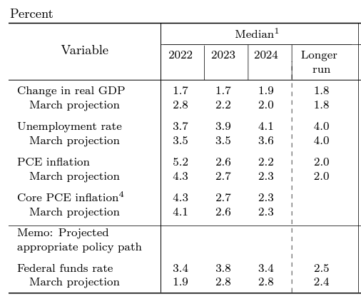
Even before the FOMC meeting and in a survey period that ended on June 10, 2022, which was the day of the hot May CPI print, the respondents to the BoA Global Fund Manager Survey showed a high degree of anxiety about a recession.
Here is the bad news. At the post-FOMC meeting press conference, Fed Chair Jerome Powell pointedly responded to a question with, “We are not trying to induce a recession”. Despite the “softish landing” rhetoric, it is becoming clear that the Fed is trying to induce a recession.
Volcker 2.0
Sometimes investors can find the most interesting clues on Fed policy intentions in speeches and statements, but the Fed hit the market with a sledgehammer with its communications policy at the June FOMC meeting. The new “dot plot” projects the Fed Funds peaking in 2023 and falling afterward. That pattern is consistent with a recession in 2023, followed by easing in 2024. By contrast, Fed Funds futures (grey line) expects a peak in 2022 and an easing in 2023, which pulls ahead of the implied probability of a recession into this year.
In addition, the most revealing sentence of the
FOMC statement was: “The Committee is strongly committed to returning inflation to its 2 percent objective”, indicating that the Fed is bent on taming inflation without regard to recession risk.
As well, Powell was asked during the post-FOMC press whether the Fed will focus on headline or core inflation in managing monetary policy. The surprising answer was “headline inflation”.
But all over the world, you are seeing these effects. And so — and we’re seeing them here, gas prices at, you know, all-time highs and things like that. That’s not — that’s not something we can do something about. So that is really — and by the way, headline inflation, headline inflation is important for expectations. People have — the public’s expectations; why would they be distinguishing between core inflation and headline inflation?
Core inflation is something we think about because it is a better predictor of future inflation. But headline inflation is what people experienced. They don’t know what core is; why would they? They have no reason to. So, that’s — expectations are very much at risk due to high headline inflation.
While core inflation is easier for central bankers to model, headline inflation fluctuates more with the volatile food and energy components, which are dependent on the resolution of the Russia-Ukraine war. Energy prices have spiked because of energy supply disruptions, and so have food prices. An influential
1997 paper by Bernanke Gertler, and Watson concluded that while recessions have followed surging oil prices, oil price increases alone weren’t the explanation. It was the Fed’s reaction to rising energy prices that caused recessions. If the Bernanke paper is correct and the Fed is focused on oil prices, which is a factor beyond its control, this is an instance of Volcker 2.0 that will induce a recession.
Here’s another ominous sign of Fed policy. Jerome Powell stated at the
WSJ Future of Everything Festival, “What we need to see is inflation coming down in a clear and convincing way, and we’re going to keep pushing until we see that.” He went on to use the “clear and convincing” language three times in the interview. It is well-known that monetary policy operates with a lag. If the Fed is waiting for “clear and convincing” evidence that inflation is falling, it will by definition overtighten.
Here is how the monthly headline and core PCE, which are the Fed’s preferred inflation metrics, are shaping up. An estimate of May core PCE based the combination of the CPI and PPI reports is 0.39%. That’s not “clear and convincing” evidence of deceleration.
Even within the Fed, some unease is appearing. A
Fed research paper by David Ratner and Jae Sim offers the alternative hypothesis that the effects of the Volcker shock are exagerrated. Inflation of the 1970’s was addressed through the degradation of the union movement rather than monetary policy.
Is the Phillips curve dead? If so, who killed it? Conventional wisdom has it that the sound monetary policy since the 1980s not only conquered the Great Inflation, but also buried the Phillips curve itself. This paper provides an alternative explanation: labor market policies that have eroded worker bargaining power might have been the source of the demise of the Phillips curve. We develop what we call the “Kaleckian Phillips curve”, the slope of which is determined by the bargaining power of trade unions. We show that a nearly 90 percent reduction in inflation volatility is possible even without any changes in monetary policy when the economy transitions from equal shares of power between workers and firms to a new balance in which firms dominate. In addition, we show that the decline of trade union power reduces the share of monopoly rents appropriated by workers, and thus helps explain the secular decline of labor share, and the rise of profit share. We provide time series and cross sectional evidence.
I leave the discussion of policy choice up to you. The political ramifications of the conclusions is above my pay grade.
Good news
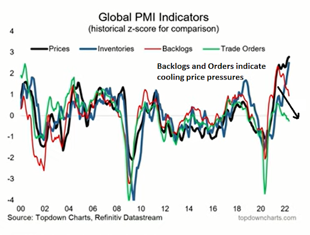
Here is the good news. Inflation is already decelerating. Callum Thomas of Topdown Charts pointed out that the leading indicators of growth, namely the backlog and order components of PMI, have been in a descending trend for several months. This should eventually lead to falling prices.
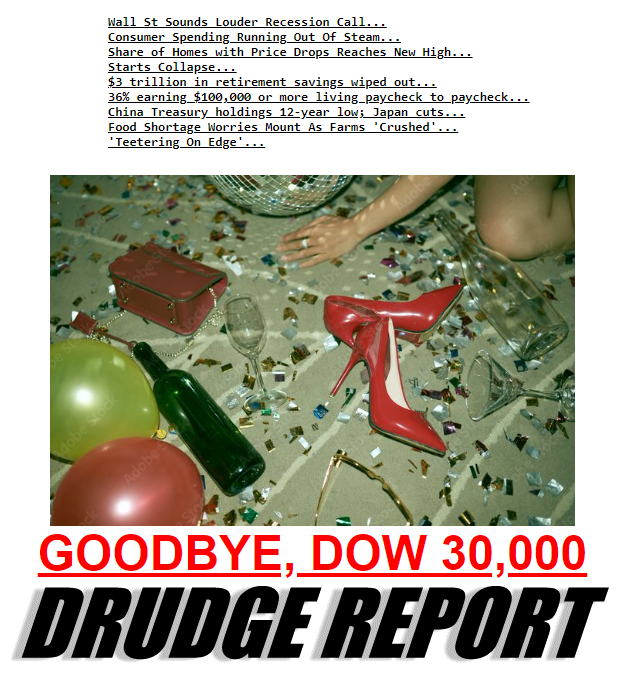
The CPI news this morning was so awful that it changed the bond market’s view of Fed trajectory, and the weakest sector broke. In bond jargon, MBS went “no-bid.” No buyers for MBS. Then a few posted prices beyond borrower demand, not wanting to buy except at penalty prices. Overnight the retail consequence has been a leap from roughly 5.50% to 6.00% for low-fee 30-fixed loans…
Another marker of MBS distress: the 10-year T-note had held 3.00% since April, the important top in 2012 and 2018. Trading 3.05% yesterday, now 3.20% — retail mortgages jumped triple that amount. The 10s/mortgages spread today is almost 300bps and double the 10s’ yield. Inconceivable. The Fed telltale 2-year T-note had held 2.70% since April, 2.85% yesterday, today 3.05% adding only one more .25% hike to the 2-cast, which is not enough to explain MBS overnight.
The earnings puzzle
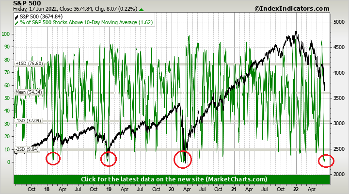
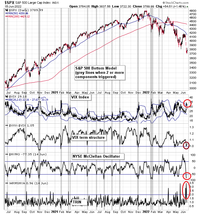
Here is the market consensus. Both stock and bond prices are falling together. In other words, the market is expecting slower growth (stocks) but inflation will stay elevated (bonds). At a minimum, the bond market should begin to rally soon. Keep in mind that rates fell across the board in the wake of the FOMC meeting, which may be a sign that the Fed is ahead of the curve, not behind it.
I have made the point before that the last time the 10-year Treasury yield was at similar levels, the S&P 500’s forward P/E ratio was trading in the 14-16 range. It is now 15.3, which represents fair value. The key question is how far earnings estimates fall should the economy experience a recession. Forward EPS estimates are still rising, so far.
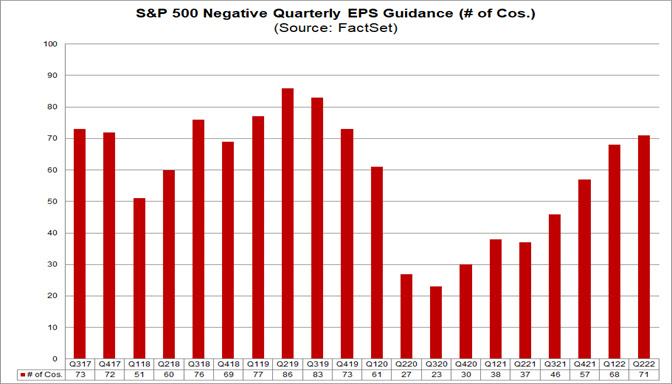
Why aren’t earnings estimates falling? Doesn’t Wall Street realize there’s a slowdown on the horizon? A more detailed analysis of forward 12-month EPS estimates by sector shows that most of the gains are in the energy sector. However, most other sectors are still seeing positive estimate revisions.
Here is the process by which most Wall Street analysts estimate earnings for their companies. In additional to independent research, such as channel checks, company estimates depend on corporate guidance. If guidance is still strong, analysts are unlikely to go out on a limb and downgrade their estimates. As analysts and companies engage in the guidance dance, it’s always possible that corporate management is shading the truth and telling a more bullish story than the company’s underlying fundamentals.
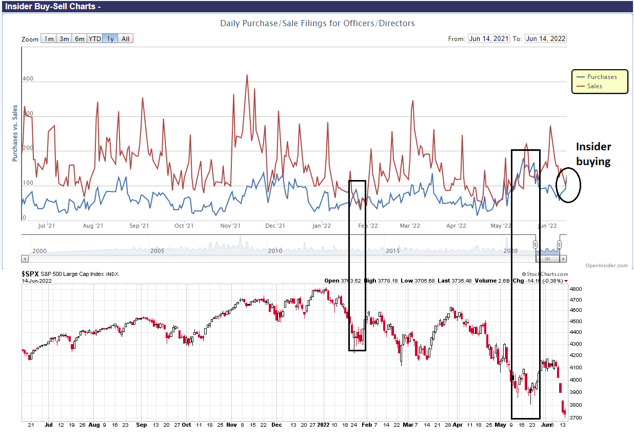
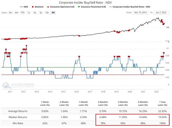
What they are unlikely to lie about is how they manage their own finances. The most constructive news for equity investors is insiders are turning more confident. This group of “smart investors” is buying the recent dip. Either the group doesn’t seem to believe the recession narrative, or it believes that slowdown fears are overblown and valuations are becoming compelling.
To be sure, insider activity is an inexact market timing indicator. Insiders were overly eager to buy in 2008.
In a more “normal” bear market like 2018, insider activity can be useful signals.
Recessions serve to unwind the excesses from the previous cycle. The good news is there is little evidence of too many excesses. A lot of the speculative money has gone into crypto. While the right tail of crypto returns were spectacular during the bull phase, any possible collapse is less likely to threaten global financial stability as crypto has largely existed in an offshore and unregulated market. This makes the left tail of the unwind less risky to asset prices.
Even if investors were to see a recession induced bear market, it shouldn’t last too much longer. My base case scenario calls for a slowdown to begin either in Q1 or Q2 2023. Historically, recessions last about 6-9 months. As markets look forward about 6-12 months, and the stock market peaked in January, this puts the timing end of the bear market between now and late Q3.
In conclusion, the Fed appears intent on tightening policy to fight inflation. It is focused on headline inflation, which is expected to remain stubbornly high as the Russia-Ukraine war keeps energy prices elevated. It’s difficult to see how the US economy can sidestep a recession.
The good news is the S&P 500 is at or near fair value, as long as earnings don’t significantly deteriorate. Renewed insider buying as the market reached its recent lows is another sign that downside risk may be low.