Remember the Lehman Crisis? The failure of Lehman Brothers marked the start of the Great Financial Crisis that destabilized and almost brought down the global financial system.
What we are seeing is a Lehman Crisis of a different sort. The Lehman Crisis of 2008 was characterized by financial institutions unwilling to lend to each other and banking system liquidity seized up.
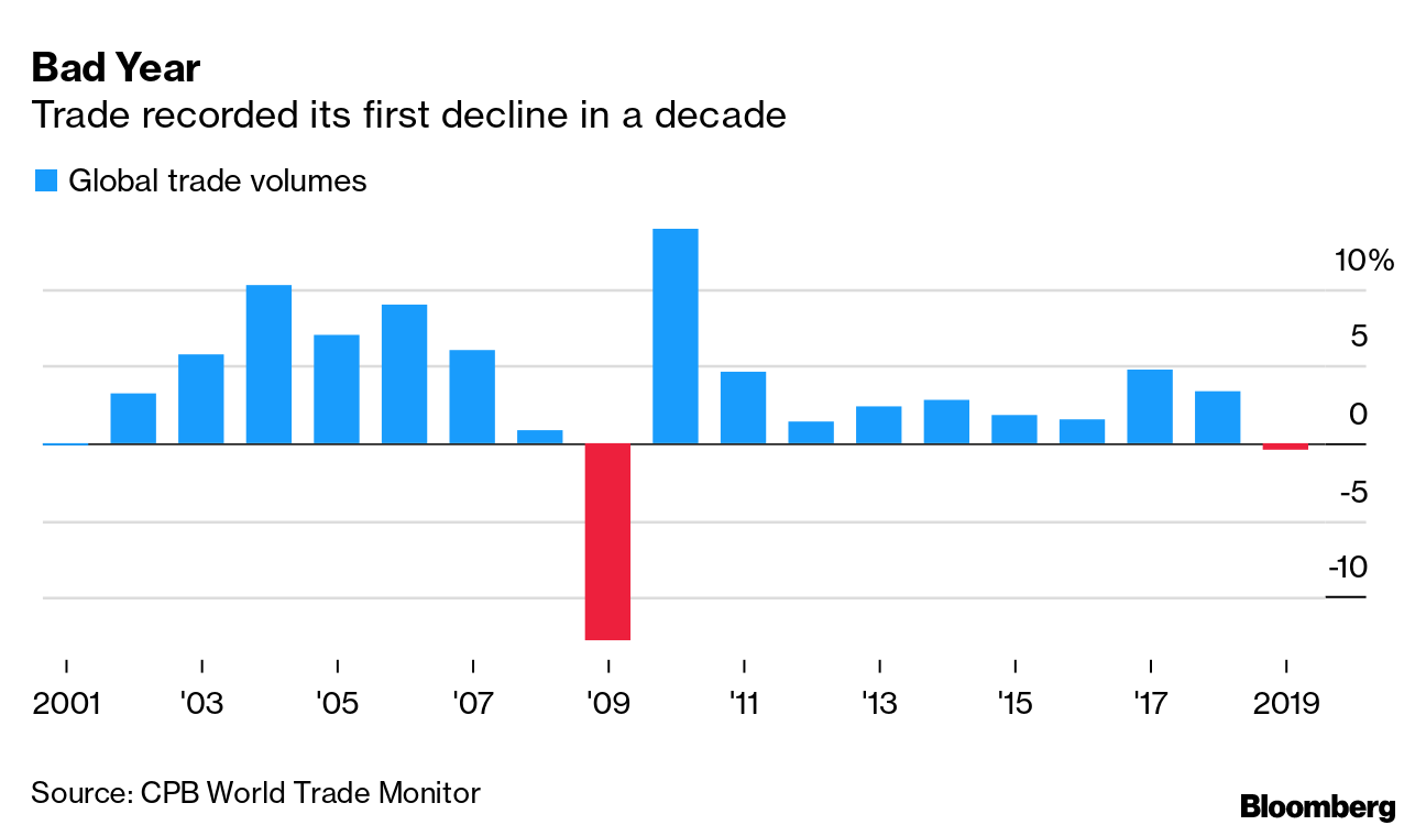
Today’s version of the Lehman Crisis is characterized by countries and regions in lockdowns, and the propensity of individuals or groups to increase their social distance, either owing to quarantine, or by fear. This is leading to both supply and demand shocks. It is a supply shock because production and transportation are seizing up, which is leading to a collapse in global trade. Even before the onset of the COVID-19 outbreak, global trade had been weak. It is about to become even weaker.
It is also a demand shock because when social distance rises, it leads to a collapse in the demand for goods and services. As an example, France’s Finance Minister Bruno Le Maire told CNBC at the G-20 meeting that tourism had fallen 30-40%.
The outbreak is not “contained”
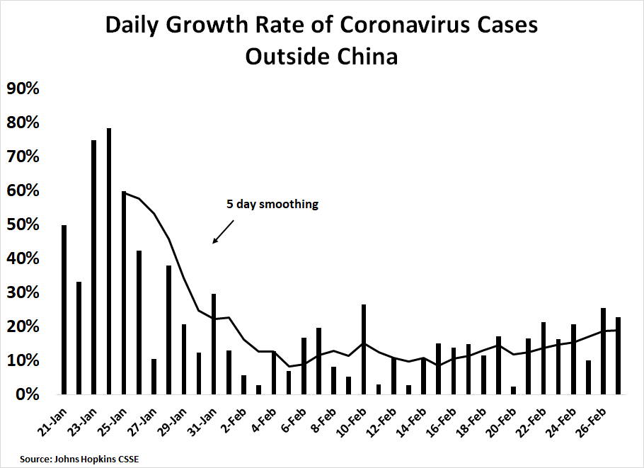
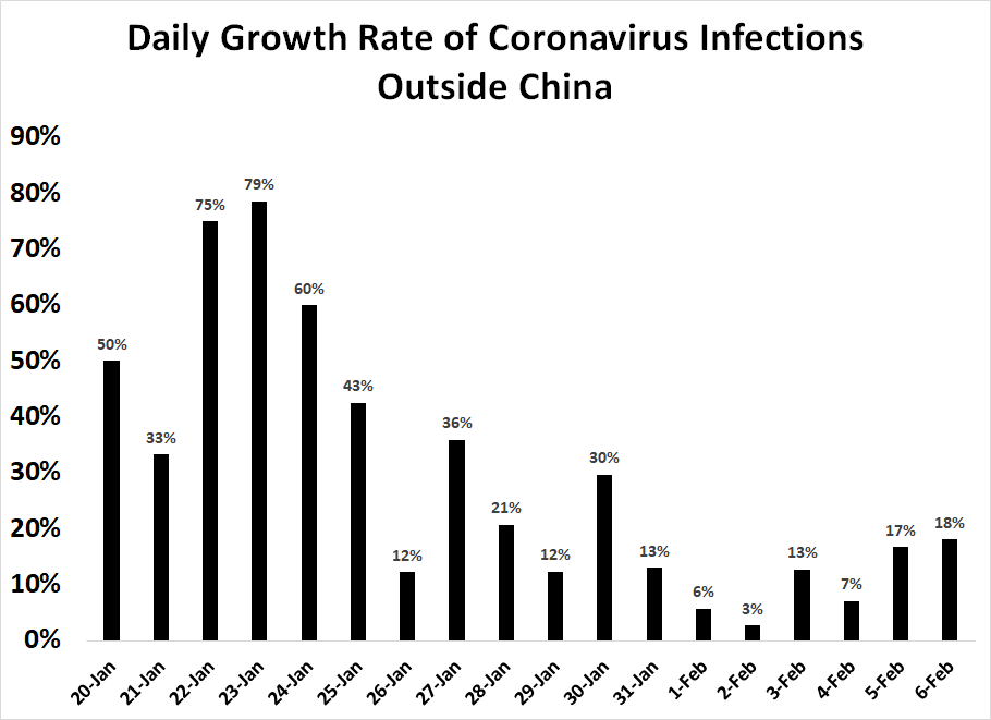
The latest update from Johns Hopkins shows that the spread of the COVID-19 virus is growing steadily outside China. Infectious clusters in South Korea, Japan, Italy, and Iran show that the strategy of containment has not been very effective. Much of northern Italy is in lockdown.
The New York Times reported that CDC officials are warning Americans to prepare for an outbreak:
Federal health officials starkly warned on Tuesday that the new coronavirus will almost certainly spread in the United States, and that hospitals, businesses and schools should begin making preparations.
“It’s not so much of a question of if this will happen anymore but rather more of a question of exactly when this will happen,” Dr. Nancy Messonnier, director of the National Center for Immunization and Respiratory Diseases, said in a news briefing.
She said that cities and towns should plan for “social distancing measures,” like dividing school classes into smaller groups of students or closing schools altogether. Meetings and conferences may have to be canceled, she said. Businesses should arrange for employees to work from home.
“We are asking the American public to work with us to prepare, in the expectation that this could be bad,” Dr. Messonnier said.
The American healthcare system does not appear to be very prepared for an outbreak. To start, virus testing capability is limited. Initially, tests to identify infected patients had to be sent to the CDC lab in Atlanta. The CDC has now sent out test kits to state and local authorities in all 50 states, but at the time of this writing, only three states, California, Illinois, and Nebraska, can actually conduct the tests. The New York Times reported that a California coronavirus patient had to wait days to be tested because of the CDC’s strict screening criteria for conducting tests. If you can’t look for an infection or you are unwilling to look, how will you even find it?
While the CDC has conducted hundreds of tests for the coronavirus, South Korea has tested tens of thousands to identify possible victims.
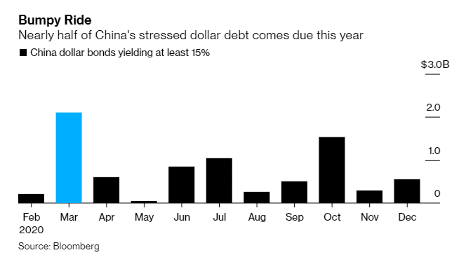
In addition, Axios reported that much of the supply chain of pharmaceutical drug production is locked up in China. While not all of the pharmaceutical plants are in China, much of the precursor materials are principally sourced from China, and a prolonged Chinese production slowdown could cause worldwide drug shortages.
About 150 prescription drugs — including antibiotics, generics and some branded drugs without alternatives — are at risk of shortage if the coronavirus outbreak in China worsens, according to two sources familiar with a list of at-risk drugs compiled by the Food and Drug Administration.\
An 2019 article by the Council on Foreign Relations made a similar point about supply chain vulnerability:
As Rosemary Gibson noted in her testimony, centralization of the global supply chain of medicines in a single country makes it vulnerable to interruption, “whether by mistake or design.” If we are dependent on China for thousands of ingredients and raw materials to make our medicine, China could use this dependence as a weapon against us. While the Department of Defense only purchases a small quantity of finished pharmaceuticals from China, about 80 percent of the active pharmaceutical ingredients (APIs) used to make drugs in the United States are said to come from China and other countries like India. For example, the chemical starting material used to make doxycycline, the recommended treatment for anthrax exposure, comes from China. When an influential Chinese economist earlier this year suggested that Beijing curb its exports of raw materials for vitamins and antibiotics as a countermeasure in the trade war with the United States, the worries surrounding our API dependence to China seemed to be vindicated. Concern about a disruption in the supply chain could explain why the tariffs on Chinese products proposed by the United States Trade Representative in May 2019, worth approximately $300 billion, excludes “pharmaceuticals, certain pharmaceutical inputs, and select medical goods.”
Indeed, the FDA issued its first notice of a drug shortage due to COVID-19 supply chain disruptions in China:
A manufacturer has alerted us to a shortage of a human drug that was recently added to the drug shortages list. The manufacturer just notified us that this shortage is related to a site affected by coronavirus. The shortage is due to an issue with manufacturing of an active pharmaceutical ingredient used in the drug. It is important to note that there are other alternatives that can be used by patients. We are working with the manufacturer as well as other manufacturers to mitigate the shortage. We will do everything possible to mitigate the shortage.
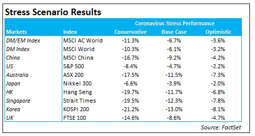
Modeling the economic impact
How bad can things get for the US and global economy?
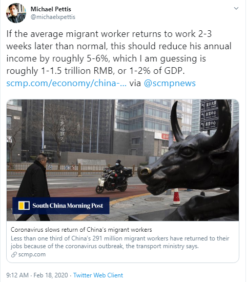
The Congressional Budget Office conducted a study in 2005-06 that modeled the effects of a 1918-like Spanish Flu outbreak on the economy. The CBO assumed that 90 million people in the U.S. would become sick, and 2 million would die. Those assumptions are not out of line with current conditions. The population of the US is about 330 million, so an infection rate of 27% (90 million infected) and a fatality rate of 2% (1.8 million dead) are reasonable assumptions.
The CBO study concluded that a pandemic of this magnitude “could produce a short-run impact on the worldwide economy similar in depth and duration to that of an average postwar recession in the United States.” A severe pandemic could reduce GDP by about 4.5%, followed by a V-shaped rebound. Demand shocks would also be evident, with an 80% decline in the arts and entertainment industries and a 67% decline in transportation. Retail and manufacturing would drop 10%.
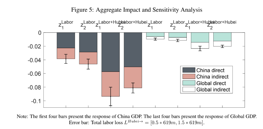
A recent paper by Luo and Tsang at Virginia Tech entitled “How Much Output Has The Coronovirus Reduced?” studied the effects of the outbreak on China and the world. It concluded that Chinese GDP would fall by a minimum of 4%, and there would be considerable spillover effects outside China.
Using a network approach, we estimate the output loss due to the lockdown of the Hubei province triggered by the coronavirus disease (COVID-19). Based on our most conservative estimate, China suffers about 4% loss of output from labor loss, and global output drops by 1% due to the economic contraction in China. About 40% of the impact is indirect, coming from spillovers through the supply chain inside and outside China.
The researchers concluded that the direct and indirect effects of Chinese dislocation alone could amount to 1-2% of global GDP growth.
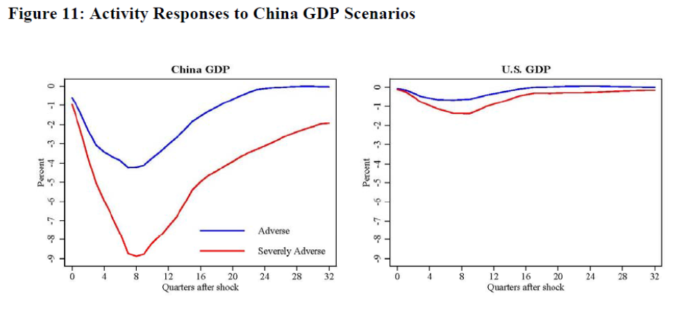
A Federal Reserve international finance discussion paper published in October 2019 entitled “Global Spillovers of a China Hard Landing” also yielded some clues on the economic impact of Lehman 2.0. Here is the abstract:
This paper analyzes the potential spillovers of acute financial stress in China, accompanied by a sharp slowdown in Chinese growth, to the rest of the world. We use three methodologies: a structural VAR, an event study, and a DSGE model. We find that severe financial stress in China would have consequential spillovers to the United States and the global economy through both real trade links and financial channels. Other EMEs, particularly commodity exporters, would be hit the hardest. The U.S. economy would be affected to a lesser degree than both EMEs and other advanced economies, and the primary channel of transmission to the U.S. could well be adverse financial spillovers through increased global risk aversion and negative equity market spillovers.
The authors’ estimates based on a Chinese 4% hit from normalized growth (blue) and 8.5% hit (red) indicate considerable damage to US GDP growth.
Effectiveness of policy response
During the Lehman Crisis, central bankers swung into action and flooded the global financial system with liquidity. In the current crisis, it is unclear whether either fiscal or monetary policy are effective to combat both a supply and demand shock. The authorities can stimulate all they want, but if people are unwilling to, or unable, either go to work, or to brave reducing social distance to spend on goods and services, fiscal and monetary stimulus cannot boost economic growth. These policies are likely to have limited effect until the supply shock begins to wear off, and people return to work.
To be sure, the monetary authorities can act to reduce risk premiums and inflate asset prices. Credit spreads have begun to edge up, and central bankers can act to put a lid on spread expansion.
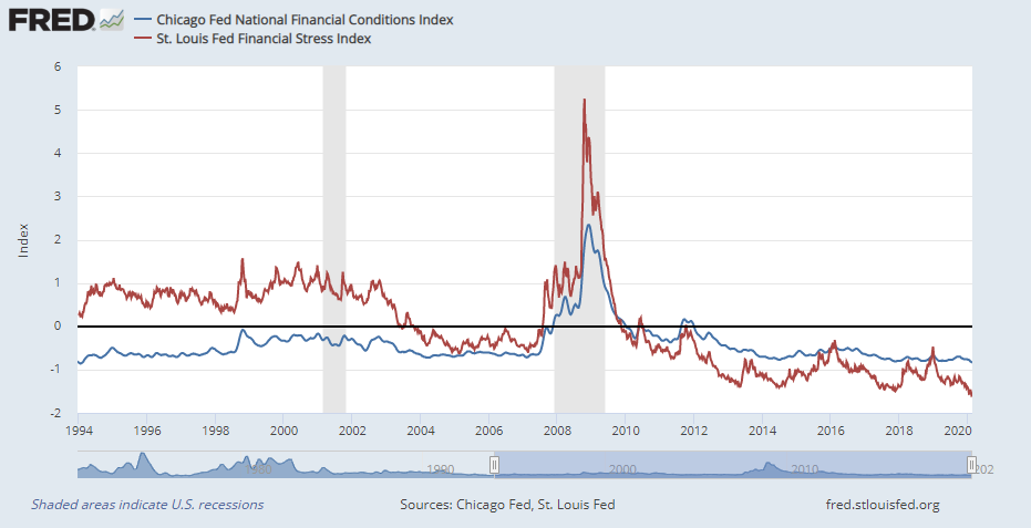
However, measures of financial stress remain relatively low, and policy makers will loath to engage to excess stimulus and create another bubble.
Nevertheless, China is certainly trying the stimulus route. Xinhua reported that the Chinese leadership has turned on the fiscal taps and decreed a series of infrastructure projects to jump start the economy.
The Chinese capital has announced to push forward 300 urban projects in 2020, involving 252.3-billion yuan (around US$35.9 billion) in investment.
The projects will include 100 infrastructure projects, 100 livelihood improvement projects and 100 high-tech industrial projects, according to Beijing’s development and reform commission.
Investment implications
What should investors do under these circumstances? A recent Bloomberg article surveyed 10 market strategists. Their views were highly disparate. They ranged from “gold rally” and “risk aversion” to “a short sharp V” and “hello TINA”, or There Is No Alternative (to risky assets). In other words, no one knows anything.
I have experienced a series of market crises during our tenure as a quantitative bottom-up equity manager. While our quantitative factor sets were well diversified across growth, value, momentum and other dimensions, we learned to turn off all of the quantitative factors when faced with a sudden crisis, such as the Russia default or 9/11. As details of the shock became known, the following classes of factors began to add value, in the following order:
- Technical Analysis Factors: The market’s price signals were the fastest to respond.
- Estimate Revision and Earnings Surprise: When the crisis hits, company analysts will not revise their estimates because they cannot quantify the impact. First, top-down strategists begin to revise their estimates, then the bottom-up company analysts. We saw one such example when the U.S. stock market rallied on Trump’s tax cuts.
- Fundamental Factors: As the environment normalizes, fundamental factors such as growth and value begin to add value once again.
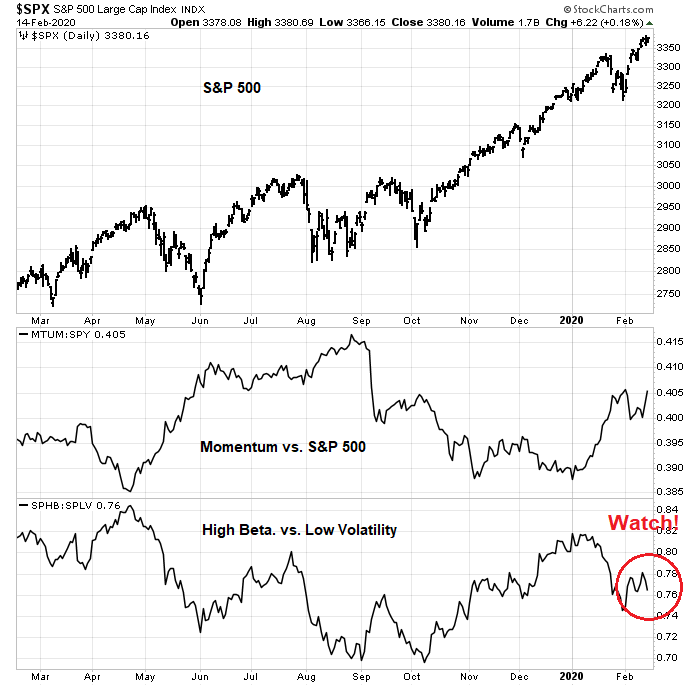
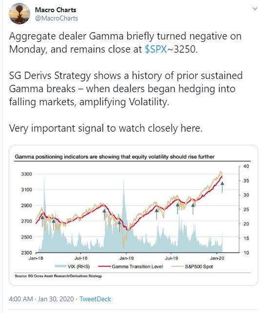
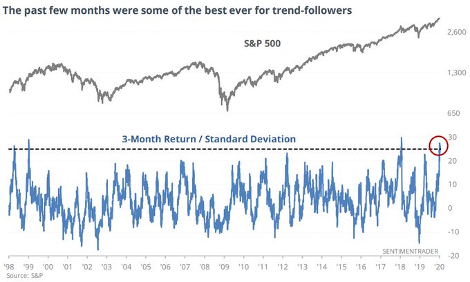
Today, the market is only in the first phase, where technical factors are in ascendance. Here is what the market technical outlook is telling us.
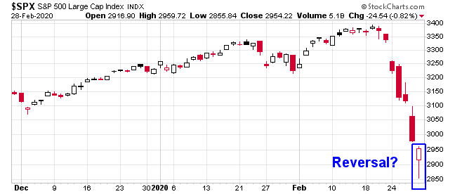
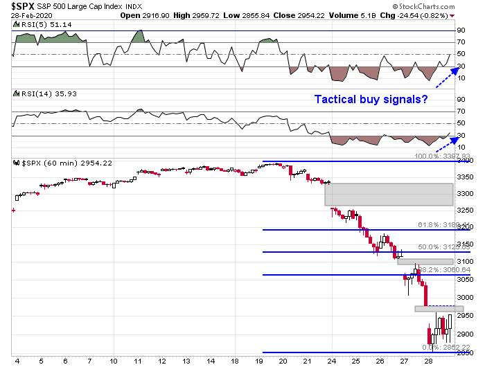
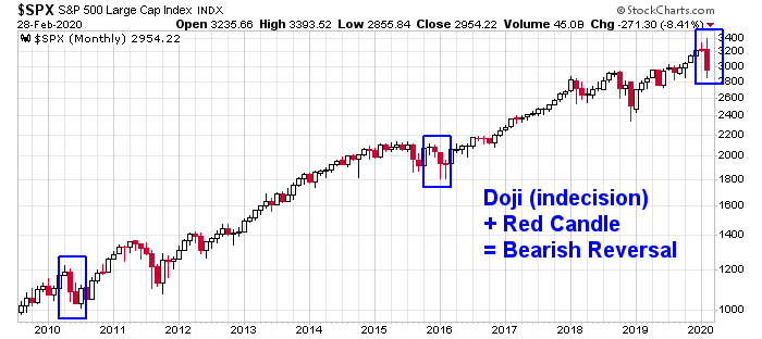
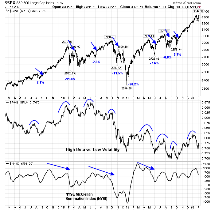
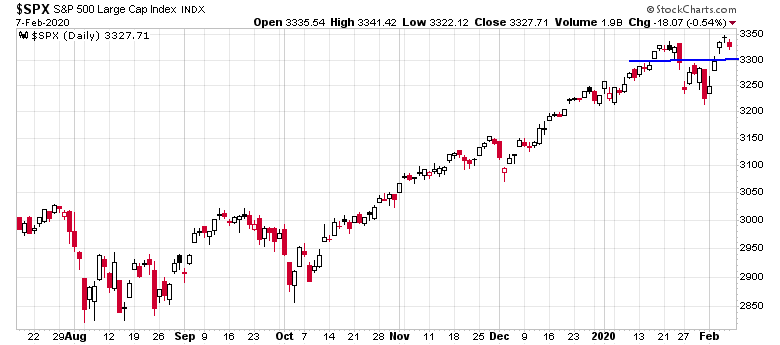
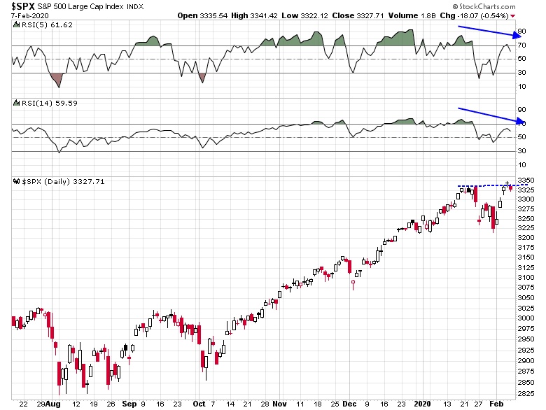
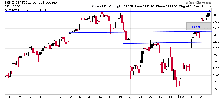
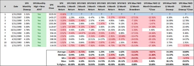
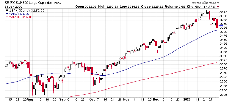
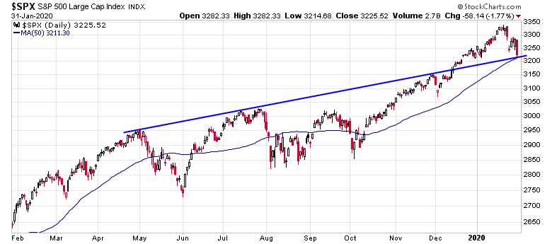
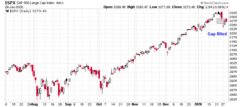
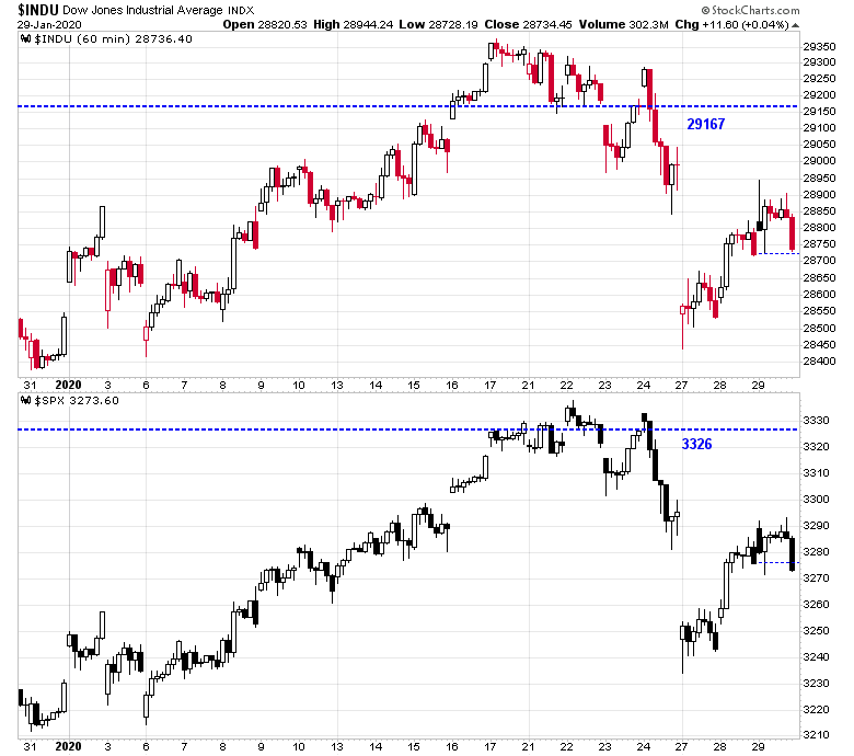
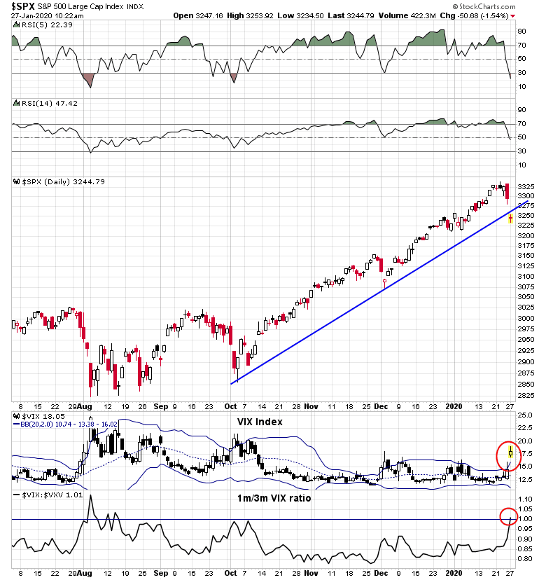
The intermediate term outlook is uncertain. The monthly S&P 500 chart printed a doji candle in January, indicating indecision and a possible turning point. The turn was confirmed by a bearish red candle in February. Such patterns have been followed be at least 1-2 months of either sideways or bearish price action.
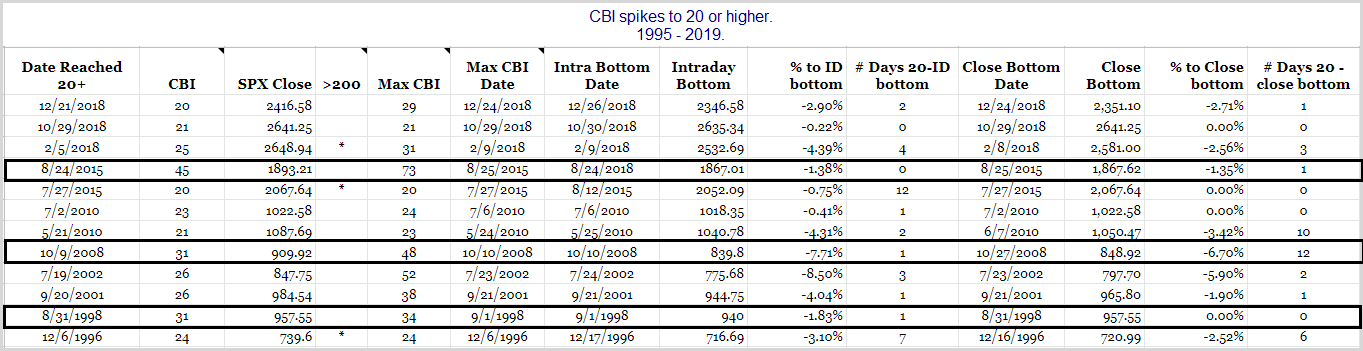
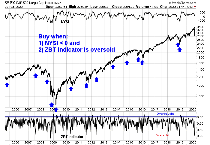
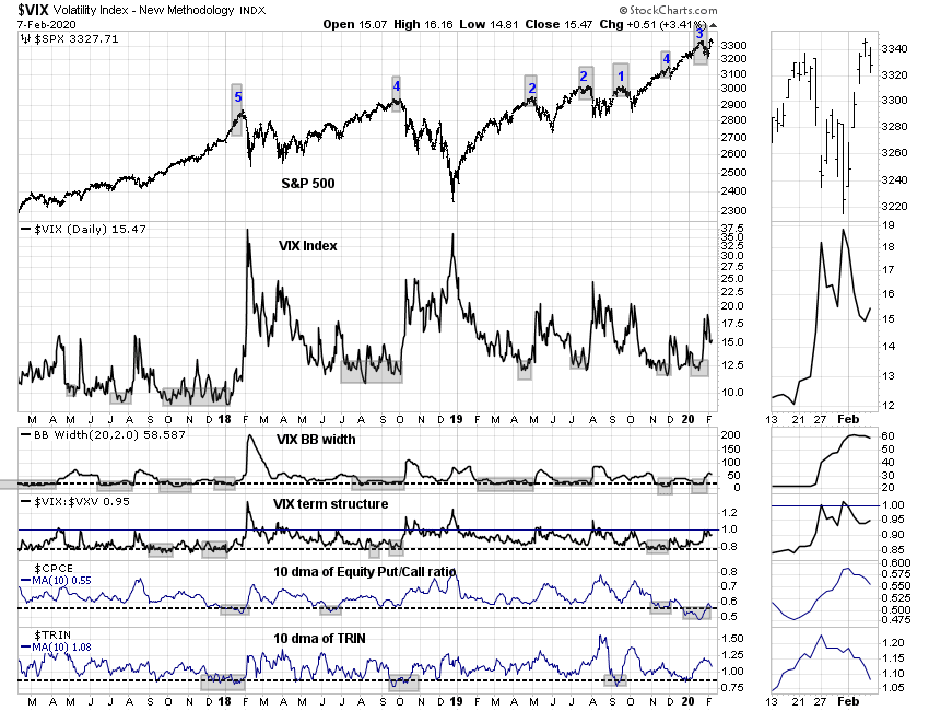
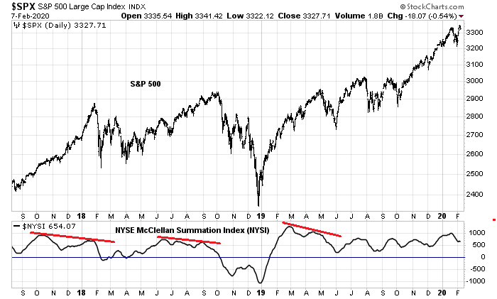
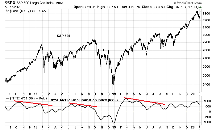
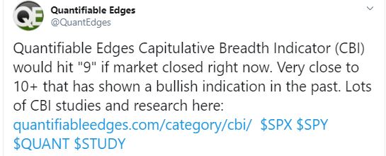
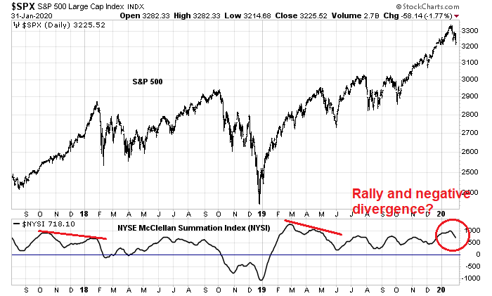
In addition, my “Ultimate Intermediate Bottom Spotting Model” has not turned bullish yet. This model flashes a buy signal based on two conditions; when the NYSE McClellan Summation Index (NYSI) turns negative, indicating intermediate bearish momentum, and the Zweig Breadth Thrust Indicator becomes oversold, which is a short-term oversold indicator. We are not there yet.
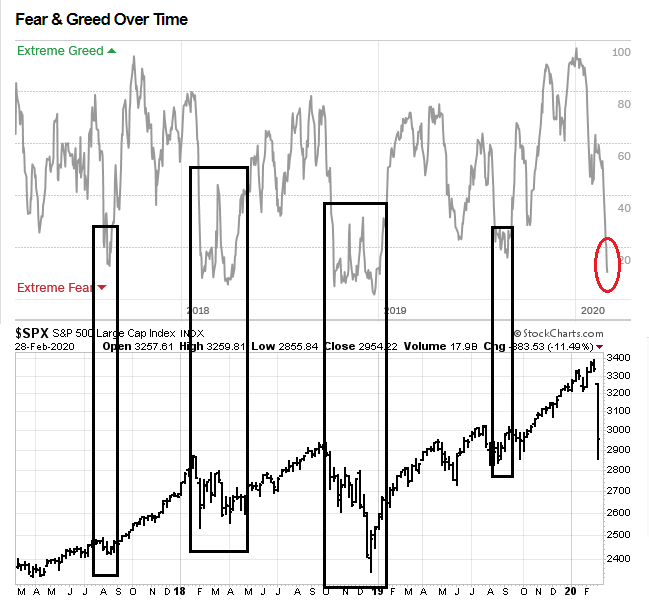
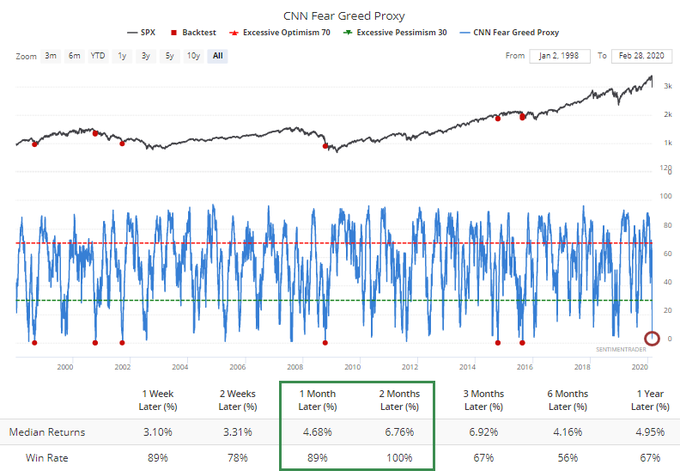
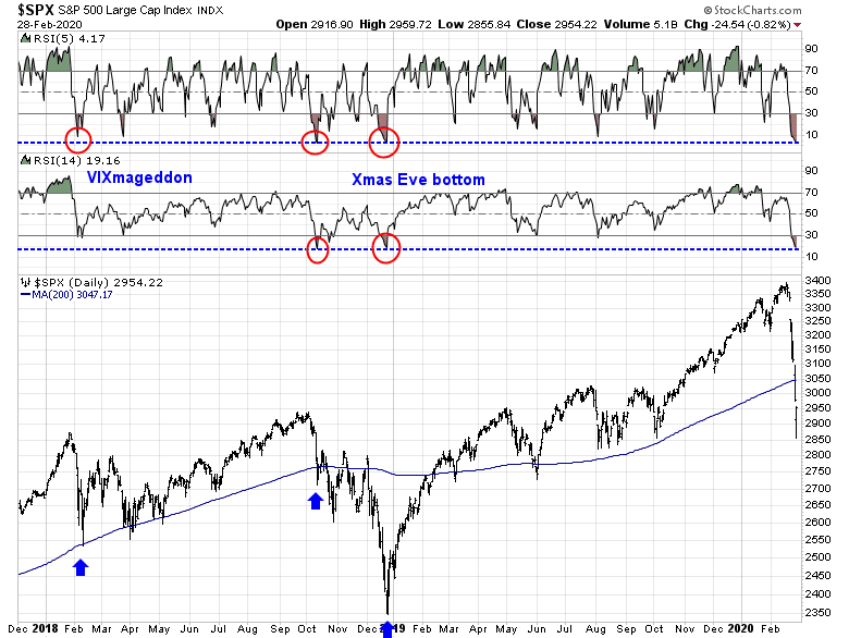
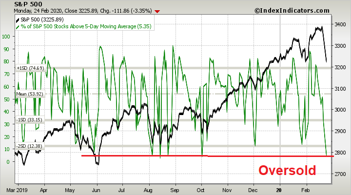
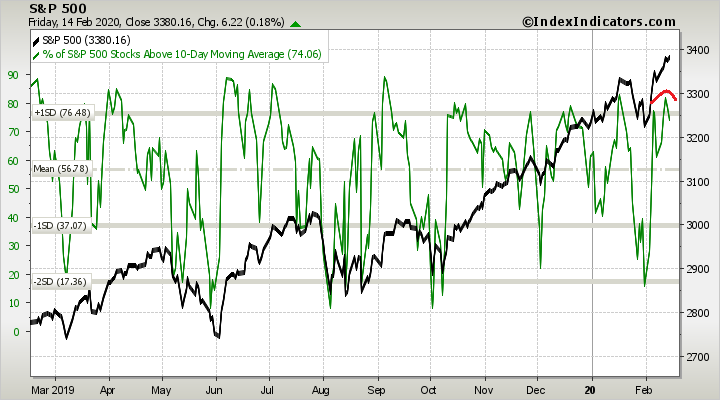
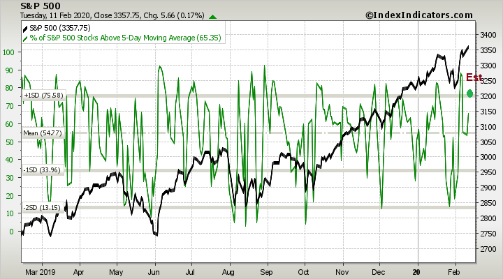
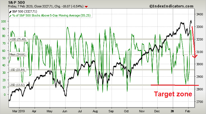
In the short run, the market may be setting up for a short-term bounce and all indicators are in maximum oversold territory. The oversold signal flashed by the Zweig Breadth Thrust Indicator has usually been resolved with a relief rally.
As measured by the 5 and 14 day RSI, the market is as oversold as it was at the Christmas Eve bottom of 2018, as more oversold than the VIXmageddon bottom of early 2018. A similar oversold condition occurred in October 2018, which was followed by an interim relief rally.
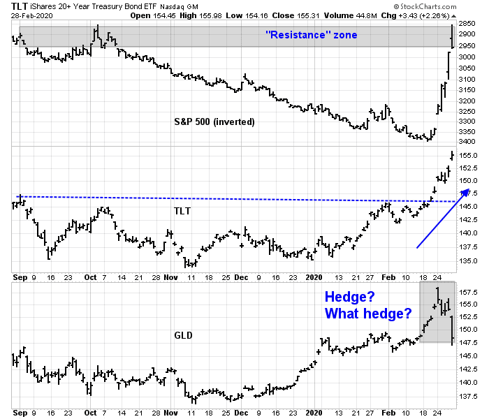
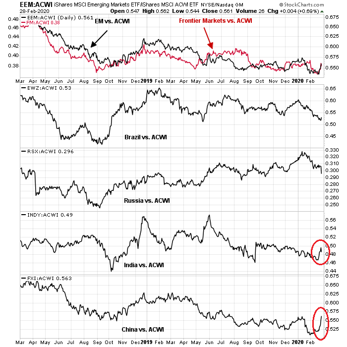
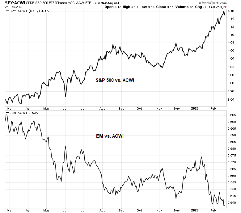
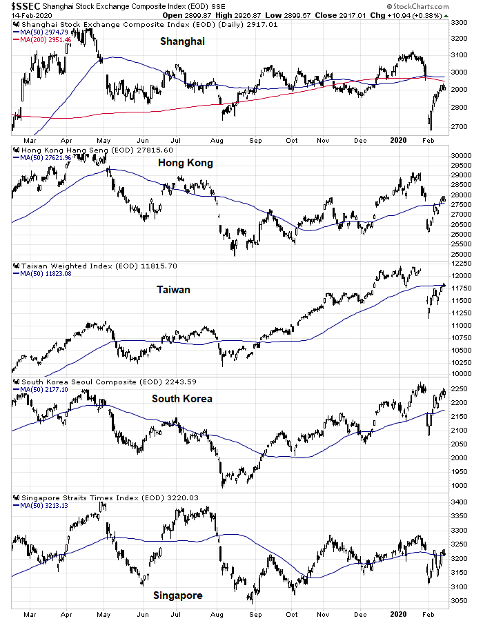
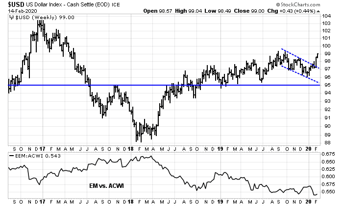
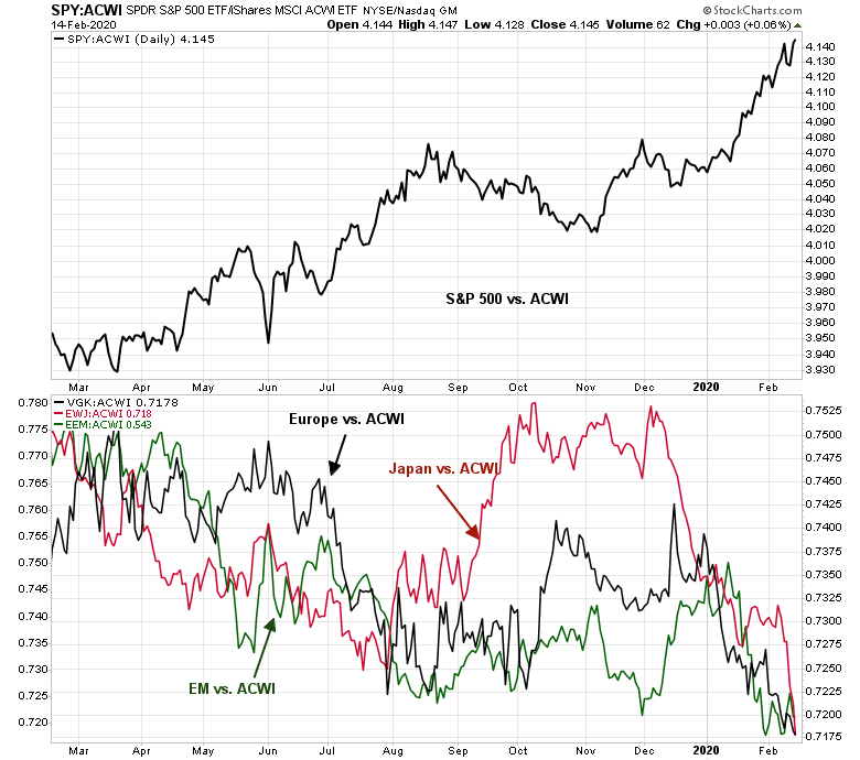
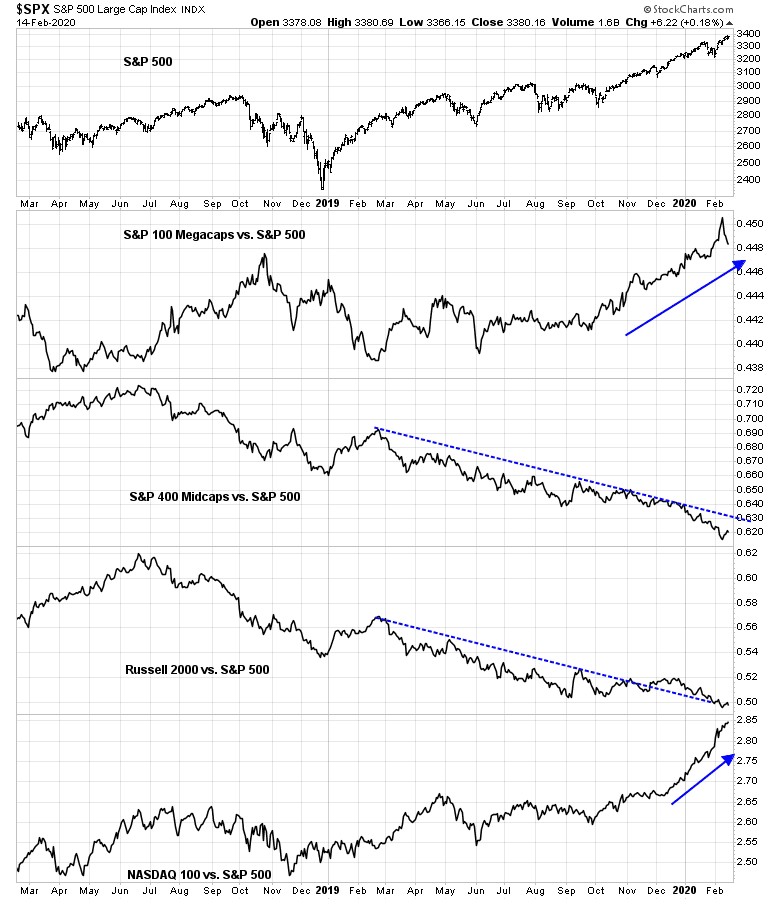
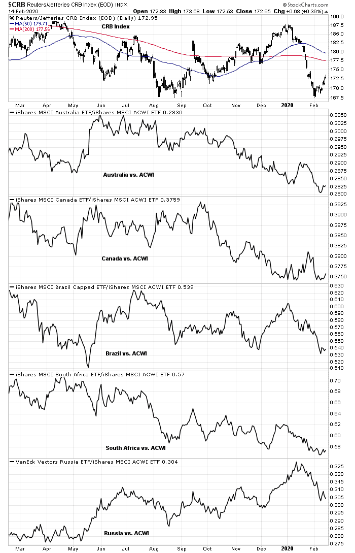
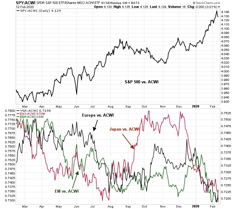
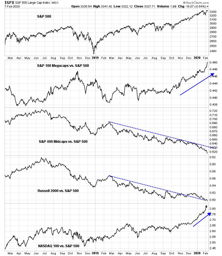
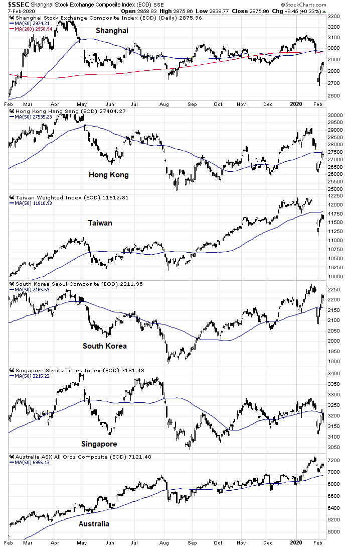
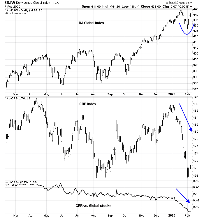
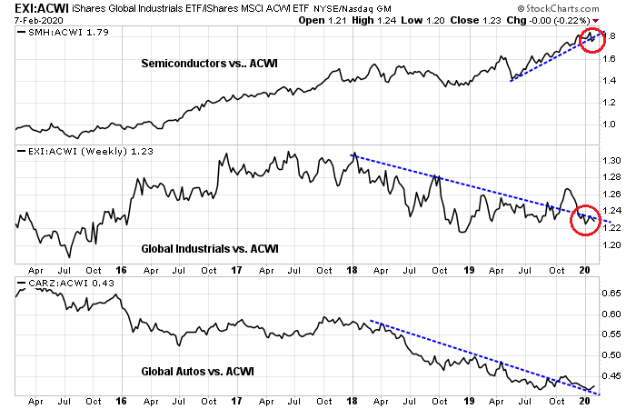
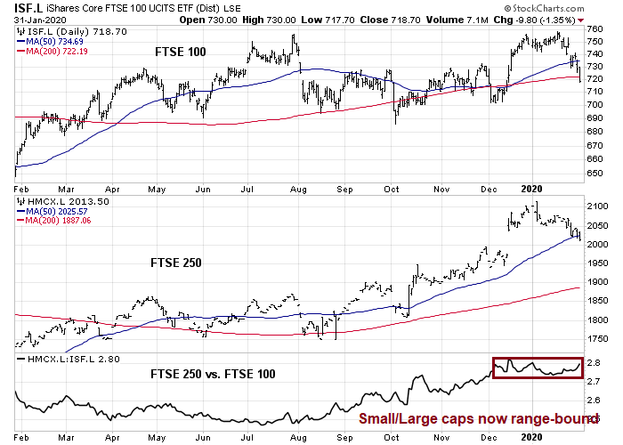
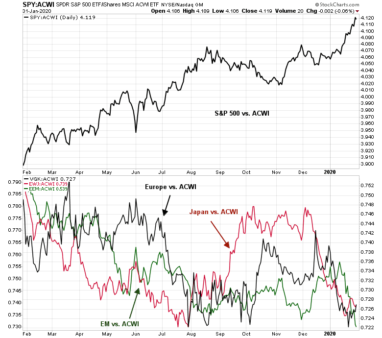
Non-US markets are also acting in a constructive manner. I had suggested in the past that investors might be better served to buy commodities and EM equities while avoiding US stocks (see The guerrilla war against the PBOC). It was a contrarian call because of the high sensitivity of commodities and EM to a possible Chinese downturn. Both commodity and EM markets have begun to stabilize and exhibit positive relative strength, indicating a possible turn in market psychology. The worst may be over.
To be sure, a deeper examination of EM market strength shows that most of it comes from China and India. EMEA and Latin American markets are still lagging. However, EM leadership cannot be dismissed as purely a China and India effect, as frontier markets are also turning up in relative strength.
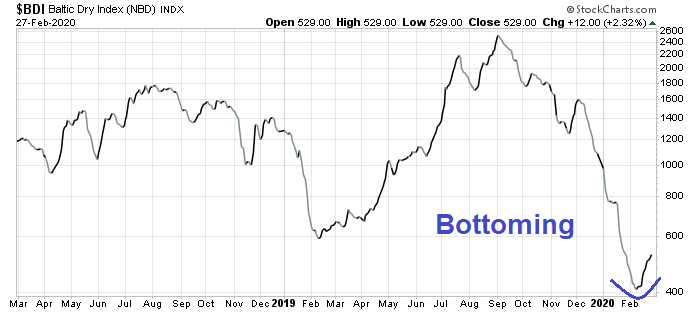
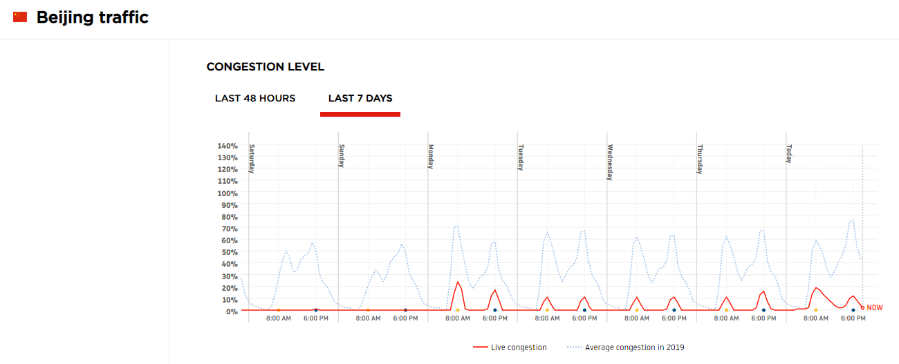
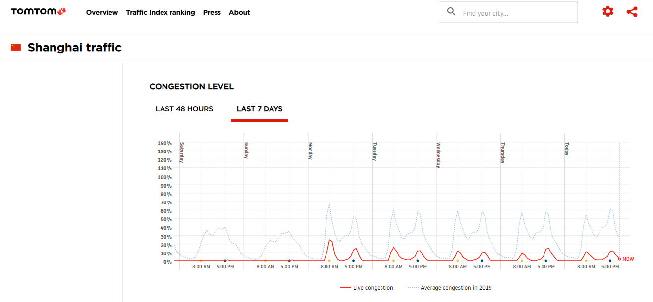
There are other signs that the world is edging back to normalcy. The Baltic Dry Index, which measures shipping costs, is showing signs of bottoming after a catastrophic decline. The worst of the global supply shock may be over.
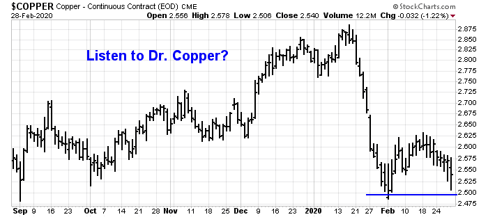
Finally, copper prices are stabilizing and have not breached their early February lows. Copper is a cyclically sensitive metal that it has been dubbed “Dr. Copper” by traders because it is said to have a Ph.D. in economics.
A long bottoming process
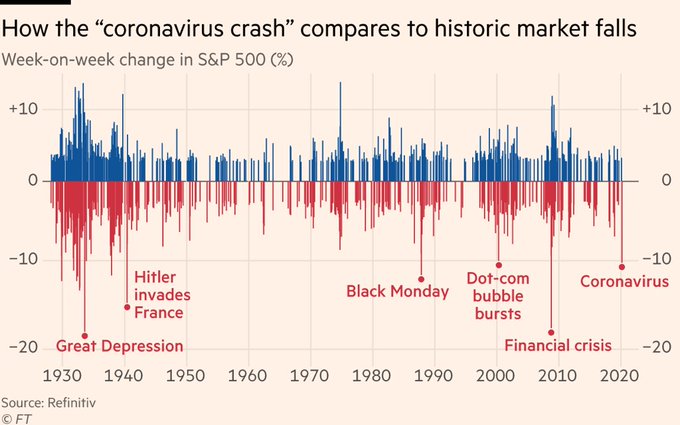
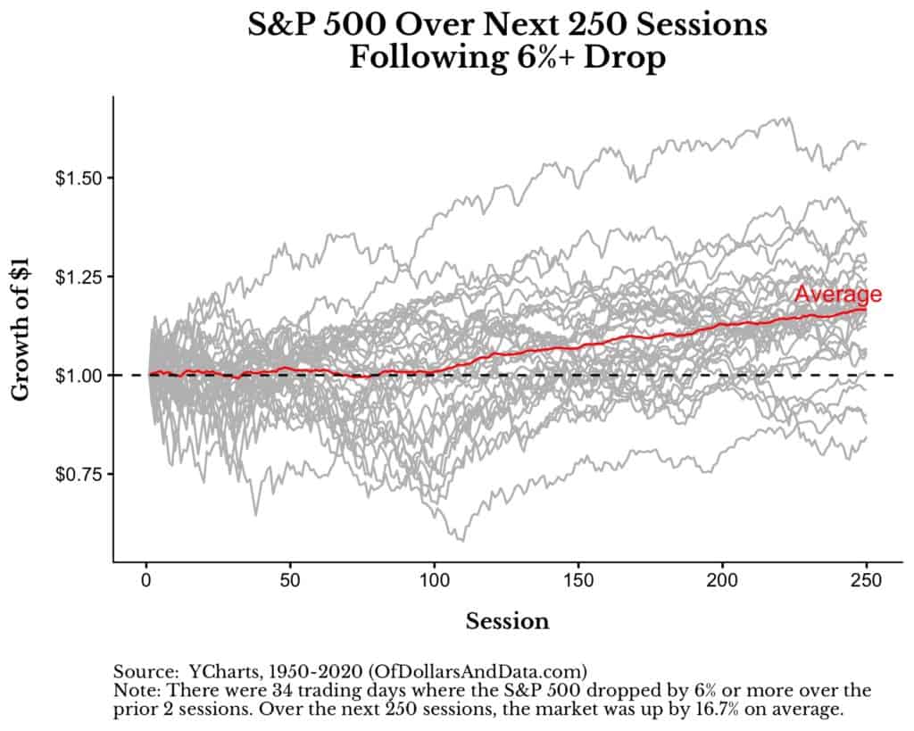
This bottoming process is just beginning, and it is likely a long process. Nick Maggiulli at Of Dollars and Data compiled the past market reaction after drops of over 6% over two days. On average, the stock market was but volatile for the next 100 trading days before rising again.
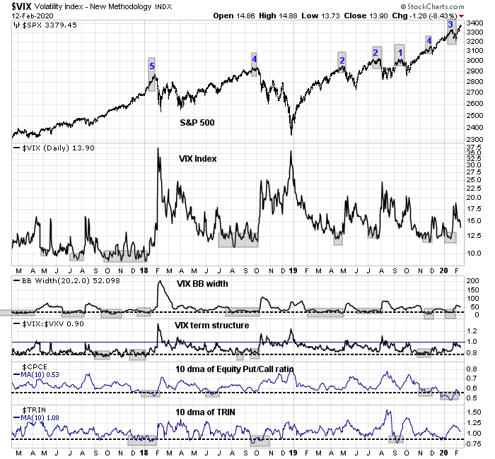
The option market is also signaling a prolonged resolution to this COVID-19 induced Lehman Crisis. The term structure of the VIX Index has inverted, which is not a surprise during these periods of fear. A recent article by Luke Kawa at Bloomberg pointed out what is unusual is the inversion is extending out past the front month:
And what makes this inversion scarier than normal is what’s happening just a bit further out on the curve. Typically, when the front of the VIX curve inverts, the rest stays relatively flat. It’s an acknowledgment that the market tumult is expected to be a relatively short-lived affair.
Not so this time. The April VIX future has closed as much as 1.3 points above May’s during this pullback, the biggest such backwardation between the second and third-month contracts since the idiosyncratic volatility blowup in February 2018. This is an indication that traders expect an environment of heightened volatility to persist for longer than your run-of-the-mill stock market correction.
This dynamic speaks to the evolution of traders’ perception of the coronavirus: what was first a contained supply shock is now morphing into a potent threat of unknown magnitude to a fragile global economy.
Even if the market were to stage a relief rally from current levels, the bearish episode is likely not over. A more typical bottoming pattern would see the markets rally, falter to retrace and retest the previous lows. There are no guarantees whether the retest would necessarily be successful.
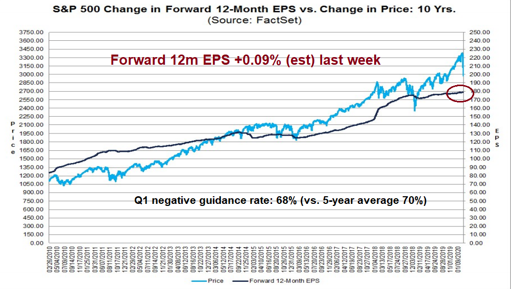
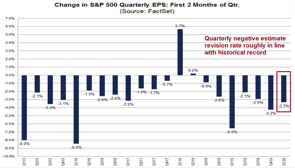
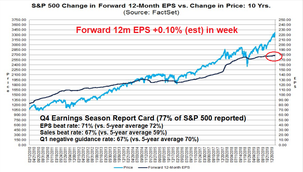
The next shoe has yet to drop. While we have seen selected profit warnings from corporate management, such as MasterCard and United Airlines, estimate revisions so far are still positive. As well, the negative Q1 guidance rate is roughly in line with the historical average.
Historically, analysts have been overly optimistic in forming EPS estimates, and they tend to revise them downwards as the date of the earnings report approaches. The current experience indicates that Street estimate revisions are not especially negative compared to history, indicating that Wall Street has not fully factored in the effects of the coronavirus yet.
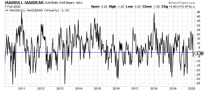
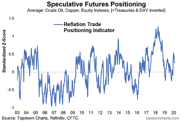
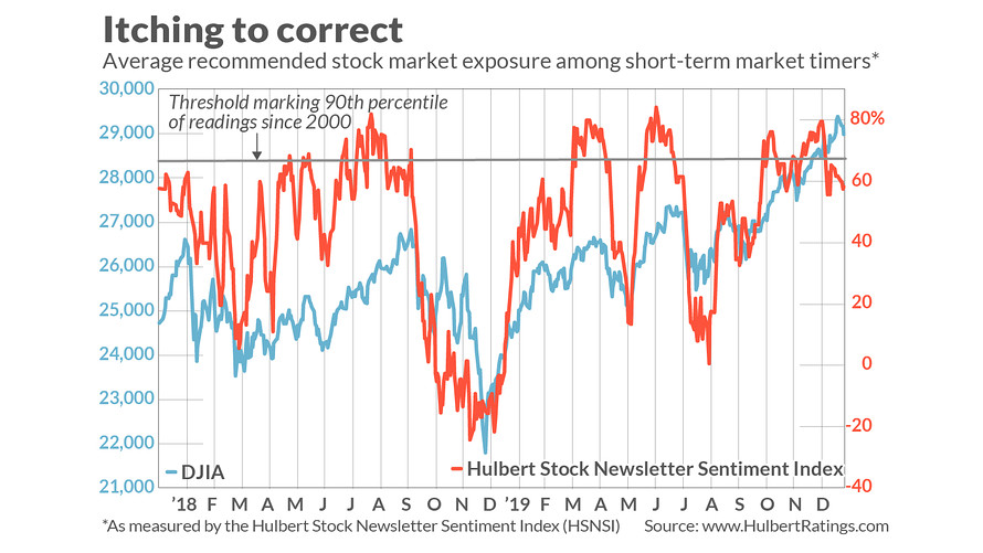
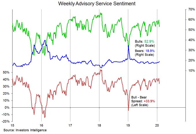
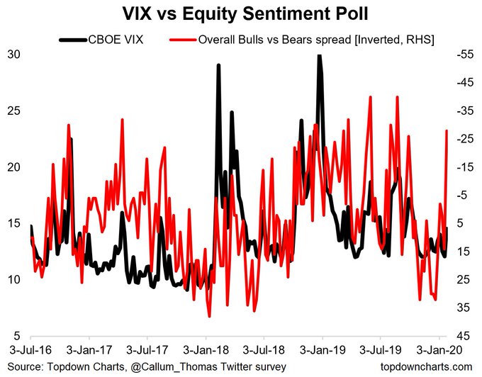
We need to see EPS estimates start to fall, followed by a period of stabilization before the fundamentally driven institutional investors feel more comfortable in taking more risk. Current survey data indicates that institutions are in a crowded long in equities, and they are just beginning to de-risk.
In conclusion, the global economy is undergoing a period of stress that will take some time to resolve. Asset prices are likely to be highly volatile for the next few months until the full extent of the uncertainty is resolved. In the short run, the stock market is extremely oversold and washed out. A relief rally and climatic reversal can happen at any time. However, I expect that any rally would be followed by re-tests of the old lows, which may not necessarily be successful.
Investment oriented accounts should be minimizing risk and aim for asset allocations with below average equity risk. I reiterate my call to overweight emerging market equities and commodities because the market has already embedded low expectations for their outlook, and underweight US equities because of their valuation risk.
Remember to tune in tomorrow for the trading analysis.