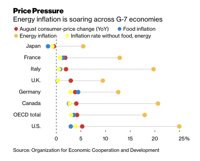
Stagflation fears are rising again. It’s a natural reaction to the short-term data. September headline CPI came in hot, though the core CPI print was in line with expectations and PPI was soft. Inflation expectations are spiking…
…while the Atlanta Fed’s GDP nowcast is plummeting. Consumer confidence is dropping, driven by supply chain bottlenecks and rising costs. The combination of these factors is becoming a threat to corporate profits.
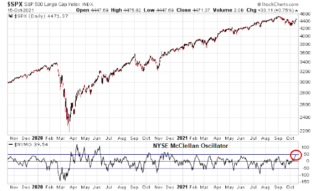
As a QE taper is more or less baked in for November, these worries have unsettled markets as the narrative is that the Fed could be making a policy mistake. Should investors cast their lot with Team Stagflation, or Team Transitory?
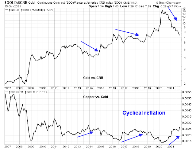
Rising signs of stagflation
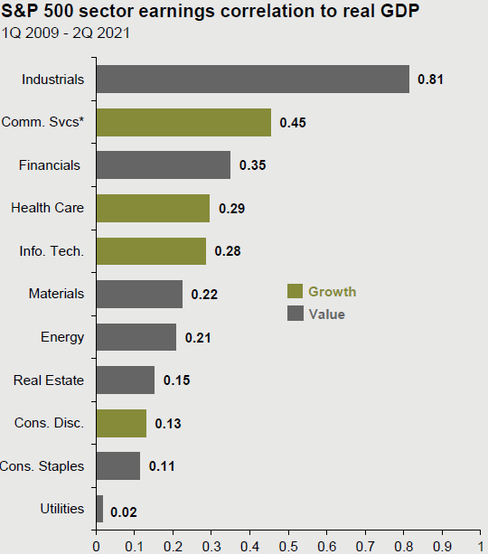
The most visible signs of stagflation can be found in the monthly NFIB small business survey. Small businesses have little bargaining power and therefore the NFIB survey can be a sensitive barometer of the economy.
Let’s start with the good news. Sales is not a problem. Small businesses reporting “poor sales” as their single most important problem fell to a multi-year low.
However, operating internals is causing some headaches, as summarized by
Marketwatch.
Small businesses complain they cannot find enough skilled workers even after raising pay. Nor can they obtain parts and supplies fast enough to keep up with demand. These problems have also affected the largest businesses across the country.
“Small-business owners are doing their best to meet the needs of customers, but are unable to hire workers or receive the needed supplies and inventories,” NFIB chief economist Bill Dunkelberg said after the survey results.
More than 50% of small businesses said they couldn’t fill open positions last month, a 48-year peak. And the number of companies offering higher pay was also at a 48-year high.
The complaints of NFIB survey respondents sound like the ingredients for stagflation. Hiring plans are peaking despite the complaints about labor shortages. While compensation rates have risen strongly, small businesses are also raising prices to pass along their costs to customers. If even small companies have the pricing power to raise their prices, investors shouldn’t worry too much about margin pressure.
What about inflationary pressures? Before everyone gets overly excited about the recent hot CPI print, take a deep breath. Most of the inflationary pressure is coming from durable goods attributable to supply chain bottlenecks. August core PCE came in at 3.6%, but durable goods PCE was an astounding 7.0%.
Much of the perceived inflation is attributable to a change in the composition of consumer spending. Households shifted spending from services to services in response to the pandemic, which led to excess demand for goods and supply chain bottlenecks. These temporary factors should fade over time.
Much of the perceived inflation is attributable to a change in the
composition of consumer spending. Households shifted spending from services to
services in response to the pandemic, which led to excess demand for goods and supply
chain bottlenecks.
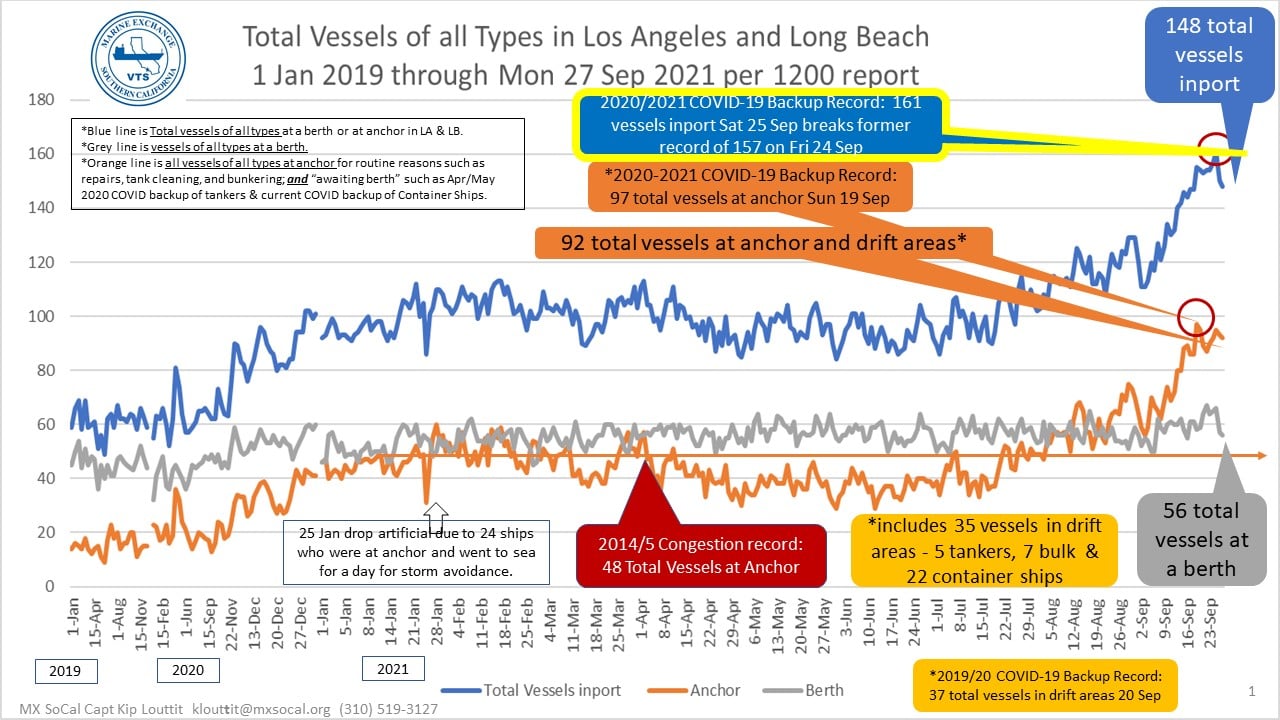
Container ship congestion on the US West Coast is peaking, indicating an easing of supply chain bottlenecks.
In addition, China’s September exports came in ahead of expectations, which is another sign of a falling of global supply chain delays.
As for services inflation, Marketwatch highlighted the divergence between the US and Sweden’s experience with the pandemic and the effects on inflation.
There’s one notable country that didn’t mandate shutdowns or lockdowns — Sweden. And there, services prices did decline. And now, inflation in Sweden is about 3 percentage points less than in the U.S.
What the Swedish experience suggests is that prices will eventually stabilize. “The surging demand for durables is correcting. Since March, it is already down by 15% but requires a further 7% decline to reach its pre-pandemic trend, which we fully expect to happen. After all, there are only so many smartphones and used cars that you can own,” Joshi said.
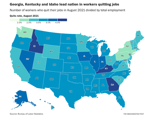
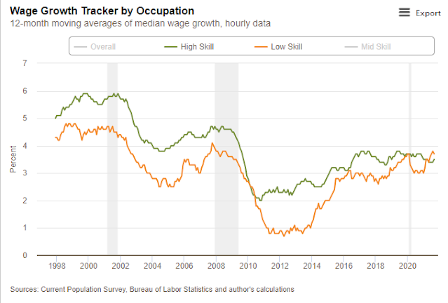
I would also like to address the concerns of small business owners about rising wages. This analysis of quits by industry shows an inverse relationship between quit rates and pay. As most small businesses tend to be clustered in low-wage industries, it’s no surprise that labor quality and supply is a growing concern.
Further analysis of the average hourly earnings (AHE) of the three lowest-paid industries relative to aggregate AHE shows that it is the leisure and hospitality, which is the lowest-paid group, have been the standouts in 2021 (red bars). By contrast, excess wage growth in the other two low-paid industries has slightly lagged.
The pandemic-related layoffs of 2020 were concentrated in low-paid services businesses such as retail and leisure and hospitality. The spike in average hourly earnings during the recovery is attributable to a compositional effect. In 2021, leisure and hospitality workers are playing wage catch-up. This is the picture of falling earnings inequality, which has become an objective of the Fed, and not an indication of broad-based wage pressures.
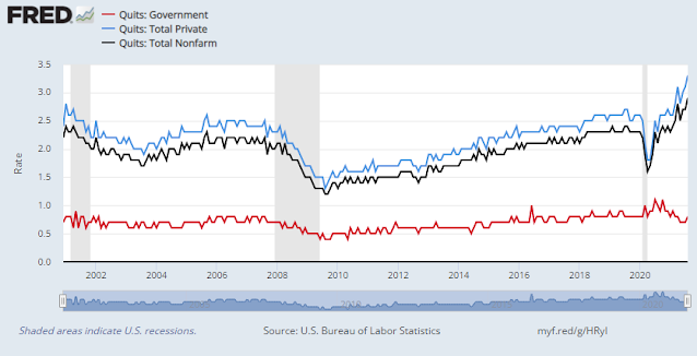
An analysis of JOLTS reveals that the quit rate is especially elevated among firms with 10-249 employees. The competitive position of small businesses are being eroded. Don’t generalize the problem in the NFIB survey to the overall economy.
The bull case
The stagflation story is only one side of the coin. The other side is a growth recovery into 2022 and beyond. Stagflationistas have touted the IMF downgrade of global growth from 6.0% to 5.9% in 2021 as support for their narrative. Less mentioned is the boost to 2022 global growth forecasts. In particular, the IMF raised the US 2022 GDP growth estimate from 4.9% to 5.2%.
Already, the US Economic Surprise Index, which measures whether economic data is beating or missing expectations, is rising again. Is it any wonder why there is upward pressure on the 10-year Treasury yield?
In addition, capital goods orders and shipments are soaring. This is another signal of a strong capex cycle that should increase productivity and support non-inflationary growth.
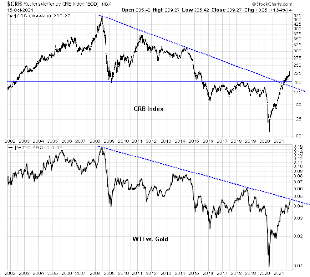
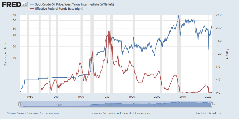
What about rising commodity prices? Won’t that act to restrain economic growth? Relax. The energy intensity of the American economy has fallen dramatically since the stagflation era of the 1970’s.
Worries about collapsing consumer confidence are also overblown. Google searches for consumer credit is surging. As household balance sheets are strong, rising credit demand tells the story of a consumer willing to spend. Watch what they do, not what they say in surveys.
Stagflation is the combination of high inflation and slow growth. For a long-term perspective, the accompanying chart shows my Stagflation Index, defined as the spread between core PCE and real GDP growth. Even if we were to use the Atlanta Fed’s GDPNow as an input, this indicator is nowhere near the stagflation era of the 1970’s. Consistent with the IMF’s forecast of renewed growth in 2022 and 2023, the Stagflation Index using the FOMC’s Summary of Economic Projections is negative.
To be sure, the key risk to the bullish scenario can be found in the IMF forecast, which warned that inflation is tilted to the upside while growth is tilted to the downside. Federal Reserve staff economists also highlighted similar risks in their economic assessment during the September FOMC meeting.
Investment implications
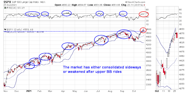
I believe investors should view these stagflation fears in perspective. They are temporary, but such concerns naturally arise during a mid-cycle expansion phase. Historically, the S&P 500 has continued to advance during such phases. Unemployment is falling, but levels are not extreme and there is still slack in the economy.
Central banks are starting to pivot from emergency stimulus to taking their collective feet off the accelerator. Stocks have historically have also performed well during periods of rising rates.
Since one characteristic of rising rates is P/E compression, a short-term key for stock prices is Q3 earnings season. It’s difficult to know how earnings season will turn out, but one early sign is constructive. The Guidance Index from Bianco Research remains positive, though it is decelerating. Q3 earnings should beat expectations, though the risk is management’s body language and guidance going into Q4 and beyond.
For the last word, I offer this comment from former IMF chief economist
Olivier Blanchard.
In conclusion, I am still on Team Transitory. Stagflation fears are temporary and should soften in the coming months. The macro backdrop coming out of the COVID Crisis is nothing like the stagflation era of the 1970’s. The equity bull is still alive, and investors should position themselves for a reflationary rebound.
As I have pointed out before (see
Not your father’s stagflation threat), the real risk is a series of supply chain disruptions from climate change related events like heat waves and floods that keep inflation elevated and reduce growth.