Exhibitions of powerful price momentum are rare. Since the market bottom in 2002, there have been eight occasions when the percentage of S&P 500 above their 50 dma has surged from below 15% to over 90% in a brief period. That latest episode occurred when stock prices soared off the bottom in October 2023. These price surges were usually resolved in either a short-term consolidation or setback, but the S&P 500 was invariably higher a year later with a 100% success rate.
I conducted a bottom-up scan of stock charts to look for technical uptrends and strong breakout formations. The scan isn’t meant to create a complete list of stocks with bullish technical outlooks.
My evaluation framework is based on two components: the simple analysis of a weekly chart of the stock in the top panel, and the relative performance of the stock against the S&P 500 in the bottom panel. U chose the weekly chart as a way of filtering out the noise from daily price movements and better show the intermediate price trend. Ideally, both should be either in uptrends or breaking out on both an absolute and relative basis.
I found at least 29 charts with bullish technical patterns, none of which should be considered to be buy recommendations without further individual fundamental due diligence. Taken together, I came away with a stronger conviction of intermediate bullishness for the stock market, sector and industries. As well, this bottom-up analysis also pointed to bullish macro conclusions about the economy.
The Magnificent Seven
No bottom-up technical scan of chart patterns would be complete without the analysis of the Magnificent Seven. I found that most of these stocks exhibited bullish patterns.
The star of the Magnificent Seven has to be NVIDIA (NVDA), which is in a well-defined uptrend and broke out to fresh all-time highs as investors have bid up the share price over the promise of AI-related demand for the company’s chips. As well, the stock staged double relative breakouts to new relative highs.
Close behind NVIDIA is Microsoft (MSFT), which is in both an absolute and relative uptrend.
While it is not in an uptrend, Meta Platforms (META) is a stock that’s exhibiting what will be a recognizable breakout from a long multi-month base, both on an absolute and relative basis.
The chart pattern of Amazon.com (AMZN) is less bullish, but nevertheless promising. The stock staged an upside breakout from a long base, but we have seen no relative breakout just yet.
Alphabet (GOOG, GOOGL) hasn’t staged upside breakouts just yet, but it is also testing resistance while exhibiting the now familiar saucer-shaped base.
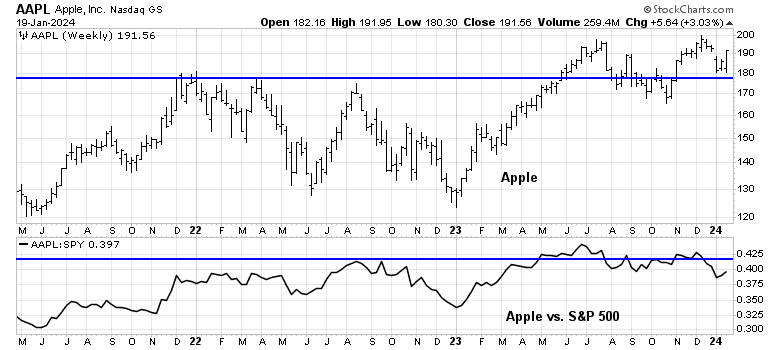
One laggard within the Magnificent Seven is Apple (AAPL). The stock staged an upside absolute breakout, but it’s trading under a key relative resistance level.
The worst chart of Magnificent Seven stocks is Tesla (TSLA), which struggled because of concerns over its China exposure.
The latest BoA Global Manager Survey showed that institutions believe long Magnificent Seven is the most crowded trade. While the trade may be crowded, megacap growth stocks may have further potential to run. The normalized relative returns of the NASDAQ 100 (black line) is only in the middle of its 12-month range. I interpret this to mean that AI-related excitement could drive these stocks much further than many people might expect.
Technology winners
In general, the technical scan has thrown off numerous bullish patterns in the technology sector. In particular, the semiconductor stocks have been standouts, starting with Broadcom (AVGO), which is in a well-defined absolute and relative uptrend.
Here is Lam Research (LRCX), which staged upside absolute and relative breakouts of saucer-shaped bases.
An honourable mention goes to Advanced Micro Devices (AMD), whose chart is not shown. AMD is testing absolute and relative resistance levels out of multi-month bases.
Nutanix (NTNX) also staged an absolute and relative breakout out of multi-month bases.
Qualys (QLYS) staged a definitive upside breakout on an absolute basis. However, it has pulled back from its relative breakout level and it’s re-testing a key resistance level (bottom panel).
Other technology stocks of note include Salesforce.com (CRM), which staged an absolute breakout, but remains below its relative breakout level.
Guidewire Software (GWRE), has a similar technical pattern of upside breakouts through absolute and relative resistance levels.
Shopify (SHOP) has also staged absolute and relative breakouts from long bases.
Lastly, here is Affirm Holdings (AFRM) within the technology sector, which staged an absolute breakout, but remains below its relative breakout level.
A strong consumer
I also found numerous technically strong stock patterns in the consumer discretionary sector, which is the sign of a strong consumer. In particular, selected apparel and footwear stocks have gone bonkers.
Abercrombie & Fitch (ANF) is in a well-defined absolute and relative uptrend.
Decker Outdoor (DECK) is exhibiting a similar absolute and relative uptrend.
An honourable mention whose chart is not shown goes to lululemon (LULU), which staged an absolute upside breakout through resistance but pulled back.
Booking Holdings (BKNG), a travel stock, is also in an absolute and relative uptrend.
Expedia (EXPE) has staged upside breakouts on an absolute and relative bases out of long bases.
These are all signs of a healthy consumer. Costco (COST) has staged an upside and relative breakout to an all-time high. While Walmart (WMT), whose chart is not shown, did breakout on an absolute basis, its relative performance is not as strong.
Important cyclical winners
My technical scan also revealed strength in important cyclicals such as housing. DR Horton (DHI), a homebuilding stock, is in an absolute and relative uptrend.
A similar price pattern can be seen in Toll Brothers (TOL), though the stock has pulled back and consolidated its gains in the past few weeks.
Price strength isn’t just confined to homebuilding stocks. Boise Cascade (BCC), a supplier of building products, has also broken out to all-time highs on an absolute and relative basis.
TopBuild (BLD) is also exhibiting a similar pattern of strong absolute and relative breakouts.
Among the cyclically sensitive industrial stocks, General Electric (GE) staged upside absolute and relative breakouts out of multi-month bases. The chart pattern that differs industrials from other bullish patterns is the breakout occurred in early 2023, which was earlier than the others that I highlighted in this publication.
Caterpillar (CAT), another globally sensitive industrial stock, staged a similar upside in early 2023, but chopped sideways since the breakout. This is nevertheless a constructive pattern.
Fastenal (FAST) is a useful industrial bellwether as it’s a distributor of industrial and construction supplies. The stock broke out of a long base in late 2023 and soared last week after its earnings report.
Among the banks, which are also cyclically sensitive, JPMorgan Chase (JPM) is a standout. It staged an absolute breakout in late 2023 out of multi-month bases to an all-time high, though the relative breakout, which occurred at the same time, exhibited less strength.
By contrast, most of the bank stocks skidded badly at the time of the Silicon Valley Bank debacle, but retained their support levels in December 2023.
Special situations
My technical scan is not meant to be comprehensive and I apologize if I missed your favourite stock. It was meant to be a bottom-up technical review to highlight sector and industry strength. With that caveat in mind, I would be remiss if I didn’t point out the strength in a couple of special situations in outlier industries.
The first is Eli Lilly (LLY), whose stock price has gone from strength to more strength over investor excitement about the promise of weight loss drugs.
The absence of healthcare stocks in my technical scan was a bit of a puzzle in light of the sector’s constructive relative bottom pattern and improving relative breadth (bottom two panels). However, a bottom-up review of the technical pattern of the heavyweights in the sector shows that much of the sector’s strength can be attributed to LLY.
The other special situation stock to highlight is the strength in uranium producer Cameco (CCJ), which is in strong absolute and relative uptrends because of renewed enthusiasm over nuclear power. The strength in CCJ is occurring in spite of the weakness in materials stocks, which is a reminder that the specific fundamentals of any company can overwhelm the price factors that influence its sector and industry.
In conclusion, a bottom-up driven scan of stock charts shows numerous stocks with bullish technical patterns consisting of uptrends or breakouts from multi-month bases with strong potential upsides. Bullish patterns are broadly based, primarily concentrated in technology and cyclicals, which argue for a continuation of the AI-related bull and an economic rebound. This bottom-up analysis also pointed to bullish macro conclusions about the economy.
Mid-week market update: I had been expecting a choppy January for stock prices, and current market action has not disappointed. Investors came into 2024 all bulled up, but rising rates eventually spooked stock prices. It all came to a head with Fed Governor Waller’s speech, in which he stated that the Fed is pivoting to an easing cycle, but the market expectations may have gotten ahead of themselves.
The S&P 500 has weakened into a support zone, while the 10-year Treasury yield is nearing a resistance zone.
Here are some reasons why I believe that the market will experience a shallow correction.
Bottoming signals
I had written that one of the conditions for a market bottom would see breadth, as measured by new highs-new lows, turn negative. They finally turned negative yesterday (Tuesday).
As well, two components of my Bottom Spotting Model have flashed buy signals. The VIX Index spiked about its upper Bollinger Band, and the NYSE McClellan Oscillator (NYMO) has fallen into oversold territory. Historically, the market has bottomed soon after two or more components flashed buy signals.
Independent from my analysis, Rob Hanna at Quantifiable Edges tweeted that his Capitulative Breadth Indicator (CBI) reached 11 yesterday, which is above the threshold of 10 for a buy signal. I would expect that today’s market weakness would push CBI even higher into buy territory.
Putting it all together, the latest bond market tantrum has rattled investors and sparked a risk-off episode. Short-term bearish psychology looks overdone and stock prices are poised for a bounce. The narrative is likely to turn from a focus on top-down macro conditions to the results of earnings season, which will begin in earnest next week.
Subscribers received an email alert that my inner trader had entered the market on the long side. I expect that this will be a short-term trade that lasts no more than one or two weeks. The usual disclaimers apply to my trading positions.
I would like to add a note about the disclosure of my trading account after discussions with some readers. I disclose the direction of my trading exposure to indicate any potential conflicts. I use leveraged ETFs because the account is a tax-deferred account that does not allow margin trading and my degree of exposure is a relatively small percentage of the account. It emphatically does not represent an endorsement that you should follow my use of these products to trade their own account. Leverage ETFs have a known decay problem that don’t make the suitable for anything other than short-term trading. You have to determine and be responsible for your own risk tolerance and pain thresholds. Your own mileage will and should vary.
A system glitch may have caused some subscribers to be unsubscribed from the email notification list. If you did, you would have received an email notification. Please click the link to re-subscribe. I apologize for any inconvenience.
We maintain several market timing models, each with differing time horizons. The “Ultimate Market Timing Model” is a long-term market timing model based on the research outlined in our post, Building the ultimate market timing model. This model tends to generate only a handful of signals each decade.
The Trend Asset Allocation Model is an asset allocation model that applies trend-following principles based on the inputs of global stock and commodity prices. This model has a shorter time horizon and tends to turn over about 4-6 times a year. The performance and full details of a model portfolio based on the out-of-sample signals of the Trend Model can be found here.
My inner trader uses a trading model, which is a blend of price momentum (is the Trend Model becoming more bullish, or bearish?) and overbought/oversold extremes (don’t buy if the trend is overbought, and vice versa). Subscribers receive real-time alerts of model changes, and a hypothetical trading record of the email alerts is updated weekly here. The hypothetical trading record of the trading model of the real-time alerts that began in March 2016 is shown below.
The latest signals of each model are as follows:
Ultimate market timing model: Buy equities (Last changed from “sell” on 28-Jul-2023)
Trend Model signal: Bullish (Last changed from “neutral” on 28-Jul-2023)
Trading model: Neutral (Last changed from “bullish” on 02-Jan-2024)
Update schedule: I generally update model readings on my site on weekends. I am also on X/Twitter at @humblestudent. Subscribers receive real-time alerts of trading model changes, and a hypothetical trading record of those email alerts is shown here.
Subscribers can access the latest signal in real time here.
As good as it gets?
As the S&P 500 tests overhead resistance at its all-time high after staging a cup and handle upside breakout, it’s experiencing negative 5-week RSI divergences that have the fingerprints of a near-term top. Is this as good as it gets, at least for now?
Technical warnings
Numerous short-term technical warnings are appearing. Market breadth, which started broadening out in November, began to roll over into narrow leadership starting in mid-December.
Megacap NASDAQ leadership has recovered and it has especially been in evident in 2024. Viewed in isolation, narrow leadership isn’t a concern. But relative breadth indicators (bottom two panels) are in decline, which is a bearish warning.
Here is the good news and bad news on breadth. The good news is net new highs are still positive, which is a constructive sign. The bad news is the market has been deprived of positive price momentum, as evidenced by negative RSI divergences. Under such circumstances, the consolidation and corrective period is unlikely to end until net new highs turn negative.
Sources of volatility
Here is what the market is worried about for the remainder of January. The first and most immediate source of volatility is the results of the Taiwan election. Lai Ching-te, whose Democratic Progressive Party (DPP) is known to favour Taiwanese independence, has won the Presidency. However, the win wasn’t a resounding one, as the DPP has lost its majority in the legislature and any major initiatives may be challenging for the new President. Nevertheless, his win is certain to force China to react in some forceful way. While the odds of an immediate invasion is low, a show of force similar to the one in reaction to the visit by then House Speaker Nancy Pelosi could rattle markets.
Bloomberg Economics estimated that a China invasion of Taiwan would cost the world economy $10 trillion, which is about 10% of global GDP and far greater than the blow of the Ukraine war, COVID Crash and the GFC.
As well, the stock market is entering Q4 earnings season. Forward 12-month EPS estimates are rising going into earnings season and it’s best to keep an eye on how this evolves. The S&P 500 is trading at a forward P/E of 19.5, which is above its 5-year average of 18.9 and 10-year average of 17.6. Any negative surprises at elevated valuation levels could mean a disorderly shock to stock prices.
As well, the Quarterly Refunding Announcement (QRA) at the end of January could be a source of volatility. The last QRA sparked a global bond market rally when the U.S. Treasury announced that it was conducting most of its borrowings in short-dated paper, which alleviated the supply pressure on coupon-bearing bonds. What will Treasury do this time?
A pause in an uptrend
In conclusion, I reiterate my view that the stock market is undergoing a temporary pause in an uptrend. In the past, exhibitions of strong price momentum as measured by the percentage of S&P 500 above their 50 dma rising from below 20% to 90% have been long-term bullish. However, such episodes have also resolved in short-term consolidations or corrections.
The short-term outlook can be characterized as a riptide market. Everything looks good, but risks are lurking beneath the surface, namely negative technical warnings and several sources of volatility. Expect the rest of January to be choppy to down, which argues for a buy the dip and sell the rip posture in trading.
I don’t expect any corrective action to be too deep. Sentiment readings from the option market are cautious. In particular, the equity-only put/call ratio is approaching levels consistent with trading bottoms.
As the 10-year Treasury yield flirts with the 4% level and the yield curve steepens from its inverted condition, it’s worthwhile to keep in mind that the universe is unfolding as it should. Monetary conditions are tight, inflation is moderating, the jobs market, though tight, is weakening, and the economy is chugging along with no signs of a recession. Various Fed speakers have cautioned that while the inflation fight isn’t finished, the hiking cycle is over and the next likely interest rate move is down.
These conditions argue for a bull steepening of the yield curve, where bond yields fall while the curve steepens, and a conducive environment for stock prices. Why fight the Fed and the macro trend?
A dovish macro backdrop
Make no mistake, conditions are ripe for rate cuts, but in a good way. The Fed has engineered a skillful tightening cycle. The Fed Funds rate is well above the inflation rate. Falling inflation has done the heavy lifting in monetary tightening. As CPI falls, the real Fed Funds rate rises. At some point in the near future, the nominal Fed Funds rate will have to fall in order to avoid overtightening.
In addition, inflation data is trending in the right direction toward the Fed’s 2% target. December headline CPI came in ahead of expectations, but core CPI was in line. Even though core CPI rose 0.3%, only 42% of the CPI basket saw monthly gains of 0.2% or more. The combination of the CPI and tamer-than-expected PPI translates into the Fed’s preferred inflation metric of core PCE of 0.2% in December, which smooths the path to rate cuts.
Moreover, the New York Fed’s survey of consumer inflation expectations is back to pre-pandemic levels. One-year inflation is expected to rise 3.0, and 2.6% over three years, compared to 5% and 3%, respectively, one year ago.
The employment situation has seen frequent negative revisions to past nonfarm payroll releases. This is an indication of a jobs market that’s weaker beneath the surface.
A dovish Fed
As a consequence of the friendly inflation environment, Fed speakers have become increasingly dovish.
Fed Governor Michelle Bowman, who is regarded as a hawk, said that in a speech that her “view has evolved to consider the possibility that the rate of inflation could decline further with the policy rate held at the current level for some time. Should inflation continue to fall closer to our 2 percent goal over time, it will eventually become appropriate to begin the process of lowering our policy rate to prevent policy from becoming overly restrictive.”
New York Fed President John Williams used his now familiar metaphor of an onion to describe inflation in a recent speech. Inflation has three layers. The first represents globally traded commodities, which “have come down significantly from their peak levels” after the pandemic and Russo-Ukraine war related disruptions. The second layer is core goods, or goods ex-food and energy, whose inflation rate has “dropped to nearly zero”. The third and last layer, core services inflation, “has come down after peaking early last year”. Equally important is the progress on core services excluding housing inflation, which “has also slowed considerably”. He concluded that “it will only be appropriate to dial back the degree of policy restraint when we are confident that inflation is moving toward 2 percent on a sustained basis”.
Dallas Fed President Lorie Logan took a more hawkish note by expressing concern about markets getting ahead of the Fed on rate cut expectations: “We can’t count on sustaining price stability if we don’t maintain sufficiently restrictive financial conditions.”
However, she sounded a word of warning about the liquidity plumbing of the banking system as the overnight reverse repo account ON RPP falls rapidly [emphasis added].
Given the rapid decline of the ON RRP, I think it’s appropriate to consider the parameters that will guide a decision to slow the runoff of our assets. In my view, we should slow the pace of run-off as ON RRP balances approach a low level. Normalizing the balance sheet more slowly can actually help get to a more efficient balance sheet in the long run by smoothing redistribution and reducing the likelihood that we’d have to stop prematurely.
As a reminder, banking system liquidity is approximated the size of the Fed’s balance sheet – ON RRP – the Treasury General Account. All else being equal, a falling ON RRP increases banking liquidity. If ON RRP falls to zero, Logan is proposing tapering quantitative tightening, or the reduction in the Fed’s balance sheet, to compensate. QT is turning into QE. Logan’s words about the Fed’s balance sheet carries extra weight as she was the former head of the New York Fed’s trading desk. In the wake of Logan’s speech, market expectations are building that the Fed will begin to taper QT mid-year.The Fed is turning dovish. The market continues to expect a rate cut at the March FOMC meeting. The Fed hates surprising the markets. Unless Fed speakers push back strongly against the notion of a March rate cut and expectations of a cut stay above the 60–65% level, a March cut will be a done deal.
Don’t fight the Fed and the macro trend.
Key risk: Transitory disinflation
However, I continue to be concerned about the risk of transitory disinflation to the dovish Fed scenario. The New York Fed’s Global Supply Chain Pressure Index is rising again, indicating that progress in goods inflation is over. Is this just normalization or something more ominous?
Red Sea related disruptions are showing up in global shipping costs. While readings are nowhere near pandemic levels, it’s a lesson how global shocks can disrupt progress on inflation.
The Atlanta Fed’s wage growth tracker came in at 5.2% in December – and it’s been stuck at that level for three consecutive months. Even though there is growing evidence of a cooling jobs market, wage pressures aren’t falling.
In conclusion, the global disinflation trend is continuing in an uneven manner and both the macro trend and Fed speakers are pointing toward a dovish Fed pivot. This argues for a bull steepening of the yield curve and a bullish backdrop for stock prices. However, investors should be aware that the lurking risk is the re-emergence of the transitory disinflation narrative, which could derail the bullish scenario.
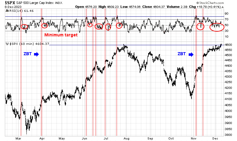
Mid-week market update: There is a time for an aggressive posture in positioning and there is a time for patience. This is a time for investors to be patient.
In the aftermath of the rally off the October bottom, the S&P 500 is consolidating its gains after breaking out through resistance at 4600 to form a cup and handle breakout. However, it was rejected at all-time high resistance and it’s now working off an overbought condition, as evidenced by the 5-week RSI. The VVIX to VIX ratio, which has led past tactical peaks in stock prices, peaked out just before the January highs, but the lack of a negative divergence in this ratio is constructive inasmuch as this is not a signal of a major top. I interpret current conditions as a consolidation within an uptrend.
An extended condition
Short-term sentiment readings tell the story of an extended position. The Commitment of Traders report show that asset manager and leveraged funds are in a crowded long in equities.
As well, SentimenTrader reported that their “dumb money confidence” indicator surged to one of its highest historical levels in late December but plummeted by 10% in a week. These conditions argue for a short-term bounce, but the market may need to chop further in order for sentiment to normalize.
Indeed, Rob Hanna at Quantifiable Edges revealed that his Quantifiable Edges Capitulative Breadth Indicator (CBI) rose above 10 to 11 on Friday, which is a tactical buy signal. He went on report that CBI fell to 2 on Tuesday, which “essentially ending the short-term bullish indication that triggered on Friday”.
I agree. The VIX Index spiked above its upper Bollinger Band, which is a short-term oversold signal for stock prices, but recycled back to its 20 dma Tuesday, which is a take profits signal if you had bought on the oversold reading.
Focus on leadership
During such choppy periods, it’s useful to focus on the evolution of market leadership. Market breadth had been broadening out, but narrowed again since 2024 began and large cap growth stocks have led again.
The renewal of large cap growth leadership appears to be a counter-trend rally. Investors seeking better returns in a sideways market may be better served by looking for outperformance opportunities in a volatile market. We will have the all-important CPI report tomorrow morning, and Q4 earnings season is just starting.
I can think of two sources of opportunity. One is the financial sector, which is turning up on in relative performance.
The other sector is healthcare. While these stocks are extended in the short run, they are becoming another source of emerging leadership and likely superior relative returns. Consider taking positions on a pullback.
We maintain several market timing models, each with differing time horizons. The “Ultimate Market Timing Model” is a long-term market timing model based on the research outlined in our post, Building the ultimate market timing model. This model tends to generate only a handful of signals each decade.
The Trend Asset Allocation Model is an asset allocation model that applies trend-following principles based on the inputs of global stock and commodity prices. This model has a shorter time horizon and tends to turn over about 4-6 times a year. The performance and full details of a model portfolio based on the out-of-sample signals of the Trend Model can be found here.
My inner trader uses a trading model, which is a blend of price momentum (is the Trend Model becoming more bullish, or bearish?) and overbought/oversold extremes (don’t buy if the trend is overbought, and vice versa). Subscribers receive real-time alerts of model changes, and a hypothetical trading record of the email alerts is updated weekly here. The hypothetical trading record of the trading model of the real-time alerts that began in March 2016 is shown below.
The latest signals of each model are as follows:
Ultimate market timing model: Buy equities (Last changed from “sell” on 28-Jul-2023)
Trend Model signal: Bullish (Last changed from “neutral” on 28-Jul-2023)
Trading model: Neutral (Last changed from “bullish” on 02-Jan-2024)
Update schedule: I generally update model readings on my site on weekends. I am also on X/Twitter at @humblestudent. Subscribers receive real-time alerts of trading model changes, and a hypothetical trading record of those email alerts is shown here.
Subscribers can access the latest signal in real time here.
A pause in momentum
Call it what you want. A breadth thrust. A momentum surge. The percentage of S&P 500 stocks surged from below 20% to over 90% in a brief two months. In the past, such episodes have usually signaled the start of bull markets. At the same time, these overbought conditions have also resolved in short-term periods of consolidation or pullbacks.
The case for a pause
The case for a pause in the uptrend is building. One factor is the failure of the Santa Clause rally, which occurs during the window starting five days before Christmas and ends two days into the new year. Historically, when the stock market fails to exhibit a positive return during this period, it portends poor returns for the rest of the year. That’s why the late Yale Hirsch coined the expression, “If Santa should fail to call, bears may come to Broad and Wall”.
While I don’t put much stock in short-run patterns as predictors of stock market returns, there are a sufficient number of traders who follow such patterns. Ryan Detrick compiled past instances of Santa rally failures and found that they were usually followed by weak returns in January, along with subpar returns in Q1 and the rest of the year.
The current episode has also been characterized by a form of momentum failure. Stocks that had been the price momentum leaders have plummeted, as shown by the relative returns of the different price momentum ETFs. I interpret this as a sign of price exhaustion as past winners can’t sustain further upside, which is another indication that a period of consolidation and pullback is ahead.
Another headwind that the stock market faces is a decline in liquidity. In the past, financial system liquidity (blue line) has been correlated with the S&P 500 (red line).
As well, FactSet reported that Street analysts are cutting Q4 EPS estimates at a higher than average rate.
Too late to short
Tactically, it’s probably too late for traders to initiate a short position in the market. The usually reliable S&P 500 Intermediate Term Breadth Momentum Oscillator flashed a sell signal last week when its 14-day RSI recycled from overbought to neutral. However, it may be too late to short the market as the NYSE McClellan Oscillator (NYMO, bottom panel) has already fallen below the zero neutral level, which is an indication of limited downside potential.
In addition, the VIX Index spiked above its upper Bollinger Band last week, which is a short-term signal of an oversold market. While these conditions don’t constitute trading buy signals, they nevertheless indicate limited downside risk in the short run.
A three black crows market
In summary, current market conditions can be summarized by the “three black crows” candlestick pattern shown by QQQ. According to Investopedia, the three black crows pattern “consists of three consecutive long-bodied candlesticks that have opened within the real body of the previous candle and closed lower than the previous candle”, and it is indicative of a bearish trend reversal. However, the market is already oversold based on the 5-day RSI, indicating probable limited downside risk.
In conclusion, the stock market is poised for a period of consolidation or pullback after a powerful breadth thrust. I remain bullish on equities as such episodes of strong price momentum have usually led to higher prices 6–12 months ahead. In the short term, I advise against traders trying to short this market as downside risk is probably limited.
Instead, this should be regarded as a buy the dip and sell the rips choppy environment. Investment oriented accounts can consider utilizing such a strategy to enhance returns around a core set of holdings.
The S&P 500 staged an upside breakout in December through a cup and handle pattern but it was rejected at all-time-high resistance, which is a somewhat disappointing development.
Instead of worrying about whether it can rally through resistance, here is another index that staged a cup and handle breakout, but to all-time-highs. It’s the NYSE FANG Plus Index, which represents megacap growth stocks, which has been the market leadership. The catch is its relative strength is faltering and its retreated to test a key relative resistance turned support level. Further relative weakness could signal a loss of megacap growth leadership.
Growth or Value?
It appears that value is starting to take over the baton of market leadership. The accompanying chart shows the relative performance of value and growth across different market cap bands and internationally. In all cases, value stocks are beating their growth counterparts. Even more astonishing is that small-cap value is turning up against large-cap growth (bottom panel).
The predominant value sectors are financials, industrials, energy, materials and selected consumer discretionary stocks, except for heavyweights Amazon and Tesla. In other words, value has a significant cyclical exposure. The accompanying chart shows the relative performance of selected key cyclical industries. With the exception of oil & gas extraction, most are exhibiting positive relative strength against the market.
In summary, the bottom-up internals of the stock market are discounting a cyclical revival. This view is confirmed by a longer-term analysis of the relative performance of growth and value. Historically, investors have flocked to growth stocks when economic growth is scarce. We can see the dramatic outperformance of growth in 2020 during the COVID Crash and in 2023 when the consensus called for a recession which never arrived.
It appears that growth stocks are faltering, and cyclicals and value are starting to lead the market.
Transitory disinflation?
In other words, a bottom-up analysis of the stock market shows that it is discounting a “no landing” scenario, in which economic growth revives, instead of the consensus top-down “soft landing”, where economic growth slows and inflation decelerates sufficiently for the Fed to cut rates. An economy that achieves “no landing” may not slow sufficiently for inflation to drop to the Fed’s 2% target, which implies a scenario of higher-for-longer interest rates. Such a development would be a jolt to interest rate expectations, which are discounting a series of quarter-point rate cuts that begin in March.
That said, a more detailed analysis of the jobs data from the JOLTS and December Employment Report shows that data is still inflation friendly, despite the stronger than expected headline prints. Temporary jobs, which lead nonfarm payroll, fell -33,000 in December.
While headline average hourly earnings came in ahead of expectations, average hourly earnings of production and nonsupervisory personnel, which mainly excludes the effects of management bonuses, continues to decelerate. As well, the quits rate from the JOLTS report is also falling, which is another sign of a cooling jobs market.
In conclusion, I have highlighted the risk of transitory disinflation before (see A Bull Market With Election Year Characteristics). A divergence has appeared between the top-down and bottom-up expectations of growth. The top-down consensus is a soft landing, while the bottom-up consensus is no landing, which could put upward pressure on inflation and interest rates. Investors need to closely monitor these developments as the market could be rattled by a transitory disinflation narrative and a higher-for-longer monetary policy response.
Mid-week market update: I know that this is a trite expression, but the easy money has been made.
The rally off the October bottom has been astounding. My trading model was fortunate enough to spot the exact day of the bottom when insiders started buying an oversold market. The rally enjoyed further tailwinds in the form of a rare Zweig Breadth Thrust buy signal. The trading model took a brief hiatus in November and re-entered on the long side. It took profits when the S&P 500 violated its 10 dma.
The rally off the October bottom was driven by falling Treasury yields, which also violated its 10 dma. While my inner investor remains equity bullish, my inner trader is far more cautious.
Short-term caution
I am seeing numerous indicators of long-term bullishness, but warnings of a short-term consolidation or pullback. The percentage of S&P 500 stocks above their 50 dma recently surged above 90%. This is a powerful signal of price momentum and usually resolved with higher prices 6-12 months later. However, such overbought conditions have also led to short-term pullbacks.
Another warning of near-term weakness comes from % bullish on point and figure indicator, which reached an overbought condition of 80% and pulled back. If history is any guide, investors can expect corrective action over the next few weeks.
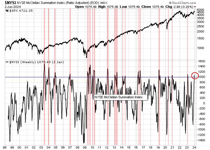
The NYSE McClellan Summation Index (NYSI) also provides a similar view of current market conditions. NYSI recently rose above 1000, which has usually been an indicator of a strong bull market. However, such overbought readings have often resolved in short-term pullbacks.
A decelerating economy
From a top-down macro perspective, job openings from JOLTS edged down in November, which is a welcome sign of a cooling jobs market that opens the door to lower interest rates. Historically, job openings have led nonfarm payroll employment by about six months and current readings indicator further deceleration in NFP growth.
In addition, there were no big surprises in the FOMC minutes, though their release did spark a bond market rally. The Fed is pivoting to lowering rates, though the timing of the cuts is uncertain.
In discussing the policy outlook, participants viewed the policy rate as likely at or near its peak for this tightening cycle, though they noted that the actual policy path will depend on how the economy evolves.
Though the inflation fight isn’t over:
Participants generally stressed the importance of maintaining a careful and data-dependent approach to making monetary policy decisions and reaffirmed that it would be appropriate for policy to remain at a restrictive stance for some time until inflation was clearly moving down sustainably toward the Committee’s objective.
My inner investor is bullishly positioned. Subscribers received an alert on Tuesday that my inner trader had taken profits in his long S&P 500 positions and he is standing aside in anticipation of near-term market volatility.
We maintain several market timing models, each with differing time horizons. The “Ultimate Market Timing Model” is a long-term market timing model based on the research outlined in our post, Building the ultimate market timing model. This model tends to generate only a handful of signals each decade.
The Trend Asset Allocation Model is an asset allocation model that applies trend-following principles based on the inputs of global stock and commodity prices. This model has a shorter time horizon and tends to turn over about 4-6 times a year. The performance and full details of a model portfolio based on the out-of-sample signals of the Trend Model can be found here.
My inner trader uses a trading model, which is a blend of price momentum (is the Trend Model becoming more bullish, or bearish?) and overbought/oversold extremes (don’t buy if the trend is overbought, and vice versa). Subscribers receive real-time alerts of model changes, and a hypothetical trading record of the email alerts is updated weekly here. The hypothetical trading record of the trading model of the real-time alerts that began in March 2016 is shown below.
The latest signals of each model are as follows:
Ultimate market timing model: Buy equities (Last changed from “sell” on 28-Jul-2023)
Trend Model signal: Bullish (Last changed from “neutral” on 28-Jul-2023)
Trading model: Bullish (Last changed from “neutral” on 20-Nov-2023)
Update schedule: I generally update model readings on my site on weekends. I am also on X/Twitter at @humblestudent. Subscribers receive real-time alerts of trading model changes, and a hypothetical trading record of those email alerts is shown here.
Subscribers can access the latest signal in real time here.
A revived bull
As 2023 drew to a close, the revival of a long-term buy signal emerged. I have highlighted the utility of the bullish crossover of the monthly MACD histogram of the NYSE Composite Index before. In the past, such instances have signaled strong long-term buy phases (blue vertical lines).
This model first flashed a buy signal in June 2023, but MACD turned negative in September. As the market rallied off its recent October lows, the monthly MACD turned bullish again. There have been two other similar episodes of these MACD buy signalisakeouts. Once in 1999, and the other in 2012. Both traced out brief range-bound price patterns before breaking out to new highs. If the limited past (n=2) is any guide, stock prices should also rally to new all-time highs in the near future.
Election year seasonality
While I am bullish on equities, I don’t think that trees grow to the skies and prices don’t rise in a straight line. This is an election year. While history doesn’t repeat itself but rhymes, chances are that equity returns will be flat to choppy in the first few months and the majority of the gains will be seen in the latter part of the year.
The risk of transitory disinflation
In the wake of a powerful rally, what could derail the bull run? I think that the biggest risk is the transitory disinflation narrative.
The current market consensus features falling inflation and continued economic growth for the U.S. economy. In other words, a soft landing. The market is not discounting a series of Fed rate cuts that begin in March.
Even though the rate of inflation has been falling, some early worrisome signs that continued disinflation progress are stalling, which would halt the expected path of decline in the Fed Funds rate. Consider, for example, that the Atlanta Fed’s wage growth tracker is stuck for a second month in November at 5.2%, which is far too high in comparison to the Fed’s 2% inflation target.
As well, the Philly Fed’s prices paid index is has been edging up. While readings are not alarming, it nevertheless signals that inflationary pressures may be reappearing.
For a broader look, the New York Fed’s Global Supply Chain Pressure Index is rising again. This is a signal that the disinflationary pressures on goods may be over. In addition, the recent shipping disruptions in the Red Sea is likely to put additional pressures on supply chains and elevated the prices of goods.
None of these data points are worrisome in their own right. However, they do indicate that the “last mile” disinflation problem of moving inflation from 3-4% to 2% may not be more difficult than the market is expecting. This has the potential of pushing out the timing of rate cuts, which has the potential to unsettle the bond market and risk assets in general. The average hourly earnings print in the coming Jobs Report on Friday will be a key test of the transitory disinflation narrative.
My 2023 report card
At year-end, it’s time to publish a review of the results of my models, starting with the Trend Asset Allocation Model. As a reminder, the trend model applies trend following techniques to a variety of global equities and commodities to arrive at a composite score that yields a buy, hold, or sell signal for equities. We’ve had an out-of-sample record of weekly signals since December 2021.
I constructed a model portfolio that either overweights or underweights the S&P 500 by 20% against a 60/40 benchmark of 60% SPY and 40% IEF based on trend model signals. The model portfolio had another good year with a total return of 17.6%, which was ahead of the 60/40 benchmark of 16.7%.
As the accompanying chart shows, the long-term track record of the model portfolio showed almost equity-like returns with balanced fund-like risk
My trading model had a good year. The model portfolio of the trend model was up 28.9% excluding dividends, which was ahead of the S&P 500 capital return of 24.2%.
The week ahead
Looking to the week ahead, the S&P 500 has the potential to rise further. The index has staged an upside breakout through a cup and handle pattern and it’s approaching its all-time high. The VVIX to VIX ratio is also signaling more bullish potential. The VVIX, which is the volatility of the VIX, to VIX ratio has shown a tendency to peak before past peaks in the S&P 500. Moreover, the last two major tops in the market were preceded by negative divergences in this ratio.While there is no sign of a negative divergence, the ratio may be rolling over, which could be foreshadowing some short-term turbulence.
In conclusion, long-term models are signaling the revival of a long-term equity bull, but the market may be vulnerable to some choppiness in the next few months. The intermediate-term outlook is bullish and I expect a positive year for the S&P 500 in 2024.
Both my inner investor and inner trader are bullishly positioned, but my inner trader is getting ready to take profits in his long positions next week. The usual disclaimers apply to my trading positions:
I would like to add a note about the disclosure of my trading account after discussions with some readers. I disclose the direction of my trading exposure to indicate any potential conflicts. I use leveraged ETFs because the account is a tax-deferred account that does not allow margin trading and my degree of exposure is a relatively small percentage of the account. It emphatically does not represent an endorsement that you should follow my use of these products to trade their own account. Leverage ETFs have a known decay problem that don’t make the suitable for anything other than short-term trading. You have to determine and be responsible for your own risk tolerance and pain thresholds. Your own mileage will and should vary.
I am not fond of the ritual of “year ahead” forecasts. Street strategists’ forecasts are far more dispersed compared to past years. The 2024 year-end target for the S&P 500 varies from 4200 to 5200.
So let’s make this brief. Analysis from Ryan Detrick of Carson Group shows that the S&P 500 rises an average of 12.2% in an election under a new president. That sounds about right in light of the recent Zweig Breadth Thrust buy signal from early November.
Instead, I would like to offer a different kind of “year ahead” analysis. What does the political and economic landscape of 2024 mean for investors in 2025?
The Fed’s balancing act
One of the key questions for investors in 2024 is the direction of monetary policy. The Fed has already signaled that it plans to pause rate hikes, but when does it cut?
The market became very excited with Fed Governor Christopher Waller’s dovish pivot when he addressed the question of rate cuts: “If you see this [lower] inflation continuing for several more months, I don’t know how long that might be—three months? four months? five months? You could then start lowering the policy rate because inflation’s lower.”
Waller’s remarks shouldn’t have been a surprise. Fed Chair Jerome Powell said the same thing at the July post-FOMC press conference [emphasis added]:
So if we see inflation coming down credibly, sustainably, then we don’t need to be at a restrictive level anymore. We can, you know, we can move back to a—to a neutral level and then below a neutral level at a certain point. I think we would, you know, we would—we, of course, would be very careful about that. We’d really want to be sure that inflation is coming down in a sustainable level. And it’s hard to make—I’m not going to try to make a numerical assessment of when and where that would be. But that’s the way I would think about it, is you’d start—you’d stop raising long before you got to 2 percent inflation, and you’d start cutting before you got to 2 percent inflation, too, because we don’t see ourselves getting to 2 percent inflation until—you know, all the way back to 2—until 2025 or so.
There was some confusion after the December FOMC meeting. The Summary of Economic Projections, or “dot plot”, projected three quarter-point rate cuts in 2024 and Powell mentioned the Committee talked about rate cuts. On the other hand, New York Fed President John Williams appeared to walk back market expectations in a CNBC interview the following week by stating, “We aren’t really talking about rate cuts right now.”
Here’s the real story. First, Powell said during the press conference that policy is restrictive, “Our actions have moved our policy rate well into restrictive territory.” However, the FOMC was only discussing rate cuts in an informal and preliminary way. Rate cut decisions were not on the active formal agenda:
So it comes up in this way today. Everybody wrote down an SEP forecast. So many people mentioned what their rate forecast was, and there was no back and forth, no attempt to sort of reach agreement, like this is what I wrote down, this is what I think, that kind of thing. And a preliminary kind of discussion like that, not everybody did that, but many people did. And then, and I would say there’s a general expectation that this will be a topic for us looking ahead. That’s really what happened in today’s meeting.
Regardless of whether there was any formal discussion of rate cuts, it is becoming evident that disinflation is gaining the upper hand. As inflation decelerates, the Fed will need to lower nominal rates so that real rates stay steady. As monetary policy operates with a lag, Fed officials will also have to pre-emptively ease policy as inflation approaches its 2% target in order to avoid excessive tightness that plunges the economy into recession.As a consequence, the market is therefore discounting a series of rate cuts that begin in March.
I think that such an aggressive schedule of rate cuts is an unrealistic expectation. I differ from the consensus with the timing of the initial rate cuts as I believe it would be reasonable for the Fed to begin cutting in Q1 or Q2. I just don’t believe the Fed will cut in the second half of 2024, which is an election year.
Fed officials don’t want to be seen as partisan in an election year. If a case for cuts can be made because of rising real rates, the cuts will have to occur in the first half. In a crisis, the Fed can take other steps to support the economy, which translates into the return of a Fed Put.
As an example, the reverse repo account (RRP) has been steadily shrinking and has been providing liquidity to the financial system. Should a crisis erupt and RRP levels are too low, which threaten the level of banking reserves, the Fed could inject liquidity into the system by halting the shrinkage of its balance sheet (QT).
In summary, the Fed has to walk a fine line between its dual mandate of price stability and full employment, as well as its unspoken mandate of financial stability and its political neutrality.
Biden’s polling problem
Here is where the economic rubber meets the political road in 2024. Political polls have consistently shown that President Joe Biden trails the Republican frontrunner, Donald Trump.
Second-term elections are usually a referendum on the incumbent’s performance. In effect, voters are asking the question that Ronald Reagan asked in 1984 in his re-election campaign, “Are you better off than you were four years ago?” If so, let’s have more of the same.
Even as the hard data shows that the economy is improving, soft sentiment data is weak, which spells trouble for the incumbent. The U.S. is unique among other advanced economies in this divergence.
When questioned about the specifics of consumer sentiment, a partisan divide in opinion becomes very evident.
A similar divide can also be seen in the opinion of small business owners, who lean small-c conservative. But that’s not the entire story.
A New York Times poll of swing state voters shows widespread economic dissatisfaction among Biden supporters.
The question is why, and the answer could determine the results of the election in November.
The answer is a combination of inflation and the pandemic. Even though inflation has been decelerating, the inhabitants of Main Street aren’t the economic nerds on Wall Street. Bloomberg recently documented how much different price categories have risen since 2020, from energy, housing, groceries and other major household costs. Is it any wonder why the electorate is dissatisfied?
To be sure, incomes have kept pace with inflation, but perceptions have also suffered from households anchoring on the recent past. The accompanying graph shows the progress of real incomes, normalized to January 2019 at 100 (red line), which has been rising unevenly since Biden took office. However, real income with government transfers (blue line), which include all the COVID stimulus, spiked in 2021 when Biden took office but it’s fallen since then. The expiry of those payments, along with the additional burden of student loan payments, has made many householders feel poorer.
In summary, New Deal democrat discussed Biden’s political problem in a blog post on November 13, 2023. He concluded, “History shows that voters generally focus on the economy for the last 6 to 9 months before the election…If we get better news on inflation and interest rates next year, Biden will be in much better shape.” Much will depend on whether the Powell Fed achieves a soft landing of the economy in 2024.
In the end, all this hand wringing over consumer sentiment might be nothing. The University of Michigan Consumer Sentiment Index has begun to recover. Similarly, the Conference Board’s December Consumer Confidence showed a similar level of recovery.
Peering into 2025
What happens after the election? As much can happen between now and the election, here is a preliminary look at what 2025 might look like under a Biden administration and a Trump administration.
A Biden White House is more predictable using conventional economic analysis, so let’s start there. Much depends on whether the Fed can achieve a soft landing of the economy. Assuming there is no recession, the economy should continue to expand in 2025, which should be positive for stock prices.
The non-partisan Congressional Budget Office estimated that the economy can grow at 2.6% between 2022 and 2026. One driver of growth is growth in the labour force, which will be a function of the hot-button issue of immigration.
But most of the growth will be a function of productivity improvement. The CBO estimate is 1.6% and the recent surge in labour productivity is promising. In addition, the CBO estimate did not include any productivity gains from the implementation of AI, which has the potential to be a productivity game-changer.
The effects of a Trump administration are more difficult to forecast. Here are the bull and bear cases.
Let’s start with the bear case. The Trump team is known to be assembling an extensive list of potential hires in order to implement its policies so that a second Trump term would not be as chaotic as the first one. During his first term, it was felt that many of Trump’s initiatives were being stonewalled by the civil service, otherwise known as the Deep State, and a more committed group of adherents would affect Trump’s plans without interference. The Heritage Foundation’s Project 2025 is one of the most intensive screens of potential personnel based on ideological beliefs. While Wall Street is likely to be agnostic about changes in government personnel, it might not be rattled if Trump were to extend his reach into the Federal Reserve.
However, the biggest risks for asset returns under a Trump administration will be the effects of foreign policy.
Trade War: Trump has proposed an across-the-board tariff of 10% on all imports. Global trade would collapse under such a scenario. Any re-shoring initiatives will be slow (see TSMC in Arizona). More importantly, re-shoring will be hampered by the disappearance of local supply chains.
Ukraine: Trump has shown himself to be highly transactional in his foreign policy dealings. He has shown antipathy to NATO and he is unlikely to continue to support Ukraine in its war (see NY Times article). A Russian victory would create a refugee crisis in Europe as Ukrainians flee into the EU that collapses the European economy (see Bloomberg article outlining U.S. allies’ fears). In addition, the growing power of anti-EU and pro-Russia elements in Europe, such as Geert Wilders of PVV in the Netherlands, Marine LePen in France, AfD in Germany, Viktor Orbán in Hungary, and the new pro-Moscow government in Slovakia, have the potential to unravel the European Project.
The End of Pax Americana: Trump’s transactional approach to foreign policy will mean the end of Pax Americana and U.S. leadership. Devoid of the protection of the U.S. nuclear umbrella, Trump’s approach incentivizes G7 allies like Germany, Italy, Japan, as well as countries like South Korea and Saudi Arabia to consider the acquisition of nuclear weapons. The world will become far more multi-polar and unstable.
Invasion of Mexico: Trump, along with a number of other Republicans, have proposed an invasion of Mexico to deal with the drug cartels in the past. The U.S. military hasn’t had a strong counterinsurgency track record and an invasion has the potential to create a Vietnam-style quagmire on America’s doorstep. It would be an enormous drain on the federal budget and a shock to Wall Street.
Here is the bull case for asset prices under Trump:
Tax Cuts: Trump is a Republican, and Republicans enact tax cuts. All else being equal, tax cuts are bullish for stock prices.
An Everything Bubble: The potential for a significant decline in the USD is very real. But a collapse in the USD could spark an Everything Bubble like 2020–2021 that turbocharges tax receipts and asset prices.
In short, the effects of a Trump White House will be more difficult to predict. The only certain investment bet under a Trump administration may be to buy volatility.
We maintain several market timing models, each with differing time horizons. The “Ultimate Market Timing Model” is a long-term market timing model based on the research outlined in our post, Building the ultimate market timing model. This model tends to generate only a handful of signals each decade.
The Trend Asset Allocation Model is an asset allocation model that applies trend-following principles based on the inputs of global stock and commodity prices. This model has a shorter time horizon and tends to turn over about 4-6 times a year. The performance and full details of a model portfolio based on the out-of-sample signals of the Trend Model can be found here.
My inner trader uses a trading model, which is a blend of price momentum (is the Trend Model becoming more bullish, or bearish?) and overbought/oversold extremes (don’t buy if the trend is overbought, and vice versa). Subscribers receive real-time alerts of model changes, and a hypothetical trading record of the email alerts is updated weekly here. The hypothetical trading record of the trading model of the real-time alerts that began in March 2016 is shown below.
The latest signals of each model are as follows:
Ultimate market timing model: Buy equities (Last changed from “sell” on 28-Jul-2023)
Trend Model signal: Bullish (Last changed from “neutral” on 28-Jul-2023)
Trading model: Bullish (Last changed from “neutral” on 20-Nov-2023)
Update schedule: I generally update model readings on my site on weekends. I am also on X/Twitter at @humblestudent. Subscribers receive real-time alerts of trading model changes, and a hypothetical trading record of those email alerts is shown here.
Subscribers can access the latest signal in real time here.
Publication note: There will be no mid-week market update next week. Regular service will resume the weekend of December 30. Happy Holidays.
A temporary blip
It appears that the best explanation for Wednesday’s sudden market downdraft was same-day option related activity (0DTE) that forced market makers to hedge by selling equities. From a longer-term context, analysis from Bespoke indicates that similar hiccups in strong bull trends haven’t done damage.
With that in mind, here are the issues to consider as we look ahead into 2024 on differing time horizons.
Short-term outlook
Starting with the short-term outlook, the year-end rally appears to be intact. First, let’s address the issue of Wednesday’s sudden market downdraft on no news, which was accomplished on a TRIN reading of above 3. Such episodes are indicative of price-insensitive selling, this time by option market-makers to hedge an influx of 0DTE put buying in an illiquid market. The past history of TRIN spikes in the last two years have usually resolved with quick price recoveries.
In the short run, I have been focused on equity hedge fund performance and the necessity of HF managers to preserve and enhance returns ahead of their December 31 incentive fee calculation dates. Equity HF returns, as proxied by the market-neutral ETF BTAL, has shown itself to have the following factor bets:
Negative beta;
Long quality and profitability;
Long large caps and short small caps; and
Long Magnificent Seven and short everything else.
As the accompanying chart shows, BTAL has been losing ground since early November and the FOMC meeting set off a sudden downdraft in returns. This will necessitate a beta chase during a historically illiquid period for funds that haven’t closed their books in order to preserve performance bonuses.
Small cap stocks are staging upside breakouts from multi-month bases during a seasonally positive period for these stocks. Further progress will confirm the bullish prognosis for these stocks, which could spark a FOMO stampede.
In addition, I have highlighted the closely linked relationship between Bitcoin prices and the relative performance of ARK Innovation ETF (ARKK). Bitcoin is also a real-time proxy for financial system liquidity and it’s still rising, indicating strong market animal spirit activity.
Even though I am a cryptocurrency skeptic, Bitcoin may have more room to rally. Jurrien Timmer at Fidelity has a fair-value estimate for Bitcoin, consisting of a _/- 2.5% real yield, and Bitcoin prices are just moving into that range.
In short, the underpinnings of the Santa Claus rally appears to be intact.
The challenges of 2024
Looking ahead into 2024, investors and traders are hearing calls to take profits in response to the strong equity rally from the October low. Bloomberg reported that Morgan Stanley’s Portfolio Solutions Group, along with others, is turning cautious on the market:
“We’ve been overweight in equities all year,” said Jim Caron at Morgan Stanley’s Portfolio Solutions Group. “We are starting to think about reducing that and moving towards neutral. We haven’t done it yet but that’s probably our next step. And why that is, everything we thought about in late October, November has actually already come through.”
Marketwatch reported that uber bull Ed Yardeni has also turned temporarily cautious:
Proceed cautiously, warns our call of the day from Yardeni Research’s chief investment strategist, Ed Yardeni, who earlier this month predicted the S&P 500 could reach 6,000 in two years.
“Is everybody (too) happy?” Yardeni asks in an update to clients on Thursday. “Most pundits concluded that the market was overbought and due for a correction. We agree, which is why we haven’t raised our longstanding year-end target of 4,600.”
The strategist said one possible trigger for the selloff was a sign that the Israel-Gaza war is turning more regional, after the U.S. announced a security operation in the Red Sea involving the U.K., Canada, France, Spain and other nations, to protect ships from a wave of Houthi attacks.
Despite these calls to take profits, keep in mind that the BoA Global Manager Survey don’t show the fingerprints of a major market top. While the risk levels of global institutions are normalizing, readings are not a crowded long and equity weights can rise much further before they reach a crowded long condition, which would be contrarian bearish.
Soft landing ahead
Here is the big picture from a macro perspective. The market is discounting Fed rate cuts that begin in Q1 2024. While recessionistas and bears have pushed back against the bullish Fed rate cut narrative on the basis that rate cuts will only occur in response to slower economic growth and a possible recession, numerous Fed speakers have underlined the message the Fed can cut rates if inflation were to fall. Analysis from Goldman Sachs shows how stock prices respond to the first rate in the case of recessions (blue line) and soft landings (gold line).
A soft landing appears to be in the cards. The Atlanta Fed’s GDPNow nowcast of Q4 GDP growth is 2.8%, which is nowhere near recession territory.
November’s monthly core PCE came in at 0.06%, which was well below the consensus estimate of 0.2%. Fed Governor Waller had implied that the Fed would start to consider cutting rates if core PCE came in at 0.2% for several months. Regardless of whether these string of readings qualify under the “several” criteria, the November PCE report will cement the market’s conviction of rate cuts that begin in March.
Key risks
My sunny outlook doesn’t come with some risks. The FedEx earnings report contained a recession warning: “U.S. package volume was down 3.5% in the November quarter, on a down 15.1% year-ago comp. In other words, the two-year volume trend is deeply negative, and worse than last quarter. So much for improving box demand…”
In addition, the stock market has been supported by strong financial liquidity. One key announcement to watch is the Quarterly Refunding Announcement in late January in which the U.S. Treasury announces its planned issuance. Despite the ballooning federal deficit and strong financing requirements, Treasury has been issuing far more bills than coupon bearing paper. The less than expected coupon supply supported bond prices, which in turn supported equity valuations. Moreover, more T-Bill issuance has reduced the levels of reverse repos at the Fed, which has the effect of boosting liquidity to the banking system. The short-term fate of the Treasury and stock markets will hang in the balance at the next QRA.
In conclusion, I end 2023 short-term bullish on equities. The market may see some choppiness in the new year as bullish year-end hedge funds flows dry up, and from calls for profit taking. The macro outlook is constructive and investors should see a decent year for equity returns.
Both my inner investor and inner trader are bullishly positioned. My inner traders anticipates that he will start to take profits in early 2024. The usual disclaimers apply to my trading positions.
I would like to add a note about the disclosure of my trading account after discussions with some readers. I disclose the direction of my trading exposure to indicate any potential conflicts. I use leveraged ETFs because the account is a tax-deferred account that does not allow margin trading and my degree of exposure is a relatively small percentage of the account. It emphatically does not represent an endorsement that you should follow my use of these products to trade their own account. Leverage ETFs have a known decay problem that don’t make the suitable for anything other than short-term trading. You have to determine and be responsible for your own risk tolerance and pain thresholds. Your own mileage will and should vary.
Mid-week market update: The recent stock market rally has been astounding. Sentiment readings on the Fear & Greed Index surged from extreme fear in October to extreme greed in less than two months. While extremely fearful sentiment can be useful buy signals, extreme bullish sentiments are condition indicators and inexact sell signals. This leads to the tactical conclusion that it’s too late for investment-oriented accounts to be adding risk. Bulls should wait for a likely pullback for a lower-risk entry point.
Publication note: There will only be one publication this weekend showing the model readings with a brief commentary. There will be no mid-week market update next week barring unforeseen volatility. The regular publication schedule will resume the weekend of January 30.
Respect the breadth thrust
Even though the market appears to be overbought, investors should keep in mind that these conditions are appearing against a breadth thrust backdrop. Consider how the percentage of S&P 500 stocks above their 50 dma surged from below 10% to over 90% this week. Such overbought conditions can be interpreted two ways. First, these are instances of strong price momentum that signal bull markets. On the other hand, they have also resolved in short-term pullbacks that can be good buying opportunities.
The 10-year history of the Zweig Breadth Thrust Indicator (bottom panel) tells a similar story. As a reminder, a ZBT buy signal is triggered when the ZBT Indicator rises from oversold to overbought within 10 trading days, which is a rare occurrence. That said, the market has flashed a cluster of ZBT Indicator overbought conditions and past instances were indicators of strong market momentum. In other words, these are “good overbought” signals.
This market advance has been accompanied by broadening breadth. Willie Delwiche pointed out that the percentage of industry groups making 13-week highs is at its highest since June 2020, which is another sign of price momentum and broadening participation.
Santa rally ahead
The official “Santa Claus Rally” season is the last five days of the year, or December 22, and ends on the second day of the new year and it is seasonally positive for equities.
Wednesday’s downdraft in prices reset the 14-hour RSI of the S&P 500 to its target of below 50 after breaching the 90 level. If the recent past is any guide, this should represent a welcome entry point for nimble traders to position for a potential Santa Claus rally.
Small-cap stocks, which have been the laggards in 2023, have tended to outperform during that period, and small caps are attempting breakouts through resistance. Upside breakouts during this seasonally strong period could signal even more upside potential.
Tactically, I believe small caps, and especially low-quality small caps, have the potential for strong gains during the Santa Claus rally period. I recently highlighted the reversal of the crowded equity hedge fund trade of long Magnificent Seven and short small caps and low-quality names. Keep an eye on the behaviour of the equity market-neutral ETF BTAL as a proxy for equity hedge fund factor exposure. Even though many hedge funds have closed down their trading books for the holiday season, their incentive fees are determined at the end of the year. If they haven’t flattened their books, further reversals of the small-cap and low-quality factors will force traders to chase these names in a short-covering rally. The price response of these stocks would be especially exaggerated during a period of low liquidity.
Too early to short
I have had discussions with traders who have shown some eagerness to short this overbought market. My advice is to wait for the sell signal before entering a short position. You don’t want to be caught short during a seasonally strong period.
Option sentiment models are nearing a sell signal, but they’re not there yet. The 10 dma of the CBOE put/call ratio and the equity-only put/call ratio are still above their one-standard deviation Bollinger Bands. A breakdown through these levels would be signals of imminent market weakness. Just not yet.
In conclusion, the stock market is overbought and sentiment models are reaching bullish extremes. However, price momentum is strong, indicating long-term bullish outlooks. Similar overbought conditions have resolved with short-term pullbacks. Investors who are under-invested should wait for weakness for a better long entry point.
Both my inner investor and inner trader are bullishly positioned. The usual disclaimers apply to my trading positions:
I would like to add a note about the disclosure of my trading account after discussions with some readers. I disclose the direction of my trading exposure to indicate any potential conflicts. I use leveraged ETFs because the account is a tax-deferred account that does not allow margin trading and my degree of exposure is a relatively small percentage of the account. It emphatically does not represent an endorsement that you should follow my use of these products to trade their own account. Leverage ETFs have a known decay problem that don’t make the suitable for anything other than short-term trading. You have to determine and be responsible for your own risk tolerance and pain thresholds. Your own mileage will and should vary.
We maintain several market timing models, each with differing time horizons. The “Ultimate Market Timing Model” is a long-term market timing model based on the research outlined in our post, Building the ultimate market timing model. This model tends to generate only a handful of signals each decade.
The Trend Asset Allocation Model is an asset allocation model that applies trend-following principles based on the inputs of global stock and commodity prices. This model has a shorter time horizon and tends to turn over about 4-6 times a year. The performance and full details of a model portfolio based on the out-of-sample signals of the Trend Model can be found here.
My inner trader uses a trading model, which is a blend of price momentum (is the Trend Model becoming more bullish, or bearish?) and overbought/oversold extremes (don’t buy if the trend is overbought, and vice versa). Subscribers receive real-time alerts of model changes, and a hypothetical trading record of the email alerts is updated weekly here. The hypothetical trading record of the trading model of the real-time alerts that began in March 2016 is shown below.
The latest signals of each model are as follows:
Ultimate market timing model: Buy equities (Last changed from “sell” on 28-Jul-2023)
Trend Model signal: Bullish (Last changed from “neutral” on 28-Jul-2023)
Trading model: Bullish (Last changed from “neutral” on 20-Nov-2023)
Update schedule: I generally update model readings on my site on weekends. I am also on X/Twitter at @humblestudent. Subscribers receive real-time alerts of trading model changes, and a hypothetical trading record of those email alerts is shown here.
Subscribers can access the latest signal in real time here.
One sentiment indicator that’s of concern is the put/call ratio. Both the CBOE put/call and the equity-only put/call ratios are approaching the bottom of their one-standard deviation Bollinger Bands, or the froth zone. Past instances, which are marked by vertical pink lines, have tended to resolve in pullbacks.
Price momentum has been strong as stock prices surged in response to the FOMC announcement. It’s starting to look like a frothy Christmas this year.
Bearish tripwires
Let’s review the other bearish tripwires that I set out two weeks ago. The weekly stochastic (bottom panel) of the NYSE McClellan Summation Index (NYSI) is wildly overbought. Fortunately, there is no sign of a downward recycle yet. Should momentum continue to be strong, stock prices can advance for a few weeks more, but investors and traders should monitor market internals for signs of weakness.
Bitcoin prices and speculative stocks, as measured by the ARK Innovation ETF (ARKK), are correlated to each other. Bitcoin suffered a brief setback last week, but the market’s speculative juices are still flowing.
Bitcoin prices are also correlated to overall market liquidity.
This wasn’t part of my suite of bearish tripwires. But for what it’s worth, the Citi Panic/Euphoria Model is nowhere near euphoric territory that indicates a major market top.
Still bullish
While some indicators are raising cautionary signals, I believe the seasonal rally has more room to run. The S&P 500 just staged an upside breakout from a cup and handle pattern, which has strong bullish implications.
A review of the Commitment of Traders report shows that leveraged long speculators, which are mostly drawdown sensitive hedge funds, are not surprisingly short S&P 500 futures and they are continuing to fight this rally. The combination of strong momentum and year-end seasonality will cause pain and should force them to cover and drive prices up further.
Small caps have a tendency to outperform this time of year. The rally is exhibiting broadening market breadth, which is an indication of better participation by smaller stocks. This is another sign that strong seasonality is taking hold.
Blowoff top ahead?
It’s difficult to know how far this rally can run but current conditions may be setting up for a blowoff top at year-end or January. A point and figure analysis of the S&P 500 using a short time horizon of 30-minute ticks, 0.25% box size and 3-box reversal shows an upside measured objective of 4949. Broader parameters yield upside measured objectives in the 5800–6000 range.
Just remember that we are entering a period of strong seasonality for the S&P 500.
A possible Gamestop style risk scramble
In addition, equity market-neutral and equity long/short hedge funds were shocked last week when their funds experienced severe drawdowns in the aftermath of the FOMC announcement. Using the market-neutral ETF BTAL as a proxy for hedge fund exposures, we can see that BTAL was caught offside in probable crowded trades in several correlated factors:
Profitability and high quality: As measured by the return spread between the S&P 500 and Russell 1000 because S&P has a stricter profitability index criteria than FTSE/Russell;
Size: As measured by the return spread between the S&P 500 and Russell 2000; and
Magnificent Seven over “junk stocks”: As measured by the return spread between the Russell 1000 Growth Index and the Russell 2000 Value Index.
All of these factors started turning down in early November in lockstep with BTAL performance. The downturn accelerated after the FOMC announcement when market participants began to buy low-quality small caps in a beta and short covering scramble in anticipation of a Fed-induced risk-on rebound. The returns to these factor exposures stabilized on Friday and so did BTAL returns.
Hedge funds may have been buying Russell 2000 call options as a hedge, which fed into the bullish feedback loop in the small cap index. The scramble for high beta hedges opens the door to a Gamestop-style parabolic price run in small caps and other correlated low-quality factors.
Will the short covering in these factors continue? I believe that this may be the start of a Gamestop style short covering rally. Hedge funds were caught offside in a crowded trade when low-quality names began to rally. The combination of risk manager mandated de-risking during a period of low liquidity have the potential to move prices further than anyone expects and such a rally would raise frothy sentiment to extreme levels. Just keep in mind that Bob Farrell’s Rule #4 is applicable to factor returns too: “Exponential rapidly rising or falling markets usually go further than you think, but they do not correct by going sideways.”
In conclusion, the U.S. stock market appears to be undergoing a seasonal rally into year-end and January. Warning signs of froth are starting to appear and traders should exercise caution. I believe stock prices may advance further into a possible blowoff top.
In particular, the market may be poised for a Gamestop style short covering rally in low-quality stocks. Hedge funds were caught offside in a crowded short when low-quality names began to rally. Bob Farrell’s Rule #4 is applicable to factor returns too: “Exponential rapidly rising or falling markets usually go further than you think, but they do not correct by going sideways.”
Both my inner investor and inner trader are bullishly positioned. The usual disclaimers apply to my trading positions:
I would like to add a note about the disclosure of my trading account after discussions with some readers. I disclose the direction of my trading exposure to indicate any potential conflicts. I use leveraged ETFs because the account is a tax-deferred account that does not allow margin trading and my degree of exposure is a relatively small percentage of the account. It emphatically does not represent an endorsement that you should follow my use of these products to trade their own account. Leverage ETFs have a known decay problem that don’t make the suitable for anything other than short-term trading. You have to determine and be responsible for your own risk tolerance and pain thresholds. Your own mileage will and should vary.
The Fed has clearly pivoted. It indicated at its December FOMC meeting that, for all intents and purposes, it was done hiking and the “dot plot” is projecting three quarter-point rate cuts in 2024 against a soft landing backdrop. Fed Chair Jerome Powell was given ample opportunity to push back against the dovish narrative. Instead, he embraced it. He shrugged off concerns about easing financial conditions. He didn’t express concern about above trend growth in the economy. When asked about the “last mile” problem of reducing inflation to the Fed’s 2% target, he said, “We kind of assume it will get harder from here, but so far it hasn’t.”
The Fed pivot set off a bull steepener in the bond market, where yields fell (and bond prices rose) while the yield curve steepened. The historical evidence shows that the relative performance of bank stocks is correlated to the shape of the yield curve. There was some interruption of this relationship in 2016–2018 when the shares of banks surged when Trump was elected on the expectations of bank tax cuts, and another rally when tax cuts were passed in 2017. Otherwise, the relative performance of banks has been sensitive to the yield curve as they tend to borrow short and lend long. As a consequence, a steepening yield curve is bullish for lending margins.
The Fed pivot is the catalyst for my high conviction call to buy U.S. financials for potential outperformance.
Inevitable dovishness
The Fed’s dovish pivot was inevitable. Conditions are ripe for a bond market rally. Monetary conditions are tight, as measured by the Fed Funds rate (red line) above core CPI (blue line). The combination of falling CPI and the start of an easing cycle has historically been conducive to falling Treasury yields.
The current disinflationary environment should put downward pressure on real yields, which is correlated to the USD.
Putting it all together, falling real yields, or rising TIPS prices, will create tailwinds for the S&P 500.
In addition, equities should receive an additional boost from rising EPS estimates. Rising estimates will boost valuation by increasing the E in the forward P/E ratio. Falling yields will also enable P/E expansion as bonds become less competitive with stocks.
A focus of financials
The financial sector had been showing signs of renewed leadership even before the Fed pivot. Financial stocks staged a decisive upside breakout in late November and relative performance had been making a saucer-shaped bottom. Relative breadth indicators were also improving.
The steepening yield curve, which improves banking profitability, should also allay fears about regional banks, whose prices have recovered sharply. Another constructive sign is that the relative performance of this group never broke relative support even at the height of the SVB crisis.
This sector is also hated. Goldman Sachs prime brokerage reported, “HFs sold U.S. Financials at the fastest pace in a month, driven by long sales. The sector now makes up 10.1% of overall U.S. Net Exposure, which is at the lowest level since March ’20.”
Keep an eye on the large-cap growth stocks as represented by the NASDAQ 100 (NDX). Even though the upside breakout by the NDX has been impressive, its relative performance is losing momentum and relative breadth (bottom panel) is weak. Should we see a convincing rotation from growth to value, financial stocks should benefit as they are the largest sector among value stocks. Perhaps as the ultimate contrarian signal, robo-advisor Wealthfront just announced it is updating its “Smart Beta service” and that it will “no longer use the ‘value’ factor in our service, as research suggests it is no longer as effective as it once was”.
In conclusion, I am making U.S. financials a high conviction buy idea for the following reasons:
Positive macro backdrop from falling yields and steepening yield curve;
Mid-week market update: The Fed delivered a dovish pause today. In addition, Powell was given opportunities to push back with bearish scenarios, such as raising concerns over the recent risk-on rally as a sign that financial conditions are loosening, or the elevated levels of super-core inflation, but he declined to do so. It is becoming more and more evident that the rate hike cycle is over. The market is looking forward to rate cuts and it’s discounting cuts to begin in March and five quarter-point cuts in 2024.
Here is a framework for thinking about the Fed’s monetary policy.
A soft landing
The Summary of Economic Projections (SEP) is projecting the unemployment rate to rise to 4.1% next year and GDP growth. In other words, a soft landing. The SEP is also projecting a Fed Funds rate of 4.6% in 2024, down from 5.1% in its September. This translates to three rate cuts next year. Moreover, it’s projecting four more rate cuts in 2025, but let’s not get ahead of ourselves.
Treasury Secretary and former Fed Chair Janet Yellen is calling for rate cuts next year in a CNBC interview: “As inflation moves down, it’s in a way natural that interest rates should come down somewhat because real interest rates would otherwise increase, which can tend to tighten financial conditions.” Already, core PCE has undershot the Fed’s year-end target from September.
This is all good news for the markets.
A positive reaction
The market has reacted positively. The S&P 500 has staged an upside breakout of a cup and handle pattern with resistance in the 4600-4630 zone.
Bond prices are also rallying after testing their 10 dma.
What more do you need to know? Get ready for the year-end rally as we approach a period of bullish seasonality. Both my inner investor and my inner trader are bullishly positioned. The usual disclaimers apply to my trading positions.
I would like to add a note about the disclosure of my trading account after discussions with some readers. I disclose the direction of my trading exposure to indicate any potential conflicts. I use leveraged ETFs because the account is a tax-deferred account that does not allow margin trading and my degree of exposure is a relatively small percentage of the account. It emphatically does not represent an endorsement that you should follow my use of these products to trade their own account. Leverage ETFs have a known decay problem that don’t make the suitable for anything other than short-term trading. You have to determine and be responsible for your own risk tolerance and pain thresholds. Your own mileage will and should vary.
We maintain several market timing models, each with differing time horizons. The “Ultimate Market Timing Model” is a long-term market timing model based on the research outlined in our post, Building the ultimate market timing model. This model tends to generate only a handful of signals each decade.
The Trend Asset Allocation Model is an asset allocation model that applies trend-following principles based on the inputs of global stock and commodity prices. This model has a shorter time horizon and tends to turn over about 4-6 times a year. The performance and full details of a model portfolio based on the out-of-sample signals of the Trend Model can be found here.
My inner trader uses a trading model, which is a blend of price momentum (is the Trend Model becoming more bullish, or bearish?) and overbought/oversold extremes (don’t buy if the trend is overbought, and vice versa). Subscribers receive real-time alerts of model changes, and a hypothetical trading record of the email alerts is updated weekly here. The hypothetical trading record of the trading model of the real-time alerts that began in March 2016 is shown below.
The latest signals of each model are as follows:
Ultimate market timing model: Buy equities (Last changed from “sell” on 28-Jul-2023)
Trend Model signal: Bullish (Last changed from “neutral” on 28-Jul-2023)
Trading model: Bullish (Last changed from “neutral” on 20-Nov-2023)
Update schedule: I generally update model readings on my site on weekends. I am also on X/Twitter at @humblestudent. Subscribers receive real-time alerts of trading model changes, and a hypothetical trading record of those email alerts is shown here.
Subscribers can access the latest signal in real time here.
A healthy consolidation
The S&P 500 staged a late Friday breakout above 4600 out of a narrow consolidation range. The accompanying hourly chart shows that whenever the 14-hour RSI reaches an overbought extreme of 90 or more, it has retreated to a minimum level of 50, which it has in the latest episode. In light of the powerful momentum exhibited by the Zweig Breadth Thrust buy signal in early November, the market has met the conditions for another bull run in the near future.
I continue to believe that stocks are poised for a rally into year-end. My analysis of market internals shows that the market’s animal spirits are still alive.
Bullish liquidity sparks animal spirits
Liquidity conditions are supportive of a risk-on tone in asset prices. One quick real-time proxy of liquidity is Bitcoin and other cryptocurrency prices.
Bitcoin prices are also correlated to the relative performance of speculative growth stocks, as measured by the ARK Innovation ETF (ARKK). Current conditions reflect a flood of liquidity and tailwinds for high beta animal spirits’ stocks represented by ARKK.
Supportive positioning
In addition, a recent interview with derivatives analyst Cem Carson also paints the potential for a melt-up into year-end and beyond. Here are the main points from the interview transcript, which is well worth reading in its entirety.
A flood of yield-enhancing structured products and ETFs that use buy-write strategies of buying an underlying index and selling call options for extra income have served to suppress implied volatility, which creates a price bullish environment.
The surge in 0DTE option trading, or options that expire the same day, allow banks issuing these structured products to hedge their risk cheaply. 0DTE option trading also suppresses implied volatility.
These circumstances create an unstable equilibrium, but don’t worry about short-term instability.
Current positioning of structured products, along with year-end re-positioning, imply strong positive flows into equity-linked products until at least January 3, or possibly January 17, which is VIX expiration.
A separate research note from Charlie McElligott at Nomura is also calling for a year-end melt-up:
That infamous call spread buyer made the jump into Dec 29th 4800/4820 ES and Jan. 5th 4800/4820 CS. Such a jump in short period likely elicit Spot up/Vol up reaction with folks forced to chase into Right Tail
No bull market without bulls
Another supportive factor is a surge of insider buying. This group of “smart investors” have historically been prescient in their market timing.
The inverse of insider activity is AAII sentiment. AAII sentiment is starting to become excessively bullish, but that’s not necessarily contrarian bearish. History shows that elevated AAII bull-bear spreads have not been actionable sell signals.in the past. In other words, you can’t have a bull market without the bulls.
Supportive intermarket signals
Intermarket signals are also flashing green. The S&P 500 has been inversely correlated with the USD, which has weakened below a resistance level. Emerging market currencies (bottom panel) already showed the way in early November by breaking up above a key resistance level.
Both equity and credit market risk appetite indicators are also strong and confirm the strength in equity prices.
Event risks ahead
The key event risks to this bullish scenario are the CPI report next Tuesday and FOMC meeting next Wednesday.
Inflation appears to be trending in the right direction. Core PCE came in at 0.2% in October. Market expectations for the November CPI print is 0.2%, while the Cleveland Fed nowcast is 0.33%. But anything can happen.
Keep an eye on bond prices, as they were the initial catalyst for the equity rally. Depending on how tight you want to set trading risk controls, the 10 dma (blue line) would be the first line in the sand, and the 20 dma (red line) would be the second.
Prepare for year-end seasonality
In conclusion, the combination of strong price momentum, supportive market positioning and intermarket factors argue for a rally into year-end. However, the CPI report and FOMC meeting next week could derail the bullish scenario and become the source of market volatility. Historically, positive year-end seasonality in a pre-election year starts about mid-month, which begins just after the FOMC meeting.
I am bullish but I am prepared for anything. The S&P 500 staged a marginal upside breakout from a cup and handle pattern with bullish implications, but we’ll have to see whether the breakout holds next week.
Both my inner investor and inner trader are bullishly positioned. The usual disclaimers are applicable to my trading positions.
I would like to add a note about the disclosure of my trading account after discussions with some readers. I disclose the direction of my trading exposure to indicate any potential conflicts. I use leveraged ETFs because the account is a tax-deferred account that does not allow margin trading and my degree of exposure is a relatively small percentage of the account. It emphatically does not represent an endorsement that you should follow my use of these products to trade their own account. Leverage ETFs have a known decay problem that don’t make the suitable for anything other than short-term trading. You have to determine and be responsible for your own risk tolerance and pain thresholds. Your own mileage will and should vary.
The Zweig Breadth Thrust buy signal in early November sparked a price surge and a price momentum chase. Already, the S&P 500 made a late-day charge above 4600 for a new recovery high.
The price momentum factor is defined as stocks that beat the market continue to beat the market. The red line in the accompanying chart shows the difference between the one-month price momentum ETF (FDMO) and the six-month price momentum ETF (MTUM). One-month momentum has rocketed upward against six-month momentum, which is an indication that under-invested funds are scrambling to buy beta and momentum in order to catch up on performance.
In all likelihood, the momentum chase will last until year-end as fast money accounts continue to chase returns into year-end. The key question for investors is what happens after the chase?
All systems green
From a top-down macro perspective, all systems are green for a soft landing and Fed rate cuts in Q1 or Q2.
Let’s take a look at the major indicators on the Fed’s dashboard, starting with the jobs market. The November Payroll Report showed an improving economy. Headline nonfarm payroll came in at 199,000 and slightly beat expectations of 180,000 but those figures were distorted by the return of UAW workers after the strike. Average weekly hours edged up to 34.4 from 34.3, which was a welcome surprise of economic strength. The unemployment rate dropped from 3.9% to 3.7%, which puts to rest Sahm Rule recessionary signals.
However, leading indicators of the jobs market are softening. Temporary employment is rolling over, and the quits/layoffs ratio from JOLTS is also falling, albeit in an uneven fashion.
Labour market productivity has been strong. This leaves more room for non-inflationary economic growth.
The improvement in productivity should lay to rest concerns about the pace of change in average hourly earning, which is decelerating but not as fast as core CPI.
Equally important is the recovery in monetary velocity. Recall that monetary theory posits GDP = MV, where M=money supply and V=monetary velocity. Even as M2 growth (red line) has fallen dramatically, M2 velocity (blue line) has been recovering to support GDP growth.
These readings cement the market’s expectations of no more rate hikes and possible rate cuts that begin in May 2024 as the Fed’s way to reduce real interest rates in the face of falling inflation.
The bulls’ challenge
While I expect that a momentum and beta chase will push upward pressure on stock prices into year-end and possibly early January, here is the challenge for the bulls.
In light of the strong macro backdrop, earnings estimates have to keep rising.
From a technical perspective, a constructive sign is the re-emergence of a positive monthly MACD for the broadly based NYSE Composite. If the signal holds until month end, such readings have historically signaled the start of long and sustainable bull runs. Keep in mind, however, that this is the only long-term buy signal and this doesn’t mean that prices advance in a straight line after the signal.
A useful development would be continual broadening breadth away from the narrow leadership of the Magnificent Seven.
Keep an eye on how the internals of value and growth rotation is progressing. It’s not enough to monitor U.S. large-cap value and growth, which is dominated by the outsized effects of the Magnificent Seven, but other value and growth relationships. Even as large-cap growth has been dominant for much of this year, mid-cap growth and value have been flat since June and small-cap value has been outperforming small-cap growth in the second half of 2023. In addition, developed market value has been turning up against its growth counterparts (top panel, red line). An ultimate test of broadening breadth and market rotation is whether small-cap value can continue to beat large-cap growth (bottom pane).
Lastly, the recent scramble for risk assets coincided with a bond market rally sparked by a tamer-than-expected Quarterly Refunding Announcement (QRA) from the U.S. Treasury. Treasury is expected to issue even more debt in Q1 2024 than in Q4 2023 and break above the bond supply of the COVID era. The next QRA will be on January 31, 2024. Mark that on your calendar as a source of volatility and possible catalyst for a bearish reversal.
In conclusion, the market appears to be setting up for a beta and momentum price melt-up into year-end. The question is what happens afterwards. Top-down macro indicators are supportive of a soft landing. From a technical perspective, the bulls need to broaden market leadership and allow the market to sustainably advance.
Mid-week market update: Another day, another sideways consolidation price action in the S&P 500, which is typical of seasonal pattern in the first half of December.
Beneath the surface, I am seeing numerous signs that the market is still poised for the year-end rally.
Supportive sentiment
First of all, sentiment models are supportive of the bull case. It’s astounding to see that the TD-Ameritrade Investors Movement Index, which measured the exposure of the firm’s clients, become more bearish after a 8.5% S&P 500 rally in November.
These conditions were confirmed by fund flow data, which saw a surge into money-market funds that brought assets to a record $1.3 trillion.
I recognize that the Commitment of Traders data is stale by a week, but the latest report shows that large speculators, or hedge funds, are still net short S&P 500 futures in the face of the rally.
The market is climbing the proverbial wall of worry.
Supportive price action
The stock market experienced a deGraaf breadth thrust last Friday, which is defined as the percentage of S&P 500 stocks at their 20-day highs rising above 60%.
If history is any guide, this should lead to higher stock prices in the coming days.
The bond market, whose reversal sparked the latest risk-on episode, is still behaving well.
Market breadth is broadening out, which is a constructive sign of healthy rotation, which is positive for the bull case.
As well, risk appetite indicators are confirming the market advance.
Tactically, stocks are overbought and it may be helpful for the percentage of S&P 500 above their 20 dma to retreat from above 90% down to 70% (bottom panel, red line).
The market’s reaction to the November Jobs Report on Friday could be an important catalyst of price action. Be prepared for volatility.
My inner trader remains bullishly positioned for a year-end rally that should begin about mid-month. The usual disclaimers apply to my trading positions.
I would like to add a note about the disclosure of my trading account after discussions with some readers. I disclose the direction of my trading exposure to indicate any potential conflicts. I use leveraged ETFs because the account is a tax-deferred account that does not allow margin trading and my degree of exposure is a relatively small percentage of the account. It emphatically does not represent an endorsement that you should follow my use of these products to trade their own account. Leverage ETFs have a known decay problem that don’t make the suitable for anything other than short-term trading. You have to determine and be responsible for your own risk tolerance and pain thresholds. Your own mileage will and should vary.
We maintain several market timing models, each with differing time horizons. The “Ultimate Market Timing Model” is a long-term market timing model based on the research outlined in our post, Building the ultimate market timing model. This model tends to generate only a handful of signals each decade.
The Trend Asset Allocation Model is an asset allocation model that applies trend-following principles based on the inputs of global stock and commodity prices. This model has a shorter time horizon and tends to turn over about 4-6 times a year. The performance and full details of a model portfolio based on the out-of-sample signals of the Trend Model can be found here.
My inner trader uses a trading model, which is a blend of price momentum (is the Trend Model becoming more bullish, or bearish?) and overbought/oversold extremes (don’t buy if the trend is overbought, and vice versa). Subscribers receive real-time alerts of model changes, and a hypothetical trading record of the email alerts is updated weekly here. The hypothetical trading record of the trading model of the real-time alerts that began in March 2016 is shown below.
The latest signals of each model are as follows:
Ultimate market timing model: Buy equities (Last changed from “sell” on 28-Jul-2023)
Trend Model signal: Bullish (Last changed from “neutral” on 28-Jul-2023)
Trading model: Bullish (Last changed from “neutral” on 20-Nov-2023)
Update schedule: I generally update model readings on my site on weekends. I am also on X/Twitter at @humblestudent. Subscribers receive real-time alerts of trading model changes, and a hypothetical trading record of those email alerts is shown here.
Subscribers can access the latest signal in real time here.
Don’t overstay the party
Two weeks ago, I set out a number of bearish trigger warnings for investors (see How Far Can This Market Run?). Two signals have been triggered.
The NYSE McClellan Summation Index saw its weekly stochastic (bottom panel) edge into overbought territory. The NASDAQ McClellan Summation Index, which is not pictured, also reached a similar reading.
Don’t panic. These readings are only bearish set-ups and not immediate take-profit signals. Current conditions are consistent with a rally into year-end and possibly early January, but it is a warning not to overstay the party.
Still bullish
I remain tactically bullish. Other indicators that I outlined two weeks ago are not flashing sell signals. Neither the CBOE put/call ratio nor the equity-only put/call ratio has reached the froth zone, which I define as the bottom of the one-standard deviation around their 200 dma.
I also highlighted cryptocurrencies as a system liquidity indicator, which has also been correlated with the relative performance of speculative growth stocks such as the ARK Innovation ETF (ARKK). Both these indicators are still flashing green.
The market is also showing signs of broadening breadth, which is another constructive sign.
Low VIX = Complacency warning?
Other analysts have raised alarms over the low level of the VIX Index. Not only is option volatility low, but also interest in buying cheap put protection has been virtually non-existent. Is this a sign of complacency?
Don’t worry. Analysis by Mark Ungewitter shows that VIX readings below 14 have historically been bullish for equities.
Even though the VIX Index has been relatively low by historical standards, the VVIX, which is the volatility of the VIX< has been elevated. I interpret this to be an early warning sign.
An analysis of the VVIX/VIX ratio (bottom panel) is revealing. My main takeaways from this analysis are:
Peaks in the VVIX/VIX ratio lead past tops in the S&P 500.
S&P 500 tops are usually proceeded by negative divergences in the VVIX/VIX ratio.
Our interpretation of this graph is this that is a sell signal set-up, but it’s too early to turn bearish just yet.
Don’t fight bullish seasonality
In conclusion, technical indicators are flashing very preliminary warning signs of an impending market top, but it’s too early for traders to take action. Price momentum is still positive and other bearish tripwires have not turned bearish yet. I are inclined to trust the seasonal pattern of December market strength. Historically, the first half of the month tends to be choppy and flat while the second half has been bullish.
Enjoy the party, but don’t overstay the festivities.
Both my inner investor and my inner trader are bullishly positioned. The usual disclaimers apply to my trading positions.
I would like to add a note about the disclosure of my trading account after discussions with some readers. I disclose the direction of my trading exposure to indicate any potential conflicts. I use leveraged ETFs because the account is a tax-deferred account that does not allow margin trading and my degree of exposure is a relatively small percentage of the account. It emphatically does not represent an endorsement that you should follow my use of these products to trade their own account. Leverage ETFs have a known decay problem that don’t make the suitable for anything other than short-term trading. You have to determine and be responsible for your own risk tolerance and pain thresholds. Your own mileage will and should vary.
Gold bulls became very excited when gold prices tested overhead resistance at the 2000–2100 level. In the past, such tests had been met with selling pressure, but technical analysts would interpret a definitive breakout at these levels as opening the door to significant upside.
Moreover, the bottom panel of the accompanying chart shows that the gold to S&P 500 ratio has been making a multi-year bottom, which argues for the start of a cycle that favours hard assets like gold and commodities over paper assets like stocks and bonds. Before you get too excited, such bottoms can take some time to develop and a hard asset bull market may not appear for several years.
In addition, the long-term bull case for commodities and hard assets is underscored by a regime of chronic underinvestment in capital expenditures in commodity extraction industries.
I am no gold bug and I have no strong opinion on the direction for gold prices. I am more interested in the cross-asset implications of this gold rally.
What’s driving gold prices?
What’s driving gold prices? Historically, gold has been inversely correlated to the USD Index. However, the relationship began to diverge in late 2014 and diverged further in 2021. If history is any guide, gold prices should be a lot weaker than it is today.
In addition, gold is positively correlated to the price of inflation-indexed bonds (TIPS) and inversely correlated to TIPS yields. A similar bearish divergence appeared in late 2022. To be sure, similar negative divergences showed up in 2006 when gold prices began to rally and the divergence didn’t close until 2013–2016.
The bond and TIPS market received a boost when Fed Governor Christopher Waller gave a dovish update to his assessment of the economy. In a previous speech on October 18, 2023 (see Something’s Got to Give), Waller highlighted a divergence in the economy and a question for Fed officials. Economic growth seems to be accelerating while inflation is slowing. Either inflation reaccelerates, which would force the Fed to adopt a tighter monetary policy, or the economic slows, which allows a more dovish path [emphasis added].
The data in the past few months has been overwhelmingly positive for both of the FOMC’s goals of maximum employment and stable prices. Economic activity and the labor market have been strong, with what looks like growth well above trend and unemployment near a 50-year low. Meanwhile, there has been continued, gradual progress in lowering inflation, and moderation in wage growth. This is great news, and while I tend to be an optimist, things are looking a little too good to be true, so it makes me think that something’s gotta give. Either growth moderates, fostering conditions that support continued progress toward our 2 percent inflation objective, or growth doesn’t, possibly undermining that progress. But which is going to give—the real side of the economy or the nominal side?
Waller’s latest update (see Something Appears to Be Giving) observed that “something appears to be giving, and it’s the pace of the economy”. Waller has been seen as a hawk and this speech was a signal that there is little appetite for further rate hikes. In a subsequent Q&A, Waller addressed the issue of rate cuts: “If you see this [lower] inflation continuing for several more months, I don’t know how long that might be—three months? four months? five months? You could then start lowering the policy rate because inflation’s lower.”
In other words, if monthly core PCE continues to print at 0.2% for 3–5 months, the Fed would start to cut rates as it’s becoming evident that inflation is moving toward its 2% target.
Fed Chair Jerome Powell also underlined Waller’s signal that the Fed is done raising rates in a speech made last Friday.
The strong actions we have taken have moved our policy rate well into restrictive territory, meaning that tight monetary policy is putting downward pressure on economic activity and inflation…Having come so far so quickly, the FOMC is moving forward carefully, as the risks of under- and over-tightening are becoming more balanced.
Though he tried to push back against the market expectations of rate cuts:
It would be premature to conclude with confidence that we have achieved a sufficiently restrictive stance, or to speculate on when policy might ease. We are prepared to tighten policy further if it becomes appropriate to do so.
The market sided with Waller and dismissed Powell’s warning by discounting rate cuts that begin in March.
The conditions set out by Governor Waller are similar to remarks by Goldman Sachs strategist Jan Hatzius in a Bloomberg podcast:
We have a proof of concept that we can bring down inflation and rebalance the labour market without having to crush the economy and put the economy into recession and I think we’ve seen that clearly in 2023.
Fed watcher Tim Duy was more blunt in his assessment of the direction of monetary policy:
If the Fed has already restored price stability, nominal rates need to come down, both quickly and deeply. If the run rate of inflation is just over 2% now, it’s reasonable to believe that inflation a year ahead should be 2%. But not if real rates stay above 3%. If real rates stay above 3%, the Fed will undershoot its inflation target.
Falling rates would put downward pressure on real yields and boost gold prices. Such an environment would also be bullish for the price of risk assets such as stocks. In the past, gold and stocks have moved in opposite directions as gold has acted as a risk-off asset, a dovish Fed would be bullish for both stocks and gold. All else being equal, lower U.S. rates would put downward pressure on the USD, which has been inversely correlated to gold and stock prices.
Chinese gold demand
While falling real rates as a driver for gold prices are bullish for equities, a more neutral factor for risk asset prices might be Chinese physical demand. The New York Times recently published an article, “Gold Bars and Tokyo Apartments: How Money Is Flowing Out of China”, which highlighted Chinese physical demand for gold.
In some cases, Chinese are improvising to get around China’s strict government controls on transferring money overseas. They have bought gold bars small enough to be scattered unobtrusively through carry-on luggage, as well as large stacks of foreign currency.
To assess the seriousness of Asian physical demand, I studied the spread between the London AM and PM gold fixes as an apples-to-apples measure of Asian demand. The AM fix occurs roughly at the end of the Asian trading day, and the PM fix is more reflective of the gold market at the end of European trading day. All else being equal, the spread should be a random walk. However, a persistently negative spread would indicate strong Asian demand, which includes both China and India, as India has traditionally been strong buyers of physical gold.
An analysis of the London AM-PM gold spread in the last two years shows some seasonal demand in Q2 and at year-end, but no persistent buying from Asia as postulated by the New York Times article. As a consequence, we can reject the hypothesis that significant Asian demand is boosting gold prices.
Rotate Into early cycle stocks
From a technical perspective, the U.S. equity market appears to be undergoing a rotation into early-cycle leadership of financials and other interest-sensitive stocks. In theory, leadership would rotate into mid-cyclical industries such as retailing and advertising as it becomes evident that the economy is expanding. Eventually, inflation-sensitive commodity producers would lead as inflation becomes a problem.
The accompanying chart shows an upside breakout by financial stocks and a constructive saucer-shaped relative bottom by the sector. In addition, the relative breadth indicators (bottom two panels) are equally supportive of further gains by these stocks.
Even though I highlighted the long-term potential of hard asset plays in the next market cycle, it’s too early to make a significant commitment to cyclicals and commodity producers. The gold/CRB and gold/oil ratios favour gold. In addition, the cyclically sensitive copper/gold ratio hasn’t turned up yet, indicating the absence of cyclical reflation as an investment theme.
In summary, I have been more interested in the drivers of gold strength than trying to forecast gold itself. My analysis indicates that gold is rising on expectations of falling real rates, which also depresses the USD. These factors should be bullish for the price of risky assets. Specifically, I would focus on financials and other early market cycle groups.
About cookies on this site
Our site uses cookies and other technologies so that we, and our partners, can remember you and tailor your user experience on our site. See our disclaimer page on our privacy policy, how we manage cookies, and how to opt out. Further use of this site will be considered consent.