How far can the relief rally run?

Mid-week market update: I have been calling for a relief rally, followed by a deeper correction (see Why I am both bullish and bearish). The relief rally seems to have arrived as the S&P 500 breached the upper trend line of a falling channel while exhibiting improvements in new 52-week high breadth.


How far can the rally run?


Lessons from recent history

Here are some lessons from recent history to consider in setting minimum rally objectives. The NYSE McClellan Oscillator (NYMO) reached an extreme oversold reading last week when it neared the -100 level. The last three times NYMO reached -100, it always staged a relief rally. Each time, the reflex rally retraced at least 50% of the decline. As well, the VIX Index fell to its 20 dma.


What does that mean in the current instance? A 50% retracement of the decline translates to  roughly 4470, which is just above the 50 dma of the S&P 500 at 4460. The VIX Index just stands above its 20 dma. In other words, there’s a bit of possible upside left when setting a minimum upside objective.


Sources of volatility

Two key events are sources of near-term volatility. The main event after the close today is the earnings report from Nvdia, which beat expectations. The stock is trading at 44 times sales and option traders went into the report positioned for a bullish outcome.


Investors will also be closely watching Jerome Powell’s speech at Jackson Hole Friday morning for any hints of shifts in monetary policy. Former Fed economist Claudia Sahm believes that the speech will be big yawner.


Powell will strive to be as boring as humanly possible in his speech. He will repeat, some of it word for word, what he said at the last FOMC meeting or last FOMC minutes—which are released three weeks after every meeting…


There’s a good reason not to get creative. Powell, as Chair, speaks for the FOMC, not himself. There are two major data releases—employment and CPI inflation—before the next vote in September. Why box the FOMC in when you don’t have to? His speech will be short; we will learn nothing from him if all goes well.


If Sahm is right, a non-speech from Powell could spark a risk-on stampede. The bond market had taken fright at the stronger than expected growth figures coming from economic statistics. A boring speech could calm markets and spur bond prices to rise and better valuation support for stock prices.


My inner trader is still long the S&P 500, but he is edging towards the exit. The usual caveats apply to my trading positions.


I would like to add a note about the disclosure of my trading account after discussions with some readers. I disclose the direction of my trading exposure to indicate any potential conflicts. I use leveraged ETFs because the account is a tax-deferred account that does not allow margin trading and my degree of exposure is a relatively small percentage of the account. It emphatically does not represent an endorsement that you should follow my use of these products to trade their own account.  Leverage ETFs have a known decay problem that don’t make the suitable for anything other than short-term trading. You have to determine and be responsible for your own risk tolerance and pain thresholds. Your own mileage will and should vary.


Disclosure: Long SPXL


Why I am both bullish and bearish

Preface: Explaining our market timing models 

We maintain several market timing models, each with differing time horizons. The “Ultimate Market Timing Model” is a long-term market timing model based on the research outlined in our post, Building the ultimate market timing model. This model tends to generate only a handful of signals each decade.


The Trend Asset Allocation Model is an asset allocation model that applies trend-following principles based on the inputs of global stock and commodity prices. This model has a shorter time horizon and tends to turn over about 4-6 times a year. The performance and full details of a model portfolio based on the out-of-sample signals of the Trend Model can be found here.


My inner trader uses a trading model, which is a blend of price momentum (is the Trend Model becoming more bullish, or bearish?) and overbought/oversold extremes (don’t buy if the trend is overbought, and vice versa). Subscribers receive real-time alerts of model changes, and a hypothetical trading record of the email alerts is updated weekly here. The hypothetical trading record of the trading model of the real-time alerts that began in March 2016 is shown below.


The latest signals of each model are as follows:

  • Ultimate market timing model: Buy equities (Last changed from “sell” on 28-Jul-2023)
  • Trend Model signal: Bullish (Last changed from “neutral” on 28-Jul-2023)
  • Trading model: Bullish (Last changed from “neutral” on 16-Aug-2023)*

Update schedule: I generally update model readings on my site on weekends. I am also on Twitter at @humblestudent and on Mastodon at @humblestudent@toot.community. Subscribers receive real-time alerts of trading model changes, and a hypothetical trading record of those email alerts is shown here.
 

Subscribers can access the latest signal in real time here.
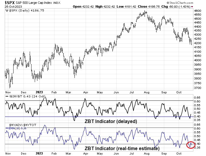


Bullish and bearish on different time horizons

As the S&P 500 violated its 50 dma but reached an oversold condition on the percentage of stocks above their 20 dma, I am bullish and bearish on stocks, depending on the time frame.

  • Due for a Relief Rally: The market is due for a bounce (1–2-week horizon).
  • A Deeper Correction: There may be unfinished business to the downside once the relief rally is complete (3–6-week horizon).
  • Long-term Bullish: The technical structure of market action points to a longer-term bull trend.


Relief rally ahead

Let’s start with the shortest time frame. The market is sufficiently panicked and oversold that the odds favour a short-term relief rally.
 

The CBOE put/call ratio spiked last week, which is a sign of panic and contrarian bullish.


Two of the four components of my Bottom Spotting Model flashed buy signals last week. Historically, such conditions have signaled strong risk/reward long entry points for traders. The VIX Index spiked above its upper Bollinger Band, indicating panic, and the NYSE McClellan Oscillator (NYMO) fell below -50, which is an oversold condition.


The extreme level of the NYMO is especially notable. The indicator closed at -97.7 on Thursday, which is within a hair of the -100 mark. I went back to June 1998 and studied past instances when NYMO fell below -100, which is a rare event as there were only 20 non-overlapping instances when this happened. Median S&P 500 returns were strong after such signals and peaked eight trading days after the signal.
 

To be sure, last Thursday’s NYMO level does not constitute an NYMO signal based on a -100 threshold. But relaxing the test from -100 to -95 yields expands the sample size from 20 to 24 and the return patterns are very similar. I show the study based on a -100 threshold purely because it’s a round number. Regardless of whether the reading was -97.7 or -100, the market was very oversold.


The market is near a tactical buy signal. A bounce is about to begin soon.


A deeper correction

While the U.S. equity market appears washed out, oversold and poised for a rebound, the stall in large-cap technology stocks, and AI-related plays in particular, constitutes significant headwinds for the overall stock market. The relative performance of the NASDAQ 100 has historically been inversely correlated to the 10-year Treasury yield, which makes sense because growth stocks have higher duration than the broad market and are therefore more sensitive to changes in interest rates. The NASDAQ 100 began to diverge from the interest rate factor until recently when it violated a key relative support level. Notwithstanding the fact that bond yields are experiencing upward pressure today, the broad market would face substantial headwinds should the NASDAQ 100 close even half the gap shown on the chart. That’s because large-cap growth stocks, which consist of technology, communication services, and Amazon and Tesla within the consumer discretionary sector, represent over 40% of S&P 500 index weight.


Make no mistake, the AI party is over. One of the most sensitive AI industries is semiconductors, which violated a relative trend line, indicating a loss of momentum.


Here’s another way of visualizing the AI frenzy. Most of the AI-related plays are listed in the U.S. The accompanying chart shows the relative performance of U.S. large-cap value and growth (black line), which has bottomed and only begun to turn up. By contrast, non-U.S. developed market value and growth relative returns (red dotted line) has been soaring since early June.


The combination of faltering NASDAQ 100 and the outsized weight of large-cap growth within the S&P 500 argues for a deeper pullback once any reflex rally runs its course.


Long-term bullish

Even though I am concerned about a deeper correction, here’s why I am still long-term bullish. Such corrective action isn’t unusual after the stock market exhibits strong initial price momentum. The accompanying chart shows the history of the S&P 500 and the percentage of stocks above their 50 dma. Historically, a close 90% above their 50 dma after a 20% reading has generally resolved bullishly for stock prices. But the market often pulls back after the 90% reading, sometimes all the way back to the 20% level.


One mitigating factor that supports the bull case is the relative strength exhibited by cyclical industries. The relative performance of key cyclicals appears constructive, with the exception of semiconductors and transportation stocks. Even then, semiconductors remain in a relative uptrend, and these stocks have shown a stair-step upward pattern in the recent relative advance.


The bull case for transportation stocks is supported by the inverse head and shoulders pattern of the Dow Jones Transportation Average, which is still holding its breakout by its fingernails.


For a big picture long-term perspective, here is the weekly point and figure chart of the S&P 500 with a 2% box size and a three-box reversal. This doesn’t look like a price pattern that the bulls should be worried about.


Lastly, take a look at the trajectories of Bitcoin and the ARK Innovation ETF (ARKK) as indicators of the market’s animal spirits and the speculative cycle. Both bottomed out in late 2022 and their rebounds are intact.


In conclusion, I am bullish and bearish on stocks depending on the time frame. The market is poised for a short-term rebound, but the durability of the rebound is in serious doubt. However, the long-term trend of the market is still bullish. Investors and traders should tailor their trading decisions depending on their own investment horizons and risk preferences.


My inner investor is bullish and he has been opportunistically accumulating positions on weakness. My inner trader initiated a long position in the S&P 500 last Wednesday and he has been averaging in on the long side. The usual disclaimers apply to my trading positions.

I would like to add a note about the disclosure of my trading account after discussions with some readers. I disclose the direction of my trading exposure to indicate any potential conflicts. I use leveraged ETFs because the account is a tax-deferred account that does not allow margin trading and my degree of exposure is a relatively small percentage of the account. It emphatically does not represent an endorsement that you should follow my use of these products to trade their own account.  Leverage ETFs have a known decay problem that don’t make the suitable for anything other than short-term trading. You have to determine and be responsible for your own risk tolerance and pain thresholds. Your own mileage will and should vary.

Disclosure: Long SPXL

What are the contagion effects of a China slowdown?

Periodically, the market is rattled by a “China is slowing” narrative. As the accuracy of official Chinese statistics can be doubtful, the real-time market reaction indicates nervousness, but no panic. The performance of the equity markets of China and her major trading partners relative to MSCI All-Country World Index (ACWI) shows that their trends are all flat to down.


How concerned should investors be about a China slowdown and its contagion effects?


Assessing the damage

The economic news out of China is certainly concerning. Bloomberg columnist John Authers pointed out that the six-month average of Chinese growth rates in different categories have been significantly decelerating.


The bad news just keeps on coming. Large Chinese shadow bank Zhongzhi and its affiliate Zhongrong missed payments on several investment products as a result of China’s property slump. The move sparked rare protests in Beijing.


The PBOC unexpectedly announced a cut in the medium-term lending rate by 15 basis points, which unsettled markets. What does the PBOC know that the rest of us don’t?
The offshore yuan, or USDCNH rate, has been weakening and briefly breached the 7.35 level. The yuan exchange rate was not helped by the ultra-dovish policies of the BoJ, which weakened the Japanese Yen and created competitive devaluation pressures in Asia.


Not as bad as it sounds

It may not be as bad as it sounds. In a recent podcast, Leland Miller of China Beige Book, which monitors the Chinese economy from a bottom-up basis, argued that the market has over-reacted to the prospect of the Chinese slowdown. There are two elements of the China slowdown story, a cyclical and a structural element. Miller believes that Chinese cyclical growth is better than the market believes, though he allowed that the structural elements are creating long-term headwinds.


Consider, as an example, Fathom Consulting’s China Momentum Indicator, which tracks Chinese GDP in a noisy fashion. The bad news is that China is indeed slowing. The good news is growth momentum is exhibiting a series of higher lows.


Beijing’s announcement that it would stop reporting the youth unemployment rate, which is at about 20% and a record high, illustrates the long-term structural challenges facing the Chinese economy. This NY Times article about China’s skyrocketing youth unemployment provides some context. Young educated graduates simply can’t find jobs, which has led to the “lying flat” movement, or the refusal to pursue a career, or consider leaving the country. In response, Xi Jinping advised the young to “eat bitterness” or to learn to endure hardships.


The youth unemployment problem seems curious in light of China’s aging demographics. Birth rates have been dropping and recently fell below the death rate. Why can’t the young find employment in an economy with aging population, which should give rise to strong employment demand?


The answer is a skills mismatch. There are plenty of low-paying jobs, but a lessened demand for the skilled workers that the Chinese education system is churning out. The NY Times article reported that “a 11.6 million college graduates are entering the work force this year, and one in five young people is unemployed”. The skills mismatch and youth unemployment problem illustrates China’s long-term challenge of transforming its economy from relying on low-cost labour as a source of competitive advantage to higher value-added production, which requires more skilled and educated workers.
 

In the long run, China faces a competitive imperative to migrate up the value chain. Chinese wage rates are already being undercut by its Asian neighbours such as Vietnam and it’s losing its edge in cheap labour costs. As well, the Party has tried to assert greater control over businesses, which as scared away foreign investment. As a consequence of these factors, Foreign Direct Investment has collapsed.


The market reaction

The market fallout from China slowdown fears has been limited. The primary tool for my analysis is the Relative Rotation Graph, or RRG chart, which is a way of depicting the changes in leadership in different groups, such as sectors, countries or regions, or market factors. The charts are organized into four quadrants. The typical group rotation pattern occurs in a clockwise fashion. Leading groups (top right) deteriorate to weakening groups (bottom right), which then rotate to lagging groups (bottom left), which change to improving groups (top left), and finally completes the cycle by improving to leading groups (top right) again.