Now that Donald Trump has become the presumptive Republican nominee for President, Wall Street is scrambling to model how a Trump White House may affect capital markets. A recent Bloomberg article summarized the consensus:
- Bond market: Expect rising yields from upward pressures on term premium.
- Currencies: Rising yields will put a bid under the USD.
- Equities: Stocks in limbo as it’s difficult to form a consensus.
I wrote about the effects of a Trump victory about a month ago (see
What the Politics of 2024 Tell Us About 2025) and highlighted the geopolitical risk from Trump’s foreign policy. Further analysis leads us to believe that Trump’s foreign policy could unravel the “Stocks for the Long Run” narrative popularized by Jeremy Siegel. This could have profound long-run implications for investors in their investment planning.
Here’s why.
Re-examining the historical record
A (paywalled)
article in the Financial Analysts Journal by Edward F. McQuarrie re-examined the data and asked the crucial questions, “Must stocks beat bonds over the long run? Should investors expect a stock portfolio to compound in real terms at 6% to 7% per year?”
Siegel’s work on returns was initially based on work by Ibbotson and Sinquefield, who studied asset returns from 1926. Subsequent studies of returns include more U.S.-traded stocks and bonds which increased the universe size by 3–5 times for stocks and 5–10 times for bonds and reduced survivorship bias. As well, the new data includes dividends and enabled the calculation of capitalization weighted indices.
McQuarrie noted that the new data captures “different regimes in the relative performance of stocks and bonds: a recent era of near-parity performance and an earlier era in which stocks did well and bonds did poorly”. In particular, the “decisive stock superiority” era that began during World War II “dominated the record when Siegel fashioned his thesis”.
This study raises the question of the importance of American Exceptionalism. How much of these returns can be attributed to the strength of the U.S. economy and the Pax Americana order after World War II, along with the dominance of the USD as the de facto reserve currency? McQuarrie highlighted an important observation from the 2020 Credit Suisse yearbook:
A dollar invested in U.S. equities in 1900 resulted in a terminal value of USD 1937. … An equivalent investment in stocks from the rest of the world gave a terminal value of USD 179 … less than a tenth of the U.S. value.
Pax Americana and American Exceptionalism
U.S. stocks have been so strong that they grew from 15% of global market capitalization in 1990 to 64% today. Using the U.S. experience to project returns would be like using the history of Apple’s stock price to generalize equity return expectations.
Similarly, the recent episode of U.S. equity outperformance since the GFC is largely attributable to the strength of U.S. technology stocks. Technology has gone through boom-bust price cycles and the current incidence of superior returns cannot be generalized to long-term expectations for investors with long-term time horizons. Despite the cheerleading about the supremacy of American economic dynamism, keep in mind that the two largest stocks by capitalization in the S&P 500, Microsoft and Apple, were founded in the 1970s and went public in the 1980s.

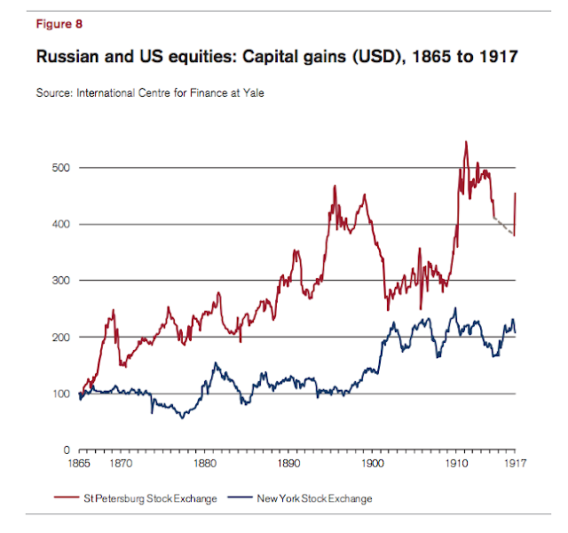
For some long-term context, here are some extreme examples of the survivorship problems of calculating return expectations that incorporate the effects of war and revolution. During much of the 19th Century, Russian equities outperformed U.S. equities – until the 1917 revolution and Russian stock prices plunged to zero. Russian-domiciled shareholders in 1917 would have been far more concerned about their own survival than the value of the portfolios.
German stocks took a roller coaster ride before and after World War II. Much like the Russian experience, German shareholders would have been far more concerned about their own survival than their portfolios during this period.
Is it any wonder there was an enormous disparity between U.S. and non-U.S. equity returns as compiled by Credit Suisse?
The accompanying chart from Thomas Piketty raises another important question. While it doesn’t directly address the issue of capital market returns, it does show the changes in net foreign asset by country starting from 1810. Net foreign assets owned by Britain and France peaked just before World War I and didn’t really recover until about 1990. Piketty attributed the surge to the effects of the French-British colonial eras.
What if the period of strong U.S. equity returns highlighted by Ibbotson and Siegel were artifacts of the Pax Americana post-World War II order that Trump’s isolationist policies are designed to dismantle?
Trump’s foreign policies are isolationist in nature. Politico reported that Trump told European officials he would never defend Europe if it came under attack:
“You need to understand that if Europe is under attack we will never come to help you and to support you,” Trump told European Commission President Ursula von der Leyen in 2020, according to French European Commissioner Thierry Breton, who was also present at a meeting at the World Economic Forum in Davos.
In a recent interview on Fox News, Trump also strongly hinted that he would not defend Taiwan if it were to come under Chinese attack, “Taiwan did take all of our chip business. We used to make all of our own chips, now they’re made in Taiwan, 90 percent of [them]…Remember this, Taiwan took, smart, brilliant, they took our business away.”
Pax Americana, or the post-World War II American security guarantee, will be threatened under a Trump Presidency.
Goodbye, Exorbitant Privilege?
Not only will the unraveling of Pax Americana threaten the geopolitical security structure of the post-World War II era, but it will also call into question the post-Bretton Woods architecture of using the USD as the de facto global reserve currency. The term “exorbitant privilege” was coined by then French finance minister Valéry Giscard d’Estaing that allows the U.S. to depress its financing costs.
The exorbitant privilege of the USD is attributable two main factors, namely its dominance in foreign exchange reserves and the stable demand for U.S. Treasury paper. Demand for safe USD Treasury assets served to compress yields and lower the cost of capital for U.S. corporations.
The ECB conducted a
study of the U.S. exorbitant privilege by comparing the accumulation of USD Treasury paper to euro and other major currency’s sovereign paper. It found that USD reserve accumulation has risen dramatically since the 1990s, which led to the conclusion that America’s exorbitant privilege of lower financing costs had improved over time.
Consider Trump’s isolation trade and geopolitical policies, which encourage the de-coupling of the three major economic blocs of NAFTA, Europe and Asia. In addition, Pikkety’s analysis of the evolution of net foreign assets in the wake of the sunsets of the British and French colonial empires is also instructive of the economic effects when empires fall into decline.
To be sure, the negative effects of isolationism won’t be seen overnight. The British and French empires were at their height just before World War I, which began in 1914, and the erosion of geopolitical powers wasn’t apparent until 1956 when these former colonial powers were humiliated during the Suez Crisis.
Today, the supremacy of the USD as a reserve currency affords Washington a powerful geopolitical tool, which the world saw employed in the aftermath of 9/11 and after the start of the Russo-Ukraine War. The U.S. weaponized the USD by denying the use of the global banking system to its adversaries by sanctioning entities from dealing with any bank that uses SWIFT, a global messaging system, to effect inter-bank transfers. The message to banks was, if you deal with any of these sanctioned entities, we will cut you off from SWIFT, which amounted to a financial death sentence for the bank.
In the wake of the sanctions imposed on Russian individuals, companies and banks in the wake of the Russo-Ukraine War, there have calls for de-dollarization in global trade and the construction of a parallel payment system to SWIFT.
De-dollarization is hard and these steps take time. As an example, there are 14 Russian tankers carrying crude sitting idle off the coast of India. While Russian companies had concluded agreements to sell the oil, Indian buyers won’t pay for it in USD for fear of sanctions. They’ve offered to pay for it in rupees, which the Russians won’t accept.
The BRIC countries have banded together and proposed to de-dollarize using an alternative currency, but there are few good solutions. A currency based on a basket of commodities would take on the volatility of the commodity basket. The boom-bust cycles of the 19th Century were largely attributable to the inflexibility of the metallic-base currency standard of that era. China would like the BRIC currency to be the Chinese yuan, but the yuan’s not convertible and effectively a Chinese IOU. Beijing controls capital flows, and the yuan’s value is manipulated.
What about a basket of BRIC country currencies? The devil is in the details of implementation. Participants could agree to a Bretton Woods style of fixed exchange rates based on some commodity price, but that gets back to the problem of commodity-based currencies. A BRIC currency based on the collective value of BRIC currencies. Such a structure would re-create the inflexible structure of the eurozone and its struggles in crafting common fiscal and monetary policies.
Even if there is no BRIC currency, a BRIC bloc raises the problems of capital flows and reserve accumulation. Imagine a simplified model of three trading partners, the U.S. and the BRIC bloc consisting of China and OPEC. China and OPEC are current account surplus countries that export to the U.S. Under the current system, they sell their wares to Americans and receive USD in return, which they invest in Treasury assets that compresses Treasury yields and lowers the cost of capital for American companies, all else being equal.
What if the BRIC countries refused to take USD and wanted to be paid in their own currencies? China can, under the current system, switch to such a regime by selling the USD it receives and buying CNY. Since China runs a current account surplus with the U.S., switching USD for CNY puts upward pressure on the yuan and makes its exports less competitive.
What about inter-BRIC trade? OPEC sells oil to China and runs a current account surplus with China because it buys few Chinese goods and services in return. Imagine China pays for the oil in yuan. Would OPEC want to hold yuan assets, especially if the currency is not freely convertible and manipulated in value?
You see the problems. De-dollarization will not happen overnight, at least in the short run.
The trade-war has not to date provided economic help to the US heartland: import tariffs on foreign goods neither raised nor lowered US employment in newly-protected sectors; retaliatory tariffs had clear negative employment impacts, primarily in agriculture; and these harms were only partly mitigated by compensatory US agricultural subsidies.
In a
Bloomberg OpEd, Karl Smith argued that Trump’s proposal to raise Chinese tariffs by a whopping 60% would be a fiscal disaster and cause a recession:
Quintupling the tariff won’t increase federal revenue by a factor of five because a tariff, by design, reduces imports. Still, let’s imagine that Trump’s tariffs do manage to increase revenue five times. These new higher rates would still raise only about $370 billion over 10 years.
The economic contraction caused by the tariffs, however, would push down both GDP and federal revenues. In 2001, a relatively mild recession resulted in a revenue decline of more than 10%, from $2.03 trillion in 2001 to $1.78 trillion in 2003. Translated into today’s numbers, a mild recession could cause revenues to decline more than $500 billion per year, dwarfing what any tariff could generate.
In conclusion, the U.S. was the only major industrialized country emerging out of World War II with its economy unscathed, which provided it with a strong competitive advantage. It used the post-war era to construct a Pax Americana geopolitical structure consisting of U.S. security guarantees coupled with the use of the USD as a major reserve currency, which compressed its financing costs, otherwise known as its “exorbitant privilege”. The outsized performance of U.S. equities in the post-war era can be largely attributable to a lower cost of capital. Trump’s isolationist policies that dismantled Pax Americana threatens the U.S. financing advantage. If investors are relying on the historical experience of U.S. asset returns to project their future returns, they may be disappointed under the scenario of a second Trump term.


