Preface: Explaining our market timing models
We maintain several market timing models, each with differing time horizons. The “
Ultimate Market Timing Model” is a long-term market timing model based on the research outlined in our post,
Building the ultimate market timing model. This model tends to generate only a handful of signals each decade.
The
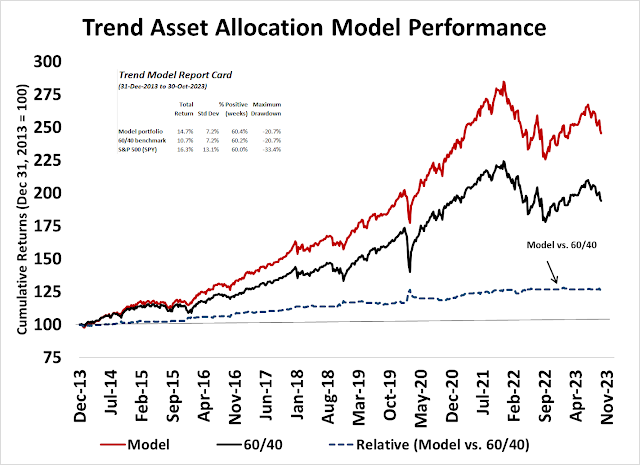
Trend Asset Allocation Model is an asset allocation model that applies trend-following principles based on the inputs of global stock and commodity prices. This model has a shorter time horizon and tends to turn over about 4-6 times a year. The performance and full details of a model portfolio based on the out-of-sample signals of the Trend Model can be found
here.
My inner trader uses a
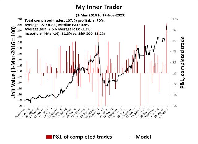
trading model, which is a blend of price momentum (is the Trend Model becoming more bullish, or bearish?) and overbought/oversold extremes (don’t buy if the trend is overbought, and vice versa). Subscribers receive real-time alerts of model changes, and a hypothetical trading record of the email alerts is updated weekly
here. The hypothetical trading record of the trading model of the real-time alerts that began in March 2016 is shown below.
The latest signals of each model are as follows:
- Ultimate market timing model: Buy equities (Last changed from “sell” on 28-Jul-2023)
- Trend Model signal: Bullish (Last changed from “neutral” on 28-Jul-2023)
- Trading model: Neutral (Last changed from “bullish” on 14-Nov-2023)
Update schedule: I generally update model readings on my site on weekends. I am also on X/Twitter at @humblestudent. Subscribers receive real-time alerts of trading model changes, and a hypothetical trading record of those email alerts is shown here.
Subscribers can access the latest signal in real time here.
An extraordinary price surge
The S&P 500 rally off the bottom in late October has been extraordinary. It resolved itself in a Zweig Breadth Thrust buy signal and four price gaps that likely won’t be filled. Classical chartists would characterize them as breakaway gaps indicating strong price momentum.
How far can this rally run?
Breakaway gaps
For some context on the price momentum that generated four consecutive price gaps in a short period, Jason Goepfert of SentimenTrader made a study of such events. While the sample size is relatively small (n=9), past returns of four unfilled price gaps showed very bullish results.
Price momentum can be thought of as “the stock market will continue to rally once it’s started rising”, while the price momentum factor is “stocks that outperform will continue to outperform”, regardless of market direction. Not only is the market’s price momentum strong, but the renewed performance of the price momentum factor also underscores the strength of this rally. The accompanying chart shows the relative performance of different price momentum factor ETFs, which have begun to beat the market in the last month.
Estimating upside potential
Under these circumstances, how should investors estimate upside potential? At what point should they take profits?
The point and figure chart offers some perspective from a longer-term point of view. Using different box sizes, the point and figure chart of the S&P 500 shows measured objectives in the 5300 range, which represents an upside potential of roughly 18%.
The point and figure chart of the NASDAQ Composite shows an even more impressive measured objective representing upside potential of over 20%.
Using the same technique, the upside potential for the Russell 2000, which is lagging the S&P 500, is similar to the S&P 500 at about 17%.
Unfortunately, the one drawback of point and figure charting is it’s silent on time horizon. While measured objectives are useful, it’s difficult to form realistic expectations of how long it will take to achieve those price objectives.
Sell signal triggers
For traders with shorter time horizons, I can offer a few indicators that can trigger a “take profit” warning.
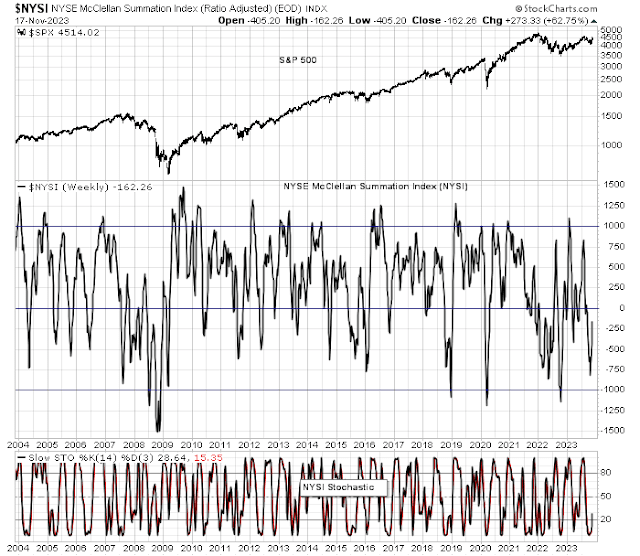
The accompanying weekly chart shows the NYSE McClellan Summation Index (NYSI, middle panel). NYSI rebounded from a near oversold condition. If history is any guide, the rally will start to peter out when the stochastic (bottom panel) becomes overbought.
Here is the NASDAQ McClellan Summation Index (NASI). NASI reached an extreme oversold condition of under -1000 and bounced. Such severely oversold episodes have marked major market bottoms in the past, and the rally hasn’t ended until the stochastic becomes overbought. The NASI rebound from such an oversold extreme consequently results in my belief that megacap growth stocks will lead to the upside in this rally.


As Cam has correctly pointed out in the chart of US10Y is the central question. Have we peaked in the interest rate cycle? A case made looking at the chart that we just had a correction in an uptrend in yields. If that is the case one would have to wonder if the magnificent 7 have more room to climb higher.
Putting genie back in the bottle is not easy. To achieve 2% inflation is either a pipe dream or rates will have to stay higher for longer. Higher for longer is not at the present time a scenario the market is counting on.
a case can be made.