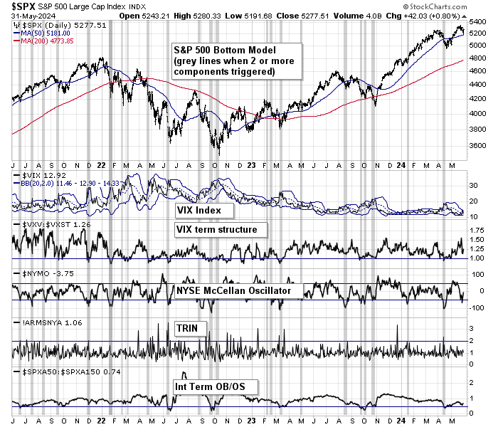
Preface: Explaining our market timing models
We maintain several market timing models, each with differing time horizons. The “
Ultimate Market Timing Model” is a long-term market timing model based on the research outlined in our post,
Building the ultimate market timing model. This model tends to generate only a handful of signals each decade.
The
Trend Asset Allocation Model is an asset allocation model that applies trend-following principles based on the inputs of global stock and commodity prices. This model has a shorter time horizon and tends to turn over about 4-6 times a year. The performance and full details of a model portfolio based on the out-of-sample signals of the Trend Model can be found
here.
My inner trader uses a trading model, which is a blend of price momentum (is the Trend Model becoming more bullish, or bearish?) and overbought/oversold extremes (don’t buy if the trend is overbought, and vice versa). Subscribers receive real-time alerts of model changes, and a hypothetical trading record of the email alerts is updated weekly here. The hypothetical trading record of the trading model of the real-time alerts that began in March 2016 is shown below.
The latest signals of each model are as follows:
- Ultimate market timing model: Buy equities (Last changed from “sell” on 28-Jul-2023)
- Trend Model signal: Bullish (Last changed from “neutral” on 28-Jul-2023)
- Trading model: Bullish (Last changed from “neutral” on 16-Apr-2024)
Update schedule: I generally update model readings on my site on weekends. I am also on X/Twitter at @humblestudent. Subscribers receive real-time alerts of trading model changes, and a hypothetical trading record of those email alerts is shown here.
Subscribers can access the latest signal in real time here.
Washed out Big Tech?
In discussions with investors, I have been asked if Are Big Tech has formed a bottom. Big Tech had been the leadership in the U.S. equity market. It’s an important group as it forms roughly 40% of the weight of the S&P 500. The NYSE FANG Plus Index staged an upside breakout out of a cup and handle pattern with long-term bullish implications. The index then pulled back and it’s bouncing off a relative support zone (bottom panel).
Is it time to tiptoe back into these stocks? What are the implications for the overall market in light of the outsized weight of Big Tech in the S&P 500?
Don’t be overeager
The chart of QQQ, or the NASDAQ 100 ETF, tells a similar but more detailed story as the analysis of the NYSE FANG Plus Index. QQQ bounced off a relative support level. However, indicators of relative breadth (bottom two panels) haven’t decisively turned up just yet.
An analysis of the 12-month normalized relative performance of the NASDAQ 100 shows that it is nearing the oversold zone. I interpret to mean that investment-oriented accounts should be accumulating Big Tech, but there is more downside potential.
Relative volume of the NASDAQ to NYSE, which tends to be either coincident or lead the NASDAQ 100, is turning down, which is another warning that Big Tech may be in need of one final flush.
I conclude from this analysis that Big Tech is showing signs of healing but may be vulnerable to further downside, which may be relatively minimal.
Constructive signs
As for the rest of the stock market, the usually reliable S&P 500 Intermediate Breadth Momentum Oscillator (ITBM) is on the verge of a buy signal, which is triggered when its 14-day RSI recycles from oversold to neutral.
About half of the Regional Banking Index has reported earnings results, and the index is holding above relative support. This is another constructive sign that a potential trouble spot has dodged a bullet.
While these are constructive signs that the stock market may have limited downside risk, Ryan Detrick pointed out that the market has historically shown some choppiness after a five-month winning streak ends. With the caveat that the sample size in this study is small (n=7), this does suggest that a re-test of the recent lows may be ahead.
Growth or Value?
Notwithstanding the questions about market direction, one key question is, value or growth? Big Tech, or large-cap growth stocks, had been the market leadership for much of 2023 and early 2024. They have since stumbled but show possible bottoming behaviour. Value stocks have begun to turn up since February and the relative performance is evident across all U.S. market cap bands and internationally.
My inclination is to follow the adage, “The trend is your friend”. Overweight value, but take a partial position in growth as it’s showing signs of a potential relative bottom.
In addition, value sectors, which tend have greater cyclical exposure, are all behaving well relative to the S&P 500.
Zweig Breadth Thrust watch
We have seen from last week’s the market has responded strongly to single market events on a daily basis, such as the Tesla earnings announcement, the GDP and PCE reports, the Alphabet and Microsoft reports. The coming week will see the Quarterly Refunding Announcements (QRA) on April 29 and May 1, the FOMC meeting on May 1, and followed by the April Employment Report on May 3.
I am on Zweig Breadth Thrust watch. As a reminder, a ZBT buy signal is triggered when the ZBT Indicator surges from oversold to overbought within 10 trading days. The 10-day window ends on Thursday, which is the day after the FOMC meeting. Anything can happen.
Watch for rate-driven volatility from the QRA, which will disclose the U.S. Treasury’s plan of issuance of bill and bond supply, and the FOMC meeting. Treasury yields are rising. The 2-year yield has already reached 5%. While the Fed isn’t expected to cut rates at the May meeting, the it may disclose plans to reduce the pace of its balance sheet runoff, or quantitative tightening, which could be a bullish development.
In conclusion, Big Tech has been lagging the market since February and the relative performance reset is nearing an end. The overall stock market is undergoing a bottoming process. Investment-oriented accounts should be accumulating positions at these levels, but should be prepared for some near-term choppiness. Tactically, I am inclined to overweight value over growth stocks for short-term performance.
Both my inner investor and inner trader are bullishly positioned and my inner continues to hold a long position in the S&P 500. The usual disclaimers are applicable to my trading positions.
I would like to add a note about the disclosure of my trading account after discussions with some readers. I disclose the direction of my trading exposure to indicate any potential conflicts. I use leveraged ETFs because the account is a tax-deferred account that does not allow margin trading and my degree of exposure is a relatively small percentage of the account. It emphatically does not represent an endorsement that you should follow my use of these products to trade their own account. Leverage ETFs have a known decay problem that don’t make the suitable for anything other than short-term trading. You have to determine and be responsible for your own risk tolerance and pain thresholds. Your own mileage will and should vary.
Disclosure: Long SPXL