We maintain several market timing models, each with differing time horizons. The “Ultimate Market Timing Model” is a long-term market timing model based on the research outlined in our post, Building the ultimate market timing model. This model tends to generate only a handful of signals each decade.
The Trend Asset Allocation Model is an asset allocation model that applies trend-following principles based on the inputs of global stock and commodity prices. This model has a shorter time horizon and tends to turn over about 4-6 times a year. The performance and full details of a model portfolio based on the out-of-sample signals of the Trend Model can be found here.
My inner trader uses a trading model, which is a blend of price momentum (is the Trend Model becoming more bullish, or bearish?) and overbought/oversold extremes (don’t buy if the trend is overbought, and vice versa). Subscribers receive real-time alerts of model changes, and a hypothetical trading record of the email alerts is updated weekly here. The hypothetical trading record of the trading model of the real-time alerts that began in March 2016 is shown below.
The latest signals of each model are as follows:
Ultimate market timing model: Buy equities (Last changed from “sell” on 28-Jul-2023)
Trend Model signal: Bullish (Last changed from “neutral” on 28-Jul-2023)
Trading model: Neutral (Last changed from “bullish” on 23-May-2024)
Update schedule: I generally update model readings on my site on weekends. I am also on X/Twitter at @humblestudent. Subscribers receive real-time alerts of trading model changes, and a hypothetical trading record of those email alerts is shown here.
Subscribers can access the latest signal in real time here.
Here comes the Great Rotation
The stock market recently underwent a Great Rotation. Leadership violently rotated from growth to value, and from NASDAQ stocks to small-cap stocks. The reversal was accompanied by a sudden downdraft in the S&P 500.
For investors, the burning question is whether the Great Rotation is a signal for a correction in stock prices.
A crowded long
Arguably, last week’s market action was just the start of a Great Rotation. The violent nature and the magnitude of the move are indicative of a price insensitive short covering. Hedge funds have been increasingly long NASDAQ and short value and Russell 2000 stocks. Fund flow analysis shows that investors have moved to an off-the-charts crowded long in technology. If the rotation were to continue, the unwind has the potential to go much further.
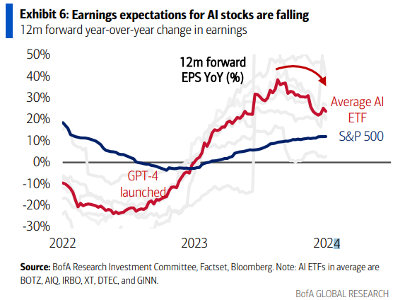
Q2 earnings season is just kicking off. Estimate revision analysis shows that earnings expectations for AI stocks are falling, which could put downward pressure on these stocks and exacerbate the effects of the Great Rotation.
The bull case
Having established a significant reversal is likely underway, the next question is, “What’s the outlook for the S&P 500?”
Here is the short-term bull case. The Great Rotation was accompanied by strong breadth, as evidenced by upside breakouts in different Advance-Decline Lines to all-time highs.
Similarly, the Great Rotation also saw an expansion in NYSE and NASDAQ 52-week highs-lows. Bear markets simply don’t act this way.
While the sample size is small (n=3), SentimenTrader pointed out that seismic shifts in small-cap to large-cap stocks were long lasting.
The bear case
Here is the short-term bear case.
The reversal out of large-cap technology has the potential to be a stampede. The top 10 stocks in the S&P 500, which is dominated by large-cap growth stocks, account for just under 30% of index weight. By contrast, the largest stock in the Russell 2000 has a weight of less than 0.5%. Selling pressure out of the large growth names has the potential to overwhelm the buying pressure from purchases.
The value component of the growth to value rotation consists mostly of cyclical stocks. The consumer discretionary to consumer staples ratio, which is an indicator of risk appetite, is showing few signs of strength, which is potentially a negative sign for equity risk appetite.
The relative performance of defensive sectors is edging up. While the moves aren’t definitive, this is a development to keep an eye on. Further relative strength by defensive sectors could be a warning for stock prices.
In addition, the NYSE McClellan Oscillator (NYMO) and NASDAQ McClellan Oscillator (NAMO) reached overbought conditions and recycled back to neutral, which are tactical sell signals.
The Citi Panic/Euphoria Model is highly euphoric.
Investment implications
So where does that leave us?
Even though breadth indicators are improving, which is bullish, we would not be so quick to buy any dip that appears. I observed last week that the second half of July tends to be seasonally weak. As well, the stock market tends to be volatile during earnings season as prices respond to the major earnings report headlines of the day, which are unpredictable.
The next week should offer better clarity on market direction. The S&P 500 has weakened to an area of support.
The value/growth ratios are at or near areas of relative resistance, and across all market cap bands.
Expect some near-term choppiness. Stay cautious short term, but be prepared to buy the dip should panic conditions appear, or if the Fed were to offer dovish guidance at the July FOMC meeting.
In the wake of Biden’s subpar debate performance and the assassination attempt on Trump, the prediction markets’ odds of a Trump victory in November have substantially risen. Equally important is Wall Street’s reaction, which has investors sitting up to take notice of the implications of a second Trump Administration in 2025.
Despite the real-time information from the betting markets, financial markets haven’t fully discounted the possibility of a Trump win. Here’s how you can take advantage of that arbitrage opportunity.
Trump 2.0 macro effects
Donald Trump sat down with Bloomberg Businessweek for a wide ranging interview. Here are the key points, covering the Fed, trade and tax policy.
Starting with the Fed, Trump said that he would allow Fed Chair Jerome Powell to serve out his term, which ends in May 2026, but “if I thought he was doing the right thing”. The Financial Times also reported that Trump warned the Fed to avoid cutting interest rates before the election. While the headline that he wouldn’t fire Powell was designed to calm markets, the qualification of “doing the right thing” and attempts to strong arm current monetary policy could create instability.
These comments puts the Fed in a difficult position. The markets is putting the odds of a September rate cut as a virtual certainty in the wake of softer-than-expected inflation data. The September cut would be followed by further cuts in November and December. Fed officials will need to push back against that dovish interpretation if they don’t want to surprise the markets.
On trade, Trump called for new China tariffs at a rate of between 60% and 100%, and would impose a 10% tariff on imports from other countries. A new economics paper modeled the effects of a 10% across the board tariffs on imports and 60% on China. It concluded “across-the-board tariffs do not protect manufacturing jobs because the cost of imported intermediate goods increases, raising costs in manufacturing production” and “the world economy can adjust to U.S. trade wars, diverting trade around the U.S.”
Goldman Sachs chief economist Jan Hatzius stated at the ECB’s Sintra conference that a 10% tariff could spark trade war retaliation which raises the U.S. inflation by 1.1% and forces the Fed to into five quarter-point rate hikes.
In addition, Trump’s threat to restrict immigration and deport undocumented workers will act as a supply shock to the labour market. This will put additional upward pressure on wages and push inflation upwards.
On taxes, Trump told Bloomberg that he aims to cut corporate taxes to 15%, though he admitted that objective may be overly challenging and he would accept a 20% rate “for its simplicity. He will also extend the 2017 Tax Cuts and Jobs Act.
On one hand, this should provide a fiscal boost to the economy. On the other hand, it will add to the fiscal deficit. A study of the effects of 2017 legislation found that the reduced corporate tax rates did increase domestic investment by 20% and investment by foreign firms substantially. However, the tax cuts did not pay for themselves and raised the deficit by an extra $100 billion per year.
In short, Trump’s plans are inflationary. A WSJ survey of economists found that 56% believed inflation would be higher under another Trump term than under a Biden term. In particular, any attempt to interfere with Federal Reserve independence could send financial shockwaves around the world in light of the reserve currency status of the USD.
On the other hand, Trump voiced his desire for a lower USD in the interview.
I think manufacturing is a big deal, and everybody that runs for office says you’ll never manufacture again. We have currency problems, as you know. Currency. When I was president, I fought very strongly and hard with President Xi and with Shinzo Abe… So we have a big currency problem because the depth of the currency now in terms of strong dollar/weak yen, weak yuan, is massive.
A government that strong arms the Fed to lower rates in the face of inflationary pressures would have the unwelcome effect of tanking the greenback as confidence on its status is eroded.
Discounting Trump 2.0
While the Bloomberg Businessweek interview and details from the Republican platform reveal the intentions of a Trump Administration, investors need to understand the new administration’s actual plan of action.
The easiest policy to implement would be the extension of the 2017 tax cuts. The BoA Global Fund Manager Survey found that the policy areas most affected by a Trump win would be trade, followed by immigration.
Global managers also believe that a sweep, which would likely be a Republican seep in light of the electoral outlook, would be inflationary that resolves in higher bond yields.
What about the stock market? Reasonable people can disagree on the growth outlook under Trump 2.0, but it is undeniable that investors face more challenging valuations today compared to Trump 1.0. When Trump first took office, the S&P 500 was trading at a forward P/E of 16, compared to over 21 today. Stock prices could face additional headwinds if bond yields were to rise, which would also put downward pressure on valuation.
How is the market reacting to all this?
It’s been a bit of a mixed bag. The accompanying charts show the performance of different Trump market factors. Each of the charts is designed that a rising line denotes rising odds of a Trump win. The trade-related factors, such as the relative performance of companies with domestic revenue, and logistics shipping giants FedEx and UPS, show little reaction. By contrast, the yield curve and gold prices are signaling higher inflationary expectations.
The Republican platform has promised a policy of “drill, baby, drill” of energy independence, which should benefit energy stocks. The energy sector has lagged the market and it would be a prime beneficiary should Trump win the White House.
Another Trump trade that should perform well is financial stocks, which should benefit from deregulation and lower taxes. Watch for few barriers to consolidation in the banking sector, which should benefit regional banks. The sector recently staged a convincing upside breakout on an absolute basis, but remains range-bound relative to the S&P 500 (second panel), though relative breadth appears constructive (bottom two panels).
By contrast, the technology sector may be at risk under a Trump White House. Trump expressed his skepticism about defending Taiwan against China in the Bloomberg Businessweek interview: “I mean, how stupid are we? They took all of our chip business. They’re immensely wealthy. I don’t think we’re any different from an insurance policy. Why are we doing this?”
The shares of TSMC skidded -3.6% after those remarks. The Semiconductor Index, which has been an AI bellwether, is testing a key area of absolute support (top panel) and violated relative support (bottom panel).
In conclusion, the betting odds on a Trump victory in November have risen substantially, but the markets haven’t fully discounted such an outcome. Investors who want to position for Trump 2.0 should seek long inflation exposure (long gold/short bonds) and short globalization (long domestic producers/short transportation and logistics). Regardless of the growth outlook, equity returns may be more challenging as Trump 2.0 will see the S&P 500 at more lofty multiples than the P/E ratio of Trump 1.0. At a sector level, look for better performance in energy and financials, while technology may be under some pressure.
Mid-week market update: Small cap stocks, as measured by the Russell 2000 and S&P 600, staged convincing upside breakouts in the past week. Both small cap indices are now testing key relative resistance zones against the S&P 500.
Even though this seems to be counter-intuitive, such a development could be bearish for the S&P 500.
A breakout and breadth thrust
Let’s start with the bull case. The small cap upside breakout was impressive. A point and figure chart of IWM with a 1% box size shows a measured upside target of 280, which represents an upside potential of about 25%.
What’s more, the market triggered a Whaley Breadth Thrust yesterday. This has resolved bullishly in the past, if history is any guide.
Reasons for short-term caution
I should be wildly bullish here. So why am I cautious?
I am worried about the possibility of a disorderly position unwind. The accompanying of market neutral ETF BTAL is a proxy for the factor exposure of the hedge fund and fast money crowd. The steady march upwards of BTAL was accompanied by long growth/short value and long NASDAQ 100/short Russell 2000.
Now we’ve seen a violent reversal of those factor returns of historic proportions. Undoubtedly, hedge funds are feeling pain and risk managers are forcing traders to unwind their positions. The risk is a disorderly stampede for the exits that resolves in a Volmageddon outcome. When that happens, hedge funds become forced sellers of everything, which results in a volatility spike and correlations of all assets converge to 1.
To be sure, the Volamageddon scenario is only a scenario that may not play out. But the market is already overbought, as measured by the NYSE McClellan Oscillator (NYMO) and the NASDAQ McClellan Oscillator (NAMO). Bear in mind, however, that stock prices can continue to advance when the market was overbought in the past, but they have usually resolved in either short-term weakness or sideways consolidations.
As well, the usually reliable S&P 500 Intermediate Term Breadth Momentum Oscillator (ITBM) saw a take profits signal when its 14-day RSI became overbought yesterday. At the same time, the percentage of S&P 500 above their 20 dma also reached overbought territory. None of this means that stock prices have to fall, only that upside potential is diminishing and it may be time for the stock bull to pause.
It only took an unexpected catalyst to spark market weakness. Today’s selloff in tech was sparked by the massive selloff in ASML on the prospect of further restrictions on the exports of chip making equipment to China. That’s how volatility spikes happen.
This is also consistent with the seasonal record of some price sloppiness in the second half of July.
In conclusion, the upside breakouts of small caps should be interpreted bullishly on an intermediate term basis. However, a combination of the possibility of a violent hedge fund position unwind and severely overbought conditions argue that it’s time for bulls to take some short-term profits and prepare for near-term volatility.
We maintain several market timing models, each with differing time horizons. The “Ultimate Market Timing Model” is a long-term market timing model based on the research outlined in our post, Building the ultimate market timing model. This model tends to generate only a handful of signals each decade.
The Trend Asset Allocation Model is an asset allocation model that applies trend-following principles based on the inputs of global stock and commodity prices. This model has a shorter time horizon and tends to turn over about 4-6 times a year. The performance and full details of a model portfolio based on the out-of-sample signals of the Trend Model can be found here.
My inner trader uses a trading model, which is a blend of price momentum (is the Trend Model becoming more bullish, or bearish?) and overbought/oversold extremes (don’t buy if the trend is overbought, and vice versa). Subscribers receive real-time alerts of model changes, and a hypothetical trading record of the email alerts is updated weekly here. The hypothetical trading record of the trading model of the real-time alerts that began in March 2016 is shown below.
The latest signals of each model are as follows:
Ultimate market timing model: Buy equities (Last changed from “sell” on 28-Jul-2023)
Trend Model signal: Bullish (Last changed from “neutral” on 28-Jul-2023)
Trading model: Neutral (Last changed from “bullish” on 23-May-2024)
Update schedule: I generally update model readings on my site on weekends. I am also on X/Twitter at @humblestudent. Subscribers receive real-time alerts of trading model changes, and a hypothetical trading record of those email alerts is shown here.
Subscribers can access the latest signal in real time here.
Another upper BB ride
The S&P 500 went on an upper Bollinger Band ride and unusually pulled back on Thursday after the soft CPI report and closed below the upper BB on Friday. What’s unusual is the risk-on tone adopted by the rest of the stock market even as heavyweight technology stocks in the S&P 500 weakened. The small-cap Russell 2000 gapped up and staged an upside breakout through a key resistance level in response to the prospect of lower interest rates owing to the weak CPI print.
Historically, the S&P 500 has consolidated sideways for a few days after upper BB rides. Will this time be any different, or does small-cap strength foreshadow further price advances in the near future? What about the rest of 2024?
The bull case
Here is what’s different this time. As we approach Q2 earnings season, fundamental momentum as measured by forward 12-month EPS revisions have been strong.
Many of the laggards, such as the Russell 2000, small cap QQQ, and bank stocks, which are just reporting earnings, are staging upside breakouts.
A pause ahead?
Here is the case for near-term consolidation. The first reason is seasonality. Historically, the month of July has been seasonally strong for the S&P 500, but most of the gains have occurred in the first half of the month.
To be sure, seasonality can inform investors about the climate but also the specifics of the weather pattern ahead. The Zweig Breadth Thrust Indicator, which is an overbought/oversold indicator, is nearing an overbought condition that has signaled periods of sideways consolidation in the past year, which was a period when the market was on a bullish rampage.
On the other hand, indications of banking system liquidity have been turning down. Liquidity has shown a rough correlation to the S&P 500 in the past and falling liquidity could pose a headwind to stock price gains.
More ominously, Cross Border Capital warned that Chinese liquidity is falling rapidly, which is negative for global risk appetite.
The Citi Panic-Euphoria Model is wildly euphoric.
A rough roadmap
So where does that leave us? Here is my base-case scenario, which represents a rough roadmap for the rest of the year.
An analysis of election year seasonality calls for a pause for the remainder of July, followed by an August rally, possible weakness in October, and a rally into the election and year-end.
On the other hand, an analysis of VIX seasonality calls for implied volatility to bottom in late July and rise until an October top, followed by declines into year-end.
My base-case scenario is based on an analysis of current market conditions and seasonal patterns of a near-term top in July and sideways consolidation for the remainder of the month. Expect a rally in August, which could be consistent with an anticipation of a September rate cut in the wake of the July 31 FOMC meeting and Jackson Hole speeches. Volatility and risk should rise into the November election, followed by a post-electoral rally into year-end.
We’ve all seen the warning signs about narrow market concentration and deteriorating breadth. The S&P 500 is an accident waiting to happen.
On the other hand, strategist Ed Yardeni stated in a CNBC interview that he believed we are in a “slow motion melt-up”. I agree. While the excesses in the stock market are becoming more evident and risks are rising, the bull isn’t done just yet.
The accompanying chart from Jurrien Timmer at Fidelity illustrates my point. If this is a bubble in the making, it could run a lot further as valuation differences are nowhere near the height of the Nifty Fifty or Dot-Com Bubble eras.
Remember Bob Farrell’s Rule #4: “Exponential rapidly rising or falling markets usually go further than you think, but they do not correct by going sideways.”
The AI bull tires
The AI-driven bull market may be starting to tire as warnings are appearing. Goldman Sachs recently published a prominent research article, “Gen AI: Too Much Spend, Too Little Benefit?”. Goldman argued that the GDP growth benefits from AI implementation will be limited. AI-related capex is too high in light of the lack of a killer application. Moreover, looming power shortages will constrain AI growth.
Sequoia also issued a research report, “AI’s $600B Question”, which raised similar points. Bloomberg reported that Citi strategists recommended investors take profits in AI-related stocks. A CNBC interview with Roger McNamee highlighted the following issues with the current state of AI research and deployment:
The power usage of Generative AI is breaking the power grid;
Water usage will be another constraint. AI needs plenty of water for semiconductor fabrication, training data sets and cloud services.
Copyright and Privacy: Large Language Models (LLMs) were made possible by stealing a lot of copyrighted content and private data-like e-mails, word processing documents and spreadsheets stored in the cloud, and so on.
Security: What are the security vulnerabilities, especially national security, for anyone who uses Generative AI and LLMs?
How do you deal with toxic uses such as deliberate disinformation, deepfake porn or deepfake scams against the elderly and plagiarism?
Today, the hyperscalers (Amazon, Microsoft, Google, and META) dominate total capex, which creates significant risk if this bubble were to pop.
For the last word, a truly transformative leap in processing may be coming in the form of bioprocessors. See this news report about 16 lab-growth brains running a living computer as a proof of concept of bioprocessing has the promise of truly transforming AI-driven processing:
Swiss technology firm Final Spark has successfully launched Neuroplatform, the world’s first bioprocessing platform where human brain organoids (lab-grown miniaturized versions of organs) perform computational tasks instead of silicon chips.
The first such facility hosts the processing prowess of 16 brain organoids, which the company claims uses a million times less power than their silicon counterparts.
While bioprocessing is still in its early research stage and its actual use is probably a decade away, what happens to all those NVIDIA chips and AI-related capex if bioprocessing is deployed at scale?
Notwithstanding the AI-related mania, consensus analyst long-term EPS growth estimates can be useful as a sentiment indicator. The latest long-term growth estimates have spiked to levels near the NASDAQ top in 2000, which is concerning.
Too early to turn bearish
Despite the warnings, I believe the bull run isn’t over just for a number of macro, fundamental and technical reasons.
First, the trend of decelerating inflation readings is setting the course for the Fed to cut rates. Jason Furman observed that core CPI for the last three, six and 12 months 1.1%, 3.3% and 3.3%, respectively. However, the higher-than-expected PPI report could call into question whether Powell can convince the hawks on the FOMC at the September meeting is still an open question, but the Fed is on track to cut rates in the near future.
The higher-than-expected PPI report didn’t move the inflation needle very much either. Now that both CPI and PPI have reported, most of the components of PCE, the Fed’s preferred inflation metric are known. The Cleveland Fed’s core PCE nowcast for June is now flat, or more precisely -0.01%. It’s an open question whether Powell can convince the hawks on the FOMC at the September meeting is still an open question, but the Fed is on track to cut rates in the near future.
From a valuation perspective, while S&P 500 forward P/E appears excessive, the excesses are concentrated in the largest names. Marketwatch pointed out that while the S&P 500 forward P/E is 21.4, which is near the top of its historical range, its median forward P/E is 17.8, which is just below its 10-year average of 17.9.
As we approach Q2 earnings season, forward 12-month EPS is very strong, which is a sign of positive fundamental momentum.
Few major signs of distribution
From a technical perspective, there are few major signs of distribution. The accompanying breadth chart of the market in 1999 and 2000 illustrates this point. Percentage bullish topped out and began to decline in May 1999, which was well before the NASDAQ top of March 2000. The S&P 500 Advance-Decline Line started diverging from the S&P 500 in mid-1999. Investors saw a warning of a major top when the NASDAQ 52-week highs-lows turned negative mid-March 2000, which was about two weeks before the actual top and technical break.
Consider the breadth outlook today. Percentage bullish has been falling this year, but as the 1999–2000 episode shows, that indicator was very early to signal a top. The S&P 500 A-D Line is only exhibiting a minor breadth divergence; 52-week highs-lows (bottom two panels) are still healthy.
The frenzy in AI-related tech has largely been confined to large-cap stocks and there are few signs of excess in small-cap tech. An analysis of the relative performances of large-cap and small-cap tech shows that small-cap tech stocks have lagged the Russell 2000 for the past year. Moreover, the relative performance of small-cap to large-cap tech parallels the relative performance of the Russell 2000 to the S&P 500 (bottom panel).
In fact, the market may be undergoing a rotation from growth to value. Value started to outperform internally in early June, and it started to turn up recently in the U.S. across all market cap bands. This is what bulls like to see. When one sector falters, another takes up the leadership baton.
As Q2 earnings season proceeds, investors will be closely watching the reports from the megacap AI names. If there is an AI bubble, it is arguably not over. If history is any guide, the 12-month normalized NASDAQ 100 to S&P 500 ratio (black line) is not even in the overbought zone and could potentially surge further.
In conclusion, valuation and breadth indicators are flashing concerning signs of excesses. I believe this market bull has more room to run. Valuations are stretched but not bubbly. Price and fundamental momentum are strong, and I am not seeing signs of distribution.
Mid-week market update: The usually reliable S&P 500 Intermediate Term Breadth Momentum Oscilator (ITBM) flashed a buy signal in the third week of June when its 14-day RSI recycled from oversold to neutral. The S&P 500 consolidated sideways for about a week and resumed it climb. This is the story of why I did not act on the buy signal and the lessons learned.
A frothy market
At the time, I was concerned about the stretched nature of market breadth and the signs of froth in sentiment readings. At the time, the put/call ratio had issued a cautionary signal, which was the sign of a tactical top. Even though the put/call ratio has backed off from a crowded long extreme, sentiment readings are still stretched.
I was also corresponding with a reader about the excessively high level of over 100 for the NAAIM Index, which measures the sentiment of RIAs who manage individual investor funds. Here is the full history of the NAAIM Index. Readings of over 100 have often marked a tactical top, but it can be a bit of a hit and miss as a trading signal. While you would have usually realized profits if you had shorted whenever NAAIM exceeded 100, you would also have experienced significant drawdowns in some instances.
There was also the continuing breadth divergence shown by the market, as documented by SentimenTrader.
Strong momentum
That’s the short of trading environment investors face today. Valuation and breadth are stretched, but price momentum is strong and positive. The S&P 500 made another all-time high while going on an upper Bollinger Band ride. In the past, breaks from upper BB rides have resolved in several days of sideways consolidation before stock prices break, either up or down.
While relative breadth, as measured by the strength of megacap leadership to the broad market, is weak, absolute breadth is behaving reasonably well. Net NYSE 52-week highs-lows is still positive, which is a constructive sign for risk appetite.
Market catalysts
Looking to the days and weeks ahead, investors can look forward to the U.S. CPI report tomorrow (Thursday) morning, followed by the PPI report Friday. Once the CPI and PPI are out, the market should have a fairly accurate estimate of PCE, which will be a key reading for Fed officials as they convene their July 31 FOMC meeting. Fed Chair Powell struck a more balanced tone in his Capitol Hill testimony this week as he characterized risks as more balanced between growth and inflation. The Street interpreted his remarks as dovish, but it remains to be seen whether he can convince the hawks on FOMC to cut rates by the September FOMC meeting, which is now the overwhelming market consensus.
Here is JPMorgan’s estimate of the market reaction function to core CPI. The Street is mostly expecting a soft CPI to fuel a greater risk-on reaction.
In addition, earnings season is kicking off and anything can happen.
My inner trader decided to override the ITBM buy signal as he was concerned about the elevated levels of risk. He missed the buy signal, and it’s too late to be buying now. Even though the trade worked out, he would have done the same thing all over again for risk control reasons.
We maintain several market timing models, each with differing time horizons. The “Ultimate Market Timing Model” is a long-term market timing model based on the research outlined in our post, Building the ultimate market timing model. This model tends to generate only a handful of signals each decade.
The Trend Asset Allocation Model is an asset allocation model that applies trend-following principles based on the inputs of global stock and commodity prices. This model has a shorter time horizon and tends to turn over about 4-6 times a year. The performance and full details of a model portfolio based on the out-of-sample signals of the Trend Model can be found here.
My inner trader uses a trading model, which is a blend of price momentum (is the Trend Model becoming more bullish, or bearish?) and overbought/oversold extremes (don’t buy if the trend is overbought, and vice versa). Subscribers receive real-time alerts of model changes, and a hypothetical trading record of the email alerts is updated weekly here. The hypothetical trading record of the trading model of the real-time alerts that began in March 2016 is shown below.
The latest signals of each model are as follows:
Ultimate market timing model: Buy equities (Last changed from “sell” on 28-Jul-2023)
Trend Model signal: Bullish (Last changed from “neutral” on 28-Jul-2023)
Trading model: Neutral (Last changed from “bullish” on 23-May-2024)
Update schedule: I generally update model readings on my site on weekends. I am also on X/Twitter at @humblestudent. Subscribers receive real-time alerts of trading model changes, and a hypothetical trading record of those email alerts is shown here.
Subscribers can access the latest signal in real time here.
Warnings everywhere
Even as the S&P 500 reached another all-time high, numerous warnings about a market top have been appearing in my social media feed and elsewhere, starting with the elevated level of the forward P/E ratio. The S&P 500 forward P/E now stands at 21.2, which is above its 5-year average of 19.3 and 10-year average of 17.9.
This will not end well
Most of the warnings fall into the “this will not end well” category, which are condition indicators and not necessarily actionable trading signals.
One example is the warning about an extreme in market concentration. The weight of the top 10 stocks in the S&P 500 has spiked to 34%, which is the highest in its history.
Topdown Charts warned about an extreme in speculative sentiment, as measured by the assets of leveraged long and leveraged short ETFs.
Another possible contrarian data point is the departure of uber bearish strategist Marko Kolanovic from JPMorgan. Kolanovic turned disastrously bearish at the market bottom in 2022 and his target for the S&P 500 was 4200. JPMorgan announced that Kolanovic is “exploring other opportunities”.
From a technical perspective, different variations of the Advance-Decline Lines are forming negative divergences as they haven’t confirmed the new all-time high in the S&P 500.
While these conditions are concerning, where’s the actionable trading signal?
Too early for risk off
For traders, it’s too early to turn bearish. I see no signs of a bearish trigger. Instead, conditions appear bullish from a tactical perspective.
Let’s start with the relative performance of the defensive sectors, which are all flat to down compared to the S&P 500.
While concerns about market concentration and narrow leadership are very real, there are no signs of price momentum breaks in large-cap growth stocks. Even though you may be cautious or even bearish, you don’t want to stand in front of this runaway freight train.
Similarly, the NASDAQ 100 achieved a relative breakout against the S&P 500. Relative breadth indicators (bottom two panels) have also been steadily improving.
As well, Q2 earnings season is coming up. Forward 12-month EPS estimate revisions are rising strongly, indicating positive fundamental momentum.
Bull or bear?
We arrive at the question, should you be bullish or bearish under these conditions?
Investors and traders should be reminded of the technical adage, “Tops are processes, but bottoms are events”. To explain, market bottoms tend to be emotional episodes marked by panics, which tends to be a sudden event. By contrast, market tops are marked by distribution, which can be a long drawn-out process.
Technical analyst Walter Deemer once quoted veteran floor trader Edwin Stern to make my point: “When everybody is bearish, everybody is apt be wrong. When everybody is bullish, everyone may be right now and then.”
Here is an example. The NAAIM Exposure Index, which measures the sentiment of RIAs who manage individual investor funds, has provided strong buy signals whenever it fell below its lower 26-week Bollinger Band. On the other hand, excessively high readings have not useful sell signals.
Your decision to be bullish or bearish will depend on your time horizon and risk tolerance. Investment-oriented accounts can consider reducing risk in their portfolios today. Traders, on the other hand, should take advantage of continuing positive momentum and stay bullish equities.
My own preference is to take a modeled approach and allow my Trend Asset Allocation Model to determine risk levels. The Trend Model remains bullish as the S&P 500 staged another upside breakout to an all-time high. Enjoy the ride, as least for now.
Recent U.S. economic data has generally been weakening, as evidenced by the decline in the Citigroup Economic Surprise Index (ESI, gold line), which measures whether economic data is beating or missing expectations. As ESI has been roughly correlated to bond yields, this should put downward pressure on rates and expectations of rate cuts in the near future.
Not so fast! Fed policy has become increasingly constrained by politics, both on a short- and long-term basis. Here’s why.
Reasons to cut rates
Here are the reasons to cut rates. The market has seen a series of tamer inflation readings, as measured by core CPI (blue bars) and core PCE (red bars). CNBC reported that Fed Chair Powell sounded dovish during a European Central Bank forum in Sintra, Portugal, though he refused to commit to a September rate cut.
“We’ve made quite a bit of progress and in bringing inflation back down to our target,” Powell said at a central banking forum in Sintra, Portugal.
“The last [inflation] reading and the one before it to a lesser extent, suggest that we are getting back on the disinflationary path. We want to be more confident that inflation is moving sustainably down toward 2% before we start the process of reducing or loosening policy,” he added.
As a reminder, Powell had set out the tripwires to rate cuts at the last FOMC press conference, namely better inflation readings or a cooling employment market. Headline June Nonfarm Payroll came in slightly ahead of expectations, but the April and May figures were revised down. More importantly, leading indicators of employment, such as temp jobs and the quits to layoffs rate, are weakening.
In addition, a mechanical application of the Taylor Rule based on a 2% inflation target and 2% real rate, shows that the Taylor Rule rate (blue line) is below the actual Fed Funds rate (red line), indicating an excessively tight monetary policy.
As a consequence, the market is now expecting two rate cuts in 2024, with the first at the September FOMC meeting, followed by a second in December.
A higher bar
While the data is pointing to a rate cut in the near future, the political cycle is constraining the Fed’s actions in the short run. Ahead of the election in November, Powell needs a unanimous decision if the Fed is to cut rates in order to avoid the appearance of boosting in order to help Biden regain the White House. He can’t afford any dissents in a rate decision vote. As I pointed out before, there is a significant hawkish group of FOMC voting members (Bowman, Waller, Barkin, and Bostic) who are resisting rate cuts (see The Market Gods Present Patient Investors With Three Gifts).
The minutes of the June FOMC meeting reflect that divide within the FOMC. Fed officials “noted that the uncertainty associated with the economic outlook and with how long it would be appropriate to maintain a restrictive policy stance”. In particular, “some participants emphasized the need for patience in allowing the Committee’s restrictive policy stance to restrain aggregate demand and further moderate inflation pressures. Several participants observed that, were inflation to persist at an elevated level or to increase further, the target range for the federal funds rate might need to be raised.”Even though Fed officials have said that they don’t concern themselves with politics, the Fed intensely monitors market conditions, and the market is starting to discount the odds of a Trump win in November. Companies with domestic revenue are leading the S&P 500, which is an indication that the market is discounting higher tariffs in the future. The yield curve is steepening, inflationary expectations are rising, and gold has staged a triangle breakout, which is consistent with a Trump win (see Why the November Election Matters to Gold).
For what it’s worth, Goldman Sachs concluded that the effects of Trump’s proposed tariffs would boost short rates by 1.3%, or about five rate hikes.
The market should gain more clarity about the Fed’s likely interest path well before the September FOMC meeting. This Fed hates to surprise markets, and if a cut is likely at the September meeting, Fed speakers will begin a campaign to correct expectations of a cut just after the July 31 FOMC meeting. At a minimum, I would like to see greater transparency about its decision making framework after the July meeting.
New York Fed President John Williams said in a speech Friday that it’s not ready to cut just yet: “Inflation is now around 2-1/2 percent, so we have seen significant progress in bringing it down. But we still have a way to go to reach our 2 percent target on a sustained basis. We are committed to getting the job done.” If the Fed intends to signal that a September cut is not in the works, expect further messaging like this to continue.
Stay in your (narrower) lane
The short-term challenge for the Fed is its rate decision process. Here are the long-term challenges. Bloomberg reported that Powell is trying very hard to “stay in his lane” ahead of the November election:
“We’ve been given this great responsibility and great powers and it’s really important that we get it right,” he observed. “We’ve been told to ‘stay out of politics and do your job.’”
The problem, as all of them know, is that political decisions, from tariffs to energy policy, all have some impact on the economy.
The same goes for public finances. Powell restated that fiscal policy is a political matter, “so we don’t comment on it — and particularly in advance of a presidential election.” But he then acknowledged the challenges.
“You can’t run these kinds of deficits in good economic times for very long,” he said. “We’ll have to do something sooner or later, and sooner will be better than later.”
A little-known U.S. Supreme Court decision in finance circles may constrain monetary policy in the longer term. The Supreme Court reversed a long-standing precedent in the Chevron case, which limits the power of federal agencies to interpret ambiguous statutes. It was a resounding victory for conservatives in government deregulation. The NY Times described the implications of the decision this way:
The Supreme Court on Friday reduced the power of executive agencies by sweeping aside a longstanding legal precedent, endangering countless regulations and transferring power from the executive branch to Congress and the courts.
The precedent, Chevron v. Natural Resources Defense Council, one of the most cited in American law, requires courts to defer to agencies’ reasonable interpretations of ambiguous statutes. There have been 70 Supreme Court decisions relying on Chevron, along with 17,000 in the lower courts.
The decision is all but certain to prompt challenges to the actions of an array of federal agencies, including those regulating the environment, health care and consumer safety.
In the past, the Fed has used its “emergency authority” to buy assets, increase its balance sheet, and “abundant reserves” in response to the COVID Crash and the GFC. In light of the reversal of Chevron, the key question for the Fed is what Act of Congress allows the Fed to manage monetary policy like this?
The Fed’s has a dual mandate from Congress, namely “full employment” and “price stability”. Under the legal standard laid out by the previous Chevron decision, the Fed used “legal authority” granted by Congress to address “short-term liquidity needs”. Under the new Supreme Court’s interpretation of Chevron, does the Fed have that level of authority to interpret the law to define an “emergency”?
Imagine some time in the near future when the federal budget becomes increasingly constrained by fiscal dominance and net interest outlays exceed the primary deficit. One solution is a financial repression through yield curve control by the Fed by keeping long rates down through open market intervention. Will someone in the near future gain the legal standing to challenge the Fed’s decision-making authority under the new legal standard?
What happens in the next financial crisis? Supposing that a major financial earthquake occurs outside the U.S. In the past, the Fed would have opened up USD swap lines to maintain global financial stability. Will it have the same level of authority under the new standard? The Fed’s mandate is “full employment” and “price stability”. Financial stability is not part of its mandate. We have seen how the lack of a dual mandate affected the conduct of the European Central Bank, which has tended to err on the side of fighting inflation.
These are all valid questions. No one has the definitive answer at this point. What it does raise is a greater risk of global financial instability in the long run.
In conclusion, recent economic data is signaling a trend of growth deceleration, which raises the odds of a September rate cut. However, political considerations may derail a decision to ease in September as Powell may not achieve a unanimous vote, which would open the Fed to charges of interference in the electoral process. In addition, the Supreme Court’s recent repudiation of the Chevron decision opens the door to constraining future Fed policy to take extraordinary measures to stabilize the financial system in the event of a crisis.
Mid-week market update: The S&P 500 followed the typical pattern of consolidating sideways for about a week after an upper Bollinger Band ride before breakout out to a fresh all-time high. As recent history shows, it’s impossible to know which way stock prices will break after the consolidation.
In many ways, the upside breakout was not a big surprise.
Positive seasonality
One reason is positive seasonality. Ryan Detrick documented how stock market has enjoyed a seasonality tailwind during the first half of July.
Other bullish factors
I am also seeing other bullish factors at play. We are entering Q2 earnings season, and John Butters at FactSet pointed out that Street analysts have made smaller than average cuts in EPS estimates ahead of reporting season, indicating strong fundamental momentum.
From a technical perspective, the lagging relative performance of defensive sectors is a constructive sign for the bulls.
Longer term, the market’s narrow leadership continues to be worrisome. In the short run, however, large cap tech is enjoying strong relative momentum (bottom two panels).
Don’t fight the bull trend, at least for the first two weeks of July.
We maintain several market timing models, each with differing time horizons. The “Ultimate Market Timing Model” is a long-term market timing model based on the research outlined in our post, Building the ultimate market timing model. This model tends to generate only a handful of signals each decade.
The Trend Asset Allocation Model is an asset allocation model that applies trend-following principles based on the inputs of global stock and commodity prices. This model has a shorter time horizon and tends to turn over about 4-6 times a year. The performance and full details of a model portfolio based on the out-of-sample signals of the Trend Model can be found here.
My inner trader uses a trading model, which is a blend of price momentum (is the Trend Model becoming more bullish, or bearish?) and overbought/oversold extremes (don’t buy if the trend is overbought, and vice versa). Subscribers receive real-time alerts of model changes, and a hypothetical trading record of the email alerts is updated weekly here. The hypothetical trading record of the trading model of the real-time alerts that began in March 2016 is shown below.
The latest signals of each model are as follows:
Ultimate market timing model: Buy equities (Last changed from “sell” on 28-Jul-2023)
Trend Model signal: Bullish (Last changed from “neutral” on 28-Jul-2023)
Trading model: Neutral (Last changed from “bullish” on 23-May-2024)
Update schedule: I generally update model readings on my site on weekends. I am also on X/Twitter at @humblestudent. Subscribers receive real-time alerts of trading model changes, and a hypothetical trading record of those email alerts is shown here.
Subscribers can access the latest signal in real time here.
Too far, too fast?
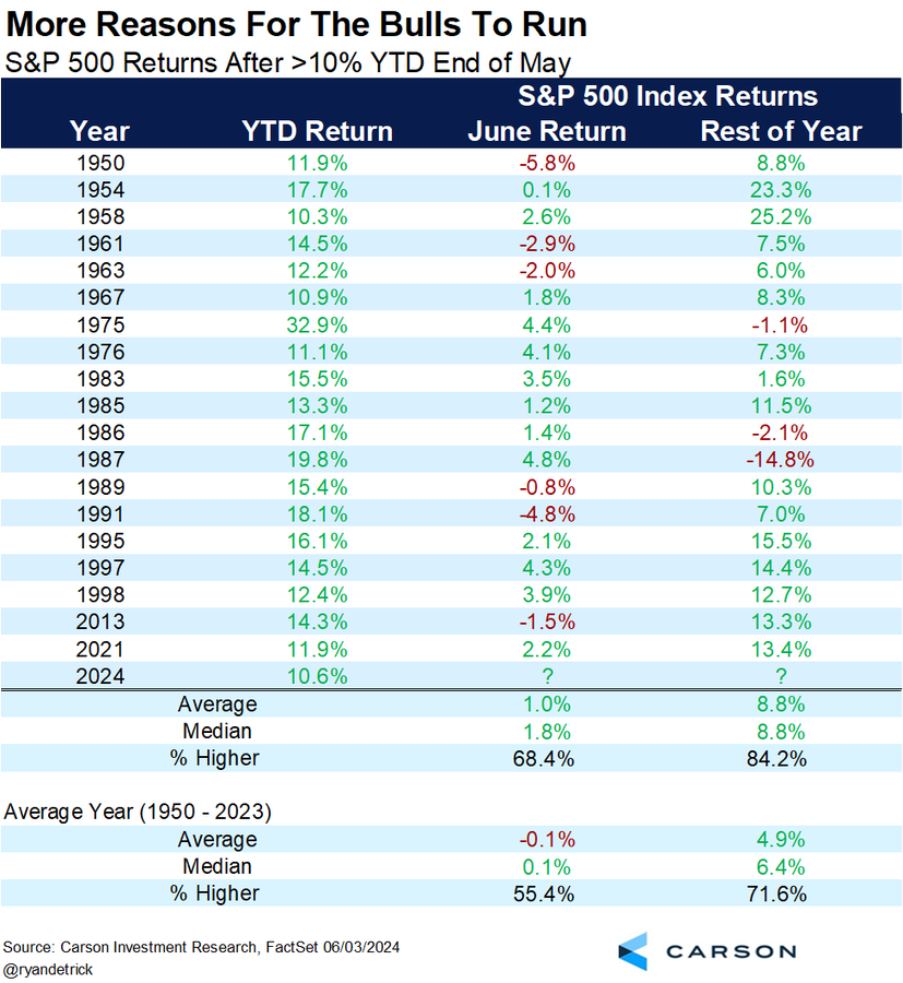
Has the bull run gotten ahead of itself? The S&P 500 was up 14.5% for the first half. In addition, Ryan Detrick observed that the Zweig Breadth Thrust signal of early November showed very strong returns. It was a buy signal I also highlighted (see Zweig Breadth Thrust: From caution to YOLO). The S&P 500 was up 19.0% in the six months since the buy signal, and the market was up 3.5% since then. Combined, investors would be up nearly 22.5% since the buy signal, which is just under the 12-month average and median return.
In light of these strong returns, how much gas is left in the bulls’ gas tank? Is this the case of the market going up too much, too fast?
Warning signs
A number of warning signs are appearing. An enormous divergence has appeared as consumer survey expectations of business sentiment is weak, but stock market return expectations are strong.
As well, household stock allocations have reached an all-time high, which is contrarian bearish.
From a valuation perspective, the equity risk premium is low, indicating that investors should expect subpar long-term returns.
Tactically, the most concerning development has been the violations of both absolute and relative rising trend lines by semiconductor stocks, which were the market leaders.
Wait for the trend break
Another warning sign is the suppression of market volatility, as measured by the low value of the VIX Index. While some may see this as an accident waiting to happen, there is no obvious trigger.
Instead, I interpret the warnings as a market in need of a breather. The S&P 500 remains in a well-defined uptrend. While it would not be unexpected to see stock prices correct, I see no signs of any trend break that signals a major bearish episode.
I also pointed out last week that the usually reliable S&P 500 Intermediate Term Breadth Momentum Oscillator (ITBM) flashed a buy signal when its 14-day RSI recycled from oversold to neutral. The market has been bifurcated between the narrow leadership AI-related plays and the rest of the market. I interpret the ITBM buy signal as the rest of the market is showing signs of positive price momentum after becoming oversold, which is a constructive sign.
In conclusion, the stock market advance in 2024 has been impressive, but prices can continue to rise. Market internals have become frothy and overbought in the AI-related leadership, but the rest of the market is showing signs of recovery that’s indicative of a leadership rotation. My base-case scenario calls for some near-term choppiness, followed by further gains into year-end.
While some of the technical warnings may be disturbing, they are not signs of an immediate major market top. Analysis from SentimenTrader put this into some context, the accompanying chart shows the spread between the percentage of S&P 500 stocks above their 200 dma and percentage of NASDAQ above their 200 dma (bottom panel). High spreads of 30% or more have signaled broad market tops in the past, but the tops can take some time to develop. Keep an eye on this development, but there is no immediate need to panic.
Debate Postscript: I am not fond of political bias in my investment analysis, but the consensus is that Biden performed very badly in the presidential debate last week and the odds of a Trump win have spiked in the betting markets. I reiterate my analysis from last week:
I project that a Biden win would be bearish for bond prices and mildly bullish for stock prices. A Trump win would be bond and USD bearish and gold bullish. The path of equity prices under a Trump Administration is too difficult to forecast as it depends on too many variables.
The first half of 2024 was very good to U.S. equity investors. The S&P 500 was up 14.5% excluding dividends for that period. As stock market investors look forward to the second half, the first order of business will be the Q2 earnings reports, and there are a number of unanswered questions.
The bulls will argue that forward 12-month EPS estimate revisions have been strong, which should be positive for stock prices. The bears will argue that top-down macro reports have largely missed expectations, which foreshadows a period of earnings disappointment and negative guidance. Moreover, valuations are becoming stretched, which will be a headwind for stock prices.
Who is right? Here is a preview of the Q2 earnings season.
A strong bottom-up outlook
Let’s start with the good news. As we look ahead to Q2 earnings season, FactSet reported that S&P 500 forward 12-month EPS revisions are strongly positive, which is a bullish sign of positive fundamental momentum.
On a bottom-up basis, Street analysts are expecting above-average EPS growth of 11.2% for 2024 and 12.7% for 2025.
A K-shaped recovery
On the other hand, Peter Atwater, author of The Confidence Map, has argued that the U.S. economy is undergoing a K-shaped recovery:
The haves suddenly had much more which, in turn, fostered an extraordinary wealth effect. For luxury in all its forms – fashion, travel, cars, real estate… – the post-COVID economy has been a golden era, sending companies like LVMH to the top of the charts.
Meanwhile, those at the bottom have not only been left behind as financial assets have soared, but with interest rates rising, they have paid a higher and higher price to stay afloat. Since 2021, food prices have risen by more than 20%, automobile loan rates have all but doubled, and today, U.S. banks charge over 25% on most credit card balances.
The net result is that behind a supposedly strong and resilient single U.S. economy, there are two: one where those at the top spend like there is no tomorrow, and one where those at the bottom struggle to make it through today.
The Transcript has documented anecdotal evidence of the K-shaped recovery from earnings calls:
“We’re seeing pretty consistent behavior with the upper-income consumers – they’re continuing to buy as they normally have.” – Casey’s General Stores CEO Darren Rebelez
“I think what we believe that we’re seeing is a little bit of impact on almost like a bifurcated economy. I think most people in this room feel pretty good about the economy, feel pretty good about what’s going on, but I think that…if you’re out there more in a working class at the lower end of the economy, you’re having to make choices every day about how to meet your mortgage, how to pay higher insurance costs, how to keep food on the table in a much higher cost environment… And so, they’re having to make tougher choices” – Phillips 66 CEO Mark Lashier
“…if you’re in the lower end of the income spectrum in the U.S., you’re under pressure from inflation…And you can see that pressure coming through — saw that pressure coming through in QSR restaurants and a number of areas where footfall or basket size was under pressure and, of course, consequent behaviors looking for affordability.” – Coca-Cola CEO James Quincey
Consumer-driven companies have responded by prioritizing a focus on volume growth by lowering prices. McDonald’s has famously brought back its $5 menu, along with a number of its competitors. General Mills revealed during its earnings calls that it’s increasing the practice of couponing in order to pursue volume growth.
From a top-down perspective, the Citigroup Economic Surprise Index (ESI), which measures whether top-down economic releases are beating or missing expectations, has weakened to levels last seen in 2022. This is indicative of a deceleration in the economic growth outlook that stands in direct contradiction to the sunny bottom-up earnings expectations of Street analysts. The silver lining to this dark cloud is that ESI has shown a rough correlation to bond yields, and lower yields would put upward pressure on stock prices.
The anecdotal evidence of lower price pressure is good news on inflation for the Fed. The market is now expecting two quarter-point rate cuts this year, with the first at the September FOMC meeting and the second at the December meeting.
Elevated valuation
Another concern for equity prices is valuation. The S&P 500 is trading at a forward P/E of 21.0, which is above its 5-year average of 19.2 and 10-year average of 17.8. These levels are above historical norms. It’s also a warning for investors who follow the Rule of 20, which stipulates that the stock market is overvalued if the sum of the P/E multiple and inflation rate is above 20.
On the other hand, I found a surprising result from my monthly screen of LBO candidates, (for an explanation of my LBO research see How To Buy A Company If You Have No Money).
In my first publication in late May, I screened non-financials within the S&P 1500 looking for LBO candidates, or stocks an investor could buy with no money down. Last month, I found no stocks fitting that criteria and 22 stocks which you could buy with 30% down.
The latest update of my screen revealed three stocks that an investor could buy with no money down and 25 stocks in total that you could buy with 30% down or less. This is a somewhat surprising result in light of the strong gains exhibited by the S&P 500 in June. I attribute this to the valuation bifurcation between large-cap technology stocks and small- and mid-cap stocks. Evidence of deep value is emerging among SMID cap stocks.
In conclusion, investors are facing a number of challenges as they approach Q2 earnings season. While bottom-up EPS estimate revisions are strong, top-down economic releases have been weak. As well, forward P/E valuations are elevated, which can create headwinds for stock prices.
I interpret these conditions as the characteristics of a mid-cycle expansion. Fundamental momentum, in the form of EPS expectations, drive the short-term trend and tells you whether you are likely to fall out of the window. Valuation, which matters in the long term but has little effect in the short term, tells you how far down the window you could fall. As long as momentum is positive, U.S. equities can continue to rise.
Mid-week market update: The S&P 500 has become an index of behemoth NVIDIA and everything else. The all-time high experienced by the S&P 500 in mid-June was largely attributable to the price action of NVIDIA. The rest of the market, as measured by the equal-weighted S&P 500, has been trading sideways for several months and never exceed the highs reached in late March.
Will the S&P 500 continue to rise, or is it destined to correct in the short run? The answer is “yes”. Here are the risks and opportunities.
The bear case
The bear case is easy to make. Semiconductor stocks, which have led the latest advance, are exhibiting signs of a loss in price momentum on both an absolute and relative basis.
If the semiconductors falter, can the rest of the market pick up the leadership baton? Don’t be so sure. The relative performance of cyclical stocks have been weak across the board, indicating a loss of macro momentum.
Speaking of momentum, different measures of the momentum factor, which measures whether stocks that are outperforming continue to outperform, has been flat to weak.
Sentiment, as measured by the put/call ratio, is low and appears frothy. Similar readings were indicative of short-term tops in the past.
I interpret these conditions as a stock market that’s vulnerable to a setback.
The bull case
On the other hand, the usually reliable S&P 500 Intermediate Term Breadth Momentum Oscillator (ITBM) recently flashed a tactical buy signal with its 14-day RSI reverted from oversold to neutral. This is a sign that the non-NVIDIA part of the market is starting to recover its price momentum from an oversold condition.
As well, the equal-weighted ratio of consumer discretionary to S&P 500 stocks is turning up, indicating positive risk appetite, which is a bullish sign.
So where does that leave us? I believe that technology stocks, and semiconductors in particular, are showing signs of bullish exhaustion and vulnerable to market weakness. On the other hand, the rest of the market is starting to rebound from weak oversold levels, which could put a floor on stock prices. It’s unclear whether the bulls or bears will prevail in the short run. My base case scenario calls for a period of near-term choppiness.
Tactically, investors could see some short-term volatility. The S&P 500 is consolidating after an upper Bollinger Band ride and anything can happen in the coming days. Thursday night will be the Presidential debate, followed by the PCE report Friday morning, which could be another source of market turbulence.
We maintain several market timing models, each with differing time horizons. The “Ultimate Market Timing Model” is a long-term market timing model based on the research outlined in our post, Building the ultimate market timing model. This model tends to generate only a handful of signals each decade.
The Trend Asset Allocation Model is an asset allocation model that applies trend-following principles based on the inputs of global stock and commodity prices. This model has a shorter time horizon and tends to turn over about 4-6 times a year. The performance and full details of a model portfolio based on the out-of-sample signals of the Trend Model can be found here.
My inner trader uses a trading model, which is a blend of price momentum (is the Trend Model becoming more bullish, or bearish?) and overbought/oversold extremes (don’t buy if the trend is overbought, and vice versa). Subscribers receive real-time alerts of model changes, and a hypothetical trading record of the email alerts is updated weekly here. The hypothetical trading record of the trading model of the real-time alerts that began in March 2016 is shown below.
The latest signals of each model are as follows:
Ultimate market timing model: Buy equities (Last changed from “sell” on 28-Jul-2023)
Trend Model signal: Bullish (Last changed from “neutral” on 28-Jul-2023)
Trading model: Neutral (Last changed from “bullish” on 23-May-2024)
Update schedule: I generally update model readings on my site on weekends. I am also on X/Twitter at @humblestudent. Subscribers receive real-time alerts of trading model changes, and a hypothetical trading record of those email alerts is shown here.
Subscribers can access the latest signal in real time here.
A case of bad breadth
Anxiety has been increasing among the technical analysis community over the blatant instances of narrow market leadership and negative breadth divergence. Even as the S&P 500 rose to new all-time highs, the Advance-Decline Line, regardless of how it is measured, is exhibiting a series of negative divergences.
Even though these breadth divergences are concerning, they are not necessarily bearish signals. Here’s why.
Persistent divergences
Here is a monthly chart of the NYSE, S&P 500 and S&P 600 Advance-Decline Lines for a long-term perspective. The most notable negative divergence began in 1998 but the S&P 500 didn’t peak until March 2000, a span of two years. A shorter lead-lag relationship can be seen at the 2007 top and the 2021 top. In the two latter cases, the negative A-D Line divergences persisted for several months among both large and small caps.
We can see a similar pattern of a persistent warning signal from the BoA Global Manager Survey, which showed that institutions had cash at historically low levels, which should be contrarian bearish. In all cases, cash didn’t outperform until the condition persisted for several months.
In other words, breadth divergences are conditional warnings and they are not automatic and actionable sell signals.
A question of leadership
Technical analysts have largely focused on the narrowing leadership of the market. This 10-year chart shows that the relative performances of the equal-weighted S&P 500 and Russell 2000 have been abysmal. Even as the S&P 500 rose to all-time highs, relative breadth indicators were nosediving to all-time lows.
The flip side of the narrow leadership coin is the persistent strength in megacap technology stocks. The NYSE FANG Plus Index staged an upside breakout from a multi-year cup and handle formation in Q4 2023. Both absolute and relative performance is strong.
Even if you are cautious, do you want to stand in front of this runaway train with no obvious bearish catalyst? This analysis highlights the importance of of Bob Farrell’s Rule 4: Exponential rapidly rising or falling markets usually go further than you think, but they do not correct by going sideways.
Waiting for the sell signal
In summary, the market advance is highly extended and stock prices can pull back at any time. However, turning tactically bearish here would be tempting fate by spitting into the wind.
I would prefer to wait for a trading sell signal. One possible candidate is an excessively low put/call ratio, indicating a crowded long, which is contrarian bearish.
Other sentiment models are also flashing warning signs. Marketwatch reported that PMorgan analyst Nikolaos Panigirtzoglou found that short interest on SPY and QQQ had evaporated and fallen to a new low.
Bear in mind, however, that sentiment is a condition model that can warn of an extreme condition, but it can’t be relied upon as a tactical sell signal.
On the other hand, while the S&P 500 appears extended, what’s the downside risk if the NYSE McClellan Oscillator (NYMO) and the NASDAQ McClellan Oscillator are near oversold?
As well, the usually reliable S&P 500 Intermediate Term Breadth Momentum Oscillator (ITBM) just flashed a tactical buy signal when its 14-day RSI recycled from oversold to neutral.
The week ahead
Looking to the week ahead, stock prices will be facing some liquidity headwind. The U.S. Treasury will have $211 billion in notes for sale. ON RRP is likely to rise as RRP rates are higher the then 1-month T-Bill rate, which would drain liquidity from the banking system.
Initial S&P 500 support can be found at the gap at 5370-5400, which represents a downside potential of less than -2%. The challenge for the bulls is to hold the line at that level. That’s when investors will find out whether the pullback will be deep or shallow.
In conclusion, while the conventional bearish view of negative breadth divergences is bearish, it isn’t necessarily correct. The bearish consequences of a negative breadth divergence can take over a year to be realized. Instead, they are warnings of bearish conditions than actionable tactical sell signals. I interpret current market conditions as highly extended that can pull back at any time, but investors should also recognize that the situation could resolve itself in a benign manner.
I am reiterating my bullish outlook on gold. The yellow metal staged an upside breakout from a cup and handle pattern in March. As well, the long-term inflation expectations of ETF (RINF) has been in a steady uptrend. The only question is how far and how fast can gold run?
The future may be bright as gold prices respond to unexpected inflation. The non-partisan Congressional Budget Office (CBO) recently updated its projection of the U.S. fiscal path by raising its FY 2024 estimate of the deficit from $1.5 trillion to $1.9 trillion, driven by emergency spending on foreign assistance to Israel, Ukraine and Taiwan, as well as student loan relief. The long-term picture also deteriorated, the deficit rises to $2.8 trillion by 2034 and debt is expected to grow to 122% of GDP by 2034.
For investors, much of its intermediate-term outlook depends on the outcome of the U.S. November elections and the trajectory of White House policies.
The path to fiscal dominance
The CBO report makes for sobering reading. Not only did the expected FY 2024 budget deficit rise by 27%, projected debt/GDP in 2034 was revised up from 116% to 122%.
It would be trite to say that the fiscal deficit is running out of control. Net interest outlays are expected to dwarf the primary deficit, or actual spending.
This makes for interesting policy choices for legislators and the Fed. Interest expense now exceeds the defense budget. Historian Niall Ferguson warned that the U.S. is starting to look like the late stages of the Soviet Union:
A chronic “soft budget constraint” in the public sector, which was a key weakness of the Soviet system? I see a version of that in the U.S. deficits forecast by the Congressional Budget Office to exceed 5 percent of GDP for the foreseeable future, and to rise inexorably to 8.5 percent by 2054.
The U.S. is on the path to fiscal dominance. It cannot resolve its fiscal challenges without resorting to some form of financial repression. In all likelihood, the Fed will own greater portion of Treasury debt in order to keep interest expense under control.
All eyes on the November election
In the intermediate term, the path of the deficit will depend on the occupant of the White House in 2025. While the Democrats and Republicans have different fiscal priorities, both are expected to expand the deficit. The only question is by how much.
As the Biden Administration is already well-known, investors should have some reasonable expectations of Biden’s economic policy. More industrial policy, such as the IRA and CHIPS Act, more military assistance for Ukraine and Taiwan, more social policy relief, such as student loan relief, and higher taxes for high income earners. Expect the deficit to expand at roughly the pace projected by the CBO under a second Biden term.
If Trump were to win in November, one sure bet would be the extension of the Trump tax cuts that are set to expire in 2025, whose effects were not scored by the CBO as they weren’t legislated. There will be more trade friction. Trump has proposed substituting tariffs revenue and eliminating the income tax.
I have many questions about this proposal. While Trump was vocal about eliminating income tax, he was silent on the payroll tax. Does that mean the payroll tax stays? Tariffs are levied on goods but not services. If a U.S. pharmaceutical or technology company minimizes its tax burden by funneling its profits to an Irish subsidiary which holds the bulk of the company’s intellectual property, would that be subject to tariffs and how does raising tariffs help onshore jobs to the U.S. in such instances? Income taxes are progressive by design, tax rates rise as your income rises, while tariffs, which is a consumption tax, is regressive. Since tariffs amount to a flat tax, tax rates fall as income rises and the burden of taxation falls mainly on lower income taxpayers. The regressive nature of such a regime would be exacerbated if Trump were to eliminate income taxes but not payroll taxes. Such an approach tilts the playing field toward suppliers of capital at the expense of the suppliers of labour.
Another major policy difference between Biden and Trump is immigration. A study from Barclays documented the immigration surge and estimates about 75% of job gains are filled by immigrants. The flood of immigrants has acted to restrain wage gains.
CBO director Phill Swagel analyzed the effects of the immigration surge and projects that lowers the deficit by $0.9 trillion for the 2024–2034 period.
In our baseline budget projections, which account for the immigrants in the surge and their children, the increase in immigration lowers deficits by a net total of $0.9 trillion over the 2024–2034 period. Specifically, revenues will be higher by $1.2 trillion over that period, in our estimation, and spending for mandatory programs and net outlays for interest on the federal debt will be higher by a total of $0.3 trillion as a result of the immigration surge.
One of the planks in Trump’s platform is to restrict immigration. These studies conclude that his policies will put upward pressure on the deficit and inflation.
In all cases, Trump proposals are inflationary. Viewed in isolation, extending the Trump tax cuts set to expire in 2025 would spike the deficit. While the elimination of income taxes could spark an investment and growth boom, which would rattle the bond market, raising tariffs puts upward pressure on consumer goods, which would also spike inflation.
I project that a Biden win would be bearish for bond prices and mildly bullish for stock prices. A Trump win would be bond and USD bearish and gold bullish. The path of equity prices under a Trump Administration is too difficult to forecast as it depends on too many variables.
Electoral expectations
How should investors position themselves ahead of the U.S. election?
The results of the election may hinge on turnout. A NY Times analysis of presidential polls found that Biden has an advantage among engaged voters while Trump leads among less engaged voters. In other words, Biden leads among survey polls while Trump leads in registered voter surveys.
I have long held the belief that market prices have informational content. Here are a few ways of handicapping the election. First of all, RealClearPolitics’ board of betting odds shows Trump in a clear lead, though the liquidity in the betting markets is thin.
As Trump has a history of being a hawk on trade policy, Bloomberg columnist John Authers has proposed that investors monitor the stock price of FedEx, the global transportation logistics giant who would benefit from rising global trade.
The accompanying chart shows the price of FedEx, along with its relative performance against an equal-weighted S&P 500 benchmark, which was chosen to mitigate the recent dominance of large-cap technology stocks. FedEx is mired at the lower end of its relative performance band, which is an indication that the market may be expecting headwinds for global trade.
For completeness, here is FedEx rival UPS, who is showing a similar pattern of underperformance.
Another group of losers under a Trump Administration would be the stock markets of NAFTA partners Mexico and Canada. Here is a chart of MSCI Mexico (in USD). Its relative performance is shown against the MSCI All-Country World Ex-U.S. Index in order to mitigate the recent strong leadership effects of U.S. technology stocks. Mexican stocks skidded in the wake of its own election, so some of the weak relative returns can be ignored.
Here is MSCI Canada, which has also been weakening on a relative basis.
In conclusion, the latest CBO fiscal update raises the odds of upside inflation surprises in the coming years, which would be bullish for gold. The intermediate-term outlook for inflation will largely depend on the outcome of the November election. I project that a Biden win would be bearish for bond prices and mildly bullish for stock prices. A Trump win would be bond and USD bearish and gold bullish. The path of equity prices under a Trump Administration is too difficult to forecast as it depends on too many variables. A survey of market-based indicators suggests that the electoral momentum is toward Trump and away from Biden.
Mid-week market update: I am publishing this earlier than usual as the U.S. markets are closed for the Juneteenth holiday.
The S&P 500 has gone on another upper Bollinger Band ride, accompanied by a severely overbought reading on the 5-day RSI, which is over 90%. Overbought conditions are often not bearish, but a manifestation of strong price momentum, otherwise known as a “good overbought” signal. That’s bullish, right?
Here is what’s different this time. The overbought condition occurred along with signs of weak breadth, as evidenced by a series of negative net highs-lows on both the NYSE and the NASDAQ even as the index made new all-time highs.
Negative divergences
Signs of poor breadth are confirmed by negative divergences from risk appetite indicators. Even as the S&P 500 advanced to new all-time highs, equity risk appetite, as measured by the relative performance of high beta to low volatility stocks (dotted red line), have been trading sideways since mid-April. A similar pattern can also be seen in the relative price returns of junk bond to their duration-equivalent Treasuries. What’s worrisome is both indicators weakened in the last week even as the S&P 500 rose.
Poor breadth is also triggering a Hindenburg Omen cluster for NASDAQ stocks, which is an indication of a highly bifurcated market that’s losing price momentum. There have been 15 clusters in the last 10 years. Nine of them resolved bearishly and six did not.
As well, the put/call ratio is nearing a crowded long condition, which is contrarian bearish.
Tech’s narrow leadership
I have documented the narrow leadership of large cap technology and the trend continues.
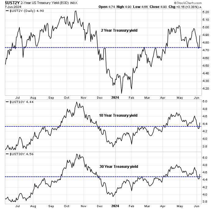
On the other hand, it’s difficult to see much equity price downside if Treasury yields are weak. The 2-year yield is testing support while the 10 and 30 year yields have violated support.
My base case calls for a 60% chance of a 5-10% downdraft, and a 40% chance of a sideways consolidation. Those aren’t sufficiently compelling odds for my inner trader to step off the sidelines and short the market.
We maintain several market timing models, each with differing time horizons. The “Ultimate Market Timing Model” is a long-term market timing model based on the research outlined in our post, Building the ultimate market timing model. This model tends to generate only a handful of signals each decade.
The Trend Asset Allocation Model is an asset allocation model that applies trend-following principles based on the inputs of global stock and commodity prices. This model has a shorter time horizon and tends to turn over about 4-6 times a year. The performance and full details of a model portfolio based on the out-of-sample signals of the Trend Model can be found here.
My inner trader uses a trading model, which is a blend of price momentum (is the Trend Model becoming more bullish, or bearish?) and overbought/oversold extremes (don’t buy if the trend is overbought, and vice versa). Subscribers receive real-time alerts of model changes, and a hypothetical trading record of the email alerts is updated weekly here. The hypothetical trading record of the trading model of the real-time alerts that began in March 2016 is shown below.
The latest signals of each model are as follows:
Ultimate market timing model: Buy equities (Last changed from “sell” on 28-Jul-2023)
Trend Model signal: Bullish (Last changed from “neutral” on 28-Jul-2023)
Trading model: Neutral (Last changed from “bullish” on 23-May-2024)
Update schedule: I generally update model readings on my site on weekends. I am also on X/Twitter at @humblestudent. Subscribers receive real-time alerts of trading model changes, and a hypothetical trading record of those email alerts is shown here.
Subscribers can access the latest signal in real time here.
Time for cheap protection?
Last week, I suggested that the stock market was susceptible to a setback (see A Time For Tactical Caution). Even though the pullback never appeared, I reiterate my cautious view, though I am not outright bearish.
In light of the market’s vulnerable position, it may be time to exploit the low VIX and buy some cheap downside protection in the form of protective put options. The S&P 500 achieved a fresh all-time high while exhibiting a negative 5-week RSI divergence. As well, the VVIX/VIX ratio is showing a negative divergence. Such episodes have tended to resolve bearishly in the past. As well, the VIX Index is low and testing its lower boundary at 12, indicating low option premium and cheap cost of downside protection.
Narrowing breadth
One of my concerns is that breadth has been narrowing instead of broadening as it often does during a bull market. Even as the S&P 500 reached an all-time high, market breadth is narrowing and not broadening out.
To illustrate my point, here is the relative performance of growth sectors. Only technology stocks are showing signs of leadership.
The relative performance of value and cyclical sectors are nosediving.
For completeness, here is the relative performance of defensive sectors, which are all lagging. Even Utilities, which recently gained a bid on the promise of AI data centre demand, rolled over in June.
In other words, only a single sector, technology, is exhibiting signs of market leadership. The other 10 sectors are lagging the S&P 500. The narrow leadership is occurring against a backdrop of a technology sector forward P/E of 30.5, which was last seen in May 2002.
The narrowness of market leadership can also be seen from a market cap viewpoint. Not only is the small cap Russell 2000 underperforming the S&P 500, but also small cap NASDAQ stocks (QQQJ) are exhibiting a similar pattern of underperformance against the NASDAQ 100.
As breadth divergences can last for a considerable time, these conditions aren’t necessarily fatal to the bull run. Instead, it should be interpreted as a signal for caution.
Silver linings
Here is the silver lining in the dark cloud for the bulls. The market’s risk-on tone has been supported by a retreat in Treasury yields across the board that have shown a pattern of support violation.
Already, the usually reliable S&P 500 Intermediate Term Breadth Momentum Oscillator (ITBM) is on the verge of a buy signal setup. The 14-day RSI of ITBM has reached an oversold reading and a buy signal occurs when it recycles from oversold to neutral.
In conclusion, a series of negative breadth divergences is signaling caution for the stock market advance. However, breadth divergence can persist for a long time and these divergences should be regarded as cautionary conditions and not outright sell signals. Investors should take steps to mitigate their long exposure using risk control techniques, such as the use of trailing stops, or take advantage of the low VIX to buy cheap downside put protection.
Remember that equity investors tend to enjoy strong returns in the absence of recession, which dents returns, or war and revolution, which can result in a permanent loss of capital. With those caveats in mind, the market gods are presenting patient investors with three gifts from the three economic blocs in the world: the U.S., Europe, and China.
Powell’s dilemma
The “dot plot” published in the aftermath of the June FOMC meeting was starkly hawkish. Four members, likely Fed Governors Bowman and Waller, along with Barkin of the Richmond Fed and Bostic of the Atlanta Fed, projected no rate cuts in 2024. There is a significant minority on the FOMC who are opposed to a rate cut this year.
It should also be acknowledged that inflation is decelerating even as the Fed Funds rates stays steady, which has the effect of a de facto tightening of monetary policy as the real Fed Funds rate rises.
The lower-than-expected CPI and PPI readings in May served to underline this point. With both CPI and PPI reported, estimating the May core PCE, the Fed’s preferred inflation metric, becomes easier. The Cleveland Fed’s inflation nowcast is now calling for a May core PCE of 0.1%.
That’s why all FOMC members a projecting rate cuts in the future. The question is one of timing. While we are seeing are welcome signs of tame inflation, the market has seen similar episodes in the last half of 2023. That’s why the FOMC hawks don’t appear convinced.
In the wake of soft inflation reports, the market is pricing in two rate cuts this year. One in September, followed by a second in December.
Here is Powell’s political problem. The Fed will have difficulty cutting rates ahead of an election in the face of entrenched opposition within the FOMC without appearing to be helping the incumbent President. He can’t afford to have any dissents on a rate cut decision at the September meeting.
Powell’s challenge was to communicate an explicit process for a rate cut or pause at the September meeting while avoiding any discussion of his political problem, which he failed to do at the post-FOMC meeting press conference. All he could manage was to repeat the mantra that the test for any cut is greater confidence in lower inflation or unexpected weakness in the jobs market. Even then, he declined to specify numeric benchmarks for inflation or employment, other than to say that the Fed is looking at a spectrum of data.
Such an approach to communications policy is a recipe for failure. Unless we see a string of very soft inflation readings between now and the September meeting or a collapse in employment, the market is likely to be disappointed.That’s the opportunity setup for investors. The macro backdrop of continued strong growth looks like either a soft landing or even no landing. As long as EPS estimates continue to rise, stock prices should advance even in the face of a pause in rate cuts. Remember that recessions are bull market killers, and there are no signs of recession on the horizon.
That’s the first gift from the market gods for patient investors. A pullback from a delayed rate cut is on the way, and it’s a buying opportunity.
Macron’s gambit
Across the Atlantic, financial markets were rattled when French President Macron unexpectedly dissolved the National Assembly and called an early election in the wake of strong gains by Marine Le Pen’s far right Rassemblement National (RN) in European parliamentary elections.
The timing of the election calls was unfortunate. S&P recently downgraded French debt on May 31 and spreads against German Bunds are blowing out. Bloomberg columnist John Authers highlighted a growing risk to the eurozone’s financial system. The Greek Crisis was a problem that Europe could survive. France and Germany are the two pillars of Europe and France is too big to save.
Now comes the terrifying part. The Greek crisis was brought to a head when the radical leftist Alexis Tsipras became prime minister in 2014. A French legislature headed by the forces of Marine Le Pen might play the same role at a time when French indebtedness has made the risk of crisis much greater… there’s the risk that most scares investors — that the Rassemblement does get to form a government, and then provokes a crisis within the eurozone that the euro could not survive. That remains unlikely. But ultimately, Europe confronts a low-probability extreme event. These are just the things that markets can’t deal with. Judging how to respond is their nightmare.
What was Macron thinking? Has his political gambit backfired? An early poll shows the far right in the lead, the left in second and Macron’s party in third place. As a reminder, the French electoral system is based on runoffs. If any candidate doesn’t achieve a simple majority in an election, the top two candidates go head-to-head in a second round runoff.
However, the polling results are highly preliminary. Macron’s surprise announcement set off a scramble to set candidate lists and form political alliances. The parties on the left acted first by forming a Nouveau Front Populaire to field a slate of candidates, though the coalition appeared slightly shaky as the Socialists were opposed to the alliance.
The right disintegrated in the wake of the election call. First, the president of Les Républicains Éric Ciotti announced on TV an alliance with Le Pen’s RN, only to be publicly fired and repudiated by the party’s executive. It’s unclear at this point the status of Les Républicains, the party of Chirac and Sarkozy.
The far right also splintered. Jean-Marie Le Pen’s granddaughter Marion Maréchal, who allied with Éric Zemmour’s Reconquête instead of her aunt Marine Le Pen’s party in the last election, announced on live TV that she would join her aunt’s RN. The announcement came as a complete surprise to Zemmour, who denounced it as the “world record of betrayals”. Chaos ensued.
If Macron’s strategy was to the far right, his election call is starting to look Jupiterian. Further disarray on the right could cause the markets to sigh in relief. However, his decision may come at a price of a left-wing resurgence that destroys his own centre-right coalition.From a technical perspective, the financial mini-panic may be nearing a crescendo. The Euro STOXX 50 skidded on Friday to test a key support level. Keep an eye on whether support holds.
No doubt there will be more drama ahead in the coming days, but this looks like the buying opportunity that accompanies the usual episode of European Crisis Theatre and a second gift from the market gods for patient investors.
The PBOC surprise
The third gift from the market gods appeared when the PBOC announced that it had suspended gold purchases. Gold prices skidded about $20 on the news and it’s testing a support level of $2300.
I have been long-term bullish on gold. The metal staged an upside cup-and-handle breakout at $2100 and it hasn’t looked back ever since. Moreover, the gold/S&P 500 ratio is forming a constructive saucer-shaped multi-year bottom that should see it outperform equities in the coming years.
Tactically, I had been concerned about the short-term extended nature of the advance in gold and gold miners but the PBOC news could be a catalyst for some welcome weakness. The gold miner ETF (GDX) had become overbought on the percentage bullish on P&F indicator and it was exhibiting a series of negative RSI divergences. Past episodes have tended to resolve in pullbacks that have turned out to be buying opportunities.
In conclusion, market conditions are setting up for buying opportunities in three markets. U.S. equities will probably weaken on disappointment over the timing of rate cuts. European stocks corrected over political turmoil in France that’s likely to be temporary. China’s announcement that its central bank had suspended gold buying looks like an entry point in the near future.
Mid-week market update: The option market was pricing in a daily equity market swing of 1.6% ahead of today’s events, namely the May CPI report and the FOMC decision. Even though the S&P 500 gained strongly today, the move could be said to be disappointing in volatility terms.
The bullish tone was set this morning by the softer than expected CPI report. Stocks gained but didn’t react much to the FOMC decision, despite the hawkish tone of the Summary of Economic Projections. Bond prices held above a key resistance level, and the USD weakened, indicating a risk-on tone.
The market is fighting the Fed, should you?
A soft inflation report
The May CPI report was much softer than expected. May core CPI (blue bars) came in at 0.16%, which was cooler than the forecast consensus of 0.3%. Supercore services (red bars) was also weak. These are all welcome signs of moderating inflation readings. The one caveat is this is only one data point and don’t necessarily represent a sufficient trend for the Fed to be confident about cutting rates.
As I’ve pointed out before, the Citi Inflation Surprise Index has been coming down for most major economies. It was therefore no surprise that other central banks, such as Switzerland, Sweden, the ECB, and Canada, have initiated rate cut cycles.
How the Fed is different
In many ways, the U.S. is different and it has shown an unusual degree of strength when compared to other economies. The Fed’s Summary of Economic Projections (SEP) published today contained several hawkish surprises.
Upward revisions in the dot plot of year-end Fed Funds projections;
Expected rate cuts reduced from three to one;
An upward revision to the long-term Fed Funds equilibrium rate.
Fed Chair Powell was asked during the press conference a number of questions that he tried very hard not to answer. The projected 2024 GDP growth rate and the unemployment rate are unchanged from March, why did the inflation forecast rise? Can you reconcile the median projection of one rate cut of one this year against no projected changes in growth or unemployment?
What Powell couldn’t say was the “dot plot” showed four participants are projecting no rate cuts in 2024. There is a significant minority of hawks in the FOMC who are adamant against rate cuts. Powell has a problem of cutting rates before the election without the move being politically motivated. He can’t afford to have any dissents. Nevertheless, the market is expecting two rate cuts this year. One in September and one in December.
I think that the market is likely to be disappointed in light of Powell’s political bind.
A vulnerable stock market
This leaves the stock market vulnerable to a short-term setback. The S&P 500 spiked above its upper Bollinger Band in the wake of this morning’s CPI print. In the past, such events have been followed either by an upper Bollinger Band ride or the sideways consolidation of a few days before making the next tactical directional move. What’s different this time compared to past upper BB spikes is relative breadth is narrowing.
It’s not unusual to see directional market moves on FOMC decision day reverse themselves the next day. Tomorrow’s PPI report could be a negative catalyst. While I am not an advocate for shorting this market, you should also be aware that stocks can pull back at any time.
We maintain several market timing models, each with differing time horizons. The “Ultimate Market Timing Model” is a long-term market timing model based on the research outlined in our post, Building the ultimate market timing model. This model tends to generate only a handful of signals each decade.
The Trend Asset Allocation Model is an asset allocation model that applies trend-following principles based on the inputs of global stock and commodity prices. This model has a shorter time horizon and tends to turn over about 4-6 times a year. The performance and full details of a model portfolio based on the out-of-sample signals of the Trend Model can be found here.
My inner trader uses a trading model, which is a blend of price momentum (is the Trend Model becoming more bullish, or bearish?) and overbought/oversold extremes (don’t buy if the trend is overbought, and vice versa). Subscribers receive real-time alerts of model changes, and a hypothetical trading record of the email alerts is updated weekly here. The hypothetical trading record of the trading model of the real-time alerts that began in March 2016 is shown below.
The latest signals of each model are as follows:
Ultimate market timing model: Buy equities (Last changed from “sell” on 28-Jul-2023)
Trend Model signal: Bullish (Last changed from “neutral” on 28-Jul-2023)
Trading model: Neutral (Last changed from “bullish” on 23-May-2024)
Update schedule: I generally update model readings on my site on weekends. I am also on X/Twitter at @humblestudent. Subscribers receive real-time alerts of trading model changes, and a hypothetical trading record of those email alerts is shown here.
Subscribers can access the latest signal in real time here.
The bull isn’t done
Make no mistake, I am intermediate-term bullish on U.S. equities. The monthly MACD buy signal remains in force and there are no signs of any negative divergence that signals a major market top.
Beneath the hood, however, disturbing signs of that not all is well in the short run. Here are bull and bear cases.
The bull case
Let’s start with the bull case for stocks. It is said that there is nothing more bullish than a stock market that makes new highs. The current bull is still young by historical standards and should have much further to run.
Sentiment readings are supportive of more gains. The latest NAAIM Exposure Index, which measures the sentiment of RIAs who manage individual investors’ funds, retreated from an excessively bullish reading to a neutral level.
The 10 dma of the CBOE put/call ratio rose steadily even as the S&P 500 rallied, which is a sign of skepticism of the market advance – another contrarian bullish signal.
Bearish cautionary signals
On the other hand, cautionary signs are appearing beneath the surface. The price momentum factor has gone nowhere. I distinguish between the concept of market momentum, which is the propensity of a stock market that’s rising to continue rising, and the price momentum factor, which measures whether stocks that are beating the market continue to beat the market.
The accompanying chart shows the relative performance of different price momentum ETFs. Each defines momentum in a slightly different way and each rebalances its portfolio at different times. In all cases, the price momentum factor is turning down, indicating leadership uncertainty.
One of the most important “tells” of market direction is the relative performance of defensive sectors. If they outperform, it means that the bears are gaining control of the tape. The jury is still out on that score, but it is disturbing for the bull case that the relative performance of three of the four defensive sectors are bottoming and trading sideways even as the S&P 500 reaches all-time highs.
Equally concerning is the relative performance of most cyclical industries. With the exception of semiconductors, cyclicals have rolled over when measured against the S&P 500.
Jason Goepfert of SentimenTrader observed that the NASDAQ Composite made a record high even as 52-week lows exceeded 52-week highs. While the sample size is relatively small (n=10), the market has tended to resolve such conditions in a bearish manner. In light of the importance of NASDAQ growth stocks in the weight, this will pose severe near-term headwinds for the S&P 500.
Equally ominous is the appearance of a cluster of Hindenburg Omen signals for the NASDAQ. Single Hindenburg Omen signals tend to be insignificant, but clusters of omens have tended to precede downdrafts.
In addition, every formulation of the Advance-Decline Line is exhibiting negative divergences against the S&P 500.
None of these conditions are automatic sell signals as there are no bearish triggers. I was asked by several readers in the wake of my last post with bullish overtones if I was long the market in my trading account (see A well-telegraphed market advance). My answer isI interpret current conditions as a weak bull pushing price upward, but the market is fragile and can pull back at any time. My base case calls for stock prices to grind upward, albeit in a choppy manner over the next few weeks.
Is good economic news good news for equities or bad news? We know how to interpret macro news for the bond market. The Citi Economic Surprise Index (ESI), which measures whether top-down economic releases are beating or missing expectations, has been a bit weak. Historically, a weak ESI has meant lower bond yields.
What does it mean for equities? Investors saw a string of weaker-than-expected macro prints last week, starting with an anemic ISM PMI on Monday, followed by a miss on job openings in JOLTS Tuesday and another miss on ADP employment Wednesday. In each of those cases, bond prices rallied and equities initially weakened, followed by price recoveries later in the day.
I interpret events from the perspective of three trading desks: bonds, commodities and equities.
The bond market reaction
Let’s start with the view from the bond desk.
The Bank of Canada did it, and so did the European Central Bank. Both announced quarter-point rate cuts last week — when will the Fed follow suit?
Up until Friday’s May Jobs report, Treasury yields fell across the entire yield curve in response to the trend in weaker-than-expected economic data. The 2-year yield bounced off a key technical support level, while longer-term yields tested support.
The closely watched employment picture is showing mixed signals. Fed Chair Jerome Powell has cited the number of job openings per available worker as an indicator of labour market tightness. The April JOLTS report shows that this metric has normalized back to pre-pandemic levels.
Even though the headline nonfarm payroll establishment survey and average hourly earnings release surprised to the upside, the noisy household survey was deeply negative and the unemployment rate actually rose. As well, the quits to layoffs ratio, which is a leading indicator of nonfarm payroll employment, has flatlined since last summer, with the caveat that this is a noisy data series.
The jobs market may be much weaker than the headlines show. Bloomberg Chief U.S. economist Anna Wong argued that the Establishment survey is overstating employment by about 100,000 because of errors in the birth-death adjustment from the Quarterly Census of Employment and Wages (QCEW), which is reported with a significant delay.
How should investors interpret this data? For now, the consensus view is mildly dovish. Fed Funds market expectations calls for the first cut expected at the September FOMC meeting and almost a coin flip as to whether we will see a second cut at the December meeting.
The commodity market reaction
The view from the commodity desk is one of economic weakness.
Commodity prices have been either trading sideways or in decline, depending on what index you use. The headline commodity indices, which tend to be heavily weighted in energy because of their higher liquidity, have been falling in the wake of last week’s OPEC+ decision to gradually allow the potential return of OPEC barrels to production. The cyclically sensitive copper/gold and base metals/gold ratios are also pulling back after a surge during the April–May period.
Precious metal investors were blindsided when the PBOC announced that it had stopped buying gold after an 18-month stretch of accumulation.
However, investors may want to take the commodity desk’s view of cyclical weakness with a grain of salt. Commodity prices are undergoing a period of negative seasonality, which should end about mid or late July.
The equity market reaction
By contrast, the view from the equity desk is bullish.
From a fundamental perspective, global EPS estimate revisions have turned positive, with the sole exception of China.
Analysis from John Butters of FactSet confirms this view. S&P 500 EPS estimate revisions have been strong.
Moreover, references to the term “recession” on earnings calls are fading.
The market’s price momentum has been strong. Ryan Detrick pointed out that the historical evidence indicates that strong price gains tend to beget more price gains.
Growth deceleration or disinflation?
In summary, the bond and commodity markets are signaling weakness while equity markets are signaling growth. How should you reconcile these disparate views?
I think investors should distinguish between economic growth deceleration, which would stand in direct contrast to bottom-up Street expectations of rising EPS estimates, and disinflation. A growth deceleration would pose headwinds to equity price gains, while disinflation would be a positive factor. That’s how you determine if good economic news is good news or bad news for equity prices.
As the economic indicators stand today, job openings have come down without a significant rise in unemployment. That’s what the fabled soft landing looks like, and it should be equity bullish.
About cookies on this site
Our site uses cookies and other technologies so that we, and our partners, can remember you and tailor your user experience on our site. See our disclaimer page on our privacy policy, how we manage cookies, and how to opt out. Further use of this site will be considered consent.