I sounded a warning in late January about a possible long-term market top, based on a negative divergence of the 14-month RSI. It wasn’t a “sell everything” signal, but a cautionary sign of a topping pattern.
It is said that “bottoms are events, but tops are processes”. That’s because market bottoms tend to be formed during panic events, while topping patterns tend to be longer-term drawn out. Here is a review of technical and macro backdrop supportive of my topping thesis.
Negative divergences
From a technical perspective, here is what a negative breadth divergence looks like. Even as the S&P 500 made a new high in February, every version of the Advance-Decline Line topped out in late November and never recovered. Even worse, the 10 dma of the NYSE 52-week highs-lows topped out last September and it’s been slowly declining ever since.
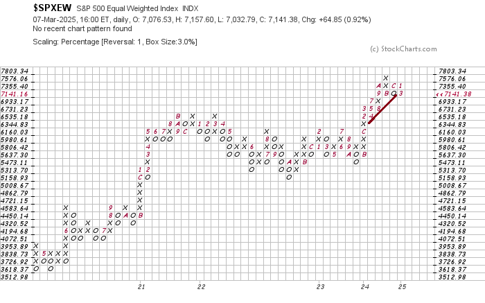
A review of the point and figure charts of the major U.S. stock market averages using a 3% box and 1-box reversal reveals a bifurcated market that’s consolidating sideways and breaking down.
The most constructive chart is the S&P 500, which remains in an uptrend.
The equal-weighted S&P 500 is starting to consolidate sideways and may have broken support.
The NASDAQ 100 is also consolidating sideways and testing trend line support.
The Magnificent Seven ETF (MAGS) has violated trend line support and it’s now breaking down.
The small-cap Russell 2000 is exhibiting a similar violation and breakdown pattern.
Fiscal headwinds
Notwithstanding the technical patterns of a possible topping market, U.S. equities face a number of macro headwinds.
If history is any guide, the first year of a Republican administration is not good for equities, particularly in the second half of the year.
While the market initially focused on Trump’s pro-growth policies of extending the TCJA tax cuts, corporate tax cuts and deregulation, it also faces the downside risk of fiscal contraction from the DOGE-related government layoffs and cuts to government spending. Keep in mind that the TCJA extension represents the fiscal status quo and is not fiscally stimulative. On the other hand, government cutbacks is fiscal contraction, which represents a growth headwind.
Strategist Jim Paulsen pointed out that fiscal contraction is bearish for equity earnings. Treasury Secretary Scott Bessent confirmed that fiscal retrenchment is a policy of the Trump Administration in a CNBC interview: “The market and the economy have just become hooked and we’ve become addicted to this government spending and there’s going to be a detox period” as the economy goes through a “transition from public to private” investment.
Trade war headwinds
Setting aside the fiscal headwinds, I haven’t even begun to address the fallout from a global trade war. It’s impossible to fully forecast the economic trajectory of Trump’s trade wars, as the situation has been fluid. The market initially didn’t take Trump seriously and interpreted his tariff threats as bargaining, but investor mood pivoted to risk-off as the threats became more concrete.
Consider, for example, the effects of the trade war on the U. S. farm belt. Trump acknowledged during his State of the Union speech that tariffs on Canada, Mexico and China might hurt American farmers, saying that there “may be a little bit of an adjustment period.”
An article in Canada’s
Globe and Mail revealed Canada’s secret weapon in its trade war – potash, which is used by American farmers as fertilizer.
More than 80 per cent of the potash used by U.S. farmers comes from mines in Saskatchewan. Canada is the king of potash. It possesses the largest potash reserves in the world – by a fat margin – and the largest production by volume. The U.S. cannot source most of its potash from elsewhere. Just two other countries have large potash reserves – Russia and Belarus – and these operations are significantly smaller than Canada’s and prone to geopolitical instability.
In economists’ terms, potash demand is largely inelastic. Potash prices can swing widely, but U.S. farmers have to buy roughly the same amount every year.
At the time of this writing, Trump imposed a 25% tariff on imports from Canada, with a 10% rate on energy, though the tariff on autos was delayed for a month. He also imposed a total of a 20% tariff rate on imports from China. China has retaliated with tariffs on U.S. agricultural products: 15% on chicken, wheat, corn and cotton; and 10% on soybeans and other items. Further, the Chinese embassy in Washington issued a statement: “If war is what the U.S. wants, be it a tariff war, a trade war or any other type of war, we’re ready to fight till the end.”
On top of that, Trump’s termination of USAID’s programs has deprived American farmers of a source of demand. One component of American foreign aid has been to buy U.S. agricultural products and send them overseas, and those purchases have evaporated.
Rising input prices and collapsing demand. You can imagine the consternation in the U.S. farm belt, which largely voted for Trump, to his “little bit of an adjustment period” for the agricultural sector. Under the circumstances, it’s not a surprise that Trump is considering a carve-out for tariffs for the agricultural sector. The market was later relieved when the 25% tariffs were delayed for all USMCA-compliant products until April 2, and Trump acquiesced to a 10% tariff rate from 25% for Canadian potash. In other words, the trade war with Canada and Mexico has been suspended for another month.
All that drama. What was the point? That’s just one corner of the trade war. I haven’t even covered the issue of Mexican retaliation or the impending trade war with the European Union.
It’s not a surprise that tariff uncertainty has served as a brake on capital investment plans and raised input cost expectations, which will create headwinds for economic growth.
The silver lining
Despite all of the dire technical and macro backdrop, the silver lining to this dark cloud is there is no recession in sight, barring an active effort by the Trump Administration to engineer a recession to achieve its stated objective of bringing down the 10-year Treasury yield. As recessionary bear markets tend to be a far more vicious variety associated with drawdowns of up to 50%, my base case calls for a mid-cycle reset of growth expectations and a milder pullback.
Two of the three categories of long leading indicators, which are designed to spot a recession a year in the future, are not signaling a slowdown. The first category of financial and monetary conditions is still relatively easy. The yield curve is upward sloping, indicating expectations of economic growth.
Financial conditions, as measured by the Chicago Fed National Financial Conditions Index, are still easy.
Money supply growth is still positive, and on only two other occasions has money supply growth failed to turn negative at least a year before a recession.
The second category, the corporate sector, appears to be healthy.
Corporate profits are rising. Corporate profits have peaked at least one year before the next recession eight of the last 12 times, one of the misses being the 1981 “double-dip”.
Forward-looking S&P 500 EPS estimates have also resumed climbing after a brief hiccup.
Corporate bond yields have usually made their most recent low over one year before the onset of the next recession, and they are showing few signs of stress.
Here is the bad news. The consumer and household sector is under stress. Real retail sales has peaked one year or more before the next recession about half of the time, and they peaked in 2021.
Housing is considered by most economists to be the most cyclical part of the economy, and housing starts are weak.
In conclusion, a review of the market’s technical conditions and macro backdrop is supportive of a long-term stock market top. The good news is, in the absence of an active policy to engineer a slowdown, there is no recession in sight. My base case calls for an adjustment of growth expectations and a garden-variety bear market, which typically sees a drawdown of 20–30%.
From a shorter-term perspective, Callum Thomas found a distinctive conditional seasonality for the popular Wall Street adage “sell in May and go away”. The six months starting in May perform far more poorly during bear markets than bull markets, which may be the case in 2025.