Preface: Explaining our market timing models
We maintain several market timing models, each with differing time horizons. The “Ultimate Market Timing Model” is a long-term market timing model based on the research outlined in our post, Building the ultimate market timing model. This model tends to generate only a handful of signals each decade.
The Trend Asset Allocation Model is an asset allocation model which applies trend following principles based on the inputs of global stock and commodity price. This model has a shorter time horizon and tends to turn over about 4-6 times a year. In essence, it seeks to answer the question, “Is the trend in the global economy expansion (bullish) or contraction (bearish)?”
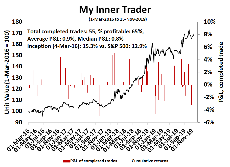
My inner trader uses a trading model, which is a blend of price momentum (is the Trend Model becoming more bullish, or bearish?) and overbought/oversold extremes (don’t buy if the trend is overbought, and vice versa). Subscribers receive real-time alerts of model changes, and a hypothetical trading record of the those email alerts are updated weekly here. The hypothetical trading record of the trading model of the real-time alerts that began in March 2016 is shown below.
The latest signals of each model are as follows:
- Ultimate market timing model: Buy equities
- Trend Model signal: Bullish
- Trading model: Bullish
Update schedule: I generally update model readings on my site on weekends and tweet mid-week observations at @humblestudent. Subscribers receive real-time alerts of trading model changes, and a hypothetical trading record of the those email alerts is shown here.
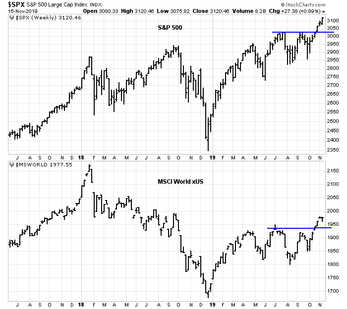
New market highs
Two weeks ago, I indicated that investors should buy the breakout (see Buy the breakout, recession risk limited). I cited as bullish factors strong price momentum, low recession risk, evidence of a global cyclical recovery, and evidence of institutions and hedge funds caught offside with excessively defensive portfolios.
Since then, US equity indices have soared to all-time highs, and non-US markets have risen to new recovery highs. Seemingly overnight, all the bears seem to have capitulated and turned bullish.
While I remain bullish, good investors always examine their assumptions. What could derail this bull case?
I concluded that market participants seem have gone all-on on risk in a steady FOMO stampede. While my base case scenario continues to be bullish, there is a risk that the perception of a global cyclical rebound, which is mainly led by China, could be a mirage. Prudent investors should monitor key real-time market based indicators of the Chinese economy for signs of decelerating growth, or financial stress.
Here comes the FOMO surge
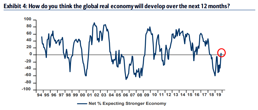
If anyone wanted an indication that a FOMO rally is underway, the widely watched BAML Global Fund Manager Survey served as confirmation. Portfolio cash levels dropped dramatically, and global growth expectations surged.
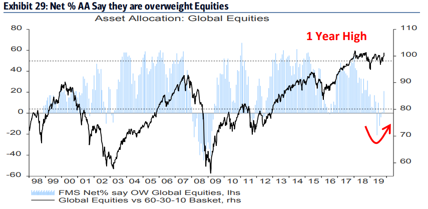
Global fund managers piled into equities from a severely underweight position to a one-year high. However, absolute weightings remain low by historical standards, indicating further buying power.
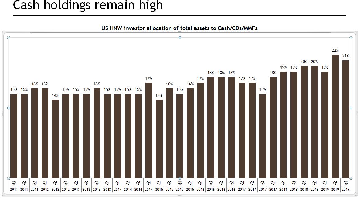
It is not just global institutions that have embraced risk. Marketwatch reported that UBS HNW survey told a similar story. HNW accounts held a high levels of cash, but readings are down from the previous quarter.
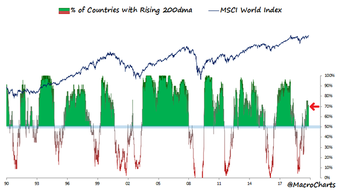
Most global equity markets are now in uptrends. If history is any guide, this is the start of a prolonged bull phase.
Bullish fundamental support
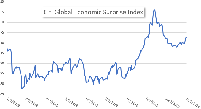
The rally has been supported by a variety of fundamental factors. First, the global economy is recovering, as evidenced by a rising Citigroup Global Economic Surprise Index, which measures whether macro data is beating or missing expectations.
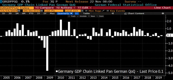
The air of gloom is definitely lifting. We saw some good news out of Germany, which is the export engine of the eurozone, avoid a recession by printing a surprise 0.1% GDP growth in Q3.
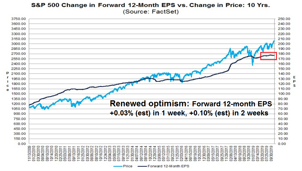
The nascent recovery is showing up in improving earnings estimates. The latest update from FactSet shows that forward 12-month estimates are rising again after a period of stagnation.
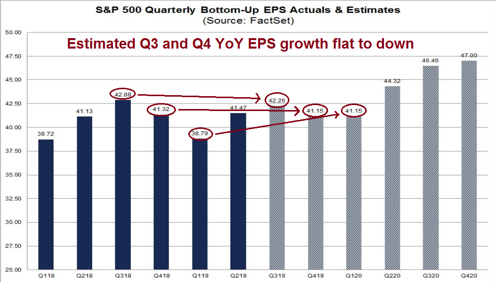
Further analysis reveals that expected Q3 and Q4 EPS growth is flat to down. Estimate risk is becoming increasingly asymmetric, and the chances of upside surprises under a cyclical recovery scenario is rising.
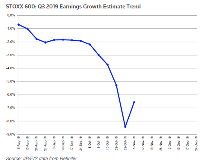
A similar pattern of positive earnings revisions can also be seen in Europe.
What’s the bear case?
While the weight of the evidence points to a multi-year bull phase, I do not discount the possibility that the buy signal could be a mirage.
The catalyst for the bear case is China. As this China bears’ favorite chart shows, debt levels have grown to historically unsustainable levels. Moreover, much of it is unproductive debt that will eventually have to be resolved in some fashion.

As China watcher Michael Pettis pointed out, China has painted itself into a corner, and Beijing has only a set of limited and unpalatable policy options.
To recap, all of the plausible policy choices available to Beijing are limited to one or some combination of the following three options: more unemployment, more debt, or more wealth transfers. This is because China (and indeed most economies) is limited to six economic paths, of which only three are plausibly available if Beijing wants to avoid surging unemployment:
- A rise in unemployment or stagnant wages. This occurs when an economy is unable to generate sufficient growth to maintain demand for workers. (The remaining five options, by definition, do generate sufficient growth.)
- A sustainable increase in investment. This would entail additional investment such that the growth in debt-servicing capacity exceeds the growth in debt. Although this option is technically open to Beijing, achieving it has been much easier said than done over the past decade. We can reasonably assume that Beijing is no longer capable of engineering enough productive investment to keep the economy growing fast enough to prevent a rise in unemployment or wage stagnation.
- An unsustainable increase in investment. This would mean an increase in nonproductive investment (in projects whose value is less than the cost of the investment), a choice that would worsen the country’s overall debt burden. China has followed this path for the past few years but may soon reach its debt limits.
- A sustainable increase in consumption. In China’s case, this would signify an increase in the consumption share of GDP that is driven by a corresponding increase in the household income share. (And this would likely further lead to an increase in sustainable private-sector investment.) This is the goal of Chinese rebalancing— effectively transferring wealth from elites, businesses, or governments to ordinary Chinese households—but achieving it has proven very difficult politically.
- An unsustainable increase in consumption. This outcome occurs when consumption growth is driven by rising household debt, which (obviously) would worsen the overall debt burden. China has followed this path for the past three years but may soon reach its debt limits. Coincidently, this path also seems to have been the main driver of U.S. growth for the past decade or more.
- A rising current account surplus. This option is only plausibly achievable for very small economies whose rising surpluses can be easily absorbed by the global economy.
These six pathways logically cover every possible option open to Beijing. If we exclude the second and sixth options as unrealistic, and if we acknowledge that the third and fifth choices both would lead to a rising debt burden, Beijing is effectively left with the same three aforementioned options as described in the Barron’s article [written by Pettis]: an increase in unemployment (option 1), an increase in the debt burden (options 3 and 5), or greater wealth transfers (option 4).
Bottom line: Either the Chinese economy crashes, or growth slows to a more sustainable rate so the household sector can become the engine of growth. The most recent path has involved a controlled efforts at deleveraging while providing sufficient policy support to achieve a soft landing. Beijing has mostly succeeded so far. Debt growth has slowed without any significant cracks in the financial system, and the PBOC has not panicked by turning on the credit spigots.
Chinese demand remains a major driver of global growth. The SCMP reported that the Chinese government linked National Institute for Finance and Development is projecting a GDP growth rate of 5.8% next year, which is in line with IMF estimates. If a government sponsored think tank is forecasting a sub-6% growth rate, then in all likelihood the risks to the forecast is to the downside.
Ignoring for the moment the possible effects of the Sino-American trade war, how is any of this consistent with the idea of a global cyclical recovery?
Sebastian Dypbukt Källman at Nordea tweeted that China’s real M1 growth only provided a temporary boost to the global manufacturing, but he expects momentum to dissipate going into 2020. If Källman is right, then the global cyclical recovery is a mirage, and investors should fade the FOMO risk-on surge.
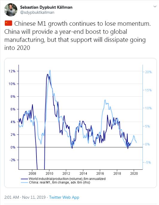
However, there are two unusual points to Källman’s analysis. First, he uses a six-month rate of change, instead of the more conventional 12-month change, which will take out any seasonal effects. Second, the inflation adjustment in the “real” M1 growth rate may be suspect.
Notwithstanding the usual doubts about China’s economic statistical reporting, Chinese inflation rates are especially subject to measurement error because of the effects of African Swine Flu on pork and other food prices. Here is the latest reported CPI, which spiked because of a surge in pork prices.
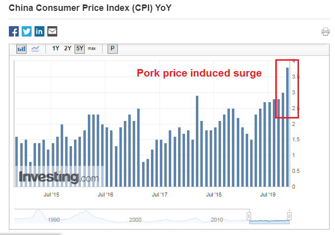
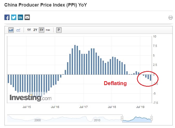
Here is China’s PPI, which is deflating. Which is right? Fortunately, core CPI (ex-food and energy) has been relatively steady at 1.5%, but the question of measurement error remains. How much of the spike in food prices have leaked into core CPI, and could that have distorted the real M1 growth rate?
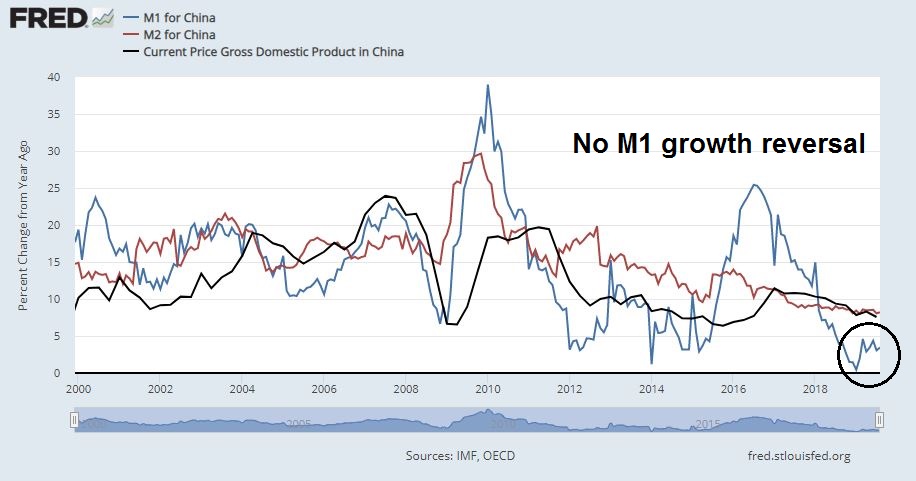
As a different way of addressing the issue, here are the nominal year/year M1 and M2 money supply growth rates, along with nominal GDP growth. We can make a number of observations from this chart:
- M2 growth is far more stable than M1 growth.
- While M1 growth is more volatile, it provides dramatic clues to trends in M2 growth, which tracks GDP growth well.
- There is no decline in year/year M1 growth, which is in stark contrast to the Nordea analysis.
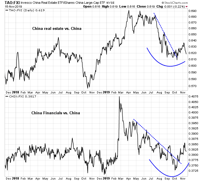
Real-time market data continues to be supportive of the cyclical recovery narrative. If stress levels are building in China’s financial system, we would see them in the behavior of the relative performance of the highly levered and cyclically sensitive property developers, and in the relative performance of financial stocks. So far, these indicators are not any warning signals.
The AUDCAD exchange rate has broken out of a downtrend and it is showing signs of stabilization. Both Australia and Canada are global resource exporters, but Australia is more sensitive to China’s economy, and Canada is more sensitive to the US economy. Notwithstanding the recent negative surprise in Australia’s job figures that tanked the AUD exchange rate, the AUDCAD rate is tracing out a constructive bottoming pattern indicating stabilization.

Trust, but verify
What should investors do? In the words of Ronald Reagan, “Trust, but verify.” I am inclined to give the bull case the benefit of the doubt, but I am not inclined to totally dismiss Nordea’s warnings either. These real-time signals are something to keep an eye on.
Should the market sidestep this false mirage of a cyclical rebound, the long-term outlook looks bright for risky assets. In the past, a negative 14-month RSI divergence after a monthly MACD buy signal has been a good warning sign of a major market top, which I signaled in August 2018 (see Major market top ahead? My inner investor turns cautious). However, investors should feel assured that such a signal is a long time away. The 14-month RSI is not even in overbought territory yet.

In conclusion, market participants seem have gone all-on on risk in a steady FOMO stampede. While my base case scenario continues to be bullish, there is a risk that the perception of a global cyclical rebound, which is mainly led by China, could be a mirage. Prudent investors should monitor key real-time market based indicators of the Chinese economy for signs of decelerating growth, or financial stress.
The week ahead
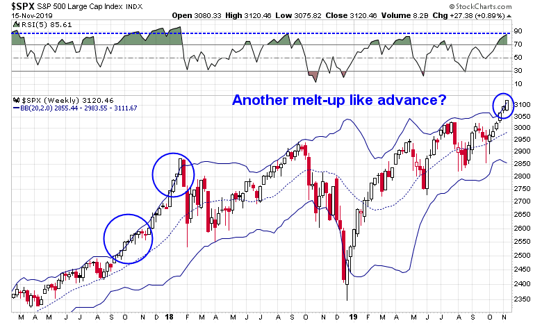
Dow 28,000! The DJIA has reached 28,000 on Friday and closed at an all-time high. Both the S&P 500 and NASDAQ Composite also closed at all-time highs. The good news is this is starting to feel like the melt-up the market experienced in late 2017. It is unusual for the index to close above its upper Bollinger Band on the weekly chart. This market has so far managed two consecutive closes above its upper BB. The last time this happened was the steady melt-up of late 2017.
The bad news is there are technical warnings everywhere.
Hindenburg Omen, Titanic Syndrome
Jason Goepfert at SentimenTrader observed that the NASDAQ had flashed both a Hindenburg Omen and a Titanic Syndrome on both last Wednesday and Thursday.
Cutting through all the noise of the ominous names, I wrote about the real meaning of the Hindenburg Omen back in 2014. The Titanic Syndrome is “when lows surpass highs, within seven trading days of a one-year peak”. Both the Hindenburg Omen and Titanic Syndrome are telling the same story. The Hindenburg Omen is also a signal of breadth bifurcation, which I explained this way in 2014:
The Hindenburg Omen indicator has a lot of moving parts and it is therefore confusing. I believe that the most important message in the Hindenburg Omen is the expansion of both new highs and low, indicating divergence among stocks and points to market indecision.
As the daily S&P 500 chart shows, it is unusual to see the market making new highs while net new highs drop to near zero or negative, which is what happened last week. Moreover, the 10-day correlation of the index with the VIX spiked above zero on Thursday. Notwithstanding the melt-up of late 2017, past high correlation signals have marked periods when the market advanced has stalled.
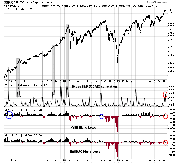
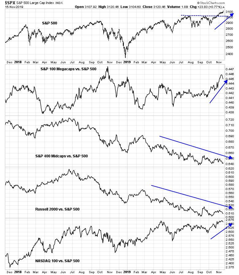
The analysis of leadership by market cap groupings reveals the Hindenburg and Titanic style bifurcations. The rally has been led by megacaps and NASDAQ stocks. Small and mid caps simply have not kept up. The NASDAQ Titanic Syndrome signal is therefore that more ominous considering that NASDAQ stocks have been the leaders, but net new highs fell below zero last week even as the index surged to a fresh high.
Macro Charts echoed the concerns raised by the Hindenburg Omen and Titanic Syndrome another way. He pointed out that market all-time highs accompanied by negative breadth occur only 0.8% of the time, which is very rare. However, these are only warning signs, and not actionable sell signals.

Sentiment is becoming frothy. The Daily Sentiment Index for the S&P 500 and NASDAQ 100 have reached 90 and 91 respectively, bullish extremes. SunTrust also reported that Mark Hulbert’s metric of newsletter sentiment is near a bullish extreme, which is contrarian bearish.

My own survey of market based sentiment indicators shows that 4 of 5 indicators are flashing red. While these indicators do not, by themselves, represent actionable sell signals, past tops has seen between 1 and 5 of these indicators sound warnings.
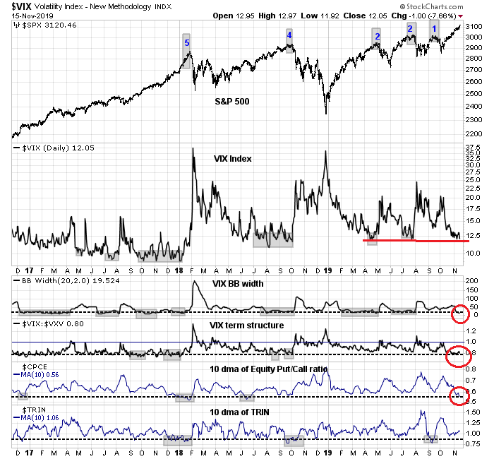
I am also seeing cautionary signs from cross-asset, or inter-market, analysis. The USDJPY exchange rate has been a strong indicator of risk appetite. A falling Yen (rising USDJPY) has historically been correlated with stock prices. USDJPY pulled back from an inverse head and shoulders pattern last week, which invalidates the bullish signal, though it remains in an uptrend. I interpret this as a sign that risk appetite is starting to fade.

Does this mean the trading outlooks is bearish? Well, yes and no. The short-term environment calls for caution, but a history of actionable trading signals, such as the spike in S&P 500 and VIX correlation, has generally seen pullbacks of no more than 1-2%. Trading guru Brett Steenbarger also made a similar comment about the market bifurcation theme on one occasion when the Hindenburg Omen appeared [emphasis added]:
Truly outstanding has been the plunge in my measure of correlation among stocks, which looks across both capitalization levels and sectors. Indeed, this is the lowest correlation level I have seen since tracking the measure since 2004. Correlation tends to rise during market declines and then remains relatively high during bounces from market lows. As cycles crest, we see weak sectors peel off while stronger ones continue to fresh highs. As those divergences evolve, correlations dip. Right now we’re seeing massive divergences, thanks to relative weakness among raw materials shares (XLB), energy stocks (XLE), regional banks (KRE), and small (IJR) and midcap (MDY) stocks. Why is this important? Going back to 2004, a simple median split of 20-day correlations finds that, after low correlation periods, the average next 20-day change in SPX has been -.33%. After high correlation periods, the average next 20-day change in SPX has been +1.43%.
Are you afraid of an average loss of -0.3%, with likely maximum drawdown of 1-2%? The market is undergoing a powerful uptrend. The market has been afforded lots of opportunity to fall, but it is not not responding to bad news. As an example, Market Insider reported Friday that Trump is not ready to sign a trade deal. The market shrugged off the news. This is not a weak market. Nevertheless, the current sentiment backdrop suggests that a brief pause is likely, but any pullback will probably be shallow.
My inner investor remains bullishly positioned, but he sold some covered call options against selected long positions to collect the premium. My inner trader took some partial profits late last week. He remains long the market, and he is prepared to buy any dip that may appear.
Disclosure: Long SPXL
The bullish macro case in the US is base on consumer spending staying strong. That is even more true in China. Workers save a huge amount of their paychecks. I could be wrong but I think it is 40%. The push by Chinese officials is to boost retail spending over infrastructure and real estate. It’s working. Consumer spending is growing close to 9% YOY. China consumer ETF CHIQ is outperforming other subgroups and the MSCI China Index. Note also that this sector is not a user of commodities as does infrastructure.
As long as CHIQ is going up, I wouldn’t worry too much about economic difficulties.
I’m starting to think that the current liftoff is due to monetary policy similar to September 2012. It was at that meeting that Bernanke said the Fed would open the QE spigot full force at least until 2015 and even live with inflation over 2% to give a cushion to deflation fighting. Markets did extremely well.
Here in the September 2019 meeting, the Fed announced the ‘this is not QE’ massive QE. To goose financial markets when we are at record highs and running a $trillion deficit is (I’m trying to find the right superlative) ….
The markets are becoming divorced from Main Street. The are floating on a sea of easy money. Trying to explain economic event with trends in corporate earnings or macroeconomics is fruitless.
The best performing two stock market indexes are Venezuela and Argentina’s. They go up big every week. I bet the Venezuela index hasn’t had a down day this year. But they say nothing about their economy. They float on money printing.
Note that the gains in the US market are large cap not the domestic Main Street indexes like Russell Smaĺl cap or the Transports. This tells me this is an institutional buying spree. This is where QE cash goes. Also these investors have been burned and turned off of overpriced private equity deals. IPOs are flopping. Cash that would have gone to this area will now go to listed large cap stocks.
This flood of Fed money and government deficit spending floats the boat as we scratch our heads about the stagnant economy not justifying the high prices.
My motto is when you are in a flood “go with the flow”. Now that is the Quality Factor. It combines some growth but not FAANG type, dividends but not sleepy dividend company type and strong low debt balance sheets that will be stellar if junk bonds implode.
Ken, always great to see you post. Thank you. Where are you seeing the evidence of institutions moving away from Private Equity and IPOs and putting money in large caps? Would you mind sharing the ETFs to invest in businesses that fit your ‘Quality factor?’ I wonder the odds of junk bonds imploding over the next 6 months as the economy continues to climb uphill and the interest rates stay low.
The quality ETF I use is SPHQ. At their home web page you can download a list of the 100 companies in it.
I watch corporate bonds via the St. Louis Fed site. The BBB yield spreads are very tame and show no real stress. The CCC true junk are showing an ominous rising spread nearing recent highs. If this surges to new highs and accelerates, I will turn VERY bearish. Central bankers and .any experts have said corporate bonds are the biggest potential downfall of the economy and the stock market. I have no idea as to when or if that will happen.
I have seen no proofs that money is shifting from private equity to public large cap stocks. It just seems reasonable since a bubble in private equity has burst. IPO failures show that private valuations were too high. Institutions must be in equities to earn their portfolio target rate of return. If not private then public is the choice.
Thank you, Ken, for your response.
Thanks Cam for an excellent report and Ken for a great feedback.