Preface: Explaining our market timing models
We maintain several market timing models, each with differing time horizons. The “Ultimate Market Timing Model” is a long-term market timing model based on the research outlined in our post, Building the ultimate market timing model. This model tends to generate only a handful of signals each decade.
The Trend Model is an asset allocation model which applies trend following principles based on the inputs of global stock and commodity price. This model has a shorter time horizon and tends to turn over about 4-6 times a year. In essence, it seeks to answer the question, “Is the trend in the global economy expansion (bullish) or contraction (bearish)?”
My inner trader uses the trading component of the Trend Model to look for changes in the direction of the main Trend Model signal. A bullish Trend Model signal that gets less bullish is a trading “sell” signal. Conversely, a bearish Trend Model signal that gets less bearish is a trading “buy” signal. The history of actual out-of-sample (not backtested) signals of the trading model are shown by the arrows in the chart below. Past trading of the trading model has shown turnover rates of about 200% per month.
The latest signals of each model are as follows:
- Ultimate market timing model: Buy equities
- Trend Model signal: Bullish
- Trading model: Bearish
Update schedule: I generally update model readings on my site on weekends and tweet mid-week observations at @humblestudent. Subscribers will also receive email notices of any changes in my trading portfolio.
Important questions for the bond and stock markets
As the 10-year Treasury yield staged an upside breakout at 2.6%, and luminary investors such as Bill Gross, Jeff Gundlach, and Ray Dalio have declared the bond bull to be over, I have a number of key questions for the markets. First and foremost, “What’s the pain trade?”
How these questions are resolved will also have important implications for the future direction of stock prices.
Which signal do you believe?
One of the most important question for the bond market is, “Which signal do you believe?”
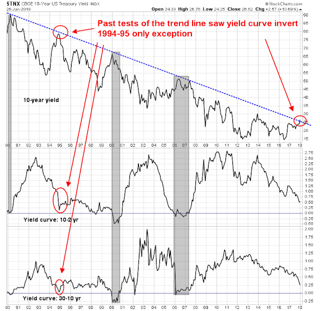
As the chart below shows, past tests of the downtrend in 10-year Treasury yields has coincided with yield curve inversions. The only exception was in 1994-95. Even then, that episode saw the yield curve flatten dramatically.
Fast forward to 2018. The yield curve is flattening, but nowhere near inversion. The 2-10 spread has been volatile and it has been bouncing between 50bp and 60bp. The 10-30 spread flattened to 25bp, which is a cycle low, but neither the 2-10 nor the 10-30 spreads are inverted.
Here is the critical question: “Do you believe the signal from the upside breakout in yield, or the yield curve?”
If you believe that the yield curve is flashing a false signal, and it should really be inverted because central bankers have distorted its shape with their endless QE programs, then the economy is nearing recession and investors should therefore adopt a risk-off posture in their portfolios. If, on the other hand, you believe in the validity of the yield curve signal, which indicates that the economy is far from an inversion and therefore a recession warning, then the upside breakout is a response to rising inflationary expectations, then the bond market is indeed entering a bear market.
A lurking growth disappointment?
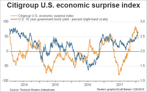
Here is one way to resolve that conundrum. Experienced bond investors understand that bond yields are correlated with growth expectations. As the chart below shows, 10-year Treasury yields have been tracked the Citigroup US Economic Surprise Index (ESI), which measures whether macroeconomic releases are beating or missing expectations.
Here is another important question, “As economic data have disappointed and the ESI fallen in the last few weeks, why haven’t bond yields followed?”
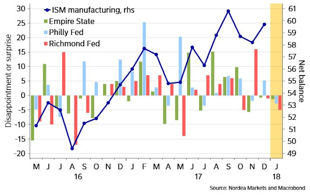
Even before the Q4 GDP miss last Friday, Nordea Markets pointed that regional Fed indices were coming below expectations.
Last Friday, the headline Q4 GDP came in at 2.6%, which was well below Street expectations of 3.0%, the Atlanta Fed’s GDPnow nowcast of 3.4%, and the New York Fed’s nowcast of 3.9%. Moreover, the GDP Deflator came in ahead of expectations, indicating rising inflationary pressures. That’s growth bearish, right?
There was, however, some debate about the underlying strength of the American economy based on the internals of the GDP report. Ryan Detrick of LPL pointed out that growth was actually quite good once you strip out the inventory and trade effects.
David Rosenberg, by contrast, chose to focus on the negatives.
Rosenberg came to an ominous conclusion for stock and bond prices.
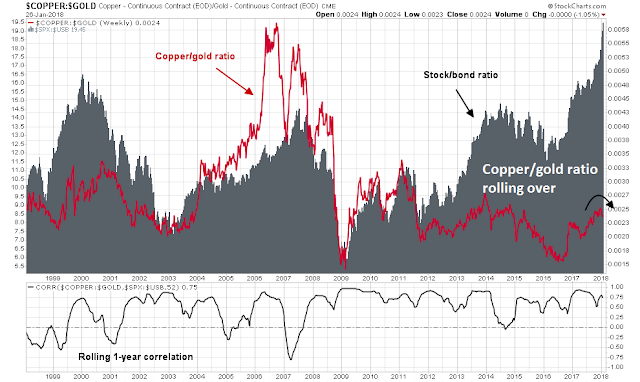
Who is right? There are signs that the market may see a downside growth surprise in the near future. The chart below shows the copper/gold ratio (red line), which is a highly sensitive indicator of cyclical growth, and the stock/bond ratio (grey bars), which measures risk appetite. The bottom panel shows the rolling one-year correlation of these two series, which validates the effectiveness of the copper/gold ratio indicator. As the chart shows, the copper/gold indicator is starting to roll over, which is a signal that global growth momentum may be stalling.
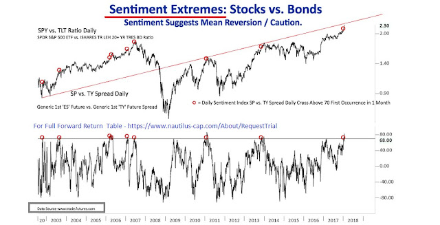
Nautilus Research also found that the stock/bond sentiment is at an extreme. Such conditions have historically signaled bond market rallies and weak stock markets.
Tiho Brkan also found a similar bullish bond market signal based on the stock/bond sentiment of the BAML Fund Manager Survey.
After the latest upside yield breakout and everyone loudly proclaiming the death of the bond bull, it appears that bond prices are poised for a rally based on disappointing growth expectations. That’s one pain trade the market is setting up for. Such a scenario is equity bearish. In light of the recent market melt-up, I remind readers of Bob Farrell’s Rule #4: “Parabolic markets go further than you expect, but they don’t correct by going sideways.”
Buy when bond blood is running in the streets
Admittedly, buying bonds and interest sensitive issues today is like trying to catch a falling knife. However, there are a number of other important investment implications to the bond rally thesis, and there are opportunities in crowded extreme positions where the proverbial blood is running in the streets (another pain trade).
The following chart provides a graphical illustration of the correlation between yields and commodity prices.
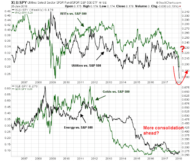
The chart below shows the relative performance of interest sensitive sectors of the stock market (top panel), and the inflation sensitive sectors of the market (bottom panel). If bond prices were to rally, then investors should focus on buying the former and avoiding the latter. Under such a scenario, inflation sensitive sector such as energy, gold, and mining may need more time to consolidate sideways relative to the market. Similarly, growth and momentum stocks are likely to lose their mojo and correct.
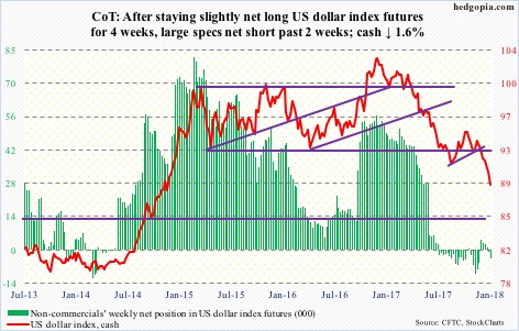
If commodity sensitive stocks were to underperform, another crowded trade that is likely to reverse is USD weakness. The latest Commitment of Traders report shows that large speculators are in a crowded short in the USD, and crowded long in the euro.
The USD Index is now testing a key long-term Fibonacci support level and a rally could occur at any time.
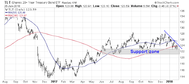
Tactically, interest sensitive vehicles are not showing signs of a bottom yet. While investors could take a partial position now, traders may wish to either wait for a test of support, or an upside breakout of the downtrend line before making large commitments. The long Treasury bond ETF (TLT) is one example of this technical pattern.
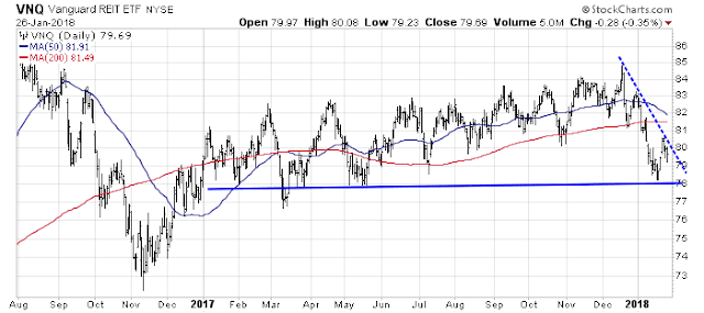
REITs are also showing a similar pattern of approaching technical support while a downtrend line defines a possible bullish breakout.
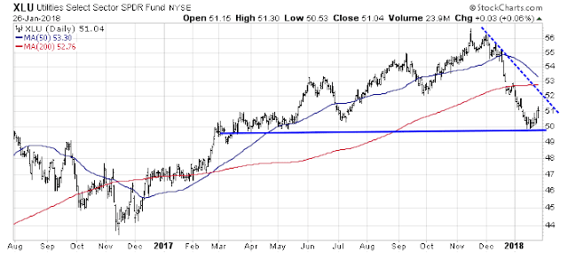
Utilities have a less well define downtrend, but the technical pattern is roughly the same.
Nearing an inflection point?
Looking to the week ahead, the environment continues to be dominated by the FOMO stampede to buy stocks. As a possible sign of capitulation, Jason Goepfert at SentimenTrader threw up his hands Friday morning. Historical studies of sentiment, breadth, and overbought/oversold indicators don’t seem to matter anymore.
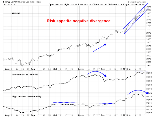
Still there are some signs that market internals are starting to weaken. Risk appetite indicators, as measured by price momentum and high beta/low volatility performance, are weakening. If the rally is based on rising risk appetite and price momentum, negative divergences in these indicators are warning flags for traders. Moreover, the latest SPX rally has been well defined by a rising channel, and the market closed Friday at the top of the channel. At a minimum, it is likely to pull back or consolidate next week even the advance were to continue.
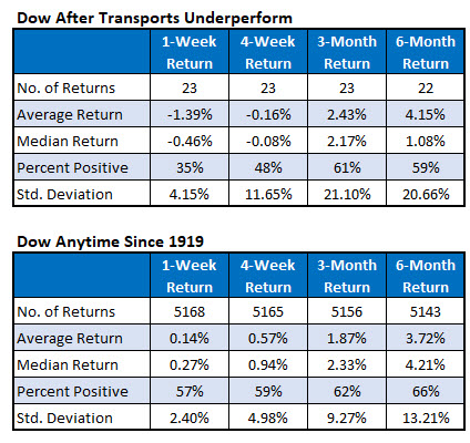
Schaeffer’s Research also highlighted the weak performance of the DJ Transports. The Dow has not performed well after such episodes.
For what it’s worth, Tom McClellan found an unusual relationship between Bitcoin prices and the DJIA, where BTC leads DJIA by eight weeks. If his analog is correct, then expect stock prices to top out the week of February 8, 2018.
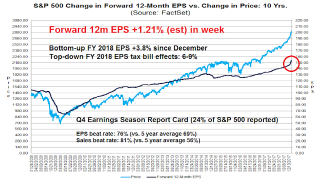
That timeframe is consistent with the latest Q4 earnings season update from FactSet. Bottom-up consensus forward 12-month EPS estimates continue to scream upwards, and bottom-up 2018 EPS estimates are up 3.8% since the passage of the tax cuts. While company analysts have hesitated to raise their estimates until they knew the precise details of the tax bill and the specific effects on their companies, top-down strategists have not been so shy and they have penciled in a 6-9% increase in 2018 EPS. At the current rate of revisions, tax-related upward estimate revisions should level out in about two weeks, or the week of February 8.
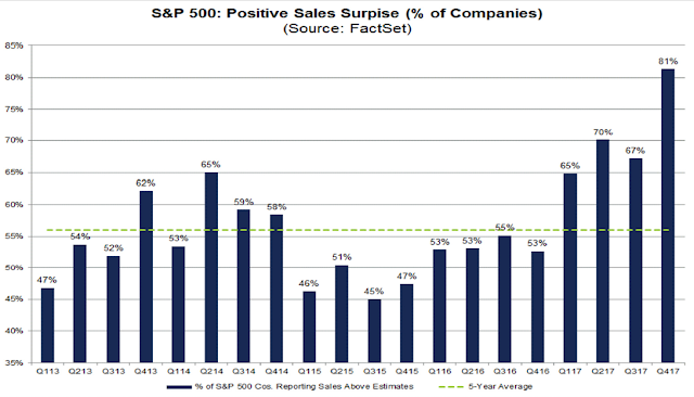
To be sure, estimate revisions may continue to rise after the tax bill effects wear off as positive revisions are based on a combination of favorable tax treatment and the positive cyclical effects of higher growth expectations. Q4 earning season has seen above EPS beat rates, an off-the-charts sales beat rate, and an extremely positive guidance rates for Q1.
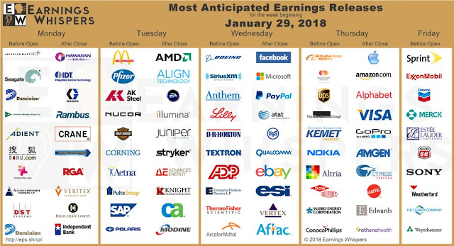
It will be an open question whether faltering top-down growth expectations can overwhelm positive bottom-up guidance. Next week will could see some event-based volatility. We can look forward to the State of the Union address (Tuesday night), Janet Yellen’s final FOMC meeting as Fed chair (Tuesday and Wednesday), and the January Jobs Report (Friday). Q4 earnings season is also continuing and there will undoubtedly be stock specific surprises. Watch for earnings reports from momentum favorites Amazon (AMZN), Apple (AAPL), Boeing (BA), Facebook (FB), Alphabet (GOOGL), and VISA (V) for sources of volatility.
My inner investor remains equity bullish and he is enjoying this melt-up. My inner trader took a small short position last week. He is nervously waiting to see if risk appetite will break downwards. Farrell’s Rule #4 suggests that any breakdown will be a doozy.
Disclosure: Long SPXU





Davos has been a global growth love-fest. The only thing that will stop this melt-up is running out of new investors.
Bought gold miners in mid-December and they are doing fine.
Bought gold bullion ETF last week as a fixed income alternative for conservative clients.
Global Central Bankers are keeping rates at low levels that should only be for extreme economic distress when on the contrary we have high global synchronized growth. Totally irresponsible.
U S Treasury Secretary blessed a lower dollar. Now others must keep rates low or their currency will rise and hurt their economy. Blind leading the blind.
Gold seems a rational choice with this insanity.
I never believed the gold bugs calls for $10,000 bullion but Bitcoin has shown that absurd gains can happen in currency-related things. Who knows?
Jason Goepfert only needs to remember one thing, $13 trillion since 2010, and still buying on net. This is and has distorted everything, and if you believe Richard Koo’s thesis (which I do and listen for the first 10 and last 30 minutes), things could get even more nutty.
https://www.youtube.com/watch?v=8YTyJzmiHGk
Many thanks for the video link….there are some amazing charts in that presentation.
Thank you for the link. I think it’s pure gold! Watched the whole video and it was time very well spent! He was very frank and made things intuitive and easy to understand. So many things just clicked together. A hallmark of a genius. Funny at how casually trashed George Bush Jr, Clinton and other bigwigs. Must’ve seen too many BS in his life to care anymore.
curious about your take on this: http://thereformedbroker.com/2018/01/21/a-momentum-signal-that-occurs-just-one-percent-of-the-time/
The bullish thesis is that the market is undergoing a momentum driven melt-up, and these episodes can carry on longer than anyone expects.
I agree.
However, momentum driven parabolic moves all end eventually. One of the clues is a stall out in the price momentum factor, which occurred last week even as the market rallied.
Is that a sufficient warning?
Very interesting this week (and great call on the correction) – so we’ve had a vol move in the bond market and the FX market which we see hitting the stock market (as the Vix was bid last week with equities still going up) and I guess this hits risk parity – + alleged large month end rebalancings happening today, selling of equities.
It seems the regime is definitely changing, intraday volatility is going up, which bigger picture you would expect as we approach the global net QT change later this year.
Whether we have seen the top or we push higher yet again once this week is over (wouldn’t be surprised) I don’t know. Which makes it very hard to call. Annoying now as VIX has moved so much it’s removes a lot of the cheap OTM option strategies for now…..
Good luck