Preface: Explaining our market timing models
We maintain several market timing models, each with differing time horizons. The “Ultimate Market Timing Model” is a long-term market timing model based on the research outlined in our post, Building the ultimate market timing model. This model tends to generate only a handful of signals each decade.
The Trend Model is an asset allocation model which applies trend following principles based on the inputs of global stock and commodity price. This model has a shorter time horizon and tends to turn over about 4-6 times a year. In essence, it seeks to answer the question, “Is the trend in the global economy expansion (bullish) or contraction (bearish)?”
My inner trader uses the trading component of the Trend Model to look for changes in the direction of the main Trend Model signal. A bullish Trend Model signal that gets less bullish is a trading “sell” signal. Conversely, a bearish Trend Model signal that gets less bearish is a trading “buy” signal. The history of actual out-of-sample (not backtested) signals of the trading model are shown by the arrows in the chart below. Past trading of the trading model has shown turnover rates of about 200% per month.
The latest signals of each model are as follows:
- Ultimate market timing model: Buy equities
- Trend Model signal: Risk-on
- Trading model: Bullish (upgrade)
Update schedule: I generally update model readings on my site on weekends and tweet mid-week observations at @humblestudent. Subscribers will also receive email notices of any changes in my trading portfolio.
Late cycle = Market top?
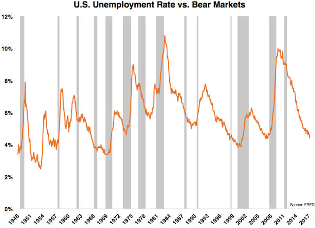
Ben Carlson recently published some research that related the unemployment rate to long-term equity returns. The current unemployment rate currently at 4.4% is indicative of a late cycle expansion and a possible signal of an impending bear market just around the corner.
Carlson showed that it pays to buy stocks when unemployment is high (and therefore blood is running in the streets) and lighten up positions when they are low.
Several readers sent me Carlson’s article and asked me how far I believed we are from an equity bear market. With that question in mind, I offer the following checklist of a market top, based on four different categories of indicators:
- Sentiment: Is it getting frothy? Are silly deals getting done?
- Equity market internals: Are there signs of breadth deterioration, or defensive sector leadership?
- Credit market signals and monetary policy: What does the bond market tell us about growth expectations and credit conditions?
- Macroeconomic conditions: Is the US economy starting to falter?
Frothy sentiment
By many measures, long-term investor sentiment is starting to show signs of froth. I have noted before the highly elevated levels of the TD-Ameritrade Investor Movement Index.
As well, the latest BAML Fund Manager Survey shows that institutional managers are throwing caution to the wind, as the incidence of hedging has been falling dramatically.
I have also highlighted anecdotal evidence of market froth in the past, such as the SEC approval of a quadruple leverage ETF, and Mike Tyson becoming the front man for an online brokerage firm. These are not things that you find at market bottoms.
While there is little question that long term sentiment metrics are showing signs of froth, the market has not seen the signs of a FOMO (Fear of Missing Out) blow-up top just yet. The BAML Fund Manager Survey shows that cash levels are still above average. On the other hand, portfolios are showing high beta characteristics. Institutions are nearing a crowded long in equities, a crowded short in bonds, and roughly neutral weight in commodities. Within the equity portion of their portfolios, managers are underweight the US and UK, while overweight Europe and Japan, which are of high beta reflationary trades.
I would add, however, that not all sentiment surveys agree with the BAML results. Ned Davis Research observed that mutual fund cash is at historical lows, which is a negative for equity prices.
Score sentiment as becoming excessive, but no signs of a blow-off top. Call it a cautionary flag.
Few signs of breadth deterioration
Market tops are often preceded by the deterioration of market internals. Breadth begins to lag. Sector leadership rotates to defensive stocks. There are few signs of that happening today.
The chart below depicts the 15 year history of the SPX and selected breadth indicators. The NYSE Advance-Decline Line (top panel, green line) topped out a few months before the actual market top in 2007, and it flashed a negative divergence when the market retested its high. Both the % bullish on point and figure chart (middle panel) and % above 200 dma (bottom panel) indicators deteriorated before the actual market top in 2007 and also gave advance warnings of the correction in 2015. There are no signs of significant breadth deteriorating today.
On the other hand, a glance at the relative performance of stocks against bonds tells a slightly different story. While the stock/bond ratio is not a traditional breadth indicator in technical analysis, it does nevertheless measure risk appetite. This ratio has warned with negative divergences at past market tops and the correction of 2015. Currently, there is a minor negative divergence that will have to be monitored.
Here is another way of thinking about the above chart. If equities were to rise to fresh new highs, but the stock/bond ratio were to continue their negative divergence, then that would mean higher bond price that offsets stock price strength. If this is happening in an environment where the Fed is raising interest rates, then it would only mean that the yield curve is flattening. A flattening yield curve is the bond market’s way of anticipating slower economic growth. An inverted yield curve, where long yields are lower than short yields, has been a surefire signal of recession.
As for the rise of defensive leadership, you have got to be kidding! The chart below shows the strong relative performance of Technology (top panel) and momentum stocks (second panel). By contrast, the relative returns of the defensive Consumer Staples (third panel) and Utilities (bottom panel) show that these sector are basing, and not showing any leadership qualities.
Score market internals as still bullish.
Credit market are still healthy
Another way of telling if an equity bear is lurking in the bushes is to watch how the credit markets are behaving. So far, credit market conditions are still healthy.
One sign of an impending recession are rising real interest rates that choke off growth. As the chart below shows, real Treasury Bill rates have been in a downtrend but ticked up recently. Current conditions are not indicative of an imminent economic slowdown. However, real T-Bill yields will need to be monitored as the Fed proceeds with its course of rate normalization this year.
Another sign of economic stress are widening credit spreads. The canary in the coalmine is high yield credit, or junk bonds. So far, the HY market is showing few signs of stress.
Here is another perspective on the credit cycle from Calculated Risk. The trend in household debt delinquencies have flattened, but not turned up. Wait for the signs of an uptick before getting concerned.
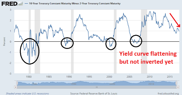
The yield curve has been an uncanny forward looking recession indicator. The 2/10 curve has inverted, or gone negative, ahead of every recession. Here, the data is starting to raise a cautionary flag, as the 2/10 spread has been flattening and fell below 100bp last week. Still, readings are above levels seen last October and nowhere close to inverting yet. Nevertheless, the trend is negative and the shape of the yield curve is something I am keeping an eye on (also see above comment about the stock/bond ratio).
Score credit conditions as still positive, for now.
Macro: Clear skies today but possible storms on horizon
The picture on the macro front is still bright, but with some caveats. Short term indicators are still bullish. Short leading indicators, such as the Chemical Activity Barometer that leads industrial production, is strong (via Calculated Risk).
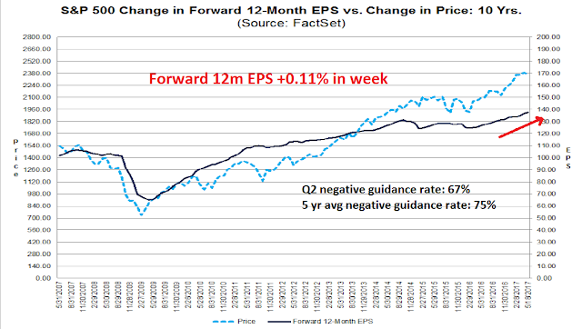
In addition, market coincidental indicators such as forward 12-month EPS estimates from FactSet are still being revised upwards. Q2 earnings guidance is also coming in at above historical norms, which is indicative of an upbeat outlook for the next three months.
On the other hand, housing may be showing early signs of turning down, according to New Deal democrat. This is one of the most cyclically sensitive sectors of the economy and forms an important part of the set of long leading indicators that are designed to spot recessions a year in advance. Last week’s release of housing starts and permits figures came in weaker than expected. More worrisome are possible signs of a stall in this sector, which could be an early warning sign of economic weakness. The Fed’s stated desire to raise rates will create a headwind for housing and construction.
Score macro conditions as bright today, but with possible storm clouds gathering on the horizon. New Deal democrat summarized current conditions well in his weekly monitor of high frequency economic indicators this way:
The nowcast for the economy remains positive The longer term forecast remains neutral to positive, shading a little closer to neutral based on the tightening yield curve, less robust growth in real money supply, and the last several months’ decline in housing permits.
No signs of a market top
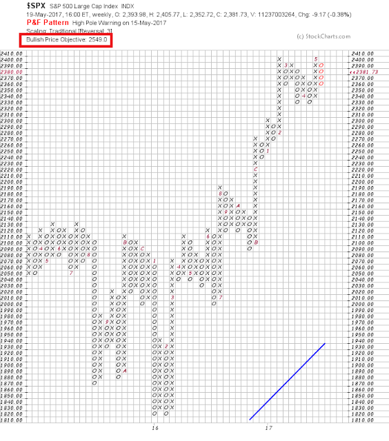
In conclusion, there are no signs of an imminent intermediate term market top. I continue to believe that the SPX point and figure target of 2549 is achievable this year, especially if the market surge to a blow-off top.
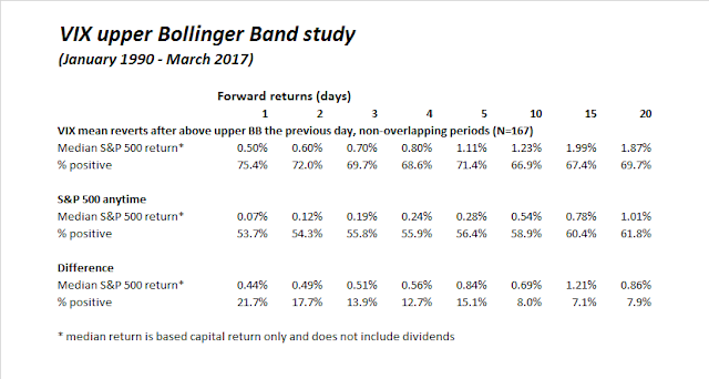
The near term outlook appears bullish as well. I emailed subscribers Friday that the trading model had flashed a buy signal because the VIX Index rose above its upper Bollinger Band during the week and mean reverted. The decline of the VIX below its upper BB coincided with the SPX rallying above its 50 dma, which is a key level of technical resistance.
Friday was day 0 of the VIX buy signal. If history is any guide, the coming week should see an upward bias in stock prices.
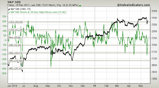
The latest breadth charts from Index Indicators show that readings has only recovered to neutral after getting oversold, which leaves the market room to rise should bullish momentum continue.
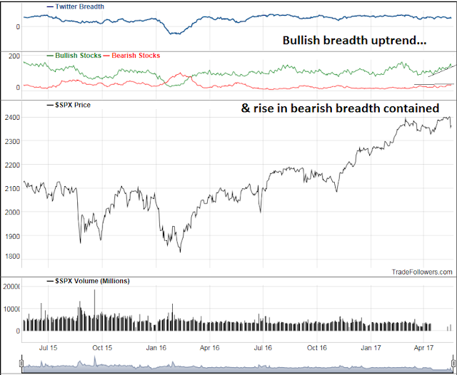
This chart of Twitter breadth from Trade Followers show that there are reasons for optimism about bullish momentum. The breadth of tweets about bullish stocks (green line) remains in an uptrend, while breadth breadth (red line) has stalled at resistance.
My inner investor remains bullishly positioned. My inner trader covered his short positions on Friday and reversed to the long side.
Disclosure: Long SPXL



A key sentiment indicator is NYSE margin loans. It peaks several months before a bull market peak. It is still going up so all is good.
Other than employment numbers, the US economic stats have weakened lately. Fed Funds futures for year-end 2018 are falling. This is positive for market valuation.
How does the latest price action with cryptocurrencies factor in to market euphoria?
Sentimentrader.com talked about the surge in Bitcoin speculation. Their conclusion was that it would cool since it’s reached previous peaks. As far as it’s relationship to stocks the last two peaks in Bitcoin did not correlate to stock highs.