Preface: Explaining our market timing models
We maintain several market timing models, each with differing time horizons. The “Ultimate Market Timing Model” is a long-term market timing model based on the research outlined in our post, Building the ultimate market timing model. This model tends to generate only a handful of signals each decade.
The Trend Model is an asset allocation model which applies trend following principles based on the inputs of global stock and commodity price. This model has a shorter time horizon and tends to turn over about 4-6 times a year. In essence, it seeks to answer the question, “Is the trend in the global economy expansion (bullish) or contraction (bearish)?”
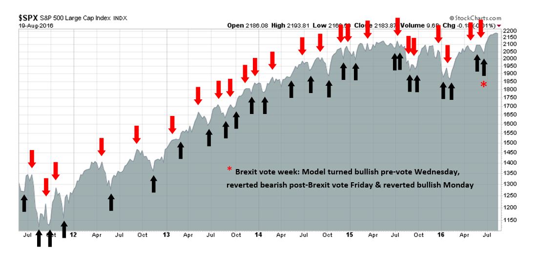
My inner trader uses the trading component of the Trend Model to look for changes in direction of the main Trend Model signal. A bullish Trend Model signal that gets less bullish is a trading “sell” signal. Conversely, a bearish Trend Model signal that gets less bearish is a trading “buy” signal. The history of actual out-of-sample (not backtested) signals of the trading model are shown by the arrows in the chart below. Past trading of the trading model has shown turnover rates of about 200% per month.
The latest signals of each model are as follows:
- Ultimate market timing model: Buy equities
- Trend Model signal: Risk-on
- Trading model: Bullish
Update schedule: I generally update model readings on my site on weekends and tweet any changes during the week at @humblestudent. Subscribers will also receive email notices of any changes in my trading portfolio.
The message from inter-market analysis
I have always believed in listening to the markets. Technical analysis is useful as it can be a way of discerning the market’s hidden message, especially when performing inter-market analysis, otherwise known as cross-asset analysis.
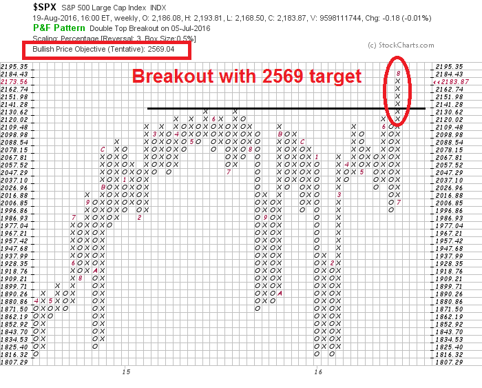
I have found point and figure charts to be particularly useful tools because they filter out a lot of the price noise, especially when markets trade sideways in a tight range as they have recently. As an example, my recent post that featured a SPX weekly point and figure chart got a lot of attention (see Be patient). Since I performed that analysis, not much has changed. The latest weekly chart pattern remains unambiguously bullish on an intermediate term basis. It also tells the bullish story of powerful price momentum, TINA (There Is No Alternative) and FOMO (Fear Of Missing Out), all rolled into one.
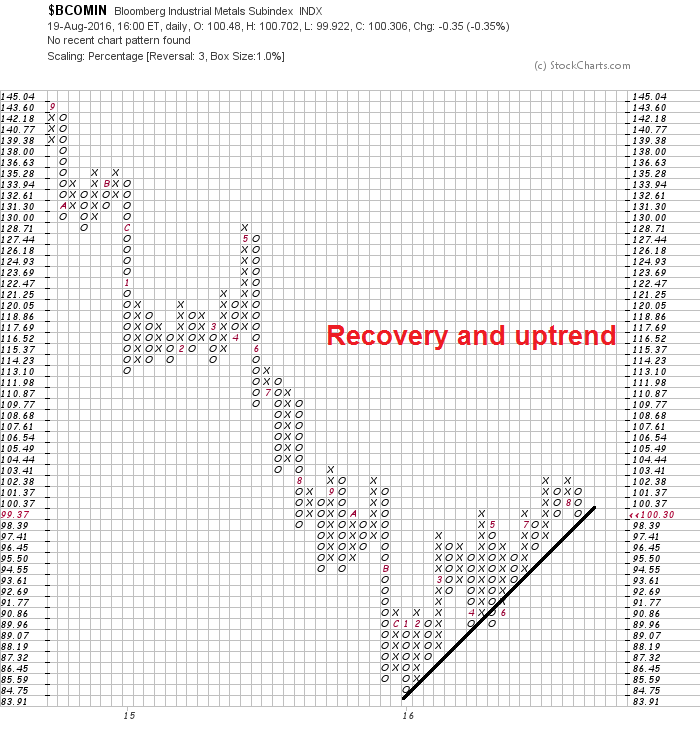
I reviewed my charts using this technique in order to get a fresh point of view and what I found astonished me. Over and over again, I was getting a lot of chart patterns like this from a single market sector.
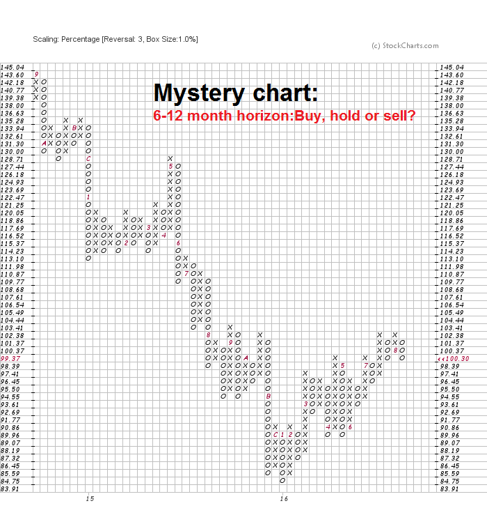
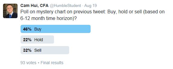
Bullish or bearish? The charted instrument is in a well-defined uptrend, but there is overhead resistance nearby. While I interpreted it bullishly, I wanted to be sure. A Twitter poll showed that the crowd agreed with me.
This results of this analytical approach was in effect a hidden message from Mr. Market. More importantly, the message has crucial medium term implications for the economy, interest rates, stock prices, and the likely trajectory of Fed policy.
A reflationary rebound
Intrigued? The mystery chart turns out to be industrial metals, which bottomed out late last year. The price of industrial metals are an important global signal of cyclical sensitivity. Their price recovery is telling the story of a global reflationary rebound.
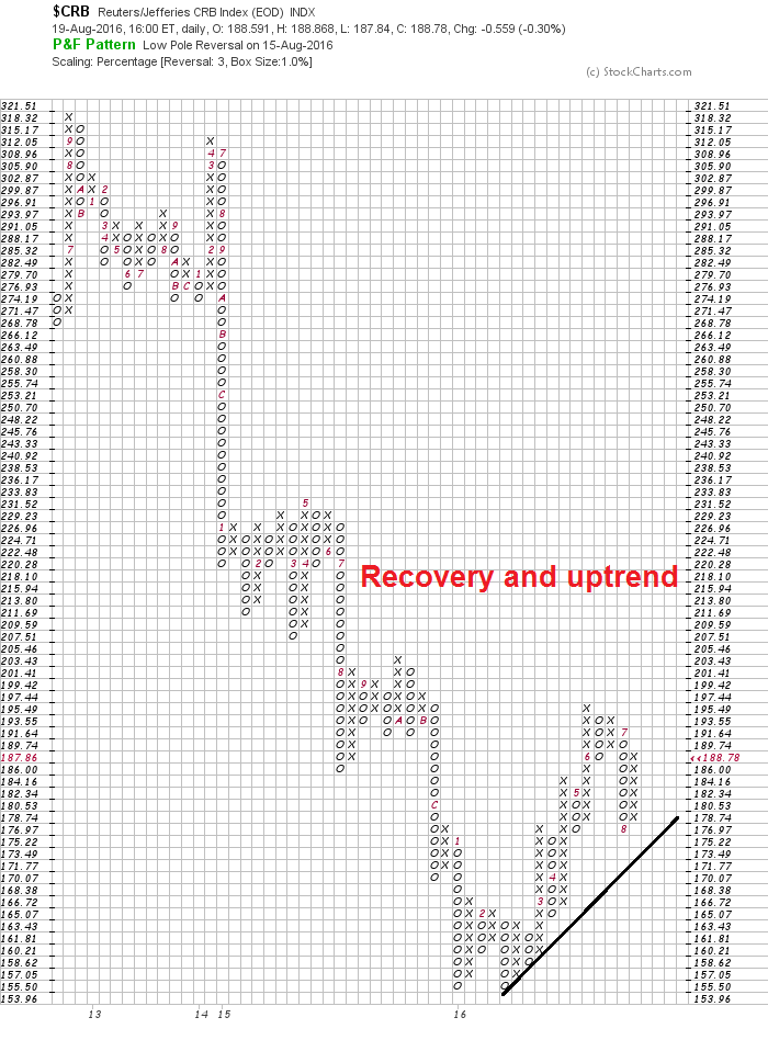
Here is the CRB Index. The CRB Index is heavily weighted in the energy complex and therefore more sensitive to movement in oil prices, which has been dragged down by its own demand-supply dynamics. Nevertheless, the pattern of a bottom and a recovery is the same as what we saw in industrial metals.
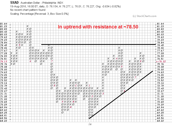
The charts of the commodity sensitive currencies are also telling the same story. Here is the Australian Dollar:
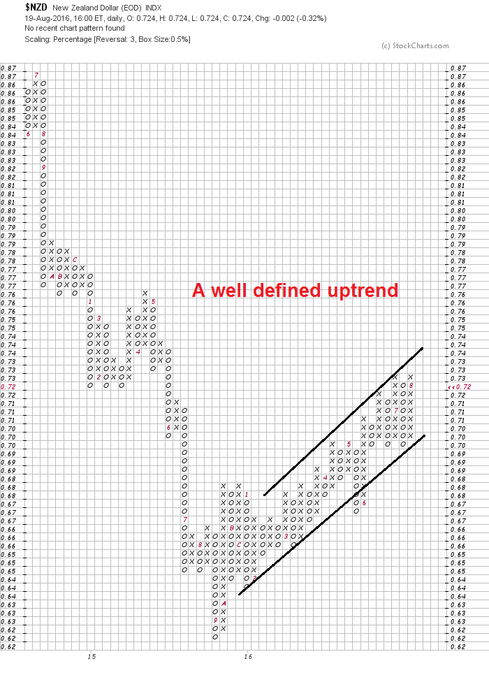
Here is the New Zealand Dollar:
The Canadian Dollar is thought to be more sensitive to crude prices. As oil have not performed as well as industrial metals, the loonie is not showing the same kind of bottom and uptrend as AUDUSD and NZDUSD. Nevertheless, it has participated in the commodity sensitive rally.

Commodity prices have been thought of primarily a barometer for Chinese growth, but their recovery is not just a story of Chinese demand. Analysis from Morgan Stanley shows that it is strong infrastructure spending from other Asian countries that is driving up commodities. Simply put, global commodity demand is broadening, which is indicative of broad based cyclical strength (via Bloomberg).
If commodity prices and commodity sensitive currencies are strengthening, then what does that mean for the inversely corrected US Dollar? As this two-year USD Index chart below shows, the USD has broken down out of an uptrend and it is approaching an important support zone.
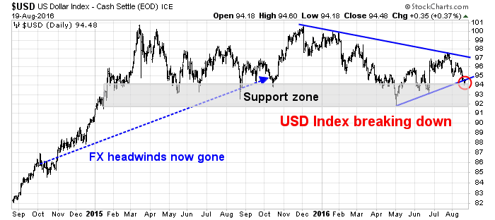
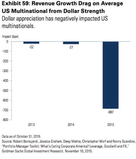
The USD strengthened strongly in late 2014 and early 2015, but it has largely flattened out since then. Dollar strength has had the negative effect of squeezing the operating margins of large multi-nationals, which created headwinds for earnings and therefore stock prices. The chart below is a little dated as it was produced in September 2015, when YoY exchange rate comparisons were still a problem for US exporters, but you can see the magnitude of the earnings effect.
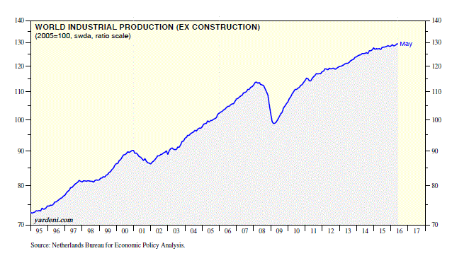
I therefore believe that the first message from the markets is the world is undergoing a reflationary rebound. Ed Yardeni pointed out last week that global industrial production has hit a new all-time high.
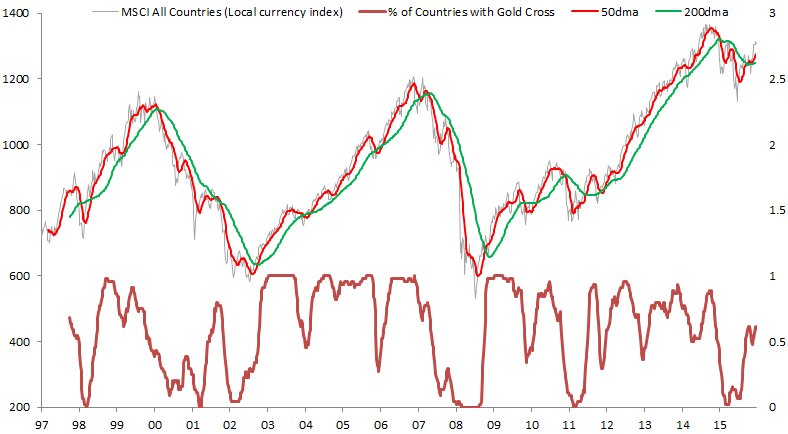
Stock markets around the world have begun to respond to the growth revival. Callum Thomas highlighted this chart, which shows the percentage of global market that have undergone golden crosses, which indicate technical uptrends (bottom panel). If history is any guide, this global reflationary rally has much more room to run.
Rising commodity inflation = ?
The second takeaway from this analysis is a signal of a resurgence in commodity inflation, which is likely to feed into the Fed’s inflation metrics. Such a change will eventually affect the tone of Fed policy, from the current cautious and dovish stance to a more aggressive program of interest rate normalization.
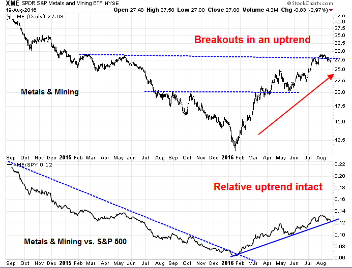
Rising commodity inflation is evident from the chart pattern of the hard asset sensitive industries and sectors of the US stock market. The chart below of the Metals and Mining stocks shows that they are experiencing upside breakouts in an uptrend (top panel). In addition, these stocks are in a well-defined relative uptrend when compared to the market (bottom panel).
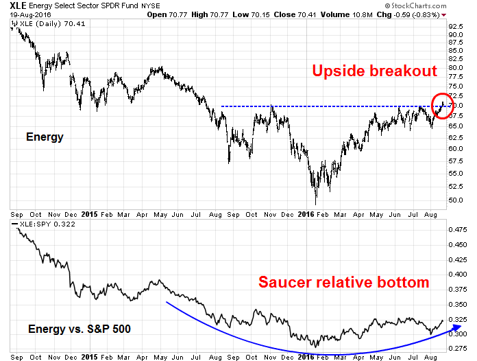
Energy prices have been weak compared to other major commodities. Nevertheless, energy stocks achieved an important upside breakout last week (top panel). In addition, they are tracing out a constructive saucer shaped bottom on a relative basis (bottom panel).
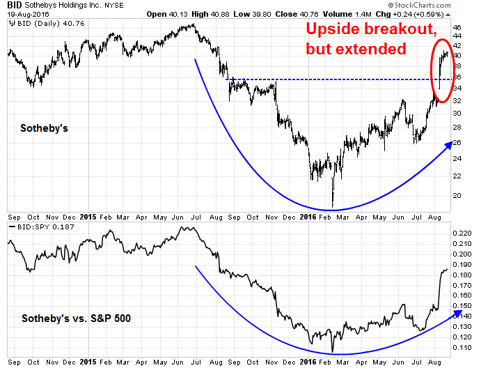
I used Sotheby’s Holdings (BID) as a proxy for the collectibles market. As the chart below shows, BID has rallied strongly and achieved an upside breakout, both on an absolute and relative basis. The stock appears to be a bit extended and may be due for a pullback, but the message from the market from mining, energy, and BID is the same: resurgent hard asset inflation.
Commodity inflation “transitory”?
Wait a minute! Doesn’t the Fed measure inflation on a core basis, which strips out the effects of food and energy? In the past, it has interpreted such price surges as transitory and ignored their effects. Indeed, most of the Fed’s metrics of inflation expectations have been trending down, not up.
This time may be different. That’s because the economy is the late stages of an expansion and excess capacity is diminishing. With the labor markets getting very tight and wage rates rising, hard asset inflation is likely to start leaking into both the core inflation rates and inflationary expectations. The Atlanta Fed’s Wage Growth Tracker shows that hourly wages have been steadily trending upwards and now stand at 3.4%, which is well above the Fed’s inflation target of 2.0%. Sooner or later, wage pressures will lead to cost-push inflation. Note that the wage cost-push inflation effect is independent of hard asset inflation.
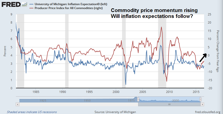
Inflationary expectations are also likely to start rising soon. The chart below shows the University of Michigan’s survey of inflation expectations (blue line, left scale) and commodity prices (red line, right scale). These two series have closely tracked each other in the past. Rebounding commodity prices are likely to start feeding into inflation expectations, which is a key input into monetary policy. So how “transitory” are food and energy effects on inflationary expectations?
The Fed’s delicate balance
In summary, the stage is set for a global reflationary rally in stock and commodity prices that will likely continue into 2017. The party is getting going. The key question for investors is when the Fed takes away the punch bowl.
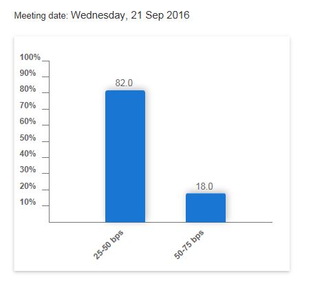
Currently, the CME Group’s Fedwatch Tool shows the odds of a rate hike at the September meeting to be only 18%, indicating a low probability of a September increase in the Fed Funds rate.
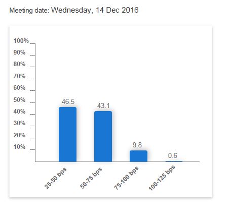
The odds of a rate hike at the December meeting is just over even odds at 53%. The Yellen Fed has shown an unwillingness to surprise the markets. If Janet Yellen plans to raise rates at the September meeting, then she will have to communicate a much tougher hawkish message at her Jackson Hole speech on Friday.
While I recognize that the Fed is always “data dependent”, the message from the commodity and currency markets is rising inflation and eventually inflationary expectations, which is a key input into monetary policy. These readings suggest that if the Fed becomes overly complacent and dovish because of concerns over “asymmetric” and “downside risks”, then it may find itself behind the inflation fighting curve. It will then have to respond with a series of rapid rate hikes which would push the economy into recession.
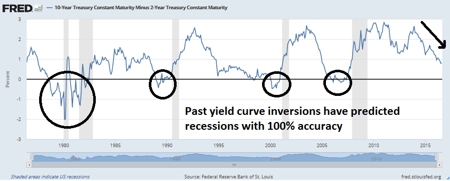
It’s a delicate balance, and I don’t have a great sense of the Fed’s reaction function to developments. In the past, they have been far more dovish than I expected. For equity investors, the most important indicator to watch will be the yield curve. A steepening yield curve, where the 10-2 year Treasury yield spread widens, will be a signal from the bond market of higher growth expectations. On the other hand, a flattening curve that inverts, or when the spread goes negative, will be a warning of recession. Right now, the yield curve is flattening, but readings are nowhere near a recession signal.
The week ahead: Round number-itis?
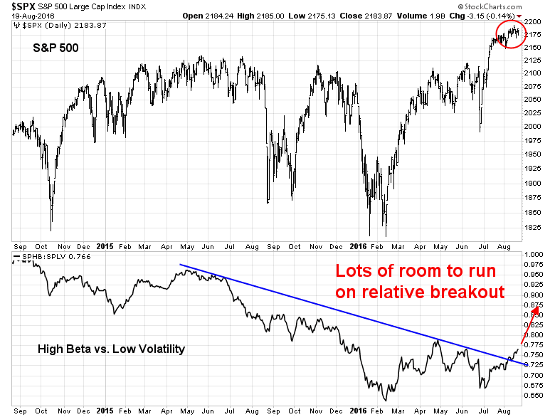
As I look forward to the week ahead, I am finding short-term market direction to be a more difficult call than usual. On one hand, risk appetite, breadth, and momentum metrics are all flashing bullish signs. The chart below depicts the relative returns of High Beta vs. Low Volatility as a measure of risk appetite (bottom panel). Risk appetite has staged a breakout through a relative downtrend and it’s nowhere near levels that indicate wild exuberance. The TINA and FOMO rally has a lot of room to run.
In addition, Todd Salamone has shown that past instances of tight trading ranges and low volatility markets have led to above average returns. Will the current episode be any different?

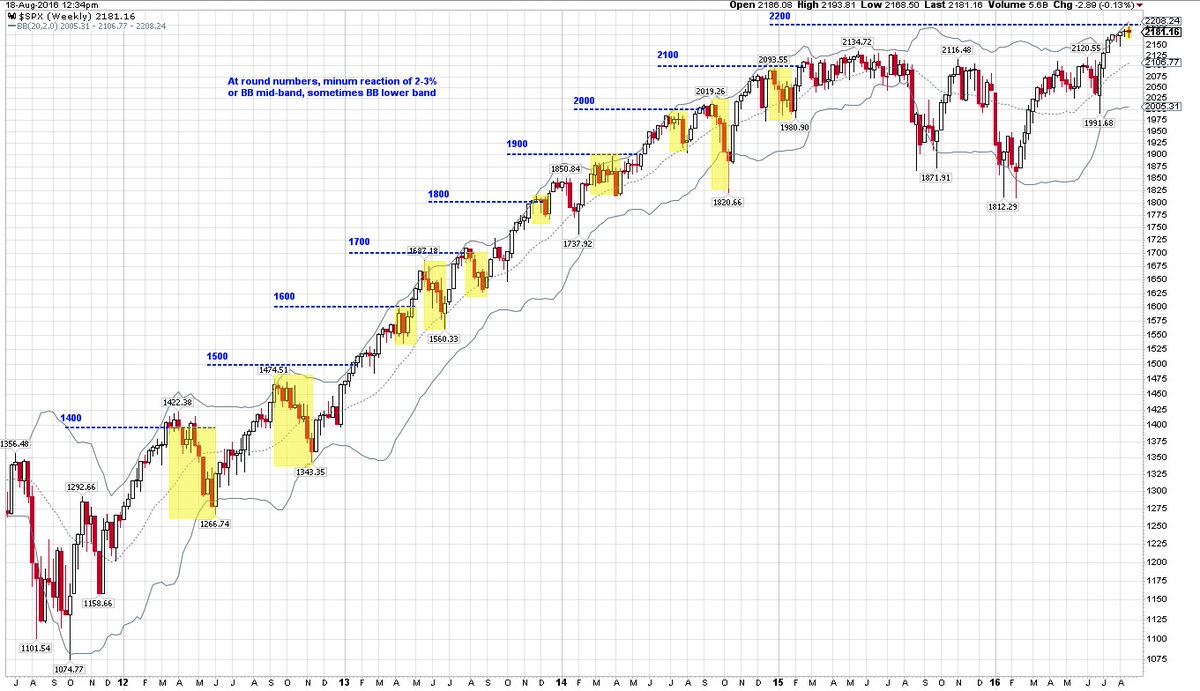
On the other hand, Urban Carmel pointed out that the stock market tends to pause when the index encounters round number resistance. As the SPX approaches the 2200 level, a pullback into the initial breakout level of 2100-2120 would not be a surprise.
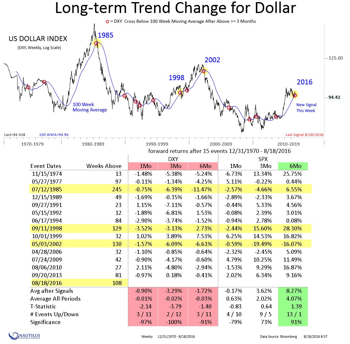
As well, Nautilus Research highlighted the fact that the USD Index has fallen below its 100 week moving average, which is consistent with my observation of commodity price strength. Past crossover episodes have resulted in short-term stock market weakness over a one-month time frame. Stock prices then recovered and advanced over the next three and six months.
My inner investor remains bullish on stocks, with overweight positions in energy stocks. He’s not overly worried about a possible correction back to 2100 as that only represents a blip in portfolio values.
My inner trader is confused and he doesn’t quite know what to think. He is open to all possibilities and he is partially long the market, but keeping some powder dry should stock prices weaken.
Disclosure: Long SPXL
I suppose, deflation seems lot harder to control as the last eight years have show us. The fed is likely to run inflation run lot hotter, for once, as it may be easier to control than deflation. Lots of below the surface data here in your article. Waiting Yellen speak at Jackson hole, and watching $ index, yield curve, VIX etc. I would like to believe that Yellen may want to wait till January, before acting. Thanks.
all eyes on Jackson hole I suppose. position unwinding before it.
Capacity Ut rose from 2009 to a November 2014 high of 78.9 and have been trending lower since, falling to 74.9 by March 2016 and up a tad from there to 75.9 in July – that’s not even close to excess capacity on a “diminishing” path likely to impact inflation on a sustained basis. Likewise the CRB has collapsed from 313 in June 2014 to 155 in February 2016, a massive decline of over 50%, and has retraced about 26% of that decline to 196 since February – hardly the stuff of sustained inflation! It is rare indeed for sustained inflationary cost-push inflation to develop when the yield curve is still flattening. Past cycles displayed the pattern you’re talking about, but this one doesn’t. You are right to be more data dependent than just trying to fit current conditions into past cyclical behaviors.
Much of that drop off in capacity utilization is undoubtedly energy related. Other manufacturing metrics, e.g. ISM and Markit M-MPI, look robust.