Preface: Explaining our market timing models
We maintain several market timing models, each with differing time horizons. The “Ultimate Market Timing Model” is a long-term market timing model based on research outlined in our post Building the ultimate market timing model. This model tends to generate only a handful of signals each decade.
The Trend Model is an asset allocation model which applies trend following principles based on the inputs of global stock and commodity price. This model has a shorter time horizon and tends to turn over about 4-6 times a year. In essence, it seeks to answer the question, “Is the trend in the global economy expansion (bullish) or contraction (bearish)?”
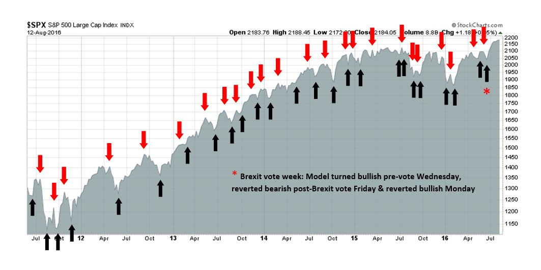
My inner trader uses the trading component of the Trend Model to look for changes in direction of the main Trend Model signal. A bullish Trend Model signal that gets less bullish is a trading “sell” signal. Conversely, a bearish Trend Model signal that gets less bearish is a trading “buy” signal. The history of actual out-of-sample (not backtested) signals of the trading model are shown by the arrows in the chart below. Past trading of the trading model has shown turnover rates of about 200% per month.
The latest signals of each model are as follows:
- Ultimate market timing model: Buy equities
- Trend Model signal: Risk-on
- Trading model: Bullish
Update schedule: I generally update model readings on my site on weekends and tweet any changes during the week at @humblestudent. Subscribers will also receive email notices of any changes in my trading portfolio.
How close are we to a market top?
I am used to getting abused for my market views, but the abuse is starting to turn into agreement – and that’s a cautionary flag. I haven’t always been a bull, here is a summary of my major market calls since January 2015.
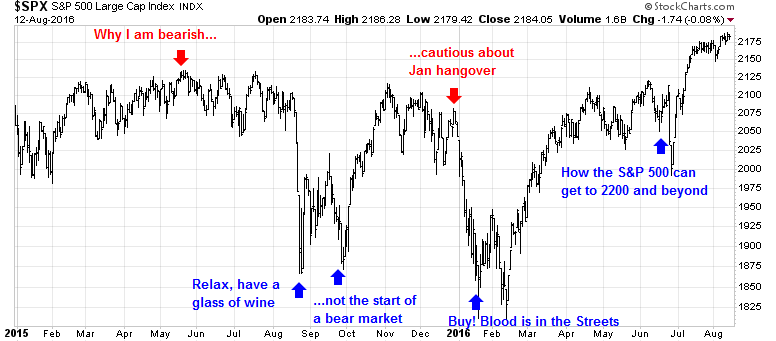
When I was cautious in the first half of 2015, I got hate mail (see Why I am bearish (and what would change my mind)). When the market corrected in August/September 2015 and I was constructive on stocks, I got hate mail (see Relax, have a glass of wine and Why this is not the start of a bear market). When I turned bullish in January 2016 at the height of the market panic, a lot of people thought I was an idiot (see Buy! Blood is in the Streets). When I reiterated my bullish views as the market moved sideways in June before the big breakout, there was much skepticism that stock prices could go much higher (see How the S&P 500 can get to 2200 and beyond).
Now that the broad market averages are seeing new all-time highs, market psychology has shifted from skepticism to grudging acceptance of the bull case. This got me worried. Am I becoming consensus and part of the crowd? Does this mean that the market is about top out?
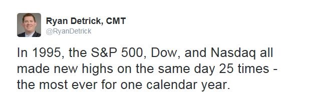
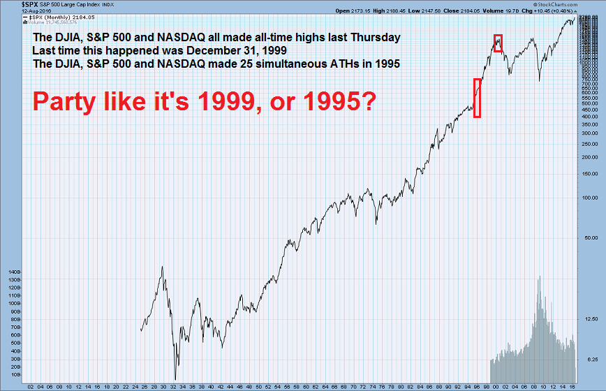
For some perspective on this question, the Dow, SPX and NASDAQ all made simultaneous new highs last Thursday. The last time this happened was December 31, 1999, which was shortly before the ultimate top in March 2000, indicating that the market may be in a high risk zone. On the other hand, Ryan Detrick highlighted analysis showing simultaneous new highs in all three indices tend to be bullish.
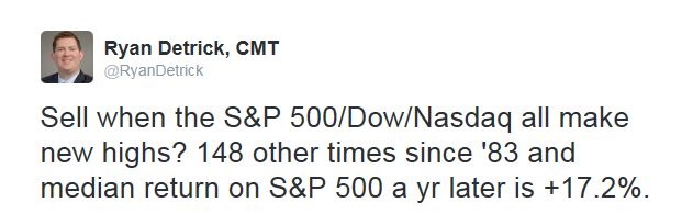
Coincidental new highs is reflective of bullish price momentum, Detrick pointed out that the market saw a total of 25 simultaneous new highs in 1995.
So should we party like it’s 1995, which was a sustained bull move, or late 1999, which marked a blow-off top?
I believe that the answer depends on the timing of a recession caused bear market, which is a function of the Federal Reserve’s reaction to economic and market developments.
A shift in psychology
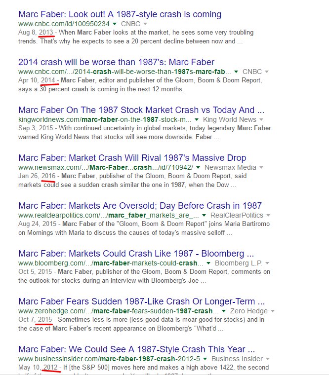
Last week, Marc Faber issued a warning for a market crash. Had he made the call six months ago, there would have been widespread acceptance in social media. Today, it was met with ridicule. Value Walk pointed out how wrong Faber had been over the years and the regularity of his “crash” calls.
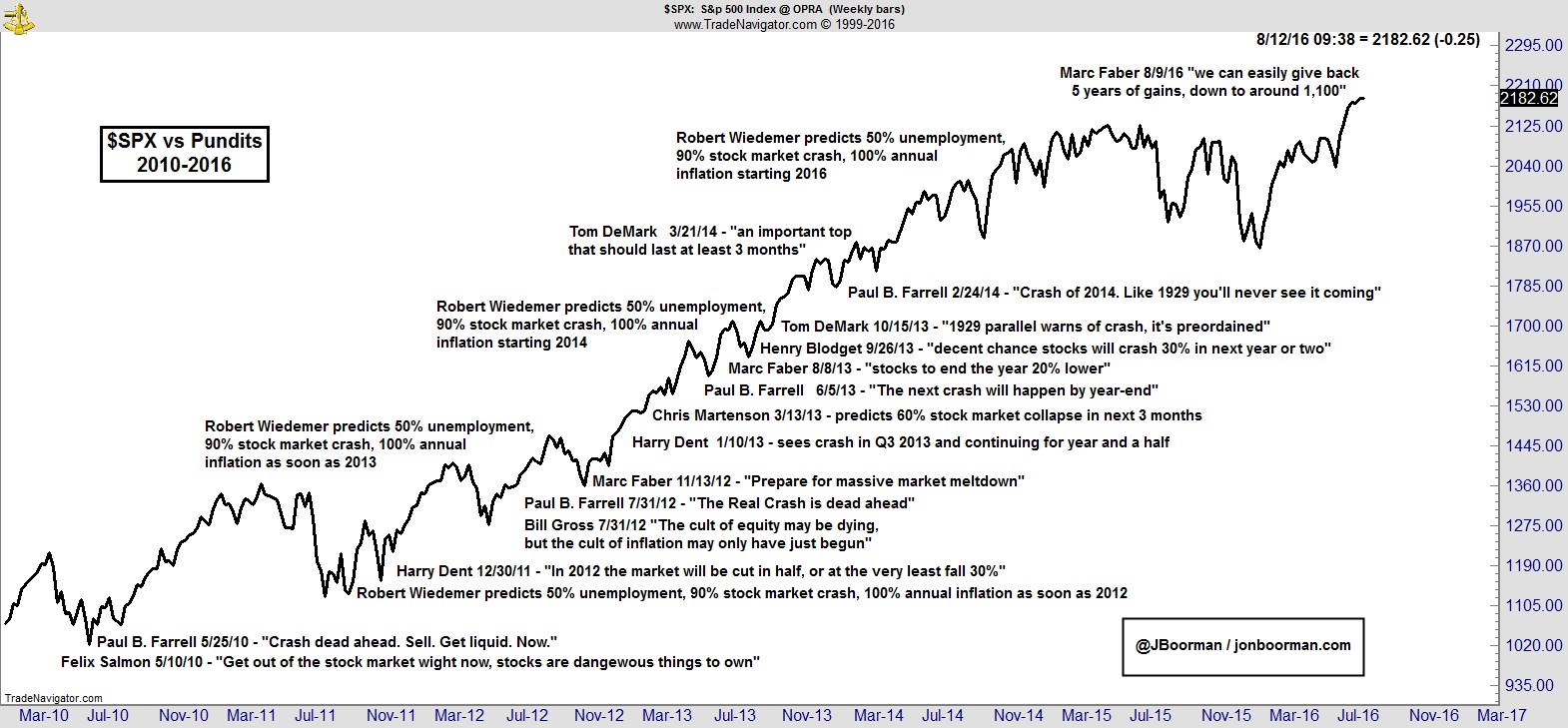
Jon Boorman went further and outlined the history of doomster Chicken Little warnings about the stock market.
Intermediate term sentiment is starting to shift bullishly from an extreme bearish reading, but there are few signs of a crowded long. (Note that I distinguish between intermediate term sentiment metrics, which measure investor psychology, and short-term sentiment, which measure short-term trader psychology). My conclusion is based on the analysis of three distinct groups, namely individuals, investment advisors, and institutions.
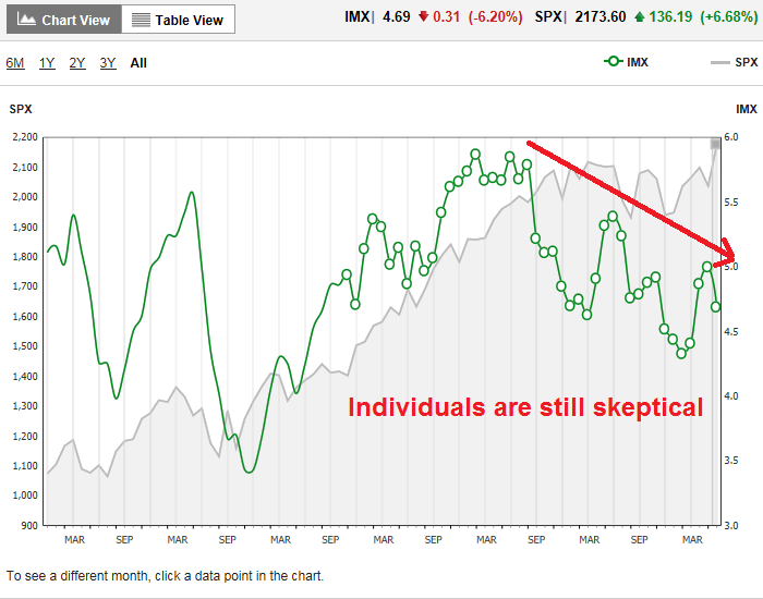
Among individual investors, the TD-Ameritrade IMX, which measures investor bullishness, has been declining since early 2015. More importantly, it fell in July even as stock prices advanced to all-time highs. This signals a continued lack of enthusiasm for stocks.
Sentiment surveys are one thing, but indicators like IMX measure what people are actually doing with their money. The WSJ reports that fund flows confirm the cautiousness shown by IMX as the difference between stock and bond fund flows are at panic levels last seen at the 2009 market bottom. This is hardly a case of rampant bullishness.

Rydex funds flows data, which also shows what people are doing with their money, is also telling a similar story of a lack of bullishness. With the market touching all-time highs, sentiment has retreated from a mild bearish reading to neutral.

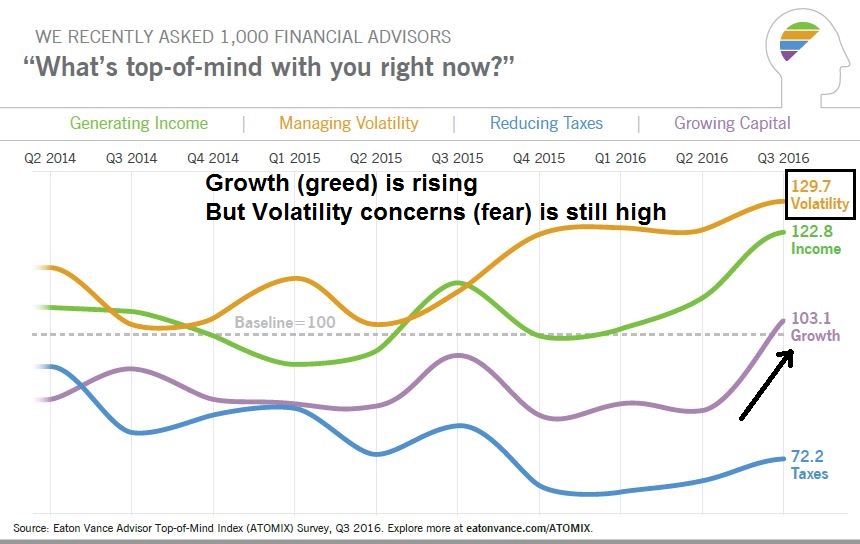
On the other hand, investment advisor psychology has been improving. The latest NAAIM survey of RIAs show bullishness at highly elevated levels, but weekly swings in NAAIM sentiment can be volatile and fickle. A recent Eaton-Vance survey of advisors was more revealing about the evolution of advisor sentiment. As the chart below shows, growth, or greed, is starting to rise, but volatility concerns, or fear, is still elevated.
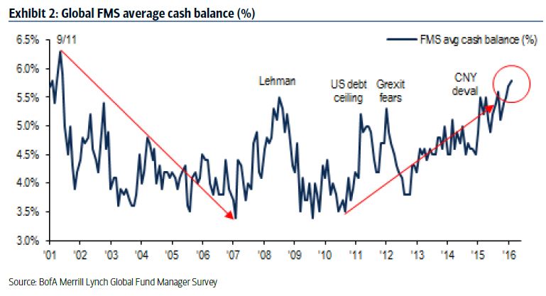
Global institutions, which represents the really slow and big money, are also gradually shifting back toward risky assets like stocks from an underweight position. The latest BoAML Fund Manager Survey shows global institution cash levels are still high, indicating an overly defensive posture.
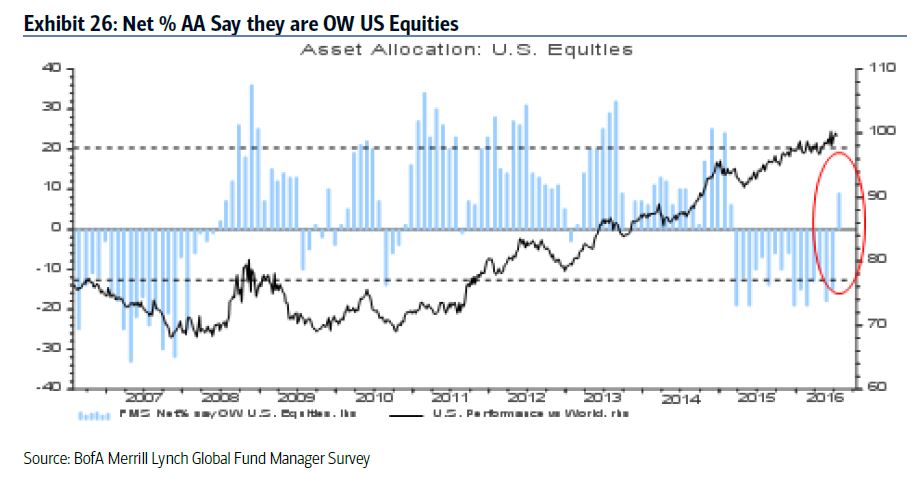
US equity weights had been below normal and institutions are just starting to buy. They are nowhere near a crowded long extreme.
In summary, investors are getting less bearish, but current readings are the not typical signs that are found at a market top.
Growth rebound continues
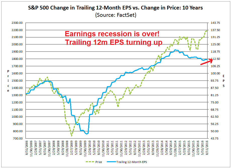
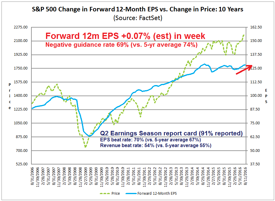
In addition, growth expectations continue to rise. As per this chart from Factset, trailing 12-month EPS is starting to recover, indicating that the earnings recession that began last winter is over. Bears should also take note of how prices tend to lag trailing EPS (chart annotations are mine).
More importantly, the forward outlook is upbeat. By contrast to the above trailing EPS chart, note from the chart below how prices are roughly coincidental with forward 12-month EPS. The latest Q2 Earnings Season is nearly over and the EPS and revenue beat rates are slightly ahead of historical averages. Corporate negative guidance is below historical norms and forward 12-month EPS continues to rise, which reflect ongoing Street optimism.
What can derail this bull move?
The combination of an under-invested investment community, a positive growth surprise, and rising bullish momentum in investor psychology all suggest that there is room for stock prices to advance further. So what can derail this bull market?
Just to be clear, by “derail” I don’t mean a correction, but a bear market where stock prices fall and continue falling. Classic bear markets of this sort began in 2007, 2000, 1990, 1982 and 1974. The common thread to these bear markets is they either preceded or coincided with economic recessions.
Georg Vrba, who has done tremendous work in recession forecasting, recently reviewed his models and concluded that a recession is at least a year away. Here are the recession triggers that he is watching;
Accordingly, the changes to the model’s parameters which may be instrumental in bringing on a new recession are:
- decrease of the 10-yr Note Yield
- decrease of the Unemployment Rate
- increase of the Fed Funds Rate
- increase of the Inflation Rate (CPI)
It is unlikely that that the 10-yr Note Yield and the Unemployment Rate will decrease much from their current levels. So it would appear that an increase of the Fed Funds Rate and/or Inflation Rate will be the most likely cause to shove the economy into recession.
When does the Fed take away the punch bowl?
Reading between the lines, all of Vrba’s indicators are tied to the Federal Reserve’s reaction to economic developments. New Deal democrat has made the case, to which I agree, that the economy is in the late cycle of an expansion. The labor market is tightening, which should induce cost-push inflation. But with few signs of rising inflation or even renewed inflationary expectations, when does the Fed react to take away the punch bowl just as the party warms up? When it does, will the rate normalization process be ahead or behind the inflation curve? How will the market react?
Those are all very good questions. An important essay by former Fed chair Ben Bernanke shed some light on the Fed’s reaction function. The chart below shows how the Fed’s expectations of economic growth (y*), unemployment (u*), and the Fed Fund rate (r*) has evolved over the years.

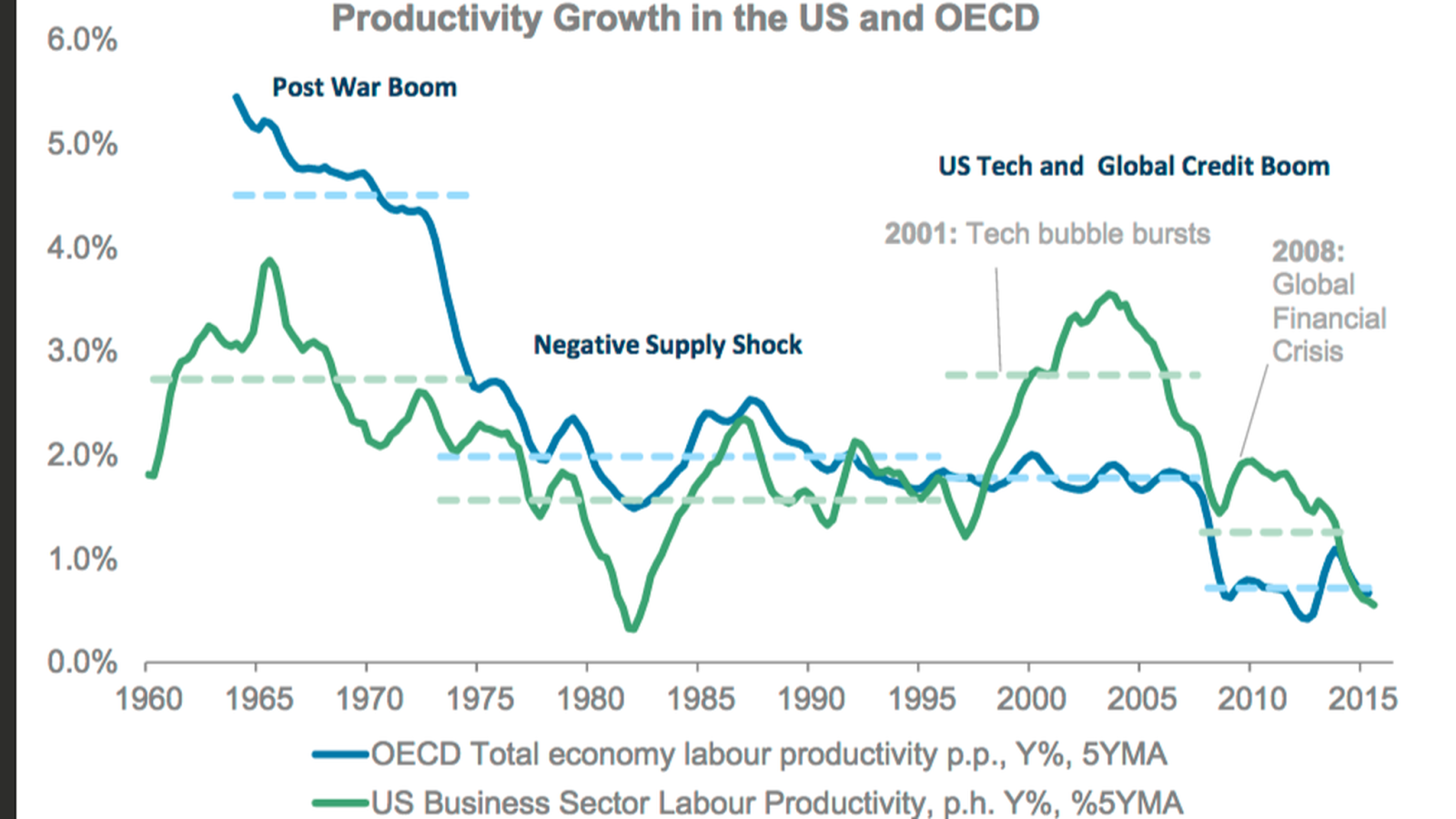
The key to understanding the Fed is to see growth expectations (y*) has fallen from the 2.3-2.5% range in 2012 to 1.8-2.0% in 2016. Both unemployment rate and interest rate expectations have been falling because growth expectations have been falling. Growth expectations were falling because of the abysmal productivity record. Here is Bernanke:
Estimates of potential output growth (y*) have declined primarily for two reasons. [1] First, potential growth depends importantly on the pace of growth of productivity (output per hour). [2] Unfortunately, productivity growth has repeatedly disappointed expectations during this recovery. For example, in 2009, leading scholars were predicting productivity growth in the coming years of about 2 percent per annum; in fact, growth in output per hour worked has recently been closer to half a percent per year. It’s possible that productivity may recover, of course, but if it doesn’t, then potential growth rates in the future will be lower than had been expected earlier.Second, although Fed forecasters have been too optimistic about output growth in recent years, they have also been, interestingly, too pessimistic about unemployment, which has fallen faster than expected despite the slow rise in GDP. Generally, the unemployment rate tends to fall when output is growing faster than its potential—a basic macroeconomic relationship known as Okun’s Law. [3] The observed combination of slow output growth and rapid unemployment declines can be consistent with Okun’s Law only if growth in potential output has been lower than thought.
It’s all about productivity
In other words, it’s all about productivity. In fact, the hand wringing over falling productivity has become so bad that Morgan Stanley downgraded long-term global productivity growth to a miniscule 1.25% (via FT Alphaville).
What if the Fed and the market are wrong on productivity? A recent Bloomberg story indicated that productivity may be ready to shoot higher because of a tight labor market.
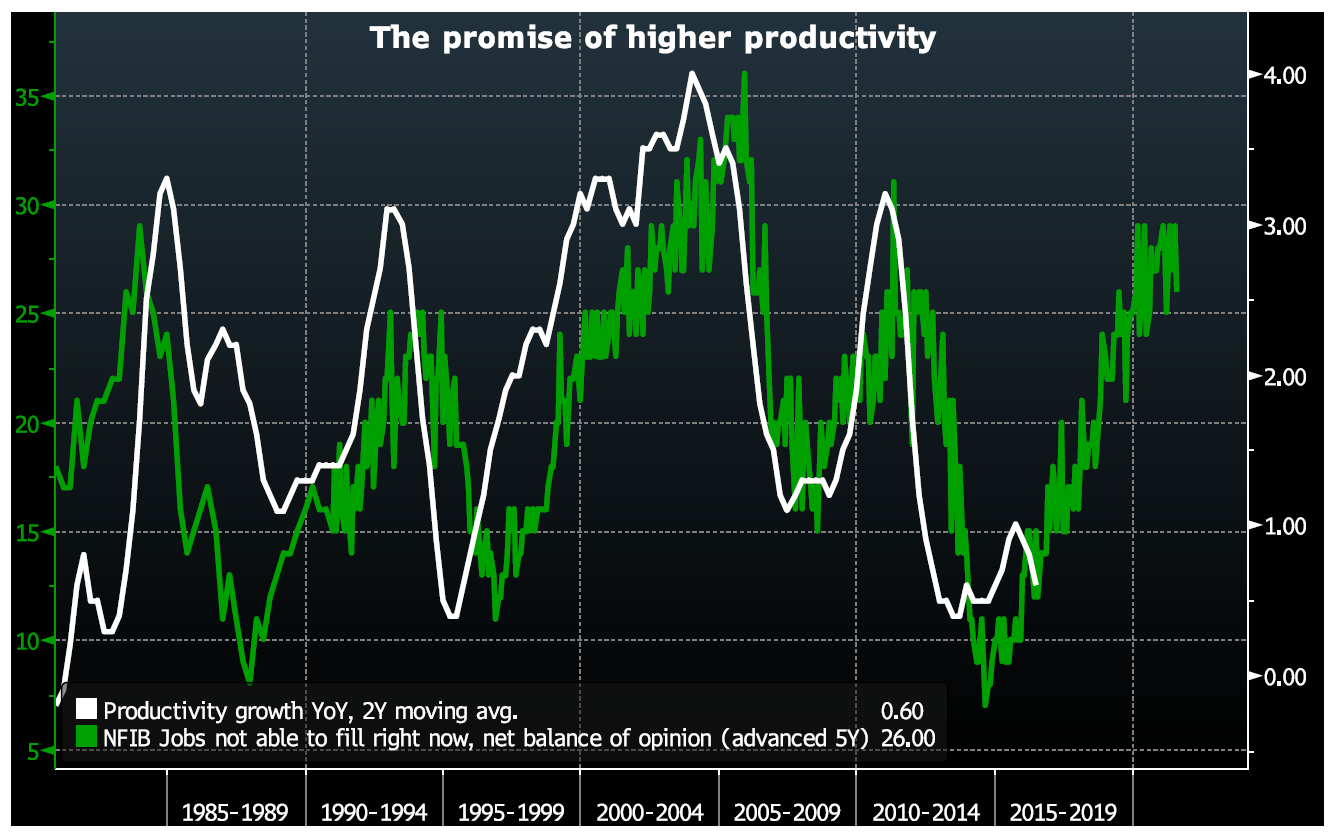
Like anything else, the cost of labor gets higher as it gets more scarce. This dynamic should incent businesses to start spending more on capital, rather than continuing to bid up wages, in order to boost production. Capital deepening, in turn, is a key driver of productivity: when workers have more/better/newer equipment, they’re generally able to produce more output per hour.
As such, Nordea Markets Chief FX Strategist Martin Enlund drew attention to the relationship of a tightening labor market eventually leading to higher productivity.
“If labour scarcity rises – and/or labour quality weakens, this greater cost-of-hiring (of L) is the same as a relative drop in the cost of real capital (K),” he wrote. “A growing capital stock would be consistent with greater productivity growth.”
Renaissance Macro Research Head of U.S. Economics Neil Dutta previously published a version of this chart shortly after the publication of productivity statistics for the fourth quarter 2015.
“If the deep recession is a reason that productivity is weak, running the economy at full employment can yield benefits in the longer run,” he added. “Full employment brings higher costs. Thus, firms have more of an incentive to find efficiencies.”
In other words, productivity has been weak because of slack in the labor market and labor has been cheap. As the economy moves towards full employment, it will push companies to spend more on capital, or plant and equipment, to replace labor. Higher investments will eventually push up productivity.
Imagine the following scenario. The Fed has mistakenly believed that the long-run growth rate is falling because of a secular decline in productivity. In fact, the slowdown in productivity is cyclical, not secular. The labor market tightens and wages rise, which induces cost-push inflation. By the time the Fed realizes what is happening, it finds itself behind the curve and will have to tighten interest rates hard – hard enough to send the economy into a recession.
The scenario I just outlined has many moving parts. When does productivity start to show signs of recovery? When does inflation start to rear its head? How long before the market realizes that the Fed is behind the curve?
The answer to those questions will tell us whether it’s 1995 or 1999. A slow reacting Fed has the potential to produce a market bubble and push stock prices to unreal levels, followed by a Marc Faber style crash. A faster reacting Fed can dampen inflationary expectations and maintain the economy’s expansion longer.
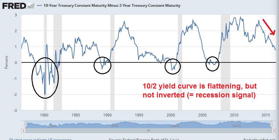
Watch the Fed. Watch the speeches coming out of the Jackson Hole retreat this year. Watch the yield curve. Is it steepening, which shows that the bond market expects rising growth, or flattening, which signals weaker growth.
The week ahead: Buy the dip!
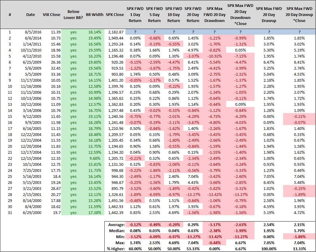
In my last mid-week market update, I highlighted analysis from SDJ10304 showing that when the VIX Index fell below its lower Bollinger Band (BB) and the BB was narrow, SPX median returns were flat for one and two weeks (see Be patient). These conditions occurred a week ago Friday and the market seems to be behaving in accordance to historical norms. The one-week SPX return was a whopping +0.05%.
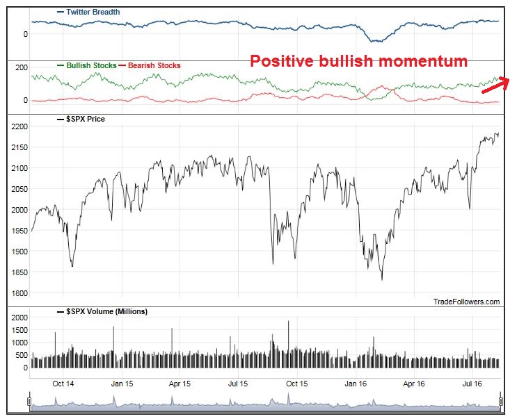
There are reasons to be optimistic. Twitter breadth, as measured by Trade Followers, is positive as the breadth of bullish stocks has been trending up.
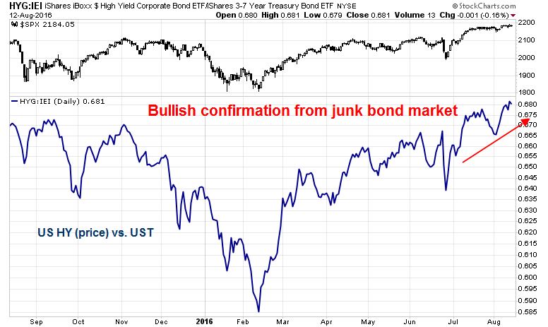
The high yield, or junk bond, market is also behaving well. This is another sign that broad market risk appetite is healthy, which is ultimately bullish for stock prices.
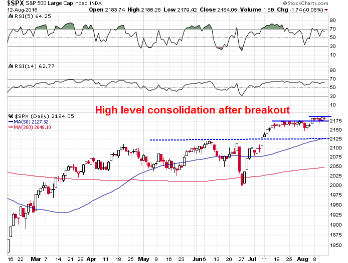
The market appears to be undergoing a high level consolidation after the upside breakout to new highs. The most likely resolution of the narrow trading range of the last week is likely to be an upside breakout to further new highs.
My inner investor remains comfortably invested with an overweight position in equities. My inner trader holds a partial long position in SPX. He will be watching for any signs of weakness next week as a buying opportunity.
Disclosure: Long SPXL
My longer term sentiment indicator is stock margin debt. At the top of the 2000 and 2007 bull markets we saw a ramping up of margin debt. With rates so low I expect a surge of borrowing when confidence is high.
Very interesting idea clarifying the current low productivity paradigm, its relationship to capital spending and labor cost. Thanks for the lucid article.
I have been a subscriber to Gloom Boom and Doom published by Dr. Marc Faber for the last decade or so, give or take. He has been insightful about portfolio construction but mostly incorrect about US market timing calls. He has been bearish on the S&P 500 for the past five years or so, give or take, however has openly admitted lately that money printing will power the US market higher. He changed his stance in the last couple of years or so, about money printing and stock prices. Much of his bearishness has been outright wrong so far on the surface. He has also been very bearish on the US $. I asked him about five years ago when he thought the US $ would collapse and he told me within the decade. He has been a gold bull since year 2000. He has remained bullish on gold as it peaked in 2011 (around 1950$ per oz) till its bottom around 1100$ per oz, last year. His time frame on gold is a lifetime. Yes, he is on record that the more money that gets printed, the higher the US stock market goes. That said, he did point out that such money printing did not power gold past 1950$ per oz. He also admits that the same did not work for Japan and has asked the question why it would work for US stocks. He has never openly admitted that US market cycle(s) are real and we could well be seeing start of an expansionary market cycle, with money printing in the US taking a back seat at present (see Cam’s analysis here that suggests possibility of an expanding capital investment cycle). Despite the shortcomings of his calls, I have learnt from him the idea of portfolio construction (which I find a very challenging task), the value of alternatives in a portfolio, and yes, long term value of gold as a hedge, amongst other things. His call on buying US ten year treasuries when the yield was 3% in the last 1.5 years was quite accurate.
you’ve always provided an excellent analysis on the US indices and economy as a whole. One of these days, we would love to hear your take on the TSX & Canadian economy!
Dear Cam,
thank you very much for your analysis. However I have to disagree with your short term part of it. In my view August and September are the weakest months in the year – it means trend down. Next week is also the week after the optionexpiration day – very short term trend also down.
Moreover, also see the seasonality chart for the years with olympic games (for US President election year).
http://www.finecharts.cz/charts/1912-sezonnost_v_olympijskem_a_prezidentskem_roce.htm
Web is running by my friend Petr Fiala. It is in Czech language but you can easily see the trend after 25/8 – generally down until approx. 21/10.
I will be very happy if you have a time to look at it and let me know your opinion on that.
Thank you very much in advance
Petr
P.S. I really like your deep analyses. It is also nice to see that your reference includes also names (with Czech origin) – such as Georg Vrba (Vrba means willow tree). 🙂