Political operative and former Clinton advisor James Carville once quipped that he wanted to be reincarnated as the bond market so that he could intimidate everybody. Equity investors and traders are well advised to remember that comment, as there is much to be learned from a cross-asset, or inter-market, viewpoint from bond market action.
For example, the relative performance of junk bonds is a terrific indicator of overall risk appetite.

The relative performance of financial stocks is also related to the yield curve, with the caveat that any analysis using a single variable can lead to erroneous conclusions as there may be other factors at play.
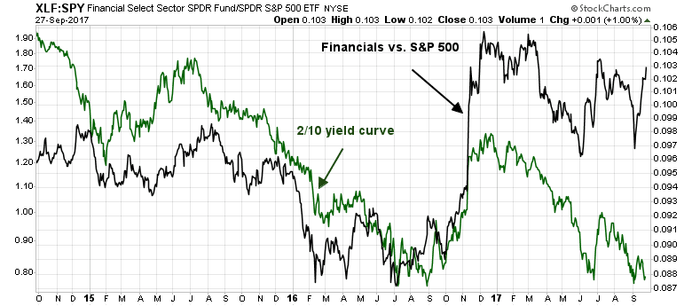
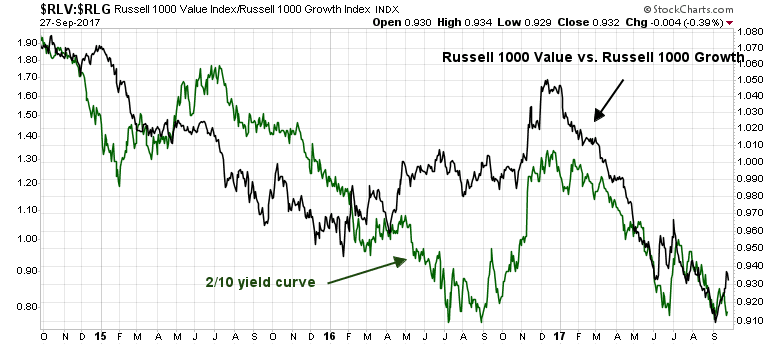
The shape of the yield curve is also correlated with the relative performance of value and growth stocks. That relationship makes sense, as a flattening yield curve (falling green line) is the bond market’s signal of slowing growth expectations. In an environment where growth is scarce, growth stocks should outperform, and vice versa.
So what is the bond market telling us now?
Tax cut reaction
The American economy is in the late stage of an expansion. Such episodes tend to be marked by a tension between the bullish forces of rising growth and the bearish tendency for the Fed to raise interest rates. The market reaction to the GOP tax cut announcement is a perfect example of this.
As the tax cut proposals was revealed, bond yields spiked and bond prices fell on the prospect of higher structural budget deficits as there are no details of any offsetting revenues to the US Treasury. By contrast, equities rallied as investors focused on the higher earnings potential of the tax cut proposals.
The Fed’s soft landing scenario
Longer term, however, the key issue for fixed income investors today is the direction of Fed policy. Matthew Klein at FT Alphaville recently analyzed the FOMC’s economic and interest rate projections and outlined how the Fed expects to achieve a non-recessionary soft landing as inflation begins to “overheat”.
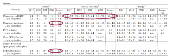
First, note that the economy’s growth rate is expected to slow down by more than half a percentage point. Ideally, this would mean that the gap between actual output and its theoretical “potential” will have gently closed by the end of 2020 — a “soft landing”. Several policymakers seem to think the US economy will already be growing by less than its potential as early as 2019, however, which suggests a bit more turbulence.
What happens next should be worrying. Most policymakers seem to think the jobless rate will continue to be well below its “longer run” level even by the end of 2020. Either the “longer run” forecast will be revised lower, or these central bankers are expecting to push the unemployment rate up by perhaps as much as a full percentage point. That’s never been done before outside of a recession.
The most interesting detail of the forecast, however, is that the policy interest rate band is expected to be above its “longer run” level by the end of 2020.
Wait! The economy slows, but unemployment stays well below NAIRU for an extended period, and monetary policy stays tight and Fed Funds is above its long run rate in 2020? What kind of fantasy thinking is that?
The Fed vs. the bond market
The latest dot plot has the Fed raising rates once at its December meeting, with three more quarter point hikes in 2018. The bond market is discounting a far more shallow path for Fed Funds in the next year. Who is right, and what does that mean for the economy, and the stock market?
The key indicator is the yield curve. Claus Vistesen thinks that while the Fed still has its hand on the tiller, it may not be able to affect the long end of the curve.
The persistent flattening of the yield curve—despite the fact that the Fed is moving slowly by historical comparison—is reflected in the gulf between markets’ forecast for interest rates, and the FOMC members’ infamous dots. The first chart below—shamelessly copied from the BBG terminal—shows that the FOMC is pencilling in a relatively steep vector in the policy rate, in stark contrast to the rates implied by market prices. Put differently; the market sees a lower “terminal rate” than the Fed.
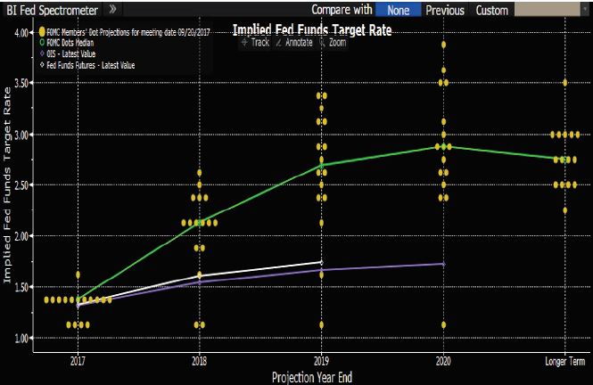
If the dot plot is to be believed, then traders should be shorting the 2-year Treasury in size. How the yield curve behaves at the long end is another matter.
Whatever you might think about the curve, the trade is simple if you believe that the Fed is taking charge. In that version of the world, markets are wrong, and front-end rates are too low. You should sell FF futures and two-year notes in size.
What happens to rates further out the curve then? If the Fed defies markets on the front end, it is reasonable to expect them to voice their objection on the long end. This doesn’t necessarily mean that long-term yields will fall, but it suggests that they will be sticky.
Vistesen believes that the long end of the curve will largely be determined by the action of other major central banks. Even as the Fed begins a tightening cycle, the other major central banks of the world are still expanding their balance sheets, though the ECB is expected to start tapering their purchases in the near future. It is difficult to believe that US long rates can rise significantly in such an environment.
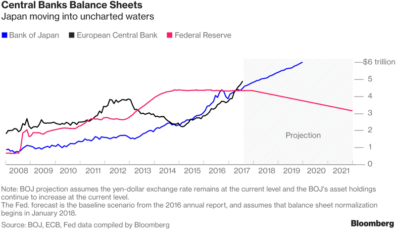
A Fed on the move is consistent with a shift in global monetary policy. The Bank of Canada is hiking, the ECB is set to reduce the pace of QE, and the Bank of England has prepared markets for a hike later this year. It should be easier for the Fed to get the job done when the rest of the world is moving in the same direction…my base case is that it will be tricky for the Fed to get traction on long rates if indeed it continues to push short rates higher. This indicates that a change in ECB/BOJ rate policies or expectations is the policy move to look out for.
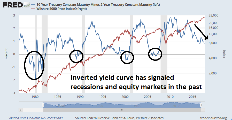
Watch the yield curve. If the Fed stays on the dot plot trajectory, then an inversion is not that far off. In the past, an inverted yield curve has been a surefire recession, and equity bear market signal.
I bought your product cause I like your intra sector relative perf analysis. I do the same myself and it helps to find sector to overweight on a momentum basis and it tells you a lot also about the market as a whole. It’s something that you don’t look much in your reports recently. The market leaders of this current bull, tech, internet, semi, financials (more recently), chemicals, machinery…. didn’t make a breakdown on a relative basis, and Russell 2000 just made a breakup vs S&P on a relative basis, so why are you becoming bearish using totally different indicators ? change of style analysis ?
Return and risk are multi-dimensional. So is my analytical framework. During different parts of the cycle, different factors matter more than others. The most important intermediate term factor right now is the direction of Fed policy.
I have not abandoned the sector rotation framework. That will the topic of discussion this weekend.
Really appreciate the range of your analysis, i.e. sectors/geography/economy/momentum/fundamentals…
For now, money is flowing into Energy and Small caps. Lately, financials and health care have also been buoyant. Such sector rotation keeps the bull market going. There is a feel for “risk on” based on small caps turning higher. All four sectors have been laggards. Energy contributes to across the spectrum cap weighted indices, so do the other sectors noted.
Japan have just announced a new $18bn fiscal stimulus package, so they are maybe not switching the taps off just yet.
There again Abe also announced a snap election so things could change again next month…
http://www.bbc.co.uk/news/world-asia-41385735