Preface: Explaining our market timing models
We maintain several market timing models, each with differing time horizons. The “Ultimate Market Timing Model” is a long-term market timing model based on the research outlined in our post, Building the ultimate market timing model. This model tends to generate only a handful of signals each decade.
The Trend Model is an asset allocation model which applies trend following principles based on the inputs of global stock and commodity price. This model has a shorter time horizon and tends to turn over about 4-6 times a year. In essence, it seeks to answer the question, “Is the trend in the global economy expansion (bullish) or contraction (bearish)?”
My inner trader uses the trading component of the Trend Model to look for changes in the direction of the main Trend Model signal. A bullish Trend Model signal that gets less bullish is a trading “sell” signal. Conversely, a bearish Trend Model signal that gets less bearish is a trading “buy” signal. The history of actual out-of-sample (not backtested) signals of the trading model are shown by the arrows in the chart below. Past trading of the trading model has shown turnover rates of about 200% per month.
The latest signals of each model are as follows:
- Ultimate market timing model: Buy equities
- Trend Model signal: Bullish
- Trading model: Bullish
Update schedule: I generally update model readings on my site on weekends and tweet mid-week observations at @humblestudent. Subscribers will also receive email notices of any changes in my trading portfolio.
Here comes the animal spirits
Josh Brown composed an insightful post last week entitled, Trump’s Singular Accomplishment:
I mean this without a trace of sarcasm, not being a fan of the President’s or pretty much anything he stands for…
Donald Trump’s singular accomplishment, in my view, is the ignition of Animal Spirits in the stock market and the real economy. Small business confidence measures shot up from the week of his inauguration and have remained elevated ever since. PE multiples expanded throughout the course of the year, which was not solely due to his tax policy – it was also about his swagger and I-don’t-give-a-f**k persona.
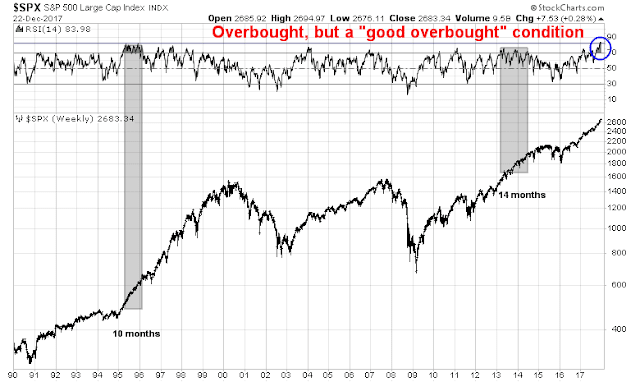
Indeed, the animal spirits in the stock market began to run wild starting in September, when the weekly RSI became overbought and stayed overbought. My former Merrill colleague Walter Murphy called this a “good overbought” condition, where the market continues to advance while remaining overbought. Since 1990, there have been two episodes when the market flashed a series of overbought readings. One lasted 10 months, the other lasted 14 months. In both instances, stock prices were significantly higher afterwards.
LPL Research quantified the “good overbought” effect on market returns using data that went back to 1950. They found that past episodes of weekly RSI above 80 has been bullish for equity returns, though the sample size is still low (N=13). The table below from LPL, which I edited and annotated, shows that the excess return from the price momentum effect fades out after six months. The incremental return from six to twelve months when when weekly RSI > 80 is not significantly different from the “at any time” returns.
This week, I review the sector leadership of the stock market. The analysis reveals a late cycle market characterized by price momentum leadership, and expectations of increased capital expenditures, as well as emerging leadership from inflation hedge sectors.
A sector review
The analytical framework for sector leadership analysis is the rotation cycle. Here is how an idealized cycle works. In the initial phase of an expansion, central banks lower rates to boost the economy, and the market leaders are the interest sensitive stocks. As the cycle matures, leadership rotates into consumer stocks, followed by capacity expansion, which leads to capital goods sector leadership. The late phase of the cycle is characterized by tight capacity and rising inflation, which is an environment where asset plays and commodity extraction industries outperform.
There is an important caveat to this form of analysis. While the market cycles thematically parallel economic cycles, they are different. Market undergo mini-cycles of changes in sentiment whose length are much shorter than economic cycles. Nevertheless, the broad principles of market cycle analysis remain valid today.
With that in mind, here is a review of the sectors of the market, starting with the market leaders first. Each of the charts shown will show the relative performance of the sector to the market on the top panel, and the relative performance of the equal weight sector to the equal weighted market in the second panel. In some cases, the equal weighted analysis can be revealing as it can show the breadth of the leadership in the sector.
Technology: The momentum play
As the animal spirits have run rampant, technology stocks have been the primary beneficiary of this trend. Both the float and equal weighted sectors are in well defined relative uptrends, and the bottom panel shows the strong relative uptrend of momentum stocks that draw mostly from the technology sector.
As long as technology and price momentum remain strong, I am inclined to stay intermediate term bullish.
Financials: Breaking out, but…
The financial sector is another heavyweight sector in the index. While the equal weighted sector has staged a relative breakout (bottom panel), the relative performance of this sector has historically been correlated to the yield curve (top panel). The divergence between the strength in these stocks and the flattening yield curve makes me somewhat cautious. However, Reuters reported that analysis from Wells Fargo states found that banks pay the highest effective tax rate at 27.5%, and therefore they should benefit disproportionately from the lower corporate tax rate.
As long as heavyweight sectors such as technology and financials exhibit strong relative strength, they should act to propel the major market indices higher.
Industrials: A capex revival?
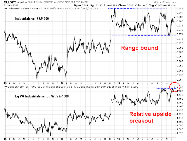
One sector that is starting to shows signs of relative strength is the capital goods heavy industrial stocks. While the relative performance of the float weighted index (top panel) remains range bound, as it was dragged down by the poor returns of heavyweight GE, the equal weighted sector has staged an upside relative breakout.
This is a signal that the market expects a capex revival.
Materials: Emerging leadership
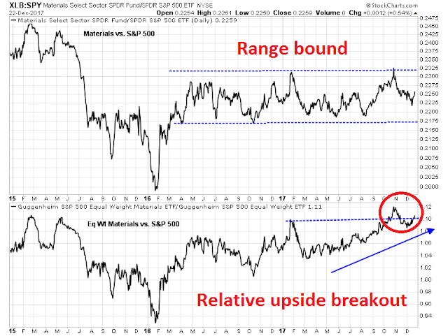
The technical condition of material stocks is similar to the technical condition shown by industrials. The float weighted index remains range bound relative to the market (top panel), but the equal weighted index has staged an upside relative breakout.
I interpret the equal weighted relative breakouts of industrials and materials as a message that the economy is at the stage where capacity is starting to get tight, and a capex cycle is necessary to alleviate those bottlenecks. Indeed, Nordea Markets pointed out that the American economy has finally closed the output gap.
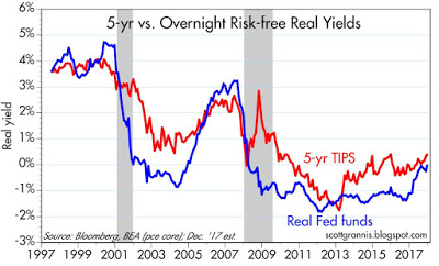
At the same time, inflationary pressures are likely to start showing up, which should benefit inflation hedge vehicles like materials and mining shares. The bond market is confirming these expectations of higher inflation. Scott Grannis pointed out that both the real Fed Funds rate and 5-year inflation expectations on TIPS are starting to edge up.
Eventually, these heightened inflationary expectations will pressure the Fed to become more hawkish, but not yet. Enjoy the party for now.
Energy: An inflation hedge laggard
If inflation hedge stocks are starting to strength, shouldn’t investors be piling into energy? As it turns out, the energy sector has been an inflation hedge laggard despite these macro tailwinds, largely because of the overhang of rising supply from US fracking. The relative strength of these stocks are still basing and it is premature to make a strong commitment to this sector just yet.
Consumer Discretionary: Tame wage growth a drag?
One sector that should be rising strongly during this phase of the expansion are consumer discretionary stocks. However, they have not performed well, and their relative strength ratios are only technically basing.
Defensive sectors: Needs more time
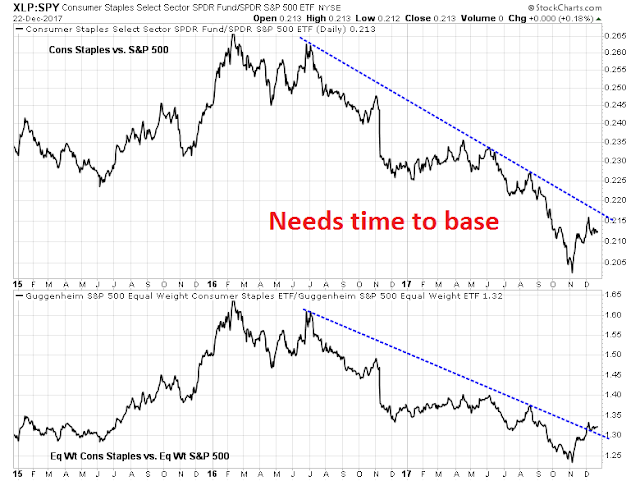
The relative strength technical conditions of traditionally defensive sectors such as health care and consumer staples are showing up as market laggards. While they are showing up as breaking up out of relative downtrends, they need time to base before they can become market leaders.
The poor performance of the defensive sectors is an indicators that the bulls are in control of the tape. Until momentum begins to falter, and defensive sectors begin to exhibit some relative strength, stock prices can go higher.
Interest sensitive sectors: Avoid
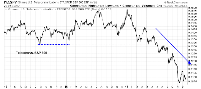
The relative performance of interest sector sectors such as utilities and REITs can only be described by one word: ugly.
The poor condition of the interest sensitive stocks is confirmed by the upside breakout of 10-year Treasury yield. Next resistance level is 2.6%.
A likely melt-up ahead
In conclusion, a review of the sector relative strength reveals a market preoccupied by growth and momentum, and dominated by the animal spirits of a late cycle expansion. In my post last week (see Five steps, where’s the stumble?), I wrote that, at the current pace, the yield curve could invert by mid-2018, but the period preceding a yield curve inversion has historically been equity bullish. If history is any guide, that suggested a SPX target of 2860 to 2970 in 6-9 months.
That target range would be what would occur in a normal market cycle. The passage of the corporate tax cuts can boost stock prices even further. Consider that the latest update from FactSet shows that bottom-up derived forward 12-month EPS continues to rise, which is a cyclical effect, and does not incorporate the effects of a lower tax burden from the passage of the tax bill.
I would expect analysts to upgrade their estimates in the next two months as companies provide guidance on the tax bill’s effects on earnings. Most of the top-down estimates indicate an earnings boost of between 6-9% for 2018. Applying a 7.5% boost to earnings for 2018, and assuming no further P/E multiple expansion, that translates to an SPX target in the 3075 to 3200 range – and this would all happen in H1 2018.
Just remember Bob Farrell’s Rule #4: “Parabolic advances usually go further than you think, but they do not correct by going sideways”.
Is 3200 in six months considered enough of a melt-up?
The week ahead
Looking to the week ahead, next week will see an extremely slow and illiquid tape, but with a seasonally bullish bias. Jeff Hirsch at Trader’s Almanac found that the three days after Christmas has historically seen a bullish tilt.
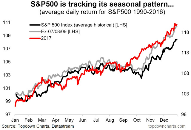
Callum Thomas also pointed out that the market is tracking its seasonal pattern of a strong December very well, though strength in December tended to be followed by a peak in early January.
My own analysis of small cap seasonality also shows that small cap stocks are rallying according as expected. As well, expect further strength from small caps as smaller companies tend to be domestically oriented, which are likely to see a greater benefit from lower corporate taxes.
Despite Friday’s minor market weakness, I was encouraged that the credit market’s risk appetite remained intact, which is a bullish sign for next week.
My inner investor remains constructive on stocks. My inner trader is aggressively long equities.
Disclosure: Long SPXL, TNA










Cam,
Thanks for the excellent analysis and overview as always. Wishing you and your family a Happy and Healthy Holiday season and a Happy New Year. Love reading your analysis with disparate moving parts of the markets.
Hi Cam, just wanted to say thanks as well for being a great guide in this complex market. I wish you and all fellow students of the markets Happy Holidays and a prosperous new year.