Preface: Explaining our market timing models
We maintain several market timing models, each with differing time horizons. The “Ultimate Market Timing Model” is a long-term market timing model based on the research outlined in our post, Building the ultimate market timing model. This model tends to generate only a handful of signals each decade.
The Trend Asset Allocation Model is an asset allocation model which applies trend following principles based on the inputs of global stock and commodity price. This model has a shorter time horizon and tends to turn over about 4-6 times a year. In essence, it seeks to answer the question, “Is the trend in the global economy expansion (bullish) or contraction (bearish)?”
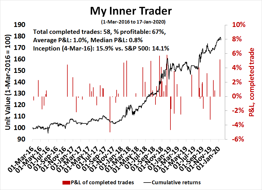
My inner trader uses a trading model, which is a blend of price momentum (is the Trend Model becoming more bullish, or bearish?) and overbought/oversold extremes (don’t buy if the trend is overbought, and vice versa). Subscribers receive real-time alerts of model changes, and a hypothetical trading record of the those email alerts are updated weekly here. The hypothetical trading record of the trading model of the real-time alerts that began in March 2016 is shown below.
The latest signals of each model are as follows:
- Ultimate market timing model: Buy equities*
- Trend Model signal: Bullish*
- Trading model: Bearish*
* The performance chart and model readings have been delayed by a week out of respect to our paying subscribers.
Update schedule: I generally update model readings on my site on weekends and tweet mid-week observations at @humblestudent. Subscribers receive real-time alerts of trading model changes, and a hypothetical trading record of the those email alerts is shown here.
Will history repeat itself?
Looking to the week ahead, there is no doubt that the stock market is becoming more and more frothy. While I did alert readers to the potential for a melt-up in early December (see Buy signal confirmed: It’s a global bull), the magnitude of the price surge has caught me even by surprise.
I remain bullish on an intermediate term basis. The SPX may be undergoing a melt-up in the manner of late 2017. It is unusual to see the index remain above its weekly BB for more than a week, which it did two weeks ago. The melt-up of late 2017 also saw similar episodes of upper weekly BB rides, punctuated by brief pauses marked by “good overbought” conditions on the weekly stochastic. The technical conditions appear similar today, and I am therefore giving the intermediate term bull case the benefit of the doubt.
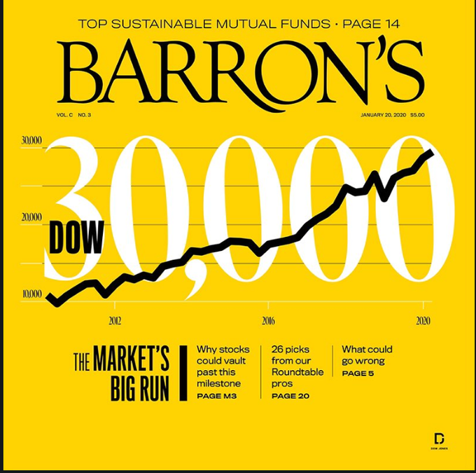
The melt-up of 2017/18 ended in late January, 2018. Will history repeat itself? As a reminder, here is the latest cover from Barron’s.
Today, market conditions are characterized by:
- Excessively bullish sentiment: While crowded long sentiment readings are warnings of downside risk, they do not act well as timely trading indicators.
- Waiting for a catalyst: While there has been plenty of good news, there has also been bad news lurking in the background. This brings investors and traders to ponder the question of, “Is the glass half full or half empty?”
- Overbought markets: But overbought markets can indicate either “good overbought” markets dominated by price momentum, or overbought markets ripe for a reversal.
Too bullish?
\
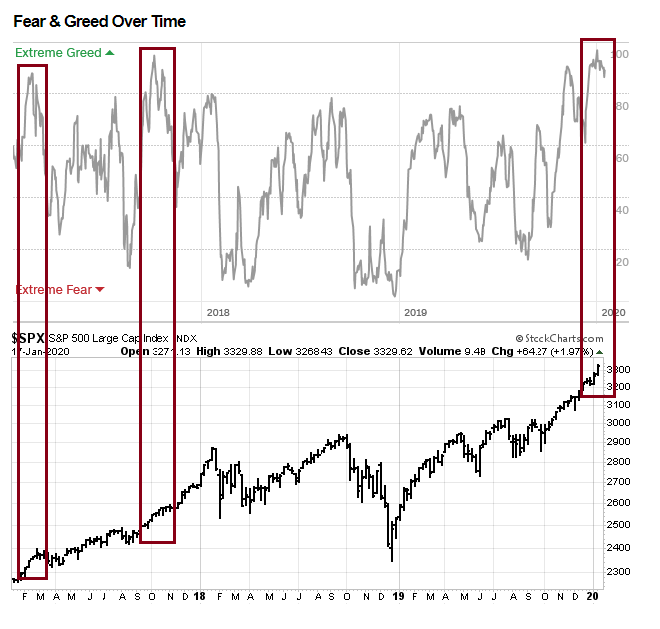
Signs of excessive bullishness are everywhere you care to look. The Fear and Greed Index has been stretched, but readings have been at nosebleed levels for over a month. While these conditions warn of contrarian bearishness, sentiment models are much better at spotting bottoms than tops. They are simply not actionable as sell signals for trading accounts.
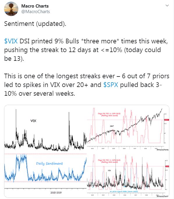
Macro Charts pointed out that the Daily Sentiment Indicator (DSI) for VIX, which tends to be inversely correlated with stock prices, printed at 9% bulls for three times last week. The historical record for such episodes have been bearish for stock prices. On the other hand, Macro Charts had been cautious since this run-up began in December. That said, DSI for both the SPX and NDX have been over 90, which are warning signs.
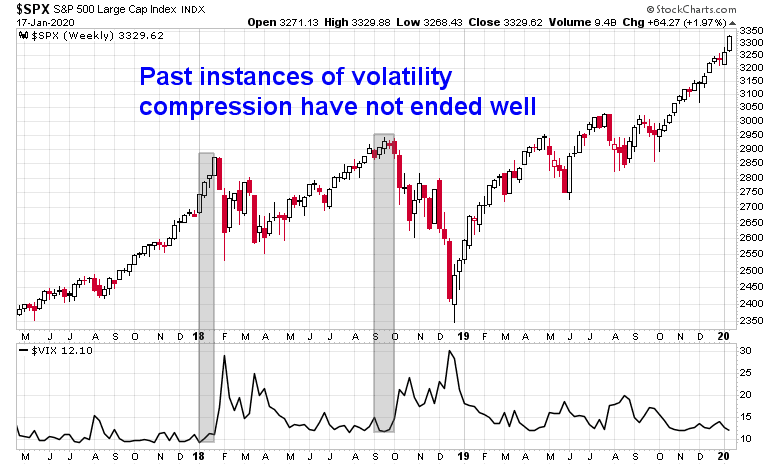
Callie Cox observed that the market is undergoing a period of prolonged equity volatility compression.
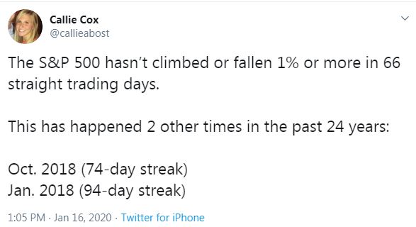
As a reminder, the last two episodes were resolved in a bearish way.
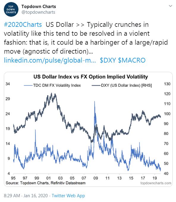
Callum Thomas at Topdown Charts also pointed out that volatility compression has not been restricted to equity volatility. FX volatility has also been suppressed, which tends to end with a volatility explosion.
File these indicators under “this will not end well”, but the market is unlikely to fall without a bearish catalyst.
Glass half full, or half empty?
A lot of important market moving news had hit the tape in the past week. While the market has reacted mostly positively to news, we have also seen bad news that have lurked under the surface. This is setting up a dilemma for investors and traders when interpreting news.
Is the glass half full, or half empty?
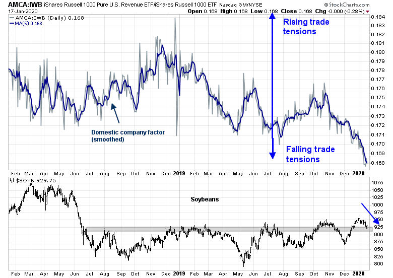
Consider the Phase One deal signed by Donald Trump and Liu He last Wednesday. While our trade war factor, which measures the relative performance of domestically oriented companies, is flashing a huge sigh of relief. On the other hand, soybean prices are retreating they are testing a major support level. Is the glass half full, or half empty?
In addition, the Senate is about to pass legislation to ratify USMCA, or NAFTA 2.0. At the same time, EU chief trade negotiator Phil Hogan called out Trump for being obsessed with the trade deficit. Treasury Secretary Mnuchin is scheduled to meet with French finance minister Le Maire at the sidelines of the Davos World Economic Forum next week. They have set a deadline of next Wednesday to settle the dispute of the French digital tax, which Trump has threatened to retaliate by imposing 100% tariffs on French wines and other imports. We could see a new transatlantic trade war break out by next weekend.
Is the trade tension glass half full, or half empty?
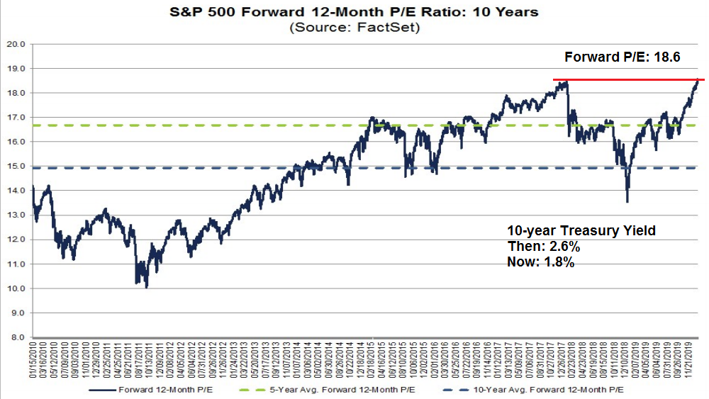
From a valuation perspective, the market is now trading at a nosebleed forward P/E multiple of 18.6. However, the 10-year yield at the January 2018 peak was 2.6%, compared to 1.8% today, indicating that the market may not have reached a similar level of peak valuation because the discount rate on earnings is lower.
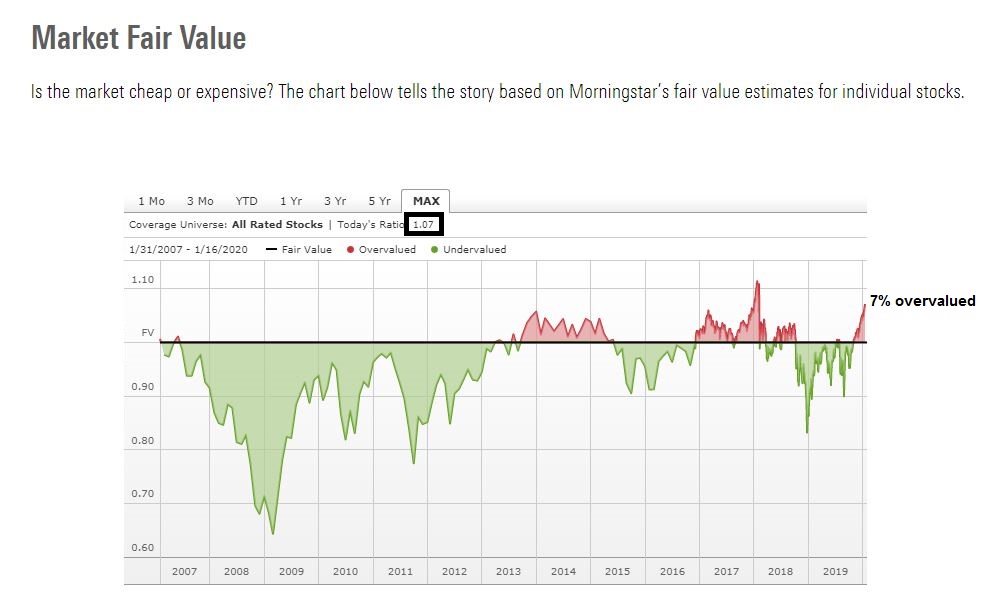
Here is another perspective on the valuation question. According to Morningstar, the market is roughly 7% overvalued. This degree of overvaluation is high relative to its history, and the only episode that eclipsed the current period was the melt-up of 2017/18.
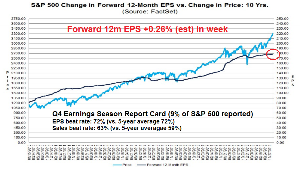
The very early results from Q4 earnings season have been neutral to positive. The EPS beat rate is in line with historical averages, while the sales beat rate is above average. Moreover, forward 12-month EPS is being revised upward, indicating positive fundamental momentum.
Is the valuation glass half full, or half empty?
The message from the credit markets is similarly ambiguous. On one hand, the performance of both investment grade (IG) and high yield (HY) relative to their duration-adjusted Treasuries have roughly matched the stock market in the past year, indicating a confirmation of the new highs. On the other hand, both the relative performance of IG and HY have been flat since mid-December while stock prices have soared, which is a negative divergence.

Is the credit market risk appetite glass half full, or half empty?
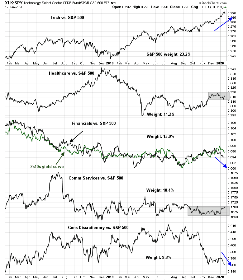
From a technical point of view, the analysis of the relative performance of the top five sectors of the market is revealing. Since these sectors comprise nearly 70% of the weight of the index, the market cannot make a major move without signs of either bullish or bearish leadership from these sectors. Of the five sectors, one (technology) is in a bullish relative uptrend, two (heathcare and communications services) are range bound, and two (financials and consumer discretionary) are weak. The net weight of strong sectors compared to weak sectors is roughly zero. In short, the internals from sector leadership is not as positive as the progress of the major market averages.
Is the technical analysis glass half full, or half empty?
An overbought market
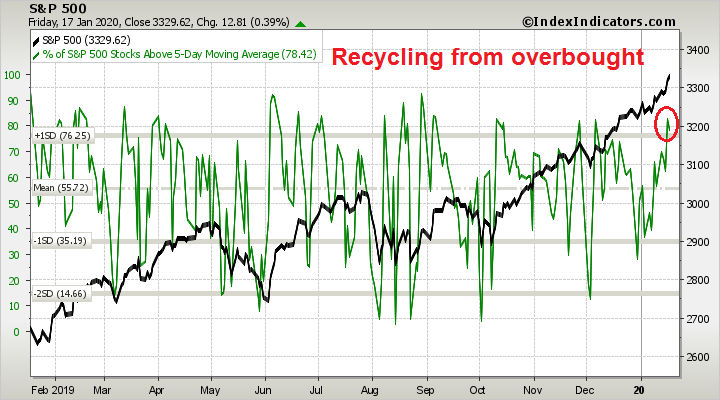
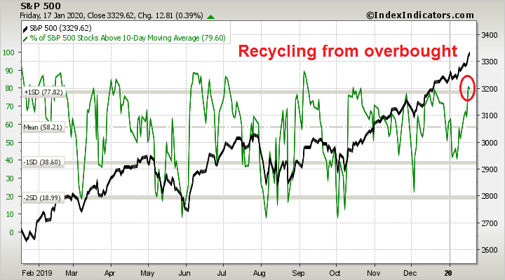
Breadth indicators from Index Indicators show that the market is simultaneously recycling from an overbought condition on different time horizons, which is unusual.
On a short (1-2 day) basis, the market is turning down from an overbought condition based on % of stocks above their 5-day moving average (dma).
On a 2-5 day horizon, the market is also recycling from overbought condition based on % of stocks above their 10 dma.
Similarly, readings are the same based on the net 20-day highs-lows, which is an indicator with a 1-2 week horizon.

Are these “good overbought” signals exhibited by a steady price momentum based market advance, or the signs of an imminent market stall?
On the edge of a precipice
The market’s prevailing thinking at this time is a glass half full, but even a minor change in psychology could turn the paradigm to a glass half empty. Tactically, the market environment is highly risky, and prices could turn down with little or no warning at any time.
My inner trader initiated a short position last week when long Treasury prices rallied above a falling trend line. Since Treasuries represent the safety trade, UST strength would be bearish for risk appetite and therefore bearish for stock prices. Unfortunately, bond prices reverted below the trend line on Friday.

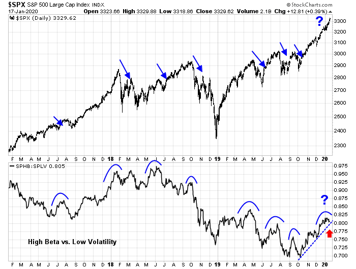
However, I am not ready to close out the short position just yet. The market has begun to recycle from an overbought position. More importantly, equity risk appetite, as measured by the ratio of high beta to low volatility stocks, is testing a rising trend line and may be rolling over. In the past, such rollovers have preceded bearish episodes.
Traders should monitor how these indicators develop over the next few days. This may be the start of an inflection point for stock prices.
Disclosure: Long SPXU
A thumb-suck maximum momentum averages 0.2% per day. The higher than that, the quicker the end. S&P 500 has clocked 0.29% over 10 days and 0.35% over 5 days. This is on par with the closing stage of Jan ’18.
I see HYG as liquidity. So i look for bearish divergence in HYG.
.
But i see HYG:IEI ratio as risk appetite, so i look for sudden spike or breakout ( The opposite of bearish divergence), implying excessive risk appetite before a mean reversion.
https://www.tradingview.com/x/2yWGztz4/
.
Market is overdue for a pullback for more than a week, but trying to predict even 1 day ahead is so difficult.
A headline like the ending or just the hint of ending of “not QE” should provide a nice convenient excuse / catalyst / trigger for a quick mean reversion.