There was some confusion from readers in response to my bullish pivot in yesterday’s post (see How the market could melt up). Much of the confusion was attributable to the bear porn that has been floating around since last Friday from the inverted yield curve when the 10-year Treasury yield fell below the 3-month.
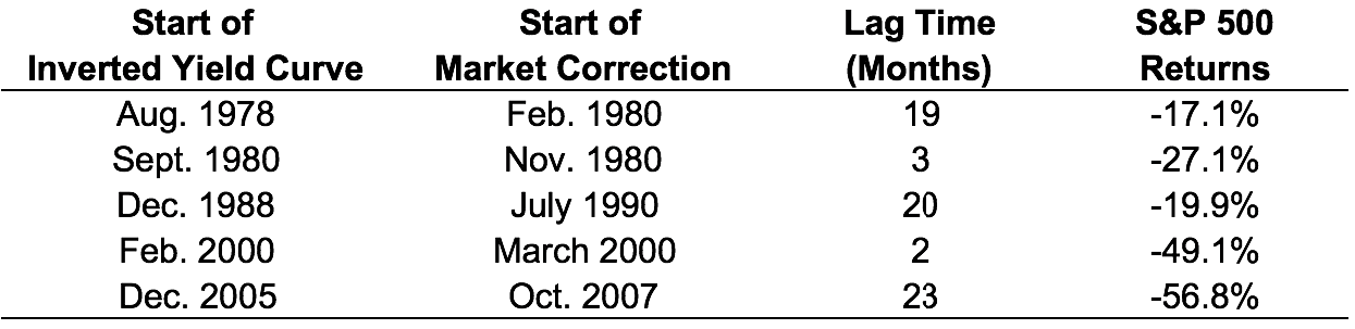
One example came from Ben Carlson at A Wealth of Common Sense, though Carlson did qualify his analysis that the timing of a stock market pullback has varied:
The timing of these market corrections varies widely. In late 1980 and early 2000, the inverted yield curve signaled a quickly approaching stock market peak. In the other three instances, it was almost two years until stocks broke down.
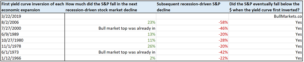
Troy Bombardia has also weighed in with his own analysis of past inversions.

I beg to differ. The underlying mechanism of this inversion is very different from previous episodes, and that’s why I don’t think a recession is in the cards.
How it’s different this time
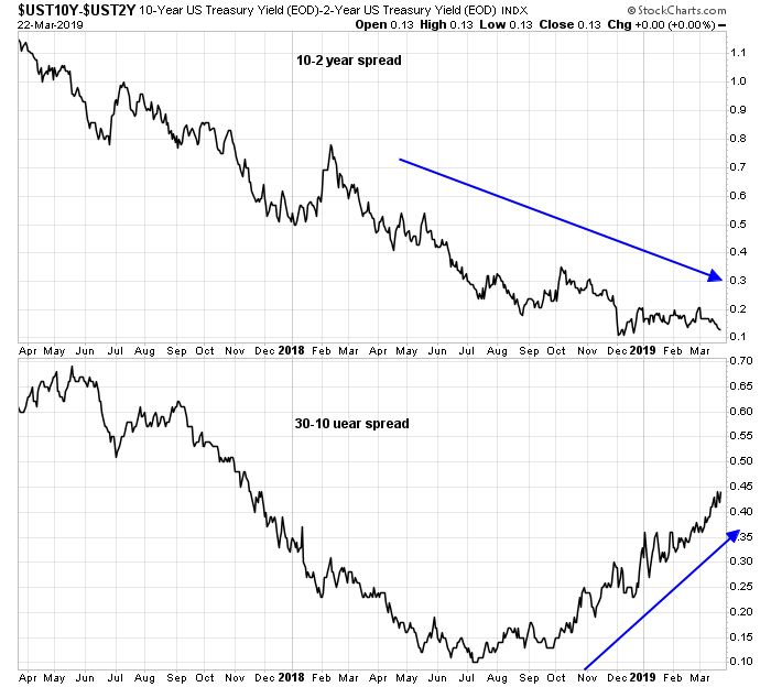
Firstly, I had pointed out yesterday that while the belly of the yield curve was flattening, or inverting, the long end of the curve is steepening. This is an indication of differing expectations about growth and inflation from the long end of the bond market, compared to the belly. In short, not all of the bond market thinks the economy is slowing to recessionary levels.
Past recessions have been caused, in part or in whole, by excessively tight monetary policy. In some cases, there were contributory factors, such as financial bubbles in 2000 and 2007. New Deal democrat constructed a simple model based on the year/year change in Non-Farm Payroll employment (blue line) and the Fed Funds rate (red line). In the past, whenever the Fed Funds rate of change has risen above the NFP line, a recession has ensued. In other words, the rise in the Fed Funds rate is an indication of a hawkish Fed that tightened monetary policy until employment growth rolled over, and plunged the economy into recession.
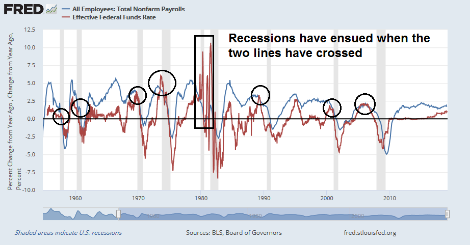
Here is the same chart overlaid with the 10-year vs. 3-month Treasury yield spread (black line). Unfortunately, the 3m10y spread data only goes back to 1982, so the full history is not available. Nevertheless, past recessionary episodes saw the Fed Funds line rise above the NFP line, and it was confirmed by an inverted yield curve.
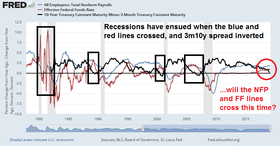
Here is why this time is different. Will the Fed Funds and NFP lines cross this time? The Fed has announced a dovish tilt and put rate hikes on hold. The red Fed Funds line will now flatten. Arguably employment growth will start to slow, but will it slow sufficiently for the two lines to cross?
In other words, is the Fed’s dovish U-Turn enough to avoid a recession in 2019 or 2020? The trend of the blue NFP growth line has been a gentle slope upwards, though the latest data point does show a deceleration. In the absence of a dramatic drop-off in employment growth to 100K or less in the next few months, the US economy should be able to sidestep a recession.
In that case, the latest panic in the stock market over the inverted yield curve is a buying opportunity.
Supportive sentiment
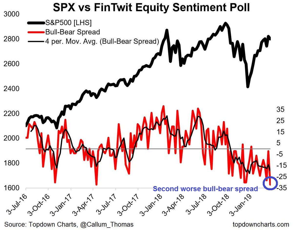
The latest sentiment reading are also supportive of a stock market advance. Callum Thomas has been conducting an (unscientific) weekend Twitter sentiment poll since July 2016. The latest reading show that equity sentiment to its second worst level since polling began, which is contrarian bullish.
In conclusion, the combination of these factors are screaming “buy the dip” on equities.
Thanks for the analysis! Not sure if it’s an oversight, but the “Subscriber posts” page doesn’t link to this article.
Thanks for pointing that out. It has been fixed.
“Bear porn” – I love that comment!
Over the weekend, there is an article from Bloomberg which attributed the massive US 10y bond buying to an algo trading, basically a technical move. The culprit is German Bund 10y yield went negative and triggered bunches of algos. Subsequently US 10y got bought in a frenzy, and its yield dropped dramatically, and 10y-3m spread went negative. In a snow-balling fashion, lots of algos were dumping equities.
Cam, I like to look to a couple other indexes for confirmation before buying back into the market. But these indexes don’t look very constructive. Can you elaborate on why these indexes don’t matter this time?
They are:
Dow Jones Transportation Index
Value Line Geometric Index
Financial Sector Index
Japanese Nikkei
In answer to your questions:
1) I addressed the DJTA issue in my last post and wrote that it was one of the indicators that I am watching.
2) I don’t know what’s going on with the Value Line Geometric Index (XVG), but the Wilshire 5000 (WLSH) is behaving much better than XVG. A long-term chart of the XVG/WLSH ratio shows that the ratio topped out in 2007 and it has been declining steadily ever since.
3) I demonstrated before that the relative performance of the Financials is highly correlated to the shape of the 2s10s yield curve. It is therefore not surprising that this sector is struggling when the yield curve is flattening. We will need to look elsewhere for leadership in the current environment.
4) Historically, the Japanese market is the one major equity market that is most uncorrelated to the rest of the world. Unless you have some special insight about how Japan might be a bullish or bearish catalyst, I have never found the Japanese market to be a good indicator for other equity markets.