Mid-week market update: I had characterized this week as a “show me” week for the market, though I had a slight bullish bias (see How the market could melt up). While I remained tactically bullish, a number of unanswered questions remained in light of the yield curve related sell-off that began late last week.
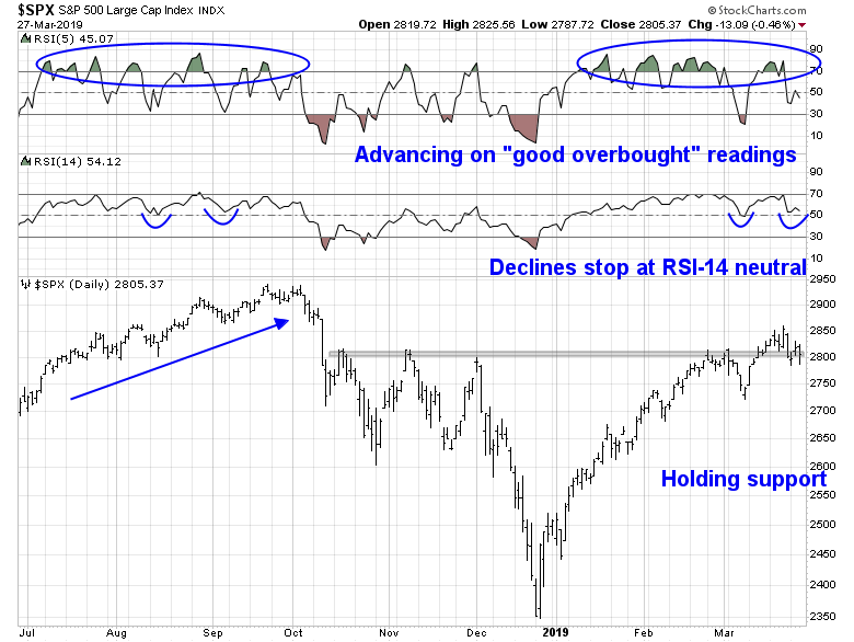
Some of those questions are getting answered. The bulls are still have control of the tape, though the control remains tenuous. The most positive sign is the SPX is holding a resistance turned support zone at about 2800. The market advance last summer was characterized by a series of “good overbought” readings on RSI-5, and pullbacks were halted when RSI-14 reached the neutral zone. The same pattern seems to be occurring today, which is constructive.
Supportive internals
One of the challenges for the bulls has been the lackluster display of risk appetite. Risk appetite factor performance were range-bound for the last few weeks. However, price momentum, as measured by MTUM, staged a minor upside breakout from its range, which is a hopeful sign for the bulls.

Other market internals are also normalizing. I had expressed some concerns about the relative performance of mid and small cap stocks. These groups bounced off key relative support lines this week and turned up. By contrast, the NASDAQ 100, which had been the past market leaders, started to turn down. NASDAQ stocks appeared a little extended on a relative basis, and the rotation is a sign of a healthy advance.
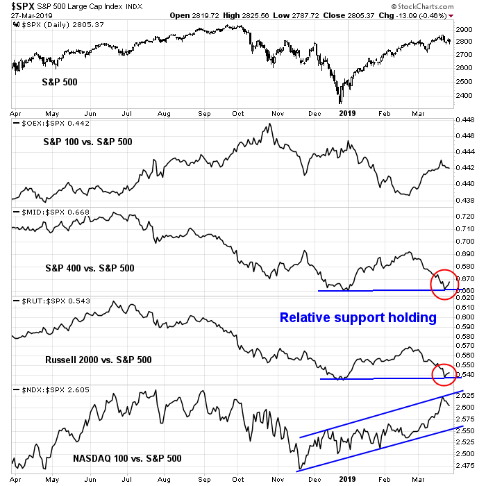
I was also watching the performance of the Transports. Fortunately for the bulls, the DJ Transportation Average held its support, both on an absolute and relative basis. This is another sign that the bulls still have control of the tape.

Confirmation from RRG analysis
We have a confirmation of the market’s bullish tilt from RRG analysis. As a reminder, Relative Rotation Graphs, or RRG charts, are a way of depicting the changes in leadership in different groups, such as sectors, countries or regions, or market factors. The charts are organized into four quadrants. The typical group rotation pattern occurs in a clockwise fashion. Leading groups (top right) deteriorate to weakening groups (bottom right), which then rotates to lagging groups (bottom left), which changes to improving groups (top left), and finally completes the cycle by improving to leading groups (top right) again.
The leadership sectors in the top half of the chart constitute 55.8% of the weight of the index.

By contrast, the lagging sectors in the bottom half of the chart constitute 44.2% of index weight.
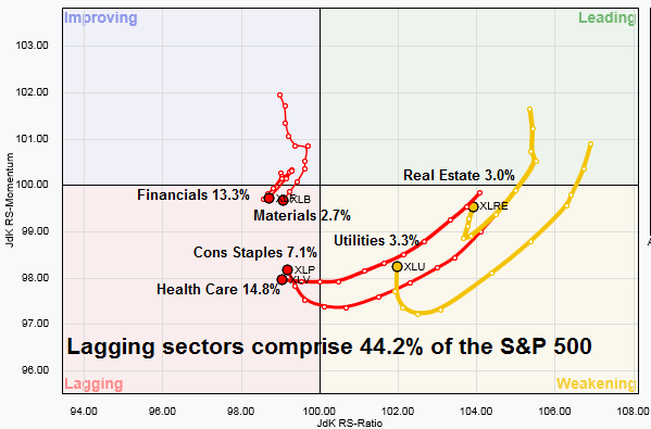
A more detailed analysis of some of the key sectors reveals further support for the bull case. Financial stocks recently fell from the improving quadrant into the lagging quadrant, but as the chart below shows, the relative performance of this sector is closely correlated to the shape of the 2s10s yield curve. As the yield curve has begun to steepen again, this should create a bullish tailwind for this sector, which comprises 13.3% of index weight. In addition, the relative performance of two leading sectors, Consumer Discretionary and Communication Services, shows a pattern of sideways consolidation. Until they actually break down, the bull case remains intact.

I interpret these conditions as the bulls still have control of the tape, though the control may appear a little bit tenuous at times. My inner trader remains cautiously bullish.
Disclosure: Long SPXL