Preface: Explaining our market timing models
We maintain several market timing models, each with differing time horizons. The “Ultimate Market Timing Model” is a long-term market timing model based on the research outlined in our post, Building the ultimate market timing model. This model tends to generate only a handful of signals each decade.
The Trend Model is an asset allocation model which applies trend following principles based on the inputs of global stock and commodity price. This model has a shorter time horizon and tends to turn over about 4-6 times a year. In essence, it seeks to answer the question, “Is the trend in the global economy expansion (bullish) or contraction (bearish)?”
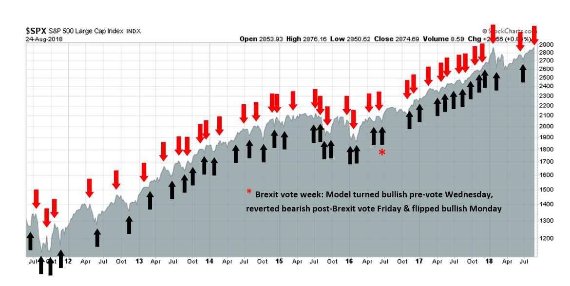
My inner trader uses the trading component of the Trend Model to look for changes in the direction of the main Trend Model signal. A bullish Trend Model signal that gets less bullish is a trading “sell” signal. Conversely, a bearish Trend Model signal that gets less bearish is a trading “buy” signal. The history of actual out-of-sample (not backtested) signals of the trading model are shown by the arrows in the chart below. The turnover rate of the trading model is high, and it has varied between 150% to 200% per month.
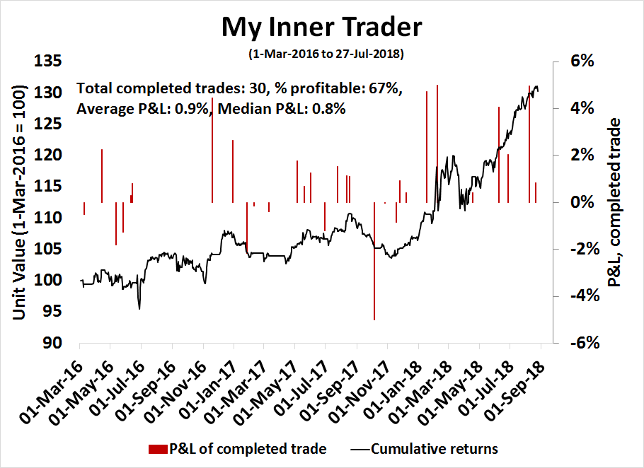
Subscribers receive real-time alerts of model changes, and a hypothetical trading record of the those email alerts are updated weekly here. The hypothetical trading record of the trading model of the real-time alerts that began in March 2016 is shown below.
The latest signals of each model are as follows:
- Ultimate market timing model: Buy equities
- Trend Model signal: Neutral
- Trading model: Bearish
Update schedule: I generally update model readings on my site on weekends and tweet mid-week observations at @humblestudent. Subscribers receive real-time alerts of trading model changes, and a hypothetical trading record of the those email alerts is shown here.
What I am cautious on stocks
I continue to get resistance to my recent bearish calls (see Major market top ahead: My inner investor turns cautious), and that was even before the major indices broke out to fresh record highs. To reiterate, the cautiousness was triggered by both technical and macro considerations. Most importantly, the Wilshire 5000 is exhibiting a negative divergence on the the monthly chart, which has foreshadowed important market tops in the past.

As well, a number of my Recession Watch long leading indicators are rolling over. While the current snapshot forecast for the next 12 months remains neutral, at the current pace of deterioration, they would become sufficiently negative to flash a recession warning later this year. This would indicate that a recession would occur in Q4 2019. As stock prices tend to be forward looking, the combination of bearish technical readings and weakness in long leading indicators suggest that a market top is forming about now.
In addition to the bearish technical indicators I cited three weeks ago, a number of other warnings have appeared indicating intermediate term cautiousness for equity investors.
Technical breaks everywhere
In the wake of that post three weeks ago, I have encountered numerous examples of technical breakdowns which warn of a developing market top. Firstly, American investors have been spoiled because US equity markets have been the global market leaders, which may have created a false sense of security for American investors.

Technical deterioration has been evident to non-US equity investors for most of 2018. Callum Thomas of Topdown Charts found that the number of equity markets experiencing a death cross has been steadily rising. (A death cross occurs when the 50 dma falls below the 200 dma, indicating the onset of a downtrend).

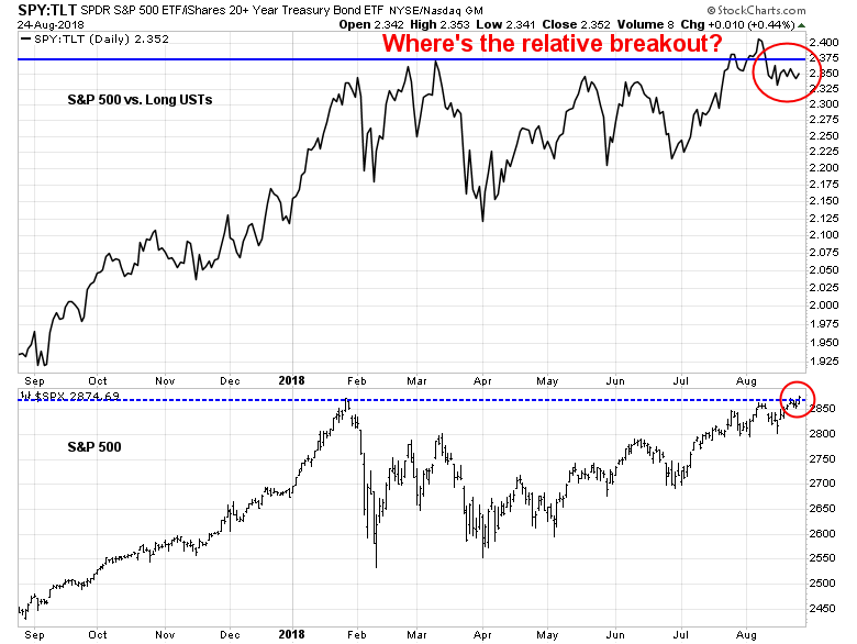
In the US, evidence of technical deteriorating is starting to appear. Consider the stock/bond ratio (SPY/TLT), which includes the total return. As the S&P 500 broke out to an all-time high last week, why did SPY/TLT behave so poorly? This ratio staged an upside relative breakout to fresh highs in early August, pulled back to test the breakout level, and it has been unable to strengthen back above relative resistance. Is that telling us something about risk appetite?
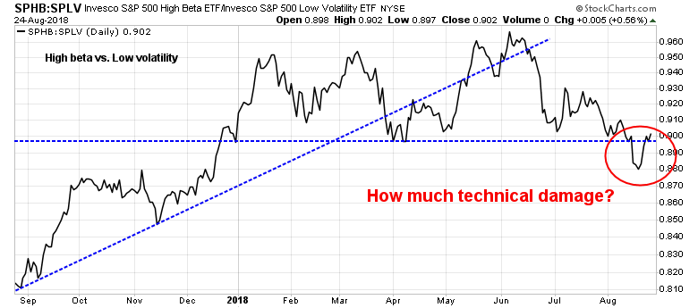
The ratio of high beta to low volatility stocks (SPHB/SPLV) is also flashing a cautionary message about risk appetite. This ratio had been consolidating sideways for most of this year, and recently broke a key relative support level. While risk appetite has tactically improved and the ratio has rallied back above the relative resistance line, the technical damage done by the relative support breach is something investors should be paying attention to.
Clues from leadership rotation
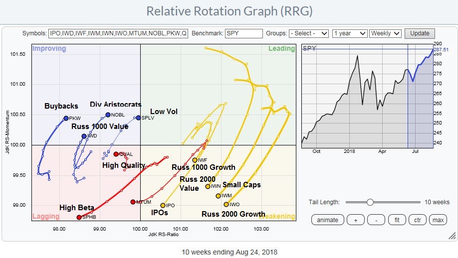
Market internals of sector leadership based on RRG charts is also showing that the bears are taking control of the tape. As an explanation, RRG charts are a way of depicting the changes in leadership in different groups, such as sectors, countries or regions, or market factors. The charts are organized into four quadrants. The typical group rotation pattern occurs in a clockwise fashion. Leading groups (top right) deteriorate to weakening groups (bottom right), which then rotates to lagging groups (bottom left), which changes to improving groups (top left), and finally completes the cycle by improving to leading groups (top right) again.
The latest RRG of style, or factor, leadership shows that the leading groups have become defensive and value in nature, while high-octane groups, such as IPOs, high beta, and price momentum are either weakening or lagging. This shows how the character of stock market internals have shifted in the past 10 weeks from growth to value, and from high beta to defensive factors.
The RRG chart of US sector leadership tells a similar story. Defensive sector such as Consumer Staples, Healthcare, REITs, and Utilities are all either improving or leading sectors. The appearance of heavyweight sectors such as Financials and Technology in the lagging and weakening quadrants is also creating headwinds for the major cap and float weighted indices.

On an absolute basis, this chart of VNQ, which represents REITs, is undergoing a bullish cup and handle upside breakout. Leadership from such a defensive sector is another technical warning of a potential market top.

The heavyweight financial stocks are current in the “lagging” quadrant, and appear to be on the verge of rising to the “improving” quadrant, but even that recovery may be suspect. As the chart below shows, the relative performance of this sector is highly correlated to the shape of the yield curve. They outperform when the yield curve is steepening, and lag the market when it is flattening. The yield curve underwent a brief steepening episode, but it appears to have reverted to its flattening trend as the Fed has signaled a steady pace of rate increases.

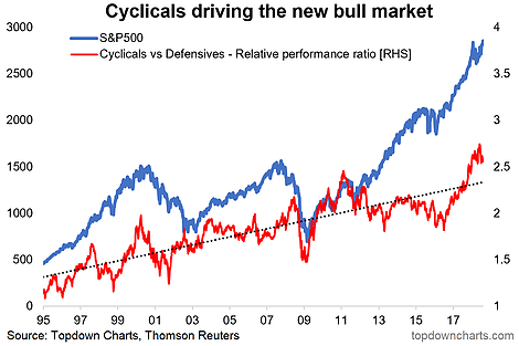
Another clue from sector leadership can be seen in the performance of cyclical stocks compared to defensive stocks. Callum Thomas of Topdown Charts observed that cyclical stocks have been one of the key drivers of this equity bull, but the cyclical to defensive stock ratio is starting to roll over.
Globally, the BAML Fund Manager Survey found that consensus profit expectations are also deteriorating, which usually foreshadows weakness in the cyclical/defensive stock performance.

The copper/gold ratio is another way that we can see how the global cycle is rolling over. Both copper and gold have commodity and inflation hedge characteristics, but copper is more sensitive to industrial production and therefore its price is more cyclically sensitive. As the chart below shows, the copper/gold ratio is declining, and this ratio has historically been correlated with the stock/bond ratio, which is a measure of risk appetite.

Warnings from trend following models
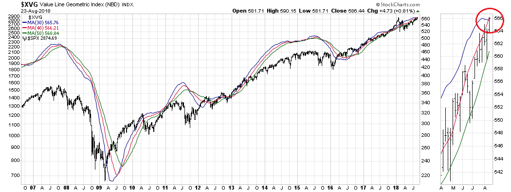
In addition, trend following models are starting to flash warnings of market weakness. I first encountered Chris Ciovacco’s work in 2016 when his trend following models proclaimed [A] Stock Market [buy] Signal Has Occurred Only 10 Other Times In Last 35 Years. This YouTube video explained his decision process. Ciovacco uses a trend following model which applies a 30, 40, and 50 week moving average to the NYSE Composite. A bullish condition occurs when each of shorter MAs are above the longer MAs, and vice versa. A warning signal is flashed when the short (30 week) MA falls below the medium (40) week MA (vertical lines). By design, trend following models will not pinpoint the exact top or bottom, but they spot the trend, and they are usually late in their buy and sell signals. As the chart below shows, the 30 WMA of the NYSE Composite just fell below the 40 WMA, which is a bearish warning*.

As well, consider how the 30, 40, and 50 WMA trend following model is telling us about market conditions when we apply the model to the Value Line Geometric Average, which is another broad measure of the stock market.
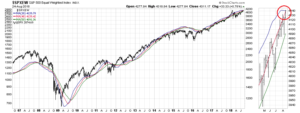
How about the equal weighted S&P 500, as a measure of the average large cap stocks, as opposed to the more conventional float-weighted index?
Of the broadly based indices, only the Wilshire 5000 is on a buy signal, though the 30 wma is showing signs that it is rolling over.
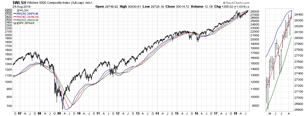
I interpret these conditions as failing price momentum, which is another warning for the bulls.
* Ciovacco remains bullish on equities today, but his bullishness is justified by moving his original goalposts. A recent article, These Facts Do Not Support Major Top Theory, presented evidence by comparing the behavior of stocks, bonds, and gold in 2008 to today.
Faltering price momentum
Indeed, the performance price momentum factor has been rolling over, which is worrisome.
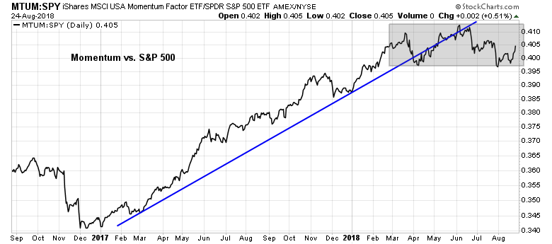
A team of academic researchers at the Cass Business School found in 2012 (see The Trend is Our Friend: Risk Parity, Momentum and Trend Following in Global Asset Allocation) that traders can optimize their results by combining trend following with price momentum. Price momentum works best when the stock market is an uptrend, and performs badly in a downtrend. In other words, when the market is rising, buy the hot story stocks of the day.
My own study reproducing the results at the sector level, instead of the stock level momentum observed in the original study, found a similar effect. I calculated the returns of a basket of high momentum sectors under different trend conditions. The accompanying chart shows that price momentum returns were astoundingly positive in uptrends, negative in downtrends, and had minimal effect in neutral trends.

The lackluster performance of price momentum for most of 2018 has to be regarded as a warning sign that the market trend may be faltering as well.
In summary, there are at least ten separate and distinct technical warning signs that a major market top is forming. One of the adages of technical analysis is while bottoms are events (because of emotionally laden panics seen at bottoms), tops are processes (as complacency and technical deterioration set in). I interpret current conditions as the US equity market undergoing a topping process. While stocks are unlikely to crash tomorrow, investors should be prepared for the bears taking control of the tape in the not too distant future.
In a future post, I will also detail the macro and fundamental headwinds for equity bulls.
The week ahead
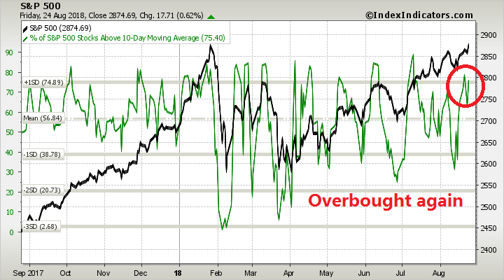
Even as many of the major stock indices staged upside breakouts to fresh highs last week, the lack of a breadth thrust is worrisome. Compare the strength of the breadth thrusts shown in the market melt-up that began in late 2017 across all market cap bands and in NASDAQ stocks to 2018. One of these market advances is not like the other, which puts into question the sustainability of the current rally.

In the short run, short-term (3-5 day time horizon) breadth from Index Indicators is back at or near overbought levels. While overbought markets can become more overbought, the risk/reward is tilted to the downside, especially in light of an absence of breadth thrusts that make the likelihood of a series “good overbought” conditions less likely.
Short-term risk appetite may be a function of the USD. A rising USD has the undesirable effects of weakening the Chinese Yuan, which exacerbates trade tensions, puts pressure on vulnerable EM currencies, and depress the earnings of US large cap multi-nationals. The USD Index staged an upside breakout through the 95 key resistance level in early August, but weakened on the back of Trump’s comments on monetary policy, and the perceived dovish tone of Powell’s Jackson Hole speech. What happens next? Your guess is as good as mine.

My inner investor is taking advantage of market strength to selectively lighten up on his equity positions. My inner trader remains short the market.
Disclosure: Long SPXU
Cam,
While you present the market topping case in your newsletters you have yet to move your “Ultimate Market Timing Model” signal to neutral or sell. Can you explain what would it take to make you change your long term signal?
Thanks,
Wally
The market topping thesis is a bearish setup. Risk/reward is unfavorable for investment oriented accounts that don’t care about every blip in the market.
That said, the actual sell signal of the Ultimate Market Timing Model would occur when the S&P 500 starts to breach the 50 dma.
Curious what your time frame is for the SPXU trade. Also, is the red “Down” arrow on the weekly analogous to the red Down arrow in October 2015 which was followed by a blue “Up” arrow 4 months later, or do you see the current “Red” arrow setup having longer duration? Finally, Urban Carmel sometimes distinguishes between a bullish or bearish “setup” and a “trigger.” Any thoughts to what trigger would make you go aggressively short as more than just a trade?
The SPXU is a position in the trading account. Trading accounts, by definition, have much shorter time horizons than investment accounts. I can’t really forecast the exact time frame. It’s like the definition of pornography: I’ll know it when I see it.
Similarly, I would also be careful about making any parallels between the current trading signal with any past trading signals. Every trade is different, though the market principles remain the same.
G Vrba has a recession indicator that you might want to look at – https://imarketsignals.com/ims-business-cycle-index/
This is setting up like 2015 which I said at the time was a bear market followed by a bear market low in early 2016 that started a brand new bull market cycle.
Ciovacco’s work provided 10 cycles in 35 years or about one every four years, about the same as the stock/business cycles. The sell signals in 2015 followed by a buy signal in early 2016, confirm that an old cycle ended and a new one started in early 2016.
The big confusion among market observers is that they think the U.S. market is in a nine year bull. Globally, the only indexes that did not go down the required 20% in 2015-2016 are the S&P 500 and the NASDAQ. Even the U.S. Russell 2000 Small Cap Index fell 26% from 2015 to 2016. So a global bear market ended and a new bull market started and in small US caps in early 2016.
This is important since we are seeing the same dynamics today with non-U.S. markets starting a bear market while the general U.S. indexes continue up. But like 2015, internally we are seeing bear markets in certain sectors.
In 2015, non-U.S. stock markets were in clear bear markets while only certain cyclical sectors like energy were in bear markets in the U.S. that ended with deep lows in early 2016. Today we are seeing similar distress with home construction and auto indexes already down more than 20% since their peaks this year.
Until the end of 2017 the global economy was in a synchronized economic boom. It was appropriate to embrace the global bull market. But in 2018, the rest of the globe has stalled economically and stock markets are falling. The U.S. tax cuts have saved the general indexes from that fate.
The big question is whether the global stock markets turn up to join the U.S. party or the U.S. falls and joins the morning after hangover.
This is at best a flip of the coin and likely more towards the negative sooner or later. Hence why I agree with Cam’s caution to keep the trading portion of ones portfolio still in play but reduce the longer term tactical stock allocation.
Ken
Thanks for communicating your take. Out of curiosity, how much stock market exposure do your clients (with 10/20/30 year horizon to retirement) have?
Same question with larger net worth clients, regardless of time to retirement?
It would truly help readers, judge where they stand in their own portfolios.
Cam, such a feed back from you, would also be very helpful. Thanks, Ken and Cam.
My growth oriented clients have a range of 50-100% in equities with 70% at the target average over a business/stock market cycle. They are now at 60%. Within the 40%, non-equity, they own a 20% holding in a defensive alternative long/short investment and a 20% alternative merger arbitrage investment that is producing steady capital gains.
My more conservative clients have a range of 30-70% in equities with 50% as a target. They are at 35%. In the non-equity portion (I use this term now rather than ‘Fixed Income’ because of the long term interest rate outlook) we also own the long/short and merger arbitrage investments mentioned above, plus tax-advantaged (in Canada) of preferred share investments and real return bond ETFs.
I hope this helps. Investors are currently dealt a difficult hand to earn a decent rate of return safely with the longer term outlook for interest rates a head wind for bonds and a stock market richly priced facing a head wind of anti-globalism.
Robo A.I. systems and money managers that invest based on past history as a guide to this new type of future will do very poorly in my estimation.
Thanks, Ken, very helpful.