Preface: Explaining our market timing models
We maintain several market timing models, each with differing time horizons. The “Ultimate Market Timing Model” is a long-term market timing model based on the research outlined in our post, Building the ultimate market timing model. This model tends to generate only a handful of signals each decade.
The Trend Model is an asset allocation model which applies trend following principles based on the inputs of global stock and commodity price. This model has a shorter time horizon and tends to turn over about 4-6 times a year. In essence, it seeks to answer the question, “Is the trend in the global economy expansion (bullish) or contraction (bearish)?”
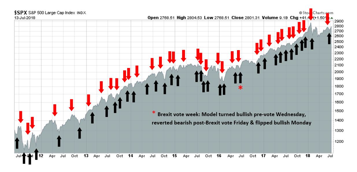
My inner trader uses the trading component of the Trend Model to look for changes in the direction of the main Trend Model signal. A bullish Trend Model signal that gets less bullish is a trading “sell” signal. Conversely, a bearish Trend Model signal that gets less bearish is a trading “buy” signal. The history of actual out-of-sample (not backtested) signals of the trading model are shown by the arrows in the chart below. The turnover rate of the trading model is high, and it has varied between 150% to 200% per month.
Subscribers receive real-time alerts of model changes, and a hypothetical trading record of the those email alerts are updated weekly here.
The latest signals of each model are as follows:
- Ultimate market timing model: Buy equities
- Trend Model signal: Neutral
- Trading model: Bullish
Update schedule: I generally update model readings on my site on weekends and tweet mid-week observations at @humblestudent. Subscribers receive real-time alerts of trading model changes, and a hypothetical trading record of the those email alerts is shown here.
What sector will lead?
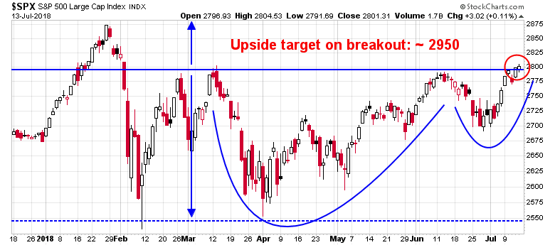
The bulls appear to have taken control of the tape. The SPX is exhibiting a bullish cup and saucer formation. If it achieves a decisive breakout at 2800, the upside target is about 2950*. In all likelihood, the upside breakout will occur, as there is strong breadth support as small cap, midcap, and NASDAQ indices all achieved all-time highs last week.
As US stock prices are poised for fresh highs, one of the key questions is the nature of the leadership that investors should expect. A standard approach of using Relative Rotation Graph charting yielded some answers, but a further factor-based analysis indicated a surprising level of risk exposure.
* I had previously published an upside target of 3050 in a past versions of the cup and handle analysis. The 3050 figure was a arithmetic error. My apologies for the mistake.
Bullish intermediate market outlook
The fundamental and macro backdrop of the stock market has been unchanged for the last several months. The nowcast and short (3-6 month) leading indicators are very positive, which is supportive of stock prices.
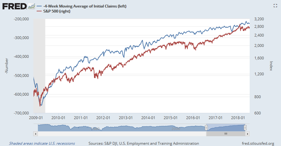
If you are looking for a quick and dirty indicator of stock market direction, look no further than initial jobless claims, which has shown a remarkable inverse correlation with equities.
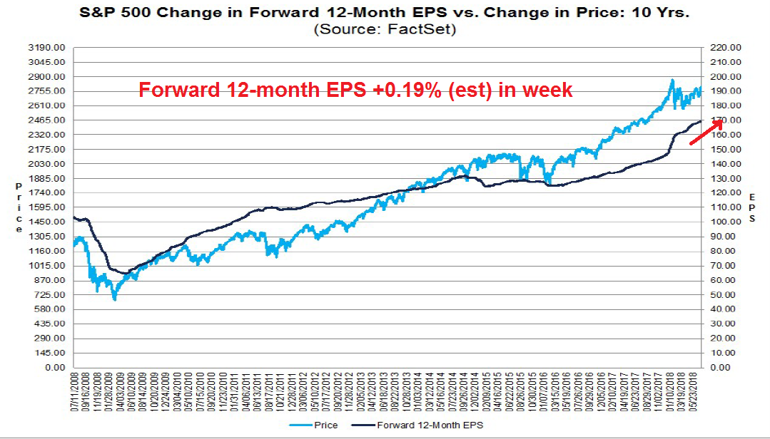
As well, the latest update from FactSet shows that forward 12-month EPS continue to rise, indicating positive fundamental momentum that is supportive of higher prices. In addition, John Butters of FactSet observed that the coming quarter is the second best quarter for corporate guidance since 2006, which should set the backdrop for a solid Q2 earnings season.
The market action of the past few months has been consistent. It has reacted positively to rising growth fundamentals, but news driven events mainly related to trade jitters have caused temporary setbacks. The likely upside breakout at 2800 indicates that market psychology is discounting the negative effects of a trade war.
Sector leadership analysis
I use the Relative Rotation Graphs, or RRG chart, as the primary tool for the analysis of sector leadership. As an explanation, RRG charts are a way of depicting the changes in leadership in different groups, such as sectors, countries or regions, or market factors. The charts are organized into four quadrants. The typical group rotation pattern occurs in a clockwise fashion. Leading groups (top right) deteriorate to weakening groups (bottom right), which then rotates to lagging groups (bottom left), which changes to improving groups (top left), and finally completes the cycle by improving to leading groups (top right) again.
An RRG chart of the US market reveals that the leading sectors of the market are Technology, Consumer Discretionary, and REITs. Healthcare stocks may represent the emerging leadership, and the most obvious laggards are Industrials and Financials.
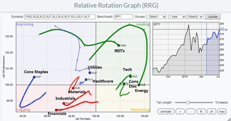
Is that the full story? One of problems with float weighted indices is the index may be dominated by just a few stocks. As an example, Amazon and Netflix comprise about 30% of the Consumer Discretionary sector. The RRG chart of equal weighted sectors against the equal weighted index provided a way of verifying our preliminary conclusions of sector leadership. The conclusions are roughly the same, as the sectors are all roughly in the same sector leadership spots.

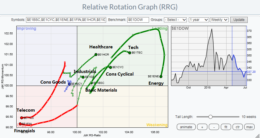
Another way of verifying the sector leadership trends is to analyze sector behavior in Europe. While US stocks have been leading European stocks, the market internals of both markets have tended to be relatively synchronized. The RRG chart of European stocks also tell a similar story. Technology and Consumer Cyclical stocks are the leaders, followed by Healthcare. Financial stocks are the laggards.
A detailed sector review
RRG analysis represents a first cut at leadership analysis. Here is a more detailed look at selected individual sectors that I would overweight.
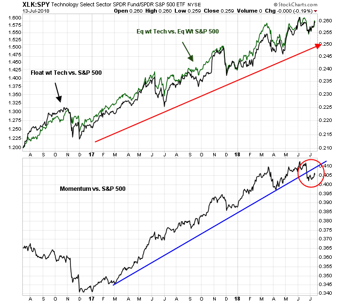
The continued strength in Technology stocks has been a surprise, especially in light of evidence of faltering price momentum. However, the relative strength of the sector, whether on a float or equal weighted basis, is testament to powerful market leadership at work.
Consumer Discretionary stocks stand out well in the RRG analysis, but a comparison of the float and equal weighted relative returns reveals that much of the sector’s strength is a float weighted attributable to Amazon and Netflix. Nevertheless, the equal weight analysis shows that the sector is making a broad saucer shaped relative base, and it has potential for outperformance.

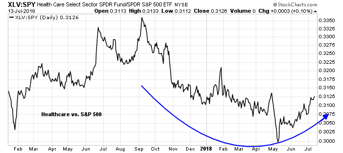
Healthcare is another sector making a constructive saucer shaped relative base.
Finally, I would suggest taking overweight positions in the interest sensitive sectors as a hedge against market weakness. These are defensive sectors, but they are also exhibiting similar saucer shaped bottom relative return patterns.
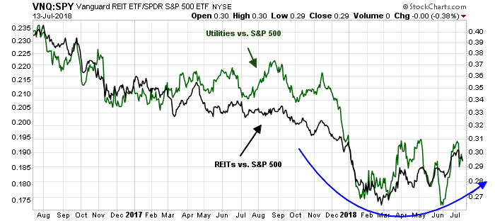
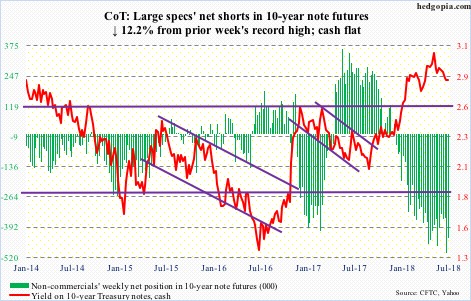
An overweight position in interest sensitive sectors may be appropriate, as the latest CFTC Commitment of Traders report indicates large speculators, which are mostly hedge funds, have taken a crowded short position in the 10-year Treasury Note. Such an extreme position is potentially contrarian bullish.
Factor exposure considerations
No analysis of sector leadership would be complete without an analysis of the sector factor beta. An RRG analysis of factors, or styles, shows that market leadership is dominated by small cap and selected growth styles. Value factors such as quality, and dividend growth are laggards.
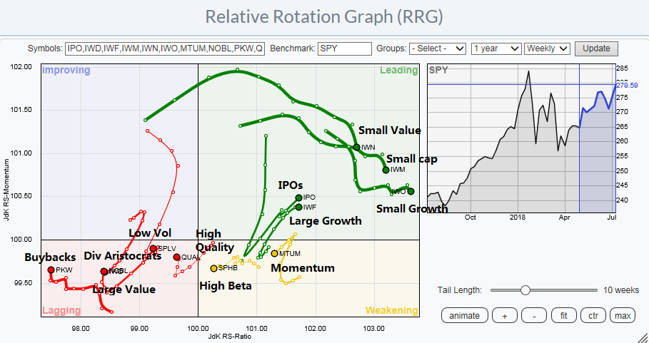
The strength exhibited by small cap leadership highlights a factor exposure that many investors may have missed. Small cap outperformance has been highly correlated with USD strength.

The USD Index is technically vulnerable to a pullback. It has tested a key resistance level and failed while exhibiting a negative RSI divergence. In addition, the index rallied to test the underside of an uptrend, and it also failed at resistance. These conditions suggest that the path of least resistance for the USD Index is down.
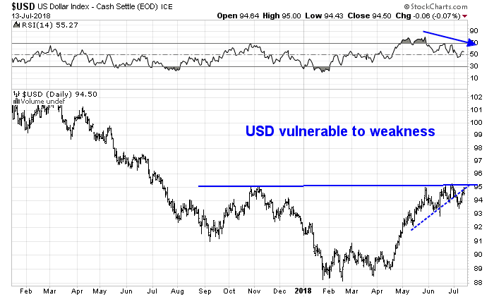
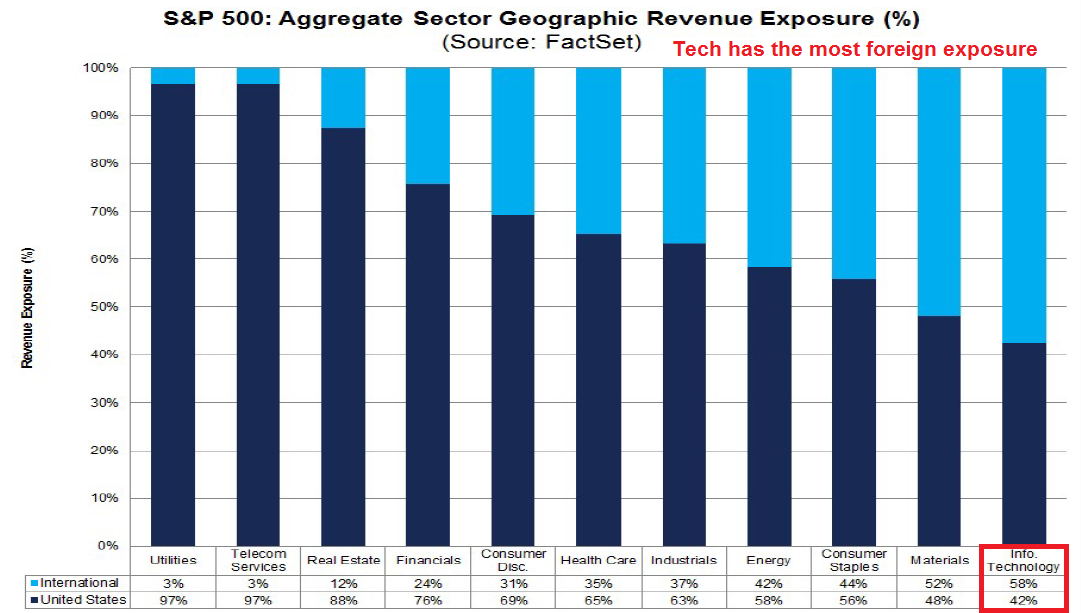
The recent strength of the USD in the past few months makes the leadership of Technology stocks that much more remarkable. Analysis from FactSet shows that the sector has the most foreign exposure of the index. A rising dollar would create headwinds for the earnings in this sector, and still these stocks outperformed. Should the USD weaken as expected, then it should create even a greater tailwind for this sector. The obvious key risk is a trade war that hurts both the supply chain and margins of this highly globalized sector.
In light of the USD sensitivity, one approach that investors could adopt is a barbell strategy to overweight Technology and the interest sensitive stocks of Utilities and REITs.
Another factor sensitivity that I would like to address is the yield curve. Historically, the relative performance of Financial stocks has been correlated to the shape of the yield curve. A steepening yield curve has been bullish for outperformance of this sector, and a flattening yield curve bearish. The only exception has been the market reaction in the wake of Trump’s electoral win, where Financial stocks rallied in anticipation of better earnings through deregulation and tax cuts.
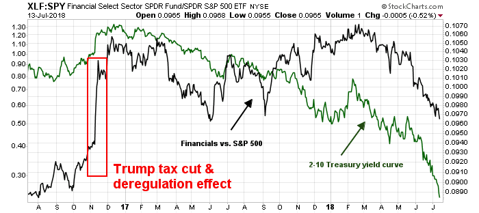
The yield curve has been flattening form most of this year in response to Fed policy. It is hard to see what might reverse that trend, and therefore I would suggest a continued underweight in Financial stocks.
In summary, a review of sector leadership shows a number of sectors that investors could overweight:
- Technology still the champ
- Consumer Discretionary and Healthcare are emerging leadership candidates
- Interest sensitive sectors such as REITs and Utilities have the useful defensive qualities and are also showing up as possible market leaders
Lastly, the relative performance of Financials has historically been correlated to the yield curve. As long as the yield curve continues its flattening trend, it will be difficult for Financials to outperform.
The week ahead
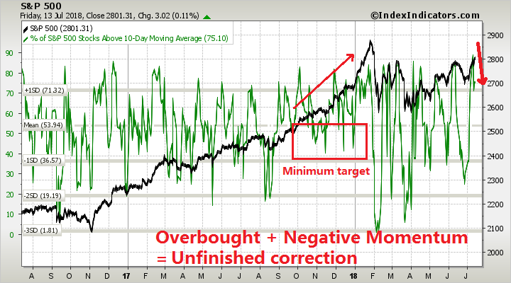
Looking to the week ahead, even though the SPX has staged a marginal upside breakout at 2800, near term caution is warranted on a tactical basis for a number of reasons. First, the upside breakout was achieved while exhibiting a negative divergence on RSI-5.

The negative divergence is clearer and more visible on the hourly chart. If the index were to pull back, there are a couple of downside gaps that could be filled, with initial Fibonacci support just below the second gap at about 2760. If that breaks, secondary support can be found at 2740.

The near-term action argues for a brief period of pullback and consolidation. Breadth indicators have become overbought and they are pulling back. Even if intermediate term price momentum is strong, look for a minimum pullback to levels just below neutral, as was the case during the strong period at the end of 2017.
The upcoming week is OpEx week. Analysis from Rob Hanna of Quantifiable Edges show that the directional bias for July OpEx is little more than a coin toss.

My inner investor is still long the market. My inner trader has a minor long commitment, and he is prepared to add to his position on market weakness, or a decisive upside breakout.
Disclosure: Long SPXL
Cam, really nice. I always look forward to Relative Rotation Graph analysis.
The Shanghai has steadily gone down since Feb 2018. Is it close to bottoming? I invest in individual equities but use your research primarily determine cash allocation and to get a better buy or sell price.
Thanks!