Mid-week market update: In case you missed it, the S&P 500 experienced a “golden cross” this week, when the 50 dma rose above the 200 dma. This is generally regarded as a bullish development among the technical analysis crowd as an indication that the price trend has turned upward.

How should traders and investors interpret the golden cross signal?
Good news, bad news
Rob Hanna at Quantifiable Edges analyzed past golden cross buy signals and he had some good news and bad news for investors. The signal was generally positive for stock prices and beat a buy and hold benchmark, but drawdowns can be quite substantial.
While drawdowns have been mostly fairly moderate since the mid-50s, prior to that there were some very large drawdowns to endure. The 2020 drawdown was the biggest since the 40s. Despite some fairly sizable drawdowns, the Golden Cross would have beaten “Buy and Hold” handily. Over the time period measured, the SPX had a compound annual growth rate (CAGR) of 5.57%. Simply incorporating a Golden Cross filter would have raised the CAGR to 7.25%. It is a bullish long-term trend indication. But it is not a bulletproof long signal.

Bullish, with a chance of pullback
This leaves us with an intermediate-term bullish outlook, but with a substantial chance of a pullback in the near term. The usually reliable 14-day RSI of the S&P 500 Intermediate Term Breadth Momentum Oscillator (ITBM) recycled from an overbought to a neutral condition yesterday, which is a tactical sell signal and an indication of a loss of momentu.
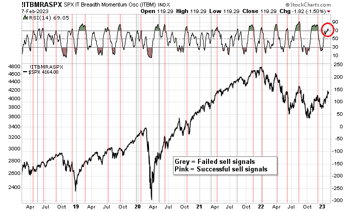
The market is getting a little frothy, and a pullback would not be unusual. How frothy? FactSet reported that the Q4 earnings beat rate was 70%, which was short of the 5-year average of 77% and 10-year average of 73%. The sales beat rate was 61%, compared to the 5-year average of 69% and 10-year average of 63%. Nevertheless, Bespoke observed, “Over the last three months, stocks that have reported have seen a median one-day gain of 0.86% on their earnings reaction days.”

Estimating downside risk
What’s the near term downside risk for the S&P 500 from here? The S&P 500 staged upside breakouts through double resistance, and a logical support level is the falling trend line at the 3920-3930 level. That represents a peak-to-trough downside potential of -5%, which is not bad in the context of an intermediate uptrend. As the equal-weighted S&P 500, S&P 400, and Russell 2000 all broke resistance, watch for them to pull back to test the breakout turned support.

In conclusion, the golden cross signal should be an intermediate term bullish signal for stock prices. However, the market is extended and the risk of a near-term pullback is high. The most likely peak-to-trough downside risk for the S&P 500 is about -5%.
Subscribers received an email alert this morning that my trading account had initiated a short position in the S&P 500. This is only a tactical short and I believe the intermediate trend is still up. The usual disclaims apply to my trading positions.
I would like to add a note about the disclosure of my trading account after discussions with some readers. I disclose the direction of my trading exposure to indicate any potential conflicts. I use leveraged ETFs because the account is a tax-deferred account that does not allow margin trading and my degree of exposure is a relatively small percentage of the account. It emphatically does not represent an endorsement that you should follow my use of these products to trade their own account. Leverage ETFs have a known decay problem that don’t make the suitable for anything other than short-term trading. You have to determine and be responsible for your own risk tolerance and pain thresholds. Your own mileage will and should vary.
Disclosure: Long SPXU
After one losing trade, Cam’s back to killing it.