In light of the recent surge in global rates, it’s time for another review of sector leadership. I will conduct the review in two ways. First, the market will be viewed through a cross-asset framework. Rising yields and a steepening yield curve have been bullish for the value/growth cycle in the past, will this time be different?
As well, the market will be viewed through a conventional technical analysis lens.
Reflation or mid-cycle pause?
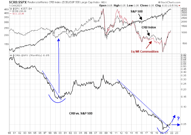
The CRB Index provides some big picture context to the current phase of the economic cycle. The CRB/S&P 500 ratio, which is a useful cyclical indicator. When the ratio is rising, the market is signaling that hard assets are more value than paper assets, which is reflationary. The ratio bottomed out in 2020 and staged an upside breakout through a downtrend in early 2021. This price pattern is similar to late 2000 when the NASDAQ Bubble popped and a recession began to take hold. The commodity/stock ratio rose into late 2000 and prices paused, which is an indication of economic weakness. The key difference between the 2000 episode and today is that stocks were in a bear market in 2000 while they have rebounded strongly today.
What happens next? Will commodity prices continue to rally indicating a reflationary rebound, or pause and trade sideways, which will be a signal of a mid-cycle slowdown?
The cyclically sensitive copper/gold and base metals/gold ratios are leaning towards the cyclical recovery and a risk-on scenario. The historical record shows that these cyclically sensitive ratios have been correlated to the stock/bond ratio, which is a risk appetite indicator.
The copper/gold ratio topped out in late 2000 and it didn’t bottom out until 2003. Today, the copper/gold ratio is trading sideways, which could be a signal of a growth pause, but that could be a false signal. The more diversified base metals/gold ratio is rising indicating a reflationary rebound.
Sector rotation review
If we were to analyze the market through a more traditional technical analysis prism, the first tool is an RRG chart, which is a way of depicting the changes in leadership in different groups, such as sectors, countries or regions, or market factors. The charts are organized into four quadrants. The typical group rotation pattern occurs in a clockwise fashion. Leading groups (top right) deteriorate to weakening groups (bottom right), which then rotates to lagging groups (bottom left), which change to improving groups (top left), and finally completes the cycle by improving to leading groups (top right) again.
The latest chart shows technology and healthcare in the top right leading quadrant with flagging leadership characteristics. Rising sectors in the top left improving quadrant are financials and consumer discretionary. Energy, materials, and industrials are in the left bottom lagging quadrant but they are showing signs of nascent strength.
Let’s start the analysis with healthcare, which was one of the leading sectors. Healthcare stocks violated a rising trend line in September. Even before the trend line violation, relative performance peaked in August and relative breadth (bottom two panels) has been weakening.
The remainder of the sectors will be divided between growth sectors and value and cyclical sectors. Technology stocks were also one of the market leaders, but they have been unable to overcome a relative resistance zone (shown in grey). Relative breadth peaked in early August and it has been in decline.
The stocks in the communication services sector is less homogeneous than other sectors. This sector violated a rising trend line and its relative performance has been range-bound since April. However, relative breadth has been improving, but the recent strength is attributable to some of the smaller stocks in the sector, such as Netflix and selected telecoms, while heavyweights Facebook and Alphabet have been weak.
Financials is the strongest of the value and cyclical sectors. The sector is tracing out a bullish cup and handle formation, but it hasn’t staged an upside breakout yet. Relative strength is correlated to the 2s10s yield curve. Banks tend to borrow short and lend long and a steepening yield curve increases profitability. Relative breadth has been strong.
Consumer discretionary stocks can be thought of as both growth and value. The largest weights in the sector are AMZN and TSLA, which are growth stocks and account for about 45% of sector weight and can be represented by the cap weight sector index. The remainder is more conventional cyclically sensitive consumer discretionary stocks and can be better represented by an equal-weighted sample. The relative performance of the cap-weighted sector has been strengthening while the equal-weighted sector has been flat against the S&P 500. However, relative breadth has been rising, which could be interpreted as a signal of better performance by the broader cyclically sensitive stocks.
Energy stocks have been strong as oil prices rose, but bullishness and bearishness are in the eyes of the beholder. The sector has staged an upside breakout from an inverse head and shoulders pattern, which is bullish, but the latest rally could be forming the right shoulder of a head and shoulders formation, which is potentially bearish. As good chartists know, a head and shoulders pattern is not confirmed until the neckline breaks. Since the neckline broke on the inverse H&S, I am inclined to give the bull case the benefit of the doubt. Unsurprisingly, relative breadth is strong as oil prices rallied.
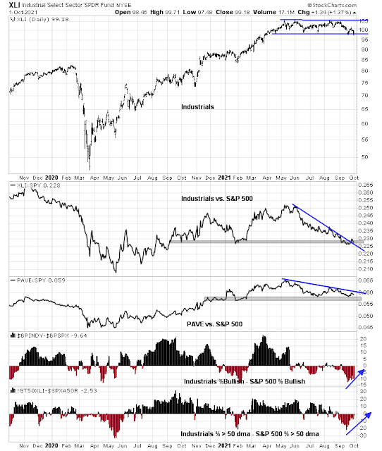
The industrial sector is range bound, but its relative performance staged an upside breakout through a falling trend line after testing a relative support zone. This technical pattern is very similar to the relative performance of the capital goods sensitive Infrastructure ETF (PAVE), which is testing a falling relative trend line. Relative breadth of industrials, while still negative, is improving.
Materials is the weakest sector of the value and cyclical sectors. The sector is testing a key resistance level, though it appears to have staged a marginal upside breakout through a falling relative trend line. However, relative breadth is negative and weak.
The remainder of the S&P 500 sectors have defensive characteristics. None are showing any signs of relative strength. If the bears were to take control of the tape, their actions would show up as improving defensive sector relative performance.
In conclusion, a review of market leadership through macro cross-asset and conventional technical analysis viewpoints shows a possible bullish setup for the reflation trade. However, the jury is still out on this bullish scenario. We need to see the cyclical and value sectors exhibit better and broader relative performance as confirmation of reflationary strength. Investors may gain better clarity on market direction once the jitters over the debt ceiling and Biden’s stimulus program are resolved.


Cam- Maybe I’m being too simplistic but if most charts are breaking down and it appears that a ST down trend is in place why remain bullish?
Many of these charts look bearish to me.