Preface: Explaining our market timing models
We maintain several market timing models, each with differing time horizons. The “Ultimate Market Timing Model” is a long-term market timing model based on the research outlined in our post, Building the ultimate market timing model. This model tends to generate only a handful of signals each decade.
The Trend Asset Allocation Model is an asset allocation model that applies trend following principles based on the inputs of global stock and commodity price. This model has a shorter time horizon and tends to turn over about 4-6 times a year. The performance and full details of a model portfolio based on the out-of-sample signals of the Trend Model can be found here.
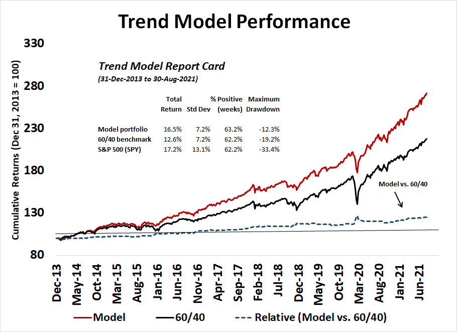
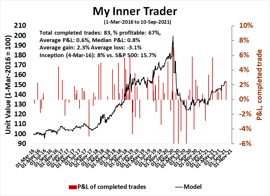
My inner trader uses a trading model, which is a blend of price momentum (is the Trend Model becoming more bullish, or bearish?) and overbought/oversold extremes (don’t buy if the trend is overbought, and vice versa). Subscribers receive real-time alerts of model changes, and a hypothetical trading record of the email alerts is updated weekly here. The hypothetical trading record of the trading model of the real-time alerts that began in March 2016 is shown below.
The latest signals of each model are as follows:
- Ultimate market timing model: Buy equities
- Trend Model signal: Bullish
- Trading model: Neutral
Update schedule: I generally update model readings on my site on weekends and tweet mid-week observations at @humblestudent. Subscribers receive real-time alerts of trading model changes, and a hypothetical trading record of those email alerts is shown here.
Subscribers can access the latest signal in real-time here.
The BB ride ends
Last week, I pointed out that the S&P 500 had gone on a ride on the upper Bollinger Band. The upper BB ride ended with the market pulling back. What’s next?

The clues to the next major move in the S&P 500 can be found in breadth indicators.
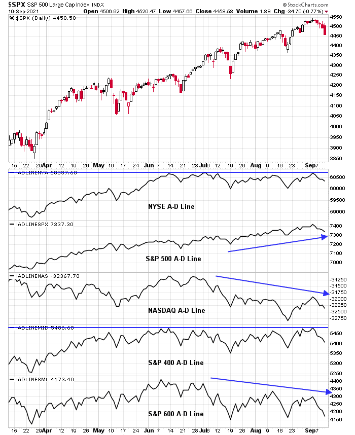
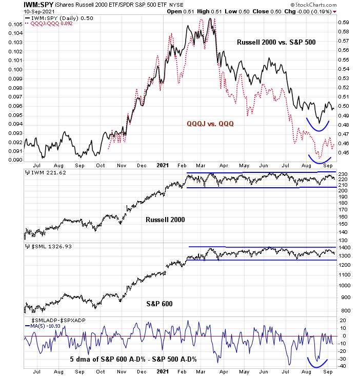
A difference in breadth
A review of the different versions of the Advance-Decline Line reveals some key differences. The S&P 500 A-D Line is the strongest and it has confirmed the continued advance of the index. The NYSE and midcap S&P 400 A-D Lines are struggling to overcome overhead resistance. The weakest is the smallcap S&P 600 and the NASDAQ A-D Line, which is a surprise given the strength of NASDAQ stocks.
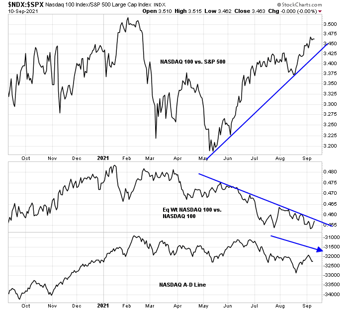
The relative performance of the NASDAQ 100 tells the story of large-cap growth leadership. Even as the NASDAQ 100 is in a relative uptrend against the S&P 500, the relative performance of the Equal-Weighted NASDAQ 100 to the cap-weighted NASDAQ 100 and the NASDAQ 100 A-D Line are falling.
Waiting for a small-cap signal
I am also waiting for a signal from the high-beta small-cap stocks, which have been range-bound for most of 2021. The relative performance of small stocks bottomed out mid-August, and so did relative breadth (bottom panel). Since then, progress has stalled.
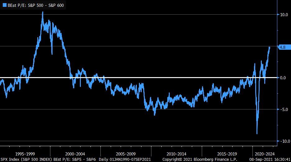
While valuation doesn’t matter much in the short term, it does matter in the long term. The relative forward P/E of the S&P 500 compared to the S&P 600 is back to 2001 levels.
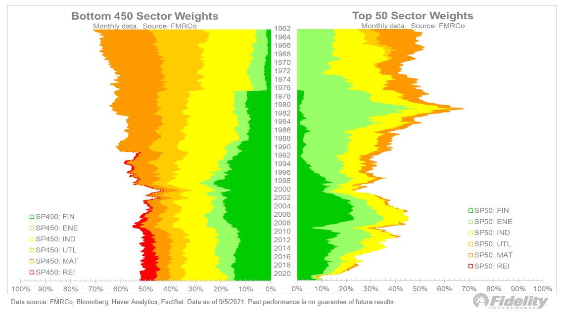
The relative performance of the size factor, or small-caps, is linked to the value/growth cycle. An analysis of the evolution in weights of value sectors in the top 50 and bottom 450 of the S&P 500 is revealing. Value stocks have been falling in the weight of the top 50 in the last 10 years while their weight in the bottom 450 has been relatively stable. A small-cap revival should, all else being equal, provide a tail-wind for value.
Credit market signals
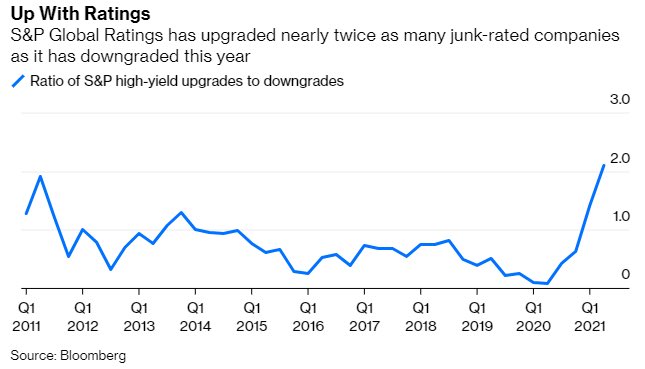
The current environment should be a period when small-caps shine. Since small companies tend to be of lower quality, I have often highighted the relative performance of junk bonds as a credit market risk appetite signal. So far, the junk bond market is tracking the performance of the S&P 500 fairly well in the last two months.
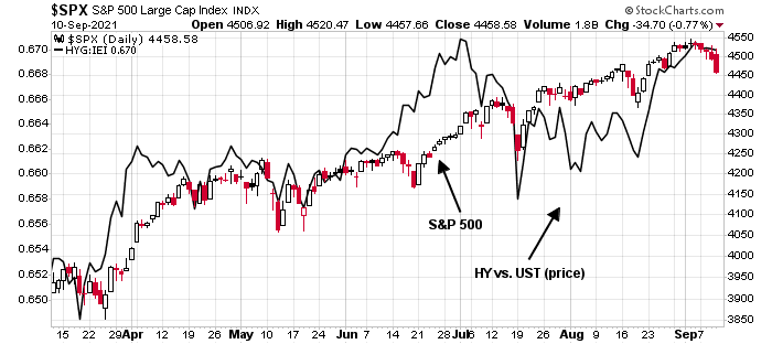
S&P reported that there have been far more rating upgrades than downgrades in junk bonds, which indicates the positive effects of the recent recovery. This should be supportive of higher stock prices from a cross-asset perspective.
Where’s the bottom?
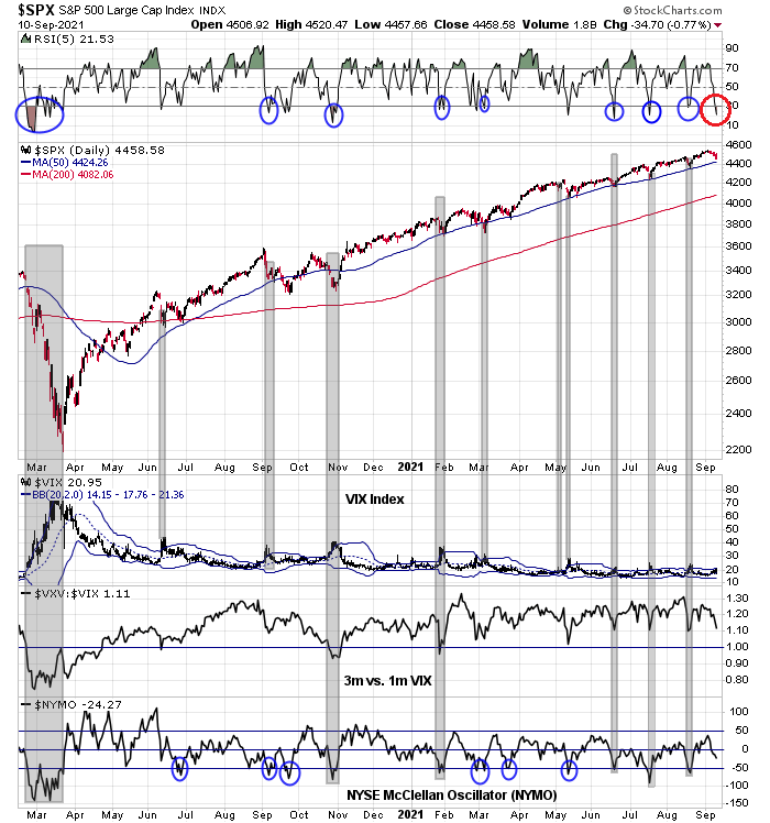
The S&P 500 has fallen for five consecutive days, but the drawdown over that period is only -1.7%. The market is oversold short-term and should bounce early in the week.

However, the decline may not be over. Only one of the components of my tactical bottoming model, namely the 5-day RSI, has been triggered. The VIX Index hasn’t spiked above its upper BB’ the term structure of the VIX hasn’t inverted; and NYMO hasn’t fallen into oversold territory.
Should the weakness continue, an obvious support level would be the 50 dma at 4424. Pullbacks in 2021 have been shallow and arrested at the 50 dma. Barring a macro or major fundamental trigger, the current episode should not be any different.
In conclusion, the stock market has begun to pull back after an upper Bollinger Band ride. The clues to the next major directional move can be found in breadth indicators, which are mixed, and small-cap stocks, which remain range-bound. In addition, the small size effect is indirectly linked to value. An upside breakout by small-cap stocks should be bullish for value stocks, while a downside breakdown should see leadership by large-cap growth.
Stay tuned.
In the story of generals leading and troops not following, how do we measure each? The troops from the A-D line, but which? Surely not the S&P 500/400? Then the NYSE composite, where the troops are not following (the S&P 500) any more.
(In StockCharts, ytd, plot !ADLINENYA, and behind price, $SPX) (Different scaling.)
Urban Carmel wrote a blog on this. Pretty much all bull markets have been led by very narrow leadership. These are usually not correlated with market tops, was his conclusion.
Thanks, D.V. I am not actually contemplating a hard market top, but a correction. Some corrections have started with a leadership gap, in which A-D moved first, followed by price. (A widening gap is a red flag.) The drop ended when the gap closed, as A-D then moves slower than price. You might say that the gap, positive or negative reflects sentiment. A gap should also represent vulnerability to adverse events.
What remains of the story of the generals?
Thanks.
Great read re what we know so far about the origins of SARS-CoV-2.
https://www.nationalgeographic.com/science/article/why-its-so-tricky-to-trace-the-origin-of-covid-19
I use the fact that people who report info about it are sent to the gulag as a leading indicator. 😉
Right. Seriously, it’s possible they’re looking for answers in all the wrong places. The current environment of political correctness is a real hindrance.
Intraday low for the SPX came within 7-8 points of the 50-day SMA and within 10 points of the 50-day EMA.
$NYMO -26.81. Relative to -64.57 on August 19.
Fear and Greed 31.
https://www.marketwatch.com/story/nearly-3-000-in-lapd-to-seek-vaccination-exemptions-on-religious-grounds-01631668634?mod=mw_latestnews
To quote UCSF’s Dr. Bob Wachter: This, despite the fact that vaccines are safe, effective, extraordinarily well studied, and blessed by a rigorous regulatory process.
Opening a position in VT.
VT closed. Went all-in on this one (a major advantage of trading the total stock market is the lower stress level when sizing up), so about a +0.34% one-hour gain.
Looks like I could have a a lot better holding the position into the close.
On the other hand, I bypassed the multi-day decline heading into today’s bounce.