Mid-week market update: One of the investing puzzles that has appeared in the last few months is the mystery of small cap underperformings. The USD Index has been strong over the last three months, which should create an earnings headwind for large cap multi-nationals with foreign operations. Instead, the relative performance of megacaps have been flat to up over this period, while mid and small cap stocks have lagged.
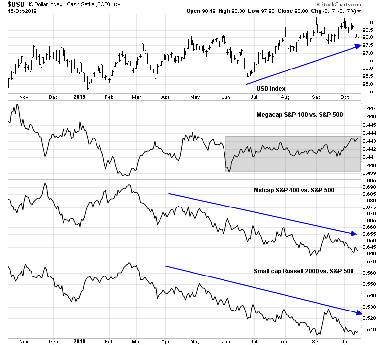
I unravel performance at a sector level, and discovered some unexpected insights about possible market direction.
A review of large and small cap sectors reveals that much of the difference in performance can be attributable to large cap FAANG stocks. In addition, the relative performance of small cap sectors shows some bullish green shoots. The cyclically sensitive small cap industrial sector exhibiting better relative strength, and the relative performance of small cap defensive sectors like consumer staples and utilities was not as strong, indicating a weaker than expected internals for low-beta names.
Unraveling small and large caps by sector
Not all stock indices are created equally. Here are the sector weights of large and small cap indices, sorted by large cap sector weights.
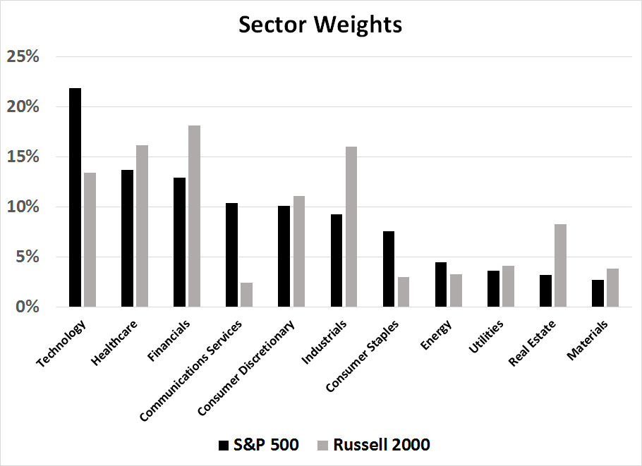
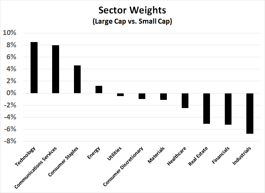
For another perspective, here are the differences in sector weights. Large caps are more exposed to FAANG (Technology and Communications Services), while small caps are more exposed to Industrials, Financials, and Real Estate, which are more interest rate sensitive.
Sector analysis
I went further by charting the relative performance of each sector to analyze both the sector effects and size effects, starting with the heaviest large cap sector and going to the smallest. In some cases, the analysis was not possible as there was no corresponding small cap sector ETF (Communications Services and Real Estate), but these sectors comprised very small weights in the Russell 2000 and therefore they were irrelevant to any conclusions that can be made. One of the reasons technicians use breadth analysis is to see what the broader market (troops) are doing, and not the heavyweights (generals). In principle, small cap sector analysis therefore yields a better picture of sector strength without the influence of megacap stocks, which can exhibit their own idiosyncrasies.
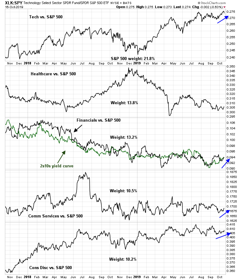
I will be using the same template for each sector, and here are the technology stocks. The top panel depicts the relative performance of large cap technology to large cap stocks (black line), and small cap technology to small cap stocks (green line). The bottom panel shows the relative performance of small caps to large caps (black line), and small cap technology to large cap technology. This way, we can see the sector effect in the top panel, and the size effect within the same sector in the bottom panel.
As the chart shows, technology stocks ahve been on a tear for most of this year, irrespective of market cap. While small cap technology has underperformed large caps technology for 2019, their relative performances have been roughly flat over the last 3-4 months.

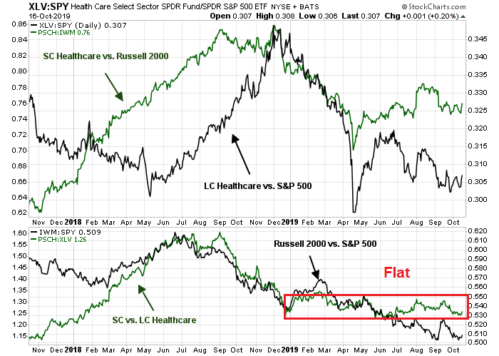
The relative performance of healthcare tells a different story. While healthcare stocks have largely underperformed in 2019, small cap relative performance was roughly flat with the market since May. The bottom panel shows that there was no discernible size effect within the healthcare sector, which indicates that large cap healthcare underperformance was attributable to the differences in sector weights of large and small cap indices. In particular, the recovery in technology stocks, which had a heavier weighting in the large cap indices, pushed down the relative performance of the large cap healthcare sector.
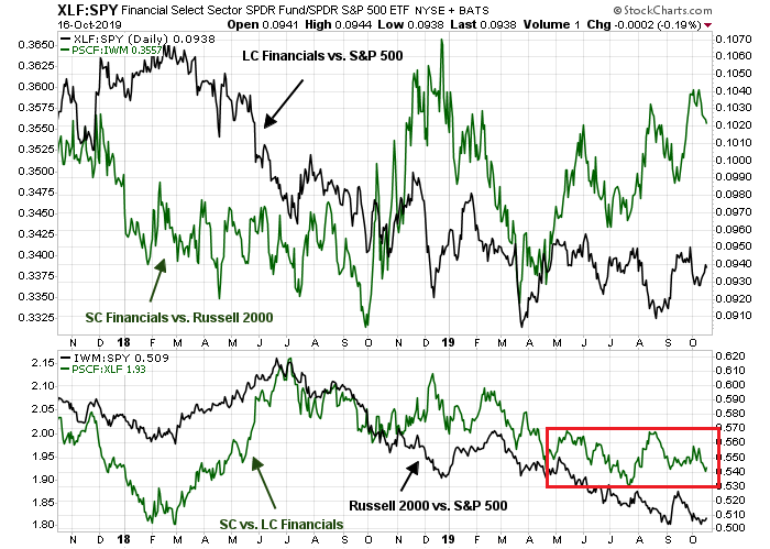
The relative performance of financial stocks tell a similar story as healthcare. While the relative performance of large and small cap financial stocks diverged in the top panel, the relative stability of performance within sector (bottom panel) indicates the divergence was attributable to differences in large and small cap index weights.
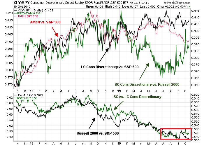
We can distinctly dissect the FAANG effect when analyzing large and small cap consumer discretionary stocks. The top panel shows the usual relative performance of large and small cap consumer discretionary stocks against their respective indices, but I added a red line showing the relative performance of AMZN, which dominates the large cap sector. When the relative performance of AMZN tailed off in the last three months, large cap sector performance was flat, but small cap sector performance soared, and the difference was mainly attributable to one stock, namely AMZN. During the same period, the relative performance of large and small cap stocks within the sector was flat (bottom panel).
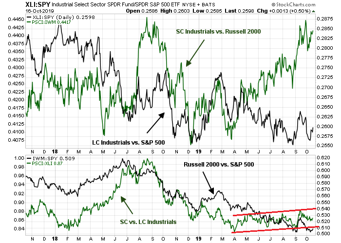
The analysis of industrial stocks reveals some possible cyclical green shoots. Even as the market worried about an economic slowdown, cyclically sensitive small cap industrial stocks outperformed (top panel), and small cap vs. large cap industrial stocks exhibited a slight rising channel (bottom panel). These could be interpreted as unconfirmed and minor “green shoots” of cyclical recovery.
Consumer staples stocks offer another hopeful sign for the bulls. When market participants stampeded into large cap consumer staples for their defensive characteristics, small cap staples did not perform as well (top panel), and small cap consumer staples continued to lag their large cap counterparts during the same period (bottom panel). The action of small caps could be interpreted as a non-confirmation of the bearish caution that had been in evidence since the market began to consolidate sideways in the past few months.

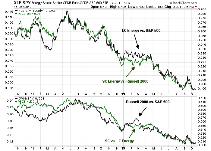
There is not much to say about the energy sector. Both large and small cap sectors are lagging their indices, and small cap energy is underperforming large cap energy.
The return pattern of utilities, which is another defensive sector, is similar to consumer staple stocks. The relative returns of large and small cap utilities to their respective indices diverged with large cap utilities showing better relative sector performance. At the same time, small cap utilities lagged large cap utilities, indicating that the defensive sector surge was not as strong as large caps.

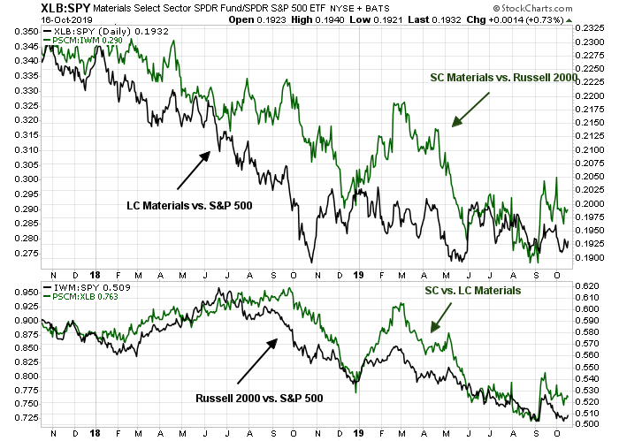
Finally, the analysis of materials stocks yield few investment insights. The performance of both large and small cap material stocks were roughly flat with their respective indices. The weight of this sector is relatively small and has little impact on overall market performance.
Green shoots?
In conclusion, a review of large and small cap sectors reveals that much of the difference in performance can be attributable to large cap FAANG stocks. In addition, the relative performance of small cap sectors shows some bullish green shoots. The cyclically sensitive small cap industrial sector exhibiting better relative strength, and the relative performance of small cap defensive sectors like consumer staples and utilities was not as strong, indicating a weaker than expected internals for low-beta names.
As well, I wrote on the weekend that, in order for the market to sustain a rally, a majority of the top five sectors that comprise nearly 70% of index weight have to show better relative performance. That seems to be happening, but these are only “green shoots” that have lasted a few days, and market action during earnings season can be volatile.
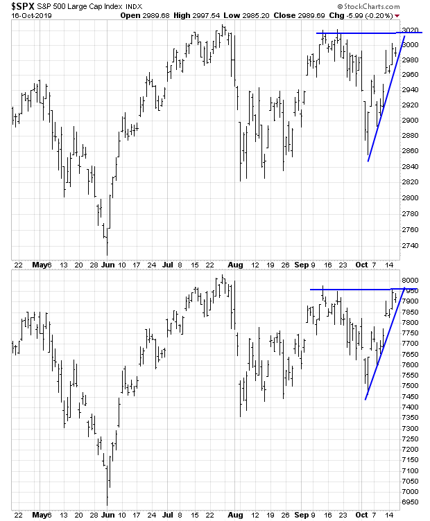
Despite all this, my inner trader isn’t quite ready to throw in the towel on the bear case just yet. Here is the final test. There are some ascending triangles that are evident in the SPX and NDX. They will resolve themselves soon in the next few days by either breaking up, or breaking down.
Stay tuned.
Disclosure: Long SPXU
Cam, thanks a lot for this analysis. Glad to see the breakdown and the reasons for small-cap under performance.
Hi Cam,
Great internals research and interesting things happening below the surface.
Have you ever read the research done by Urban Carmel on if Small caps leading are a good indicator of the markets? Trust you might find some findings interesting: http://fat-pitch.blogspot.com/2019/06/small-caps-are-lagging-investors-should.html