Mid-week market update: I have been asked to periodically update my sector leadership analysis as a guide to spot up and coming sector strength. The standard approach is to apply the Relative Rotation Graph (RRG) to the market.
As an explanation, RRG charts are a way of depicting the changes in leadership in different groups, such as sectors, countries or regions, or market factors. The charts are organized into four quadrants. The typical group rotation pattern occurs in a clockwise fashion. Leading groups (top right) deteriorate to weakening groups (bottom right), which then rotates to lagging groups (bottom left), which changes to improving groups (top left), and finally completes the cycle by improving to leading groups (top right) again.
The sector RRG chart shows that Healthcare stocks remain the leading sector. Up and coming sectors are Financial and Industrial stocks, and defensive sector such as Consumer Staples, Utilities, and REITs are starting to lose steam.
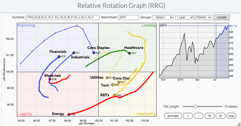
However, the recent reclassification of stocks into the newly formed Communication Services sector, which moved high octane names such as Alphabet, Amazon, and Netflix into the sector makes RRG analysis somewhat deceptive. Standard RRG analysis on sectors doesn’t tell the entire story. As an alternative, I present a couple of two other ways of rotation analysis for insights for both leadership and market direction.
The most powerful signal for stocks
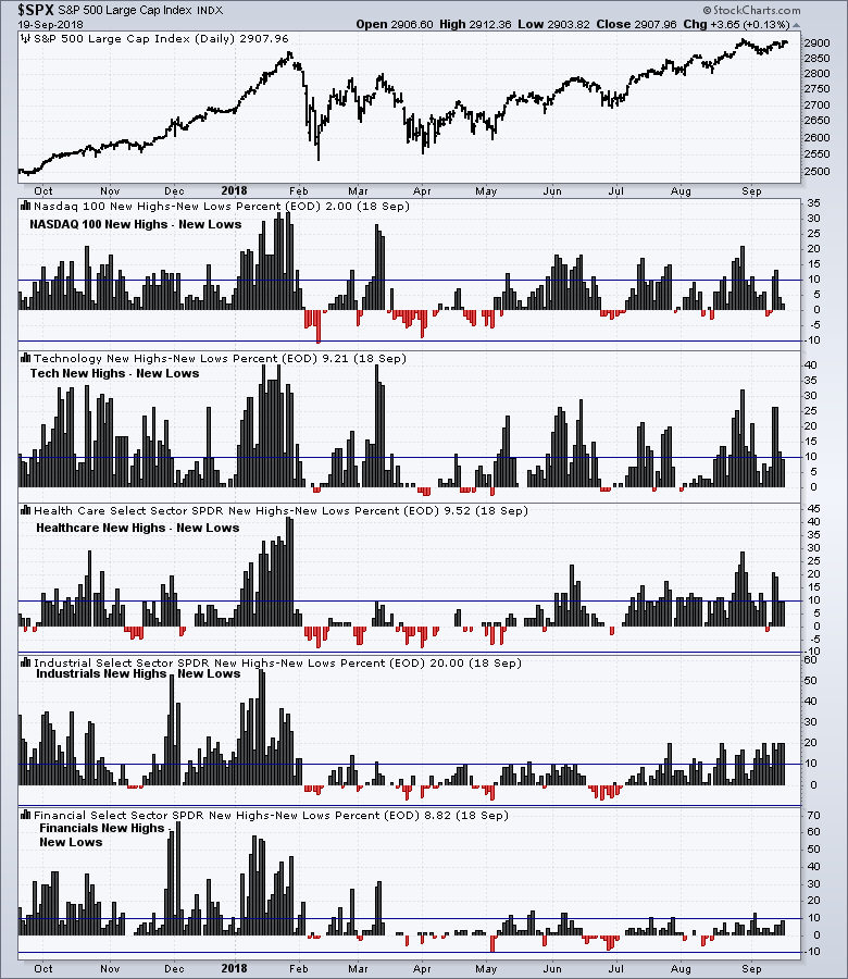
What’s the most powerful technical signal from a stock, sector, or stock market? The answer is to make a new high.
With that in mind, I found a number of sectors that have been showing consistent net new high strength, namely Technology, Healthcare, and Industrials. The chart below shows the net new highs of these sectors, as well as the NASDAQ 100, which is a close cousin to Technology stocks. As a comparison, Financial stocks (bottom panel) are not showing the same degree of net new high breadth as these other sectors.
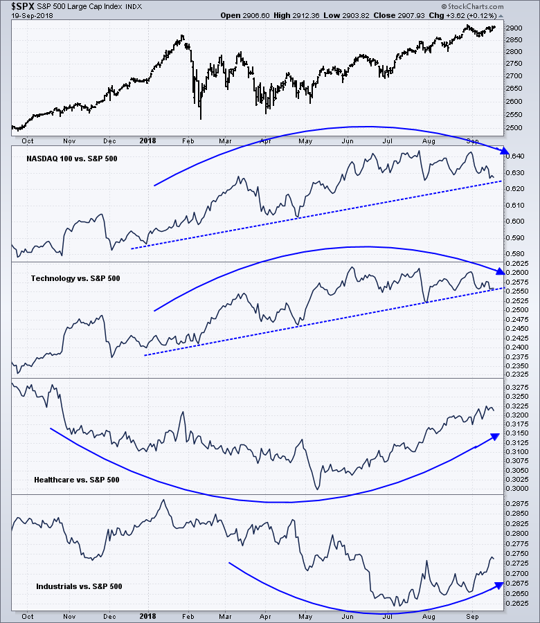
Does that mean you should blindly buy into these market leaders? Not so fast. The above RRG sector chart shows that Technology leadership is faltering. The relative performance chart of these sectors tell a slightly different story. While NASDAQ 100 and Technology remain the leaders and their relative uptrends remain intact, they are rolling over on a relative basis. By contrast, Healthcare stocks are showing a constructive relative bottom pattern, and Industrial stocks are in the early stages of a turnaround.
That’s still not the whole story.
A case of bad breadth
The emerging leadership of Industrial stocks made me sit up and take a look more closely, as it was inconsistent with some of my other models. One important macro implication of Industrial stock leadership is a cyclical economic upturn, which is inconsistent with the industrial metal to gold ratio, which is an important global cyclical indicator. In the past the industrial metal to gold ratio has moved coincidentally with the stock to bond ratio, which is a risk appetite indicator.

As well, the cyclical strength implied by the outperformance of Industrial stocks is also inconsistent with the growth expectations of institutional investors, as measured by the BAML Fund Manager Survey.

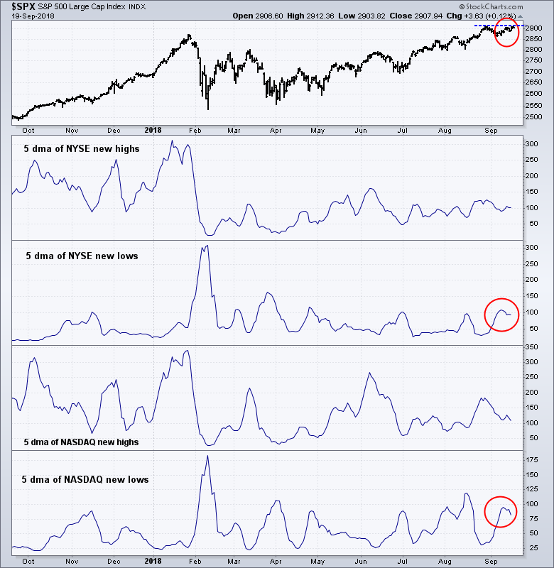
If the most bullish technical thing that a stock, or stock market can do is make new highs, I have also been concerned about the waning net new highs of NYSE and NASDAQ stocks. Why are new lows so high when the market is within a stone’s throw of its all-time highs?
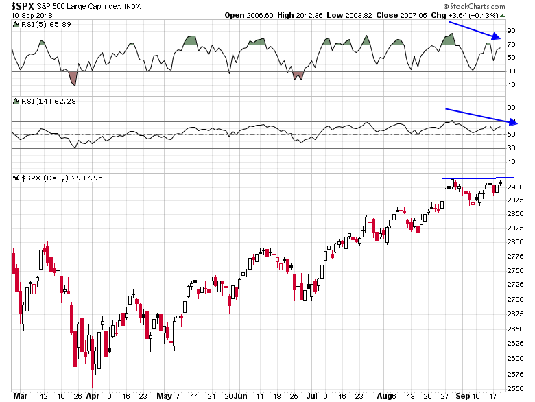
In addition, the SPX is flashing a negative RSI confirmation as it tests its highs, which is another cautionary signal.
Clues from factor rotation
One clue is the RRG chart analysis through a factor, or style lens. One advantage of applying RRG analysis to factor returns is this approach is not subject to the problems of sector reclassification. As the chart below shows, leading factors remain either defensive or value oriented in nature. Leading factors include Dividend Aristocrats (dividend growth), High Quality, Buybacks, and Small Cap Value, though the Low Volatility is surprisingly showing signs of rolling over. Lagging factors remain the high octane plays like Large and Small Cap Growth, IPOs, and High Beta.
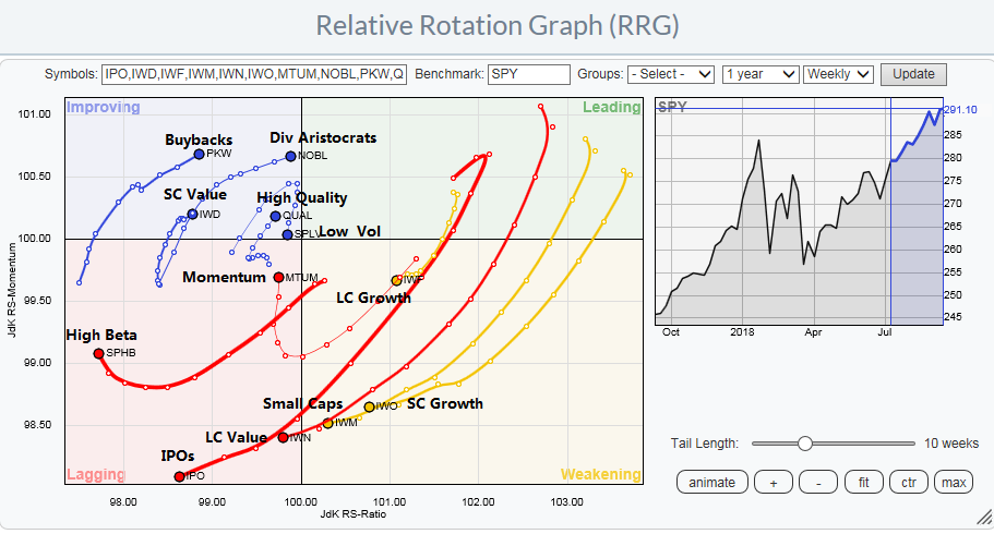
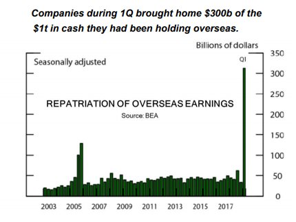
The only exception to the defensive and value theme among the market leaders is buybacks. The emergence of stocks with high buybacks is expected, as the tax bill encouraged the repatriation of offshore cash, some of which went into buybacks (h/t Kevin Muir, the Macro Tourist).
These results suggest that investors should remain defensive in the portfolio posture. Focus on defensive and leading sectors like Healthcare, and take profits in high beta groups like Technology on strength. From a factor perspective, remain defensive and emphasize dividend growth and high quality stocks.
The bulls are still partying
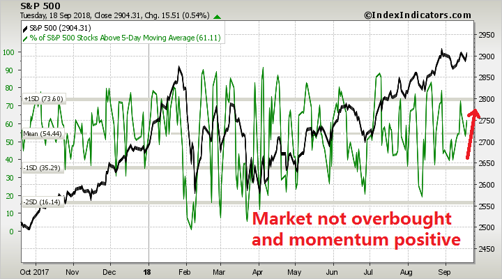
Despite the bearish backdrop, we are likely to see new marginal highs in the major indices in the next couple of days. I recently wrote that the bulls were throwing a quiet little get-together for their friends, but the party was unlikely to evolve into an out-of-control street party, and I stand by those remarks. Short run (1-2 day) breadth indicators from Index Indicators show that momentum is positive, and readings are not overbought, which suggests further upside potential.
As well, the CBOE option put/call ratio stands at 0.95, which is unusually elevated on a day when the index is advancing as it consolidates above its upside breakout level of ~2870. These readings indicate skepticism, which are signs that the market is climbing the proverbial wall of worry.

My inner trader remains long the market. He is watching for signs that the market is becoming overbought before taking profits, which will likely occur later this week.
Disclosure: Long SPXL
Cam
It would be important to see of oil is starting to break out. You have included oil to S&P 500 graph in recent missives. A resurgent oil is usually bullish for the economy and may be an important metric to consider.
Industrial metals may be under a shadow, because of EM downturn. Gold is not exactly running away to the upside either, depressing the Industrial metal to gold ratio (do not like relative strengths graphs). Thanks.
“What’s the most powerful technical signal from a stock, sector, or stock market? The answer is to make a new high.”
Intuitively this is always difficult for me to digest.