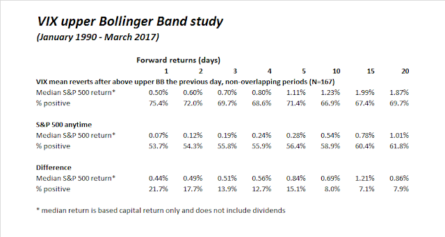
Mid-week market update: So far, my recent VIX based buy signal has worked out according to plan (see A market top checklist). I emailed subscribers the buy signal from the trading system on Friday, which was triggered when the VIX Index rises above its upper Bollinger Band and then mean reverts below.
If history is any guide, stock prices should continue to grind upwards for the next couple of weeks.
As the market tests resistance at all-time highs, further strength would imply a sustainable advance to further highs. However, an analysis of market breadth and sector leadership indicates the equity market faces a number of technical headwinds.
A case of bad breadth
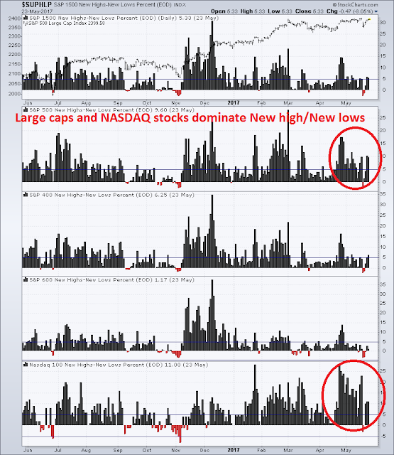
First, consider the leadership of the market. If we were to focus on the 52 week new high/new low ratio, we can see that market leadership is dominated by large caps and NASDAQ stocks.
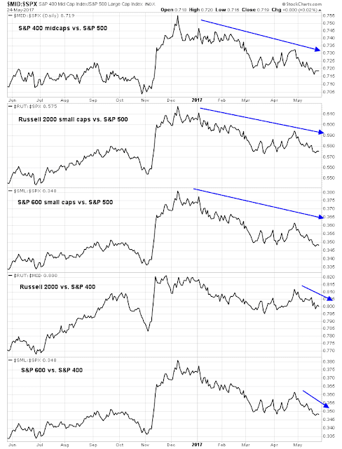
For another perspective, the chart below shows the relative performance by market cap. As the chart shows, large cap stocks are dominating performance right now by beating both mid-cap and small cap stocks. In fact, returns degrade as we go down the market cap ladder. Small caps have been underperforming mid-caps for all of 2017, and they have lagged for the past few weeks.
If the intent of studying market breadth is to determine whether the troops are following the generals, this is not a good sign.
Narrow sector leadership
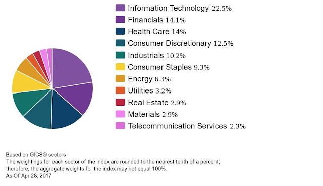
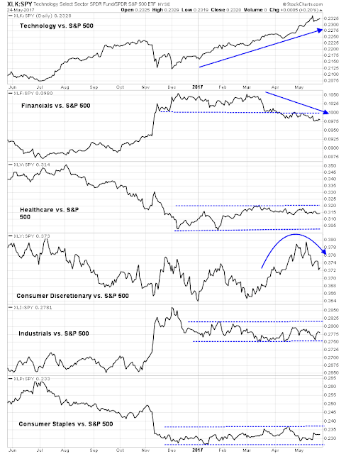
Now consider the composition of the index by sector, as shown by the chart below.
The chart below shows the relative performance of the top six sectors by weight, which comprise roughly 82% of total index weight. As the chart shows, Technology (22.5% weight) has been the leader; Financials (14.1%) has underperformed; Consumer Discretionary (12.5%) were showing leadership qualities but has started to roll over; while the other major sectors have been flat against the market.
In other words, the market’s advance has been carried by Technology stocks! The chart below shows the relative performance of the Tech sector, along with selected high octane groups within the sector. All are in relative uptrends and showing few signs of weakness.
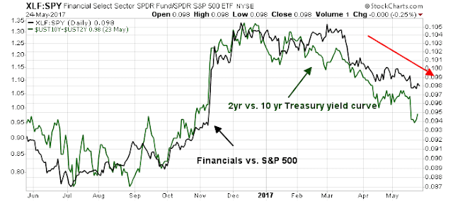
By contrast, the relative performance of the next biggest sector, the Financials. As the chart below shows, the relative returns of this sector is closely correlated to the shape of the yield curve. The flattening yield curve has not been good news for this sector.
Since none of the other major sectors are showing signs of leadership, the ability of the SPX to advance to fresh highs is therefore a function of the tug-of-war between Technology and Financial stocks. A breakout to all-time highs therefore requires one or more of the following factors to occur:
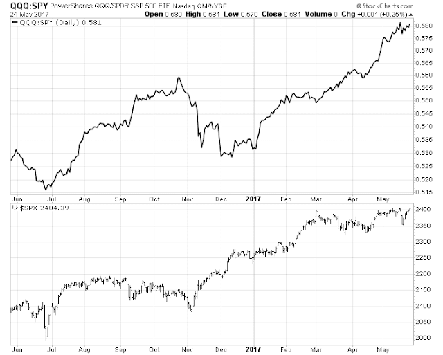
- Continued enthusiasm for Technology stocks (watch the NASDAQ vs. SPX ratio).
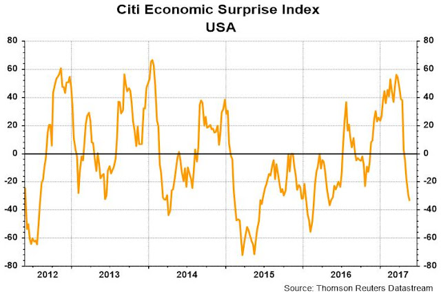
- The yield curve reverse its flattening trend and begin steepening, which is a function of economic growth expectations (watch the Citigroup Economic Surprise Index).
- Renewed enthusiasm for the reflation trade, which is characterized by leadership from cyclical industries, such as Industrial and Consumer Discretionary stocks (also watch the Citigroup US ESI above, and Global ESI).
I don’t pretend to know what will happen should the SPX test its all-time high resistance in the near future. All I can do is provide guideposts of what to watch. That’s how my readers learn how to fish.


Today was a head scratcher. The NDX was up almost one half of a percent, even though the daily breadth on the NASDAQ was about even and Apple was down .3%.
I think we will stall here.i bought SPY puts on the close.
Cam, spot on analysis!