Preface: Explaining our market timing models
We maintain several market timing models, each with differing time horizons. The “Ultimate Market Timing Model” is a long-term market timing model based on the research outlined in our post, Building the ultimate market timing model. This model tends to generate only a handful of signals each decade.
The Trend Model is an asset allocation model which applies trend following principles based on the inputs of global stock and commodity price. This model has a shorter time horizon and tends to turn over about 4-6 times a year. In essence, it seeks to answer the question, “Is the trend in the global economy expansion (bullish) or contraction (bearish)?”
My inner trader uses the trading component of the Trend Model to look for changes in the direction of the main Trend Model signal. A bullish Trend Model signal that gets less bullish is a trading “sell” signal. Conversely, a bearish Trend Model signal that gets less bearish is a trading “buy” signal. The history of actual out-of-sample (not backtested) signals of the trading model are shown by the arrows in the chart below. Past trading of the trading model has shown turnover rates of about 200% per month.
The latest signals of each model are as follows:
- Ultimate market timing model: Buy equities
- Trend Model signal: Risk-on
- Trading model: Bearish (downgrade)
Update schedule: I generally update model readings on my site on weekends and tweet mid-week observations at @humblestudent. Subscribers will also receive email notices of any changes in my trading portfolio.
The message from sector leadership
It is said that no one rings a bell at the market top, but a review of sector leadership shows that late cycle inflation hedge sectors are poised to assume the mantle of market leadership (see Nearing the terminal phase of this equity bull), which would be the signal for a blow-off in inflationary expectations. Such an event would be the trigger for the Fed to become more aggressive in its rate normalization policy, and raises the risk of a policy mistake that could push the economy into recession.
If investors are looking for a bell to ring at the top, then there are signs that someone is slowly ascending the bell tower.
Consider the Relative Rotation Graphs, or RRG chart, of the market today. As an explanation, RRG charts are a way of depicting the changes in leadership in different groups, such as sectors, countries or regions, or market factors. The charts are organized into four quadrants. The typical group rotation pattern occurs in a clockwise fashion. Leading groups (top right) deteriorate to weakening groups (bottom right), which then rotates to lagging groups (bottom left), which changes to improving groups (top left), and finally completes the cycle by improving to leading groups (top right) again.
Wayne Gretzky famously said that his secret was to skate where the puck is going to be. Using that principle, the top left hand quadrant shows the sectors that are the likely emerging market leadership. These groups, with the exception of Financial stocks, are all in the inflation hedge and resource extraction industries, namely Energy, Metals and Mining, and Materials.
In short, the message from the evolution of sector leadership indicates that the market is poised for a blow-off in inflationary expectations, which will likely prompt a response from the Fed.
Resource extraction as emerging leadership
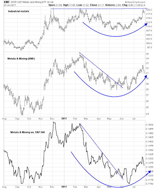
Let us consider each of the groups within the resource extraction sectors. The chart below depicts industrial metals (top panel), with Metals and Mining stocks (XME, middle panel), and the market relative performance of XME against SPY (bottom panel). Industrial metals are in the process of making a saucer bottom but they have not staged an upside breakout yet. XME shows a similar saucer bottom formation after breaking out of a downtrend. Similarly, the XME relative performance chart also shows a rounding bottom after rallying out of a relative downtrend. The price action of these related groups suggest that a cyclical upturn is at hand.
The performance of crude oil and the Energy sector is not as well developed. Oil prices (top panel) is testing resistance at a downtrend line. Energy stocks (XLE, middle panel) has staged an upside breakout out of a downtrend, and so has the market relative performance of XLE (bottom panel). These patterns are constructive for the oil and Energy sector, but if these groups follow the pattern of XME, then expect some back and forth consolidation before oil prices and Energy stocks can rise in a sustainable manner.
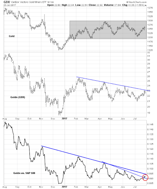
While we are on the topic of resource extraction stocks, the chart below shows the same analytic on gold and gold stocks, as many readers are interested in this group. Gold and gold stocks are not as well developed in their near-term market leadership potential as Metals and Mining, or Energy stocks. Gold (top panel) remains range-bound, and gold stocks (GDX, middle panel) is testing resistance at a downtrend line. However, the market relative performance of GDX (bottom panel) shows that GDX has rallied through a minor relative downtrend line, but still faces further overhead relative resistance that’s not that far away.
From a global perspective, the RRG chart shows a similar pattern of emerging resource leadership at a country and regional level. Emerging leaders are resource based economies, such as Canada and Australia, while the Eurozone, and the markets of China’s major trading partners are rolling over in relative strength.
The relative performance of MSCI Canada (EWC) against MSCI All-Country World (ACWI) is a typical example (all returns are in USD). EWC staged an upside breakout from a relative downtrend and it is in the process of forming a saucer shaped relative bottom against ACWI.
Janet and the yield curve
I would like to add a word about the other emerging leadership sector, the Financials. Financial stocks are driven by slightly different, but related, fundamental expectations. The top panel of the chart below shows that Financial stocks (XLF) recently pulled back after staging an upside breakout out of a range. The bottom panel shows the market relative performance of this sector is correlated to the shape of the yield curve. A bet on this sector is therefore a bet on a steepening yield curve, which is a signal that the bond market expects better growth ahead. That’s why the relative performance of resource extraction stocks and financial stocks are related, because higher growth tends to put upward pressure on inflation and inflationary expectations.
I would add a caveat to the analysis of Financial stocks using the yield curve. Janet Yellen recently stated that the Fed is watching the yield curve in its conduct of monetary policy (via Marketwatch):
Federal Reserve Chairwoman Janet Yellen on Thursday said the central bank would consider the bond market yield curve as it slowly reduces its $4.5 trillion balance sheet, which it had used to help stimulate the economy.
Yellen, in front of the Senate Banking Committee, was speaking of the Fed’s plan to stop reinvesting the principal on Treasury- and mortgage-backed securities.
Yellen explained that the Fed would set caps on the amount of reinvestment allowed to occur, and that the caps would gradually rise over time.
“So once we trigger this process, I expect it to run in the background, not something that we’ll be talking a lot from meeting to meeting,” she said.
“Now, we think that our purchases of assets did have some positive effect in depressing longer-term interest rates relative to short-term interest rates. But of course we will take that into effect, namely a steepening of the yield curve, in how we set the federal funds rate, which I hope will remain our primary tool for adjusting the stance of monetary policy.”
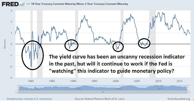
If the Fed is “watching” this indicator so closely, then the yield curve may cease to function as a recession indicator in this cycle. The Fed may not allow the yield curve to invert by using its powers to intervene in the market.
In addition, Goldman Sachs believes that unwinding the Fed’s balance sheet is likely to steepen the yield curve (via Marketwatch):
Goldman Sachs Group Inc.’s strategist predict that Treasury prices will fall, pushing the 10-year yield up. Goldman forecast that the 10-year yield will rise an additional 20 basis points in 2017, assuming reductions kick off this year as predicted. Then, the bank sees an annual increase of 12.5 basis points in yields over the following two years. Bond prices and yields move inversely…
Applying a model from the Fed, Goldman has sought to understand the ramifications of erasing the legacy of extraordinary monetary policy. Researchers at the board of governors of the Fed had estimated quantitative easing had depressed the term premium by a 100 basis points. A term premium represents the extra yield investors demand for holding longer-term and potentially less liquid securities.
Bottom line: While a steepening yield curve may be beneficial to Financial stocks, it may be ineffective as a recession forecasting tool in this cycle.
Market turbulence ahead?
Looking ahead, intermediate term sentiment and technical indicators are starting to look a little stretched on the bullish side, which is contrarian bearish. I had pointed out that the Fear and Greed Index rose above 80 last week, and such conditions have led to either sideways or corrective markets in the past.
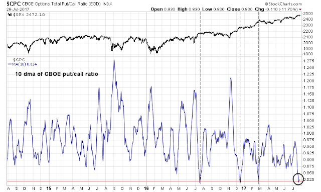
As well, the 10 day moving average of the CBOE put/call ratio has fallen to crowded long levels where market has had trouble advancing in the past.
The NYSE Common Stock only McClellan Summation Index is also getting into overbought territory, indicating a pause may be needed.
The stock market sold off on Thursday when JPMorgan’s Marko Kolanovic derivatives strategist put out a research note warning about the risks of low volatility (via Street Insider):
It is safe to say that volatility has reached all-time lows and this should give pause to equity managers. Low volatility would not be a problem if not for strategies that increase leverage when volatility declines. Many of these strategies (option hedging, Volatility targeting, CTAs, Risk Parity, etc.) share similar features with the dynamic ‘portfolio insurance’ of 1987. While these strategies include concepts like ‘risk control’, ‘crisis alpha’, etc. in various degrees they rely on selling into market weakness to cut losses. This creates a ‘stop loss order’ that gets larger in size and closer to the current market price as volatility gets lower. Additionally, growth in short volatility strategies in a self-fulfilling manner suppresses both implied and realized volatility. This in turn prompts other investors to increase leverage, and those that hedge with options lose out and eventually throw in the towel. The fact that we had many volatility cycles since 1983, and are now at all-time lows in volatility, indicates that we may be very close to the turning point.
Kolanovic went on to warn about complacency, as shown by low stock correlation and the risk presented by the Fed’s normalization of monetary policy:
Over the past year, correlation of stocks and sectors declined at an unprecedented speed and magnitude (Figure below). A similar decorrelation occurred on only 2 other occasions over the last 30 years: in 1993 and 2000. Both of those episodes led to subsequent market weakness and an increase in volatility (in 1994, and 2001). The current decline in market correlations started following the US elections and was largely driven by macro (rather than stock specific) forces. Expectation of Fiscal measures, deregulation and higher interest rates set in motion large equity sector and style rotations. For instance, the correlation between Financials and Technology dropped to all-time lows (similar level to during the tech bubble). The correlation between equity styles also dropped (e.g. Value was lifted by rates, and Low Volatility was impacted negatively). Declining correlations pushed market volatility lower (see here), and the ~25% market rally further suppressed correlations and volatility. To investigate what are potential implications for the future price action we look at the 1993 and 2000 decorrelation events…
The current episode of correlation decline shares some similar features to both 1993 and 2000. The decline of correlation was in part driven by the market rally and elevated valuations; after a period of falling, interest rates are expected to rise (as in 1993), sector valuations (e.g. Internet) and sector rotations play an outsized role in market price action (similar to 2000), and record low levels of volatility increased the level of risk taking (as in 1993). Normalization of monetary policy will most likely lead to an increase of correlations and volatility, and that will at some point result in market weakness. While it seems that the 1993/1994 analogy is more appropriate (implying an orderly price action), investors should be aware of hidden leverage and tail risk of a more significant correction, such as the one in 2001.
The combination of excessively bullish sentiment, and market positioning by dynamic hedging strategies identified by Kolanovic suggests that stock prices are poised to hit an air pocket of unknown magnitude.
The good news
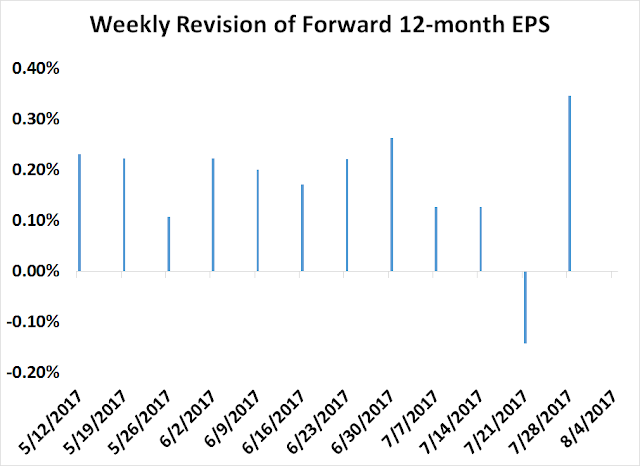
The good news is that any correction is likely to be brief and stock prices are well supported by fundamentals. The negative estimate revision that I identified last week (see What would a contrarian do?) turned out to be a data blip. The latest update from John Butters of FactSet shows that forward 12-month EPS rebounded strongly after a solid Q2 Earnings Season.
The recent history of weekly forward 12-month EPS revisions shows that estimates rebounded strongly in the most recent reporting period.
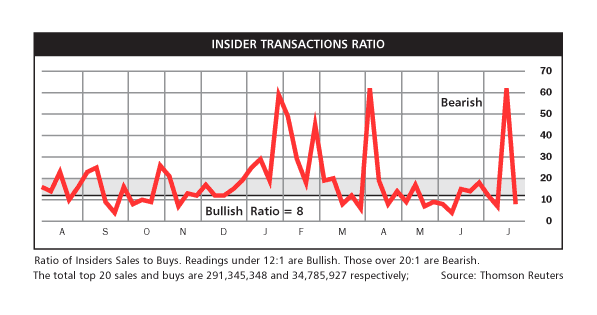
As well, the spike in insider sales reported by Barron’s also turned out to be data blip and readings are back at a “buy” signal again.
The week ahead
Does this mean that the bulls can buy with both hands? Well…
I interpret current conditions as an overbought market in need of a pullback, but downside risk is likely to be relatively limited unless Kolanovic’s scenario of a disorderly unwind of positions were to occur. The market may need some volatility to shake investors and traders out of their complacent mood. According to Ryan Detrick of LPL Financial, a 5% pullback would not be unusual by historical standards (via Marketwatch):
61 of the past 67 years have had a 5% downdraft at least once, or 91% of all years, according to Ryan Detrick, senior market strategist, at LPL Financial.
“The inevitable 5% drop will be a shock to nearly everyone,” Detrick said. “We’ve been historically spoiled so far this year, but as the economic cycle ages, we fully expect more volatility the remainder of this year and the likely 5% correction to take place as well,” he said.
Under these circumstances, my inner trader is relying on breadth indicators from Index Indicators to time his exit from his short positions. The short term (1-2 day time horizon) breadth model is showing negative momentum, but readings are neutral and not oversold yet.
The longer term (1-2 week time horizon) models are also showing similar readings.
My inner investor remains constructive on stocks, though he believes that this bull is nearing the end of his run. My inner trader is short the market, and he is watching for oversold readings on short term indicators in order to close out his position.
Disclosure: Long SPXU








I don’t normally include politics into my investing but this week is extraordinary. Healthcare reform failing puts tax cuts in jeopardy with infrastructure spending pushed further into the future. These were the justification for the stock market and U.S. dollar surge after the November election (plus deregulation which is proceeding).
White House personnel changes and possible changes (Sessions) are causing major concerns among Republicans.
The American dollar is very weak. Often Forex volatility precedes stock market volatility. Now could be the time for a 5-10% correction. When the House of Representatives returns in September and starts working on tax cuts, the market might get another upswing going.
Be aware, my focus is purely intermediate term.
Something to consider about September even before tax reform. OMB director Mick Mulvaney said Sunday that nothing should get a vote before a healthcare bill.
http://thehill.com/blogs/blog-briefing-room/344513-mulvaney-its-white-house-policy-that-nothing-gets-a-vote-before
Umm…what about the debt ceiling?
The US appears to be on track to raise debt ceiling, and borrow more and spend. Would the US (and other western countries and Japan) pay down the debt they are incurring? The “western world” is consuming more than it is producing. The “consumption” is being funded by debt. China is providing consumable “goods” and India and other countries consumable “services” in return for debt incurred by these countries. How long will this cycle go on? That is the crux of the matter. Common sense dictates such cycle can continue if we inflate our way out of it or default.
Inflating our way out of it: What it means is a dollar borrowed today, will be paid in the future by a dollar that is worth less than it is worth today. That is a practical way of how the cycle of fiat money continues.
Can China and India refuse to accept payments in US $s? This would break the cycle of using fiat currency (US $), as a payment mechanism. China has desperately tried and is trying to break past the hegemony of payments using US$, but so far has been unsuccessful. Iraq refused to accept payments for its oil by US $s that led to war. China has proposed a “basket” of currency approach, so that America would be forced to pay for say oil using a basket of Remnimbi, and Euro and Yen. Such a move, if it gains traction, would be very damaging to the US.
Ken, the $ index cracked the 93.xy line in the sand today. A weak $ suggests weak US economy, despite the rhetoric. The US president has shown a streak of failed bids, so far, which is what the weak $ is betting on that the tax cuts and overseas capital repatriation idea are toast.
Cam’s recent articles point to inflation running hotter. Weak $ is putting upward price pressure on oil and commodities. One is left to wonder if we end up with stagflation at some point down in time.