It was a closely watched FOMC meeting. The Fed raised rates by a quarter-point, which was widely anticipated, and signaled that it would likely raise another quarter-point before it’s done. It was interpreted as a dovish hike. The Fed also published a Summary of Economic Projections (SEP), also known as the “dot plot”. In the end, the “dot plot” wasn’t very relevant for two reasons. It was stale by the time it was published, and there was a high degree of uncertainty around the projections.
During these times of uncertainty, what matters more is the Fed’s reaction function to financial crises. To address that issue, I have conducted an event study of how the Fed has reacted to shocks and crises in the past in order to estimate the Powell Fed’s reaction function.
1987 Crash
Starting with the Crash of 1987, the accompanying chart shows the S&P 500 as a measure of risk appetite, the yield on 2-year and 3-month Treasury paper as measures of market expectations of changes in policy, the Fed Funds rate, and the 3-month growth in M2 money supply indications of changes in monetary policy.
In response to the greatest market crash since 1929, the Fed embarked on a course of monetary easing as Treasury yields and the Fed Funds rate fell and bottomed within and bottomed within a month of the crash. M2 growth similarly surged and stabilized at about the same pace as the other indicators.
LTCM implosion, 1998
Policy response to the Asian Crisis of 1997 was more complicated and matters didn’t come to a head until the Russia Crisis and the failure of Long-Term Capital Management (LTCM) in 1998. After Russia defaulted in August 1998, Treasury yields fell first and policy action, as measured by the Fed Funds rate and M2 growth, followed about a month later. LTCM, which was a secretive hedge fund founded in 1994 by Joh Meriwether, the former head of bond trading as Salomon Brothers, and included Nobel laureates Myron Scholes and Bob Merton, had initially been initially been very successful with strong returns by identifying small pricing differences and exploiting with high degrees of leverage. The fund began to suffer difficult drawdowns in 1998, starting with -7% in May, -10% in June, and –18% in July. The Russia default and subsequent financial crisis widened the pricing differences LTCM expected to converge and the fund was down -44% in August. The fund collapsed -83% in September as excessive financial leverage magnified the losses to a total of $4.5 billion, which threatened the financial system’s stability. The Fed engineered a recapitalization of LTCM on 23 September 1998 by a Consortium of 14 financial institutions after the fund collapsed and declared bankruptcy.
Treasury yields, which are a proxy for market expectations, bottomed in October, about a month after the LTCM bankruptcy. As measured by the Fed Funds rate, policy rates bottomed in December, and M2 growth, as a measure of monetary stimulus, peaked in late November.
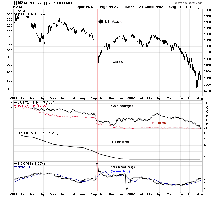
9/11, 2001
The 9/11 attack on the Twin Towers in New York was an exogenous geopolitical event. and not a crisis rooted in the financial system. The stock market had been in a bear market for over a year when the dot-com bubble burst in March 2000. Interest rates had already been declining, but the Fed reacted to 0/11 by boosting liquidity into the banking system, as evidenced by the surge in M2 growth. As the financial effects of the shock wore off, monetary stimulus was withdrawn and normalized by December. Stock prices rebounded, but topped out in early January and resumed their bear trend, which ended in late 2002.
GFC, 2008
The crash that marked the Global Financial Crisis (GFC) of 2008 was a slow and draw-out affair. The S&P 500 topped out in 2007. Bear Stearns failed in March 2008, but the markets shrugged off the event as it didn’t pose any systemic risk. It wasn’t until the Lehman Brothers collapse in September that it sparked an institutional bank run and a crisis of confidence among broker-dealers. That’s when the Fed swung into action. Treasury yields fell and the Fed Funds eased to the zero-bound. M2 growth surged. Stimulus measures peaked in December. Even though the three-month rate of m2 growth peaked at that time, the 12-month growth rate continued to rise until February 2009.
COVID Crash, 2020
The COVID Crash was another event whose roots were not in the financial system, but whose effects had real-world economic implications. After the COVID-19 pandemic began to spread, China responded by shutting down its economy to combat the virus. The Chinese shutdown, along with outbreaks in the rest of the world, threatened the global economy with a slowdown of Great Depression proportions. Fiscal and moneary authorities around the world responded with unprecedented levels of stimulus. Interest rates dropped to near zero, and M2 growth surged over a three-month time span
What’s next?
Fast forward to 2023, what can investors expect?
It is said that history doesn’t repeat itself but rhymes. This was a limited event study that focused on the reaction of the Fed to financial crises and other shocks. In all cases, the Fed took action to stabilize the system once it became apparent that a failure threatened financial stability. Once stability returned, the Fed withdrew stimulus measures 2-3 months after the event. If history is any guide, the Fed should normalize and withdraw liquidity enhancing measures by about May or June.
If that’s the template, here are some real-time indicators to watch. First, anxiety over the banking system needs to stabilize. The KBW Regional Banking Index is testing a key support zone. A violation would signal further bank system jitters and invite further policy support.
Watch for signs that the Fed is withdrawing liquidity support, which would be bearish for equities. Fed liquidity can be measured by changes in its balance sheet – changes in the Treasury General Account – changes in Reverse Repo Purchase agreements.
While the Fed liquidity indicator is reported weekly, the price of Bitcoin and other crypto-currencies can be used as a quick approximation of system liquidity.
Also don’t forget the USD. The USD is a risk-off asset and it’s inversely correlated to the S&P 500. The USD will eventually break out of its trading range, but in which direction?
Once policy support is withdrawn, equity investors will have to focus on such mundane matters as interest rates and the earnings outlook. While most of the instances in the five historical studies saw stock prices roar to new highs, this time may be different. Fed Chair Jerome Powell pushed back at his press conference twice against the notion that the Fed will cut rates in 2023 as it’s not in the Fed’s baseline. Nevertheless, market expectations are calling for a series of cuts that begin mid-year. Either the market or the Fed is very wrong, and it’s usually not wise to fight the Fed.
In addition, the yield curve is starting to steepen after becoming deeply inverted. A steepening yield curve after an inversion usually foreshadows recession, and recessions are not negative for stock prices.
Putting it all together, the banking crisis pattern of 2023 more resembles the 9/11 shock. The stock market was already in a bear market, and interest rates rose after the effects of the shock wore off. Expect a similar pattern of a short-term stock market recovery, followed by further weakness as market fundamentals reassert themselves. This is consistent with my “party now, pay later” theme of a near-term rally, follow by weakness later this year


Great review Cam. A+
I’m going to print this one out so I can review it from time to time.
I think that what these guys do is fake it, say things are fine and hope that everything settles down. I mean what would the reaction be if they said we were in deep doodoo. It makes me think of the transitory inflation story and how that worked out, it didn’t. Now we have these banks in trouble, which got papered over, and now we are supposed to think everything will settle down. Maybe they will, but what if they don’t. It’s not just 3 banks in the USA, in Europe of course we have CS and DB, and an energy crush, and the ECB hasn’t pushed rates as high as we have. Perhaps we are at Bear Stearns and Lehman is still out there, to use an analogy.
This year alone, money market funds received $228B inflow, most likely from outflow from regional banks and big portion of it occurring just last week. It might continue.
Meanwhile banks have borrowed $165B recently form Fed’s discount window and its new Bank Term Funding Program, signaling a high potential stress level.
And yet Fed jawboning continues. Jimmy Bullard just talked again last Fri. Highly likely rate hikes are done and cuts on the way.
Cam,
I liked the brief reviews of financial crisis. I’ll save a copy as well.
I tried to search for the Fed liquidity chart but didn’t find anything that looks exactly like yours. Do you have a URL? If not, can you tell me how to reconstruct it?
It’d be handy to have that.
Thanks!
sanjay
You need to be registered user to create composite charts on the FRED website (registration is free). Copy the link below, which tracks the Fed’s Balance Sheet, then substract the Treasury General Account and TGA and Reverse Reports once you’re logged in.
https://fred.stlouisfed.org/series/WALCL
Hugues, thank you very much. Really appreciate it.