Mid-week market update: Occasionally, it is useful to step back and view the market through a different prism. I was reviewing the RRG charts of sector, region, and factor, and I found that they are all telling a similar story.
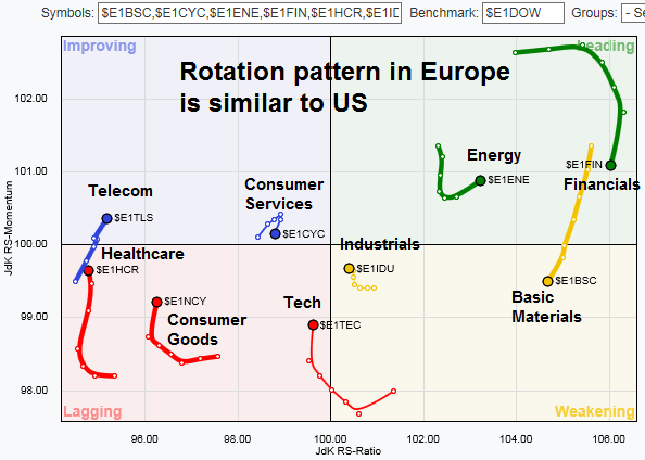
First, let’s start with a primer. Relative Rotation Graphs, or RRG charts, are a way of depicting the changes in leadership in different groups, such as sectors, countries or regions, or market factors. The charts are organized into four quadrants. The typical group rotation pattern occurs in a clockwise fashion. Leading groups (top right) deteriorate to weakening groups (bottom right), which then rotates to lagging groups (bottom left), which changes to improving groups (top left), and finally completes the cycle by improving to leading groups (top right) again.
The latest sector rotation chart shows that financial stocks and cyclical stocks (energy, industrials, materials) are the leading groups, but they are weakening. By contrast, defensive sectors are starting to improve from the lagging quadrant to improving. In particular, the upgrade of interest sensitive utilities from lagging to improving quadrant is consistent with the nascent counter-trend rally seen in the bond market.
In short, high beta is faltering and defensive sectors are starting to turn up.
Confirmation from Europe
The trend of waning risk appetite appears to be global in nature. We can see a similar pattern in the RRG chart of European sectors. The main difference between the US and European RRG charts is the behavior of the materials sector. The European basic materials sector has already deteriorated into the weakening quadrant, whereas US materials remain in the top right leading category.
Style rotation: Too far too fast?
The message from style rotation of US equities also tells a similar story. High beta groups are ascendant, but starting to weaken. The value style, which had been on a tear, is also starting to roll over in relative strength. By contrast, out of favor styles such as dividend payers, as well as growth and momentum (think FANG), are starting to turn up.
Global regions: Buy Europe and Asia
A glance at regional and country rotation tells a story of cyclical factors starting to roll over. The leadership countries are Russia and Canada (oil), and the US. Europe appears to be a source of emerging strength, while Asian markets are lagging, but starting to improve. Tactically, traders may wish to consider selling their cyclical exposure and start to add exposure to Europe and Asia.
From a top-down macro perspective, even though Citigroup’s Economic Surprise Index have been surging, the market believes that the pace of improvement is probably unsustainable (h/t Topdown Charts).
Be contrarian
From an absolute return viewpoint, the de-risking pattern from the RRG charts suggests that US equities are likely to undergo a period of sideways action, or mild pullback for the remainder of Q1.
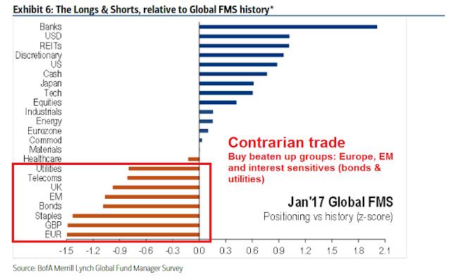
In addition, the message from group rotation analysis is a cyclical rally that is starting to stall. Better performance may be found in some of the laggards, such as emerging leadership groups like interest sensitives (utilities, bond market), or European equities (in the face of anxieties over Brexit and upcoming elections in France and Germany). As well, traders may also want to consider beaten up and out of favor groups, such as growth and momentum stocks, as well as Asian equities.
In other words, be contrarian. This view is confirmed by the latest results in the BAML Fund Manager Survey (annotations in red are mine).


This is another really helpful article–Thank you, Cam. If you have any thoughts on the gold market for the near term day to a month), I would be most interested to learn. Thank you again!
Very useful analysis! Thank you, Cam. I would also be interested in hearing your thoughts about gold/gold miners and USD. Thanks much!