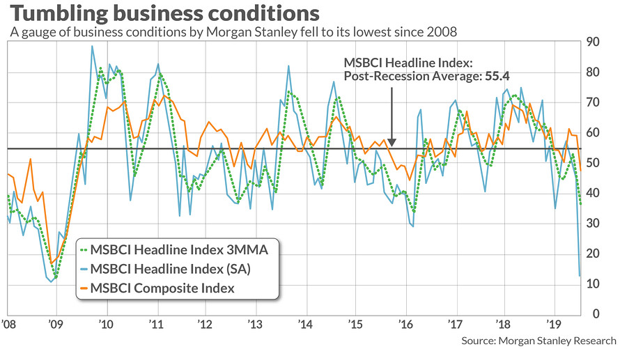
Marketwatch recently reported that Morgan Stanley’s Business Conditions Index had deteriorated to levels last seen during the 2007-08 financial crisis. Wow! Is this an alarming signal, or contrarian?
In reality, it was a lesson for data analysts in quantitative analysis.
Looking for confirmation
When I see a surprising result, I look for confirmation. To be sure, CEO confidence has fallen off a cliff.

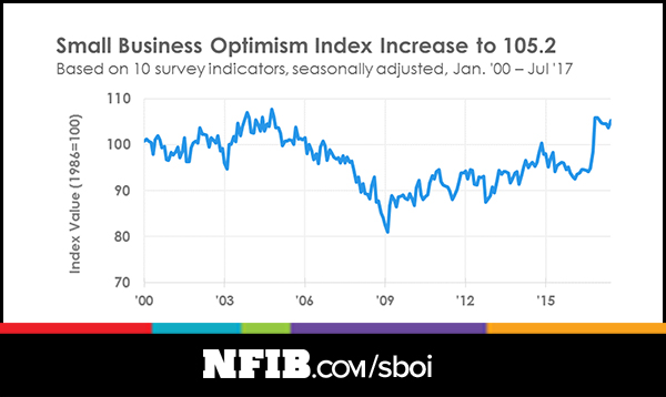
On the other hand, NFIB small business optimism has been on fire.
What’s the real story here? Is there a severe bifurcation between big business (CEO) and small business (NFIB) confidence? Wouldn’t the Morgan Stanley index be more reflective of the big business rather than the small business outlook?
I was able to obtain some of the details behind the Morgan Stanley Business Conditions Index. A detailed analysis of its components reveals some of the reasons behind the index crash. Capex plans had dropped dramatically from 21 in May to 7 in June, which is consistent with what we see in CEO confidence. On the other hand, the Manufacturing Subindex cratered from 67 to 0 in a single month, while the Services Subindex fell from 35 to 18. The other components, such as the Price and Prices Paid Indices, were relatively stable.
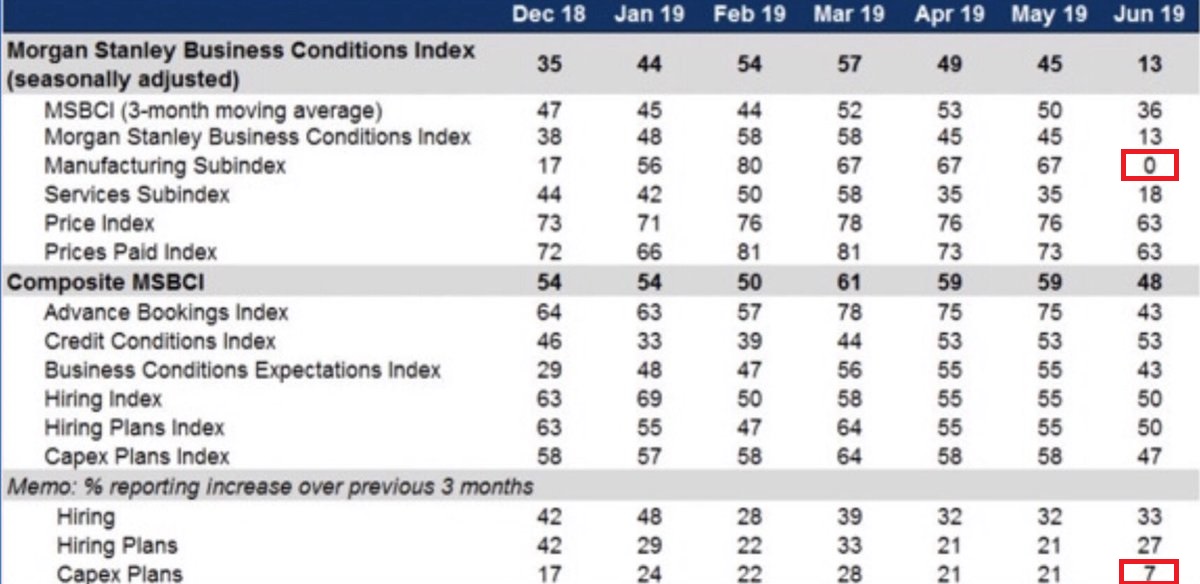
67 to 0? Really? Did someone forget to fill in the spreadsheet? That looks like a possible data error that someone should be looking into. In the meantime, investors should view such dubious data with some skepticism without confirmation.
The moral of the story is, “Don’t believe everything you read on the internet.”
Excellent lesson! Thanks for the reminder.
It goes to heart of how reliable each indices/indicators are.
Q: there are so many indicators/measure out there. Which ones can be reliably used? Cam: How often do you check the consistency and reliability of the indicators that you used for your market timing model?
The timing models are based mainly on price data. I can generally see what’s behind them.
Remember Ken Rogoff’s fisaco just a few short years ago? For a long while this big shot from Harvard is tooting his own horn in all kinds of manner. Until mounting evidences forced him to go back to his spreadsheets and examine the data. Turns out that the data entry is screwed and he re-did his article, but he has lost credibility. How can he not has any doubt upon seeing the data plots in the first place? Where is his due diligence? Or he simply doesn’t care and he was just cruising and feeling comfortably numb.
Expanding this into the bigger arena, how can we even trust any data presentation? I went to a big-name school and got a PhD and became totally cynical upon graduation. Once there was a big-time professor from Berkeley coming to get us a presentation and he had a chart containing one data point and a line drawing thru it. One student asked how he managed to drawing a line with one data point and he said he just felt the slope should be like the one shown on the slide. Why bother to study geometry? This is engineering and I don’t fully trust it. Now any data from soft disciplines like finance and econ would be all suspicious because the human factors cannot be accurately modeled, and there are a lot of shoddy work everywhere.
One last laugh. Website 538 behaves like Rogoff. They are sure HRC going to smack Trump. In today’s world people have learned to not reveal what they are really thinking. So if you are in public opinion business, showing humility is absolutely warranted.
BIGGEST level of Fear amongst the BAML Fund Manager survey since 2008:
https://twitter.com/BullandBaird/status/1140958987250221056