Preface: Explaining our market timing models
We maintain several market timing models, each with differing time horizons. The “Ultimate Market Timing Model” is a long-term market timing model based on the research outlined in our post, Building the ultimate market timing model. This model tends to generate only a handful of signals each decade.
The Trend Model is an asset allocation model which applies trend following principles based on the inputs of global stock and commodity price. This model has a shorter time horizon and tends to turn over about 4-6 times a year. In essence, it seeks to answer the question, “Is the trend in the global economy expansion (bullish) or contraction (bearish)?”
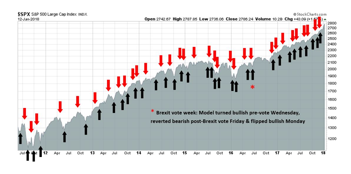
My inner trader uses the trading component of the Trend Model to look for changes in the direction of the main Trend Model signal. A bullish Trend Model signal that gets less bullish is a trading “sell” signal. Conversely, a bearish Trend Model signal that gets less bearish is a trading “buy” signal. The history of actual out-of-sample (not backtested) signals of the trading model are shown by the arrows in the chart below. Past trading of the trading model has shown turnover rates of about 200% per month.
The latest signals of each model are as follows:
- Ultimate market timing model: Buy equities
- Trend Model signal: Bullish
- Trading model: Bullish
Update schedule: I generally update model readings on my site on weekends and tweet mid-week observations at @humblestudent. Subscribers will also receive email notices of any changes in my trading portfolio.
Come over to the Dark Side
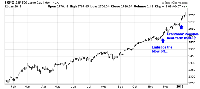
I have a confession to make. I’ve gone over to the Dark Side. Valuation doesn’t matter. Excessively bullish sentiment doesn’t matter. Overbought readings don’t matter. The only thing matters is the Melt-Up (see Embrace the blow-off, but with a stop-loss discipline and Jeremy Grantham’s call for a market melt-up).
If the market is indeed undergoing a blow-off rally, then investors should be mindful of Bob Farrell’s Rule #4: “Parabolic markets go up further than you think, but they don’t correct by going sideways.”
Nevertheless, there are a number of simple techniques of spotting the top in a parabolic move.
How parabolic tops resolves themselves
When a market goes parabolic, standard analytical techniques don’t matter. The only factor that matters is emotion. Under these conditions, I rely on technical analysis to spot the top on an intermediate term basis.
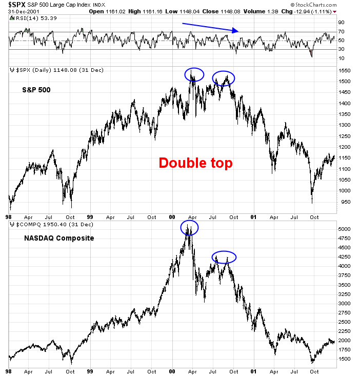
One of the common patterns that occurs when a market tops out in a buying frenzy is the double top. The market will make a first high, retreat, and then rally to a second high several months later. One of the more notable double tops was the 1980 generational top in gold prices, when it briefly touched $850 in January on the news of the Soviet invasion of Afghanistan in December 1979, the Hunt brothers’ attempt to corner the silver market, which pushed up gold prices, and rising inflationary expectations that the Volcker Fed eventually stamped out with a series of painful interest rate hikes.

Another frenzied top occurred in 2000 when the NASDAQ staged an upside blow-off. While the double top was less discernible in the chart of the NASDAQ Composite, the pattern is far clearer in the SPX, which saw a negative RSI divergence as stock prices rallied after the initial top.
This same pattern of double top and negative RSI divergence can be found in the chart of DJ Global Index. This chart illustrates an important point that was missing in the previous two charts, namely that the second high may or may not exceed the first high. The latest reading shows that the index is highly overbought, but it has not made the initial top yet. Wait for the decline, and watch for the negative divergence, if any, as an intermediate term signal of a blow-off top.

A similar pattern of negative divergences at major market tops can be found in Callum Thomas’ Euphoriameter, which is the combination of Forward P/E, VIX, and Bullish Sentiment (chart annotations are mine).

No signs of an imminent top
Current readings show no signs of an imminent top.
Even as Jeremy Grantham called for a possible melt-up, Mark Hulbert pointed out that James Montier, who is part of GMO’s asset allocation team, pointed out that price momentum is dominant during the formation of an asset bubble:
But the more I examined the issue, the more I discovered a different possibility: It’s not necessarily irrational to continue investing in the market even as the odds of a bubble increase — even if it’s not for the faint of heart.
I owe this insight to James Montier, a member of the asset allocation team at Boston-based GMO. In a study he conducted several years ago, he pointed out that investing in a bubble can be rational so long as the market delivers ever-higher returns as the odds of its bursting also increase. It’s just a matter of risk and reward: If the reward is great enough, virtually any risk can be tolerated.
Though Montier doesn’t use this analogy, it’s akin to playing Russian Roulette with your money. Each successive month in which the bubble doesn’t burst is akin to the gun firing a blank. Of course, that only increases the odds even more that the bursting will happen in the subsequent one. To continue playing the game, investors need to be promised a bigger and bigger payoff.
Montier’s model helps to explain why the market’s advance becomes parabolic right before a bubble bursts. Just recall the market’s rise in the final stages of the internet bubble: In the last six months before that bubble burst in March 2000, the Nasdaq Composite doubled in value.
This is also part of the reason why Montier’s colleague, Jeremy Grantham, is advising clients to ready for themselves for a “melt-up” in the stock market before the current bubble bursts. He points out that, strong as the stock market has been over the last year, it hasn’t risen at the near-parabolic rates that were produced in the latter stages of past bubbles.
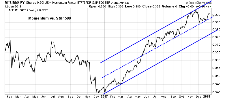
If momentum is a characteristic of bubbles and melt-ups, then the behavior of this factor indicates that the blow-off is not at an end. MTUM, which is the price momentum ETF, remains in a healthy relative uptrend to the market.
In this momentum mad environment, some of the traditional technical and sentiment indicators that would normally indicate caution can have unexpectedly bullish interpretations. This chart of 14-month RSI shows that the market is wildly overbought and stretched to the upside, but these readings can be seen as “good overbought” conditions indicating positive momentum. Indeed, such conditions have led to substantially higher prices in the past.
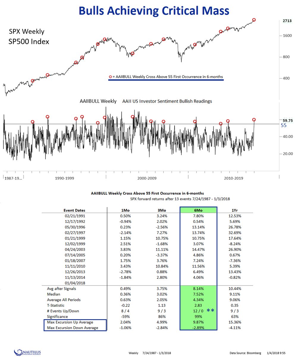
Similarly, Nautilus Research found that a crowded long in the AAII sentiment survey has historically been bullish.
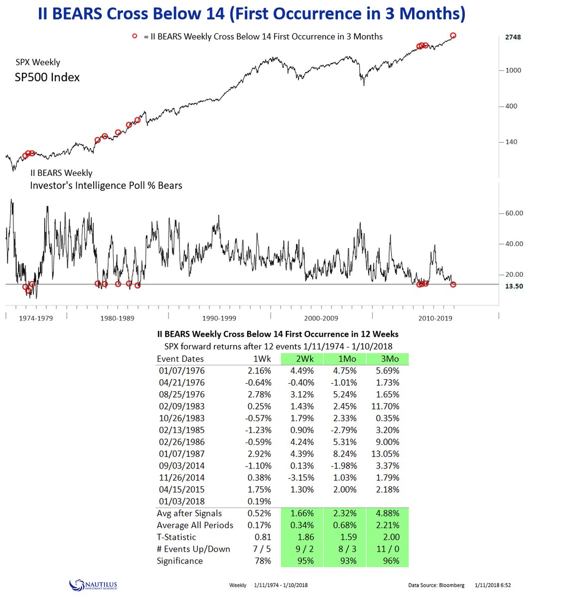
…and an absence of bears in the II survey has similarly led to higher equity returns in the past.
There are also signs of fundamental momentum at work as well. Ned Davis Research pointed out that the typical pattern of aggregated consensus EPS estimates is they start high, and then slowly decay over time. That`s because analysts tend to be overly optimistic, and cut their estimates as the actual earnings reporting dates approach. This year, 2018 EPS estimates unusually rose, possibly due to the effects of the recently tax cuts.

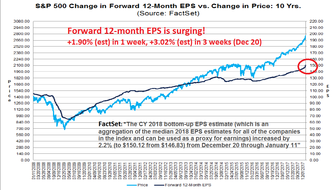
To quantify the tax cut effect, FactSet reported that forward EPS has risen an astonishing 1.90% in one week, and 3.02% since December. Moreover, 2018 estimates have risen 2.2% from December 20 to January 11. The increase in these bottom-up aggregates only began when the actual details of the tax bill became known, as company analysts would not raise their estimates until they could calculate the precise impact of the corporate tax cuts on the companies in their coverage universe.
However, we can get an idea of the magnitude of the tax-cut effect another way. Top-down strategists have not been shy about estimating the impact of the tax bill, and most top-down forecasts call for an increase of 6-9% in 2018 EPS. As FactSet reported that 2018 EPS estimates have only risen 2.2%, the upward momentum in bottom-up EPS revisions is likely to continue.
Come over to the Dark Side. Don’t turn bearish too soon.
The week ahead
Looking to the week ahead, the tactical technical picture remains positive. Despite many readings of an extended market, which can be ignored, some of my key indicators are not flashing short-term sell signals yet.
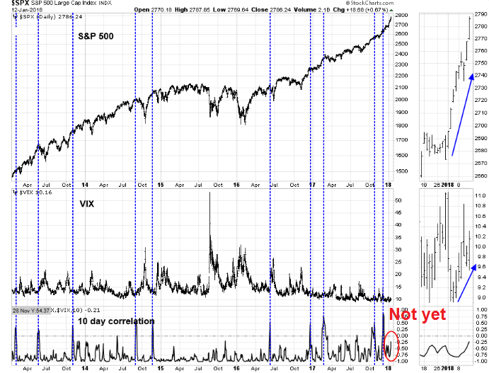
During the market rally, the term structure of the VIX Index moved to an extreme complacent reading on January 3. As the stock market continued its advance, this sentiment indicator retreated to neutral indicating cautiousness. In other words, the market is climbing a wall of worry.

We can see a similar effect in the VIX Index last week. As stock prices rose, the VIX Index unusually rose along with the market. I am in debt to Jesse Felder, who pioneered the use of the 10-day SPX-VIX correlation as an indicator. In the past, spikes in SPX-VIX correlations has seen the market struggle to maintain its advance. Current readings are not in the danger zone yet.
In addition, credit markets are not showing any signs that risk appetite is one the wane. The price action in investment grade (IG), junk bonds, or high yield (HY), and emerging market (EM) bonds are all confirming the equity market advance.

Rob Hanna of Quantifiable Edges published the following study on Thursday after the market briefly paused its advance. He confirmed my own analysis about the persistence of price momentum under the current circumstances (see Can the melt-up continue?). If history is any guide, the market advance is likely to continue.

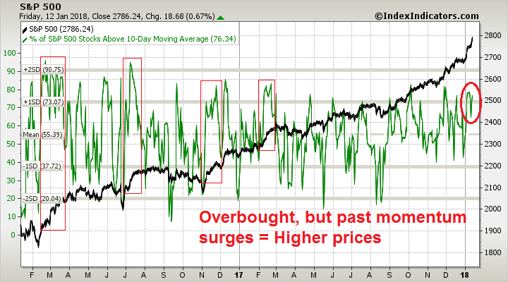
I would nevertheless like to offer a word of caution. Breadth indicators from Index Indicators are flashing overbought conditions. However, overbought markets can continue to stay overbought, and momentum surges have led to higher prices in the past.
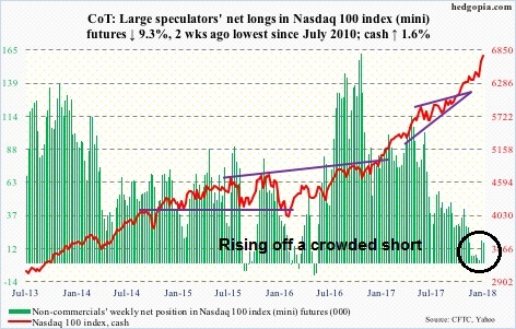
Lastly, I found an encouraging reading from the Commitment of Traders (COT) data. My conclusion of analysis of COT data has found that COT analysis of the SPX and Russell 2000 was not effective at forecasting future directional moves. However, extreme readings in the NASDAQ 100 was a useful contrarian signal, as NASDAQ 100 index represent a highly liquid instrument to make high beta bets.
The latest report from Hedgopia found that large speculators (read: hedge funds) are moving off a crowded short position in the NDX. This suggests that some people in the fast money crowd got caught offside as the market rose. Traders who got caught are likely feeling a lot of pain in this updraft, indicating that there is potential buying power as risk managers force hedge fund traders and portfolio managers to cover their short NDX positions.
Come over to the Dark Side! Party on!
My inner investor remains bullishly positioned, and my inner trader added to his long positions after the brief pause that he anticipated (see Can the melt-up continue?). In a future post, I will detail the risks that may derail this blow-off. Stay tuned for Bubbleology 102.
Disclosure: Long SPXL
Cam
Jeremy Grantham has not exactly been in the bull camp over the past decade. Now that he is embracing a blow off top, is another indicator of how bull markets lure in the last remaining bears. Of course, with due respect, Jeremy Grantham is no average bear out there (pun intended).
Anecdotally, speculators are starting to buy real estate in Florida, to flip. Once, a TV show called ‘flipper brothers’ debuts, we can settle that real estate would also be in “bubble territory”.
From what I can see, there is net outflow of money from mutual funds (https://www.yardeni.com/pub/ecoindiciwk.pdf). Once the average investor starts to buy equities with both hands, a significant top could be in place.
M2 to GDP is at a historic high value (Calafia beach pundit; chart 5 http://scottgrannis.blogspot.com/2018/01/worrying-about-rising-confidence.html), indicating desire of average investor to horde cash, rather than part with cash and buy riskier assets. We can call it the “dark side”, but rising profits are usually behind rise in equity markets, valuations not withstanding. The current rise in S&P is too classic for comfort, but for now, stocks are following a pattern, they should, by the book.
If a bear market we’re to start soon, the most similar period in my experience would be 1987. It didn’t offer that second failed run at the peak that gives an astute investor a chance to exit as described above in this week’s blog.
The bear market then happened with no recession and leading economic indicators had not turned down. The Fed was tightening aggressively causing rates to ramp up and stock indexes were up over 30% from the previous year.
But the biggest similarity is the accident caused by the new financial futures introduced that year. The surprising waves of selling pressure overwhelmed the exchanges. Indexes fell 30% in one day.
ETFs have become extremely popular and we haven’t seen how investors will react with them in a big correction. It is so much easier to sell an ETF in your portfolio than a group of stocks. We could see a wave of selling overwhelm the exchanges. In my mind, this is the reason to take precautions like using hard stop loss techniques or simply reducing equity exposure to minimize sudden risk.
Technology sector has been the big winner over the last year. The Intel chip problem and Facebook changing it’s policies could send the group down. Social media in general is starting to be under attack. If Trump comes out with disruptive trade policies, it might hurt Tech’s supply chain.
This leading group topping could be the catalyst for a correction.
Today’s market reminds me of Jan 2000…surging market & a severe influenza season…a sell off started in March.
Hmmm…still a lot of skepticism around here. I’m a European investor and because of the EUR/USD performance over the last few weeks the S&P 500 has not become more expensive for me. Since mid-December the Euro has gained more than the S&P 500, so actually US stocks have become cheaper for me – and the multinationals will benefit from a strong Euro as well.
The “Intel chip problem” will actually provide a strong incentive to update to newer hardware. Semiconductors (SMH) have not fully recovered to the November highs and many stocks in that sector (except Nvidia maybe) do not carry excessive valuations.
Trump just convinced Broadcom to “come back home”, he would love to have iPhones assembled in the US, but that would not change the secular trends that many tech stocks are benefitting from. In fact Apple has already started building component factories with their suppliers in the US.
Just sending some other indicators that are starting to send yellow flags;
http://money.cnn.com/data/fear-and-greed/ Note the “Junk bond demand” graph, widening spreads between Junk and investment grade yields is now starting to widen. This is not good. I will have to see if there is a longer term (1-2 decade) graph of this metric.
https://www.financialsense.com/tom-mcclellan/chart-worries-me-hy-bond-d-line Note the Advance/Decline line in the Junk bond market. Again, this shows a similar yellow flag like the above. Both are worth watching IMHO.
Today we had a mini melt up in equities and the VIX was going bid, fixed income has formed a small base in a downtrend the last 3 days (long ends ) and the mkt is very very long oil………and does anyone want to nail themselves to the mast after the first 2 weeks of the year when we have had massive inflows into equities (see BAML flow show).
To my mind oil has been a massive driver of markets…..for a variety of reasons.