Mid-week market update: Business Insider recently highlighted an earnings warning from Strategas Research Partners about possible earnings disappointment for the remainder of 2017 and early 2018. Expect a deceleration in EPS growth because of base effects:
A big part of Strategas’ argument stems from the fact that the period against which current earnings are compared — the first half of 2016 — was notably weak. And that, in turn, pushed year-over-year growth to unsustainable levels.
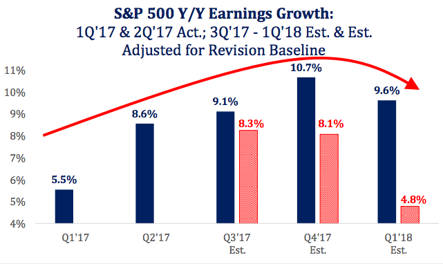
As the chart below shows, Wall Street is not bracing for the decline. Its estimates are represented by the blue columns, which show continued profit expansion over the next two quarters. Strategas has other ideas. Adjusting for historical factors, the firm sees earnings growth declining over the period before being cut almost in half by the first quarter of 2018, as indicated by the red columns.
In addition, Strategas believes that sales growth appears “toppy”.

On the other hand, Ed Yardeni has the completely opposite bullish view:
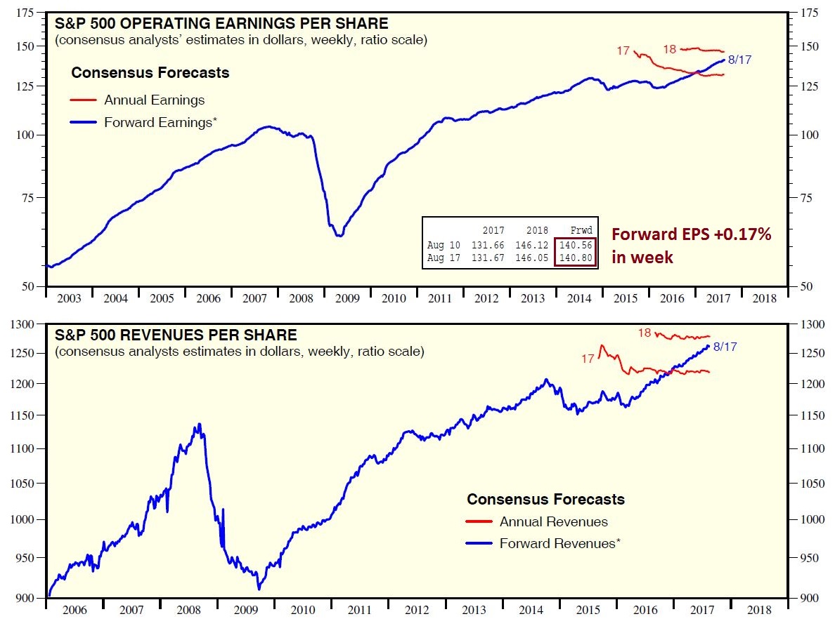
(1) S&P 500 forward revenues per share, which tends to be a weekly coincident indicator of actual earnings, continued its linear ascent into record-high territory through the week of August 10.
(2) S&P 500 forward operating earnings per share, which works well as a 52-week leading indicator of four-quarter-trailing operating earnings, has gone vertical since March 2016. It works great during economic expansions, but terribly during recessions. If there is no recession in sight, then the prediction of this indicator is that four-quarter-trailing earnings per share is heading from $126 currently (through Q2) to $140 over the next four quarters.
Yardeni’s believes that there is little risk to stock prices, as long as forward 12-month EPS and revenues are rising.
What`s going on? How do investors reconcile the two contradictory conclusions of analysis of the same data set?
Top-down vs. bottom-up analysis
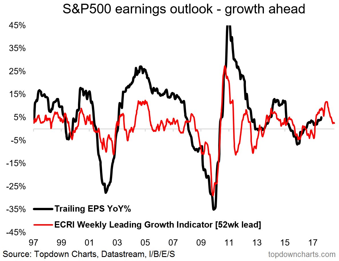
The Strategas case for caution rests on lower than expected YoY EPS growth rates for the remainder of 2017 and into early 2018. The Strategas view is not unique. Callum Thomas is warning of a similar dropoff in EPS growth based on a deceleration in the weekly ECRI indicator.
The key question in resolving the Yardeni bull and Strategas/Thomas bear debate appears to be a top-down vs. bottom-up debate. The Strategas analysis indicates that the market is likely to see disappointing growth rates in Q3 and Q4. Reading between the lines, Strategas seems to be estimating earnings and sales growth rates, rather than aggregating bottom-up derived earnings estimates and then calculating the growth rates afterwards. Some clues that it is employing a top-down analytical framework is the inconsistency of its conclusion with the relatively low levels of negative guidance shown by companies, and continued upward revisions of forward 12-month EPS and sales observed by Yardeni.
Solving the puzzle
Which is right, the top-down or bottom-up analysis?
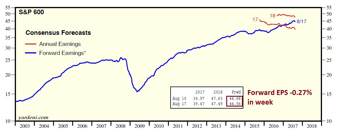
An important piece of this puzzle comes from Yardeni Research. While forward 12-month EPS is rising for the large cap S+P 500, it is falling in mid and small cap stocks. As the chart below shows, the rate of negative estimate revisions is higher as we go down the market cap band.

A case of bad breadth
Technical analysts often use price breadth as an analytical tool. An often posed question is, “If the underlying theory is, if the generals (large caps) are leading the charge, are the troops (small and mid caps) following?”
In this case, we are seeing a negative divergence in fundamental breadth. While large cap forward EPS revisions remain healthy, negative estimate revisions in mid and small cap stocks reveal a lack of broader participation in fundamental improvement.
From a technical perspective, we are seeing a similar breadth deterioration as we go down the market cap band. The chart below depicts the net 52-week highs-lows for large, mid, and small cap stocks. As the chart shows, mid and small cap breadth is significantly weaker compared their large cap counterparts.
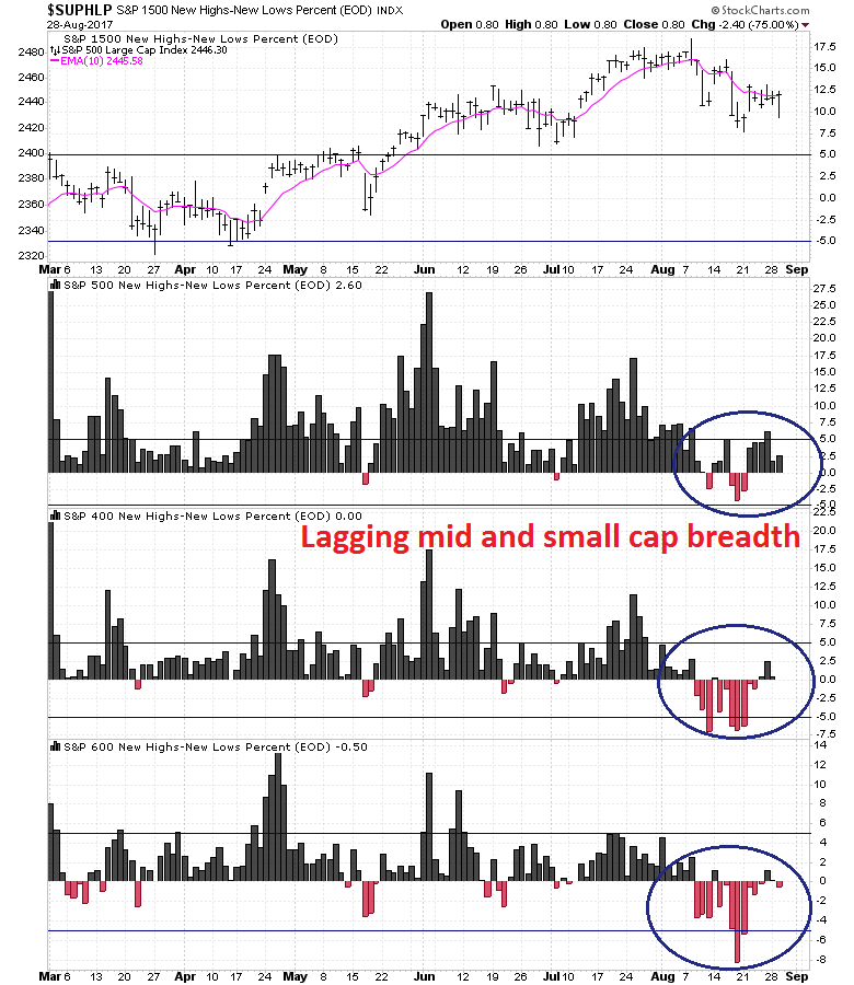
In conclusion, both the fundamental and technical frameworks lead to the conclusion that the generals are leading, but the troops are not following. These conditions indicate a high risk environment going into Q3 Earnings Season.
Disclosure: Long SPXU
Perhaps the cause of the rising revenue and earnings estimates for the larger cap stocks is the weak dollar in 2017, which magnifies earnings in other currencies when translated back to dollars. The bigger cap companies have more business outside the US than the smaller ones do.
I like your explanation. Furthermore, there seems little cash on the sidelines, something to consider, as we approach a top. See the link; https://pbs.twimg.com/media/DITvDWSW0AE4qdY.jpg:large
D.V., (or anyone who knows)
Thanks for this chart.
I see on the bottom of the chart, topdowncharts.com.
Do you know what is https://pbs.twimg.com? I was hoping I could look around there for more great stuff.
Is it topdowncharts.com?
Paul
The link you referenced appears to be an open source application programming interface for Twitter. It would, as an example, scale images up or down for example, when they are created outside Twitter and embedded into a Twitter post. I do not know more about such API, as I am not familiar with Twitter programming. There is no further “data” you could gleam following what seems like a link.
The weakness of troops could be a sign of of a bear market soon or it could be a dip in a continuing bull market that one should take advantage of. How to decide? A key is junk bond spread. Leading up to the 2007, 2011 and 2015 important peaks, the spread widened substantially. Now not.
The S&P 500 has almost no members that have junk debt. The Russell 2000 and the small cap indexes mentioned above have many. If profitability becomes an issue the junk spread will widen and warn of danger. Since the spread is low and flat, my vote is the troops will soon gain courage and join the general.
Here is a link to the Junk Bond Index
https://fred.stlouisfed.org/series/BAMLH0A0HYM2
The St. Louis Fed will send out a daily email on request. It’s a great intermediate indicator.
Note how the spread widened before previous bigger market tumbles.
If the index makes a higher high in the next while. I will get a bit nervous. If it surges higher, I’ll be VERY nervous.
Ken,
Thanks for posting this link. What happened in Jan 2016, that cracked the spread to 9%?
That was the energy companys’ junk debt spread blowing out when oil prices plunged to $26 January 2016 from a high of over $100 in 2014. That sent a risk-off chill throughout the junk bond world. In a risk-off environment, even non-energy junk sees wider spreads.
Once again, we see the safe Exxon and Chevron energy types in the S&P 500 while the riskier smaller energy companies with junk debt are in the other indexes.
Ken
Thanks for the explanation. I remember Cam discussing this at that time and also his generational bottom in energy.
Thanks, Ken, for your insight. I hadn’t thought of the higher financial leverage characteristic of mid and small caps compared to large cap stocks.
That said, the relative performance of small caps should be related to the performance of the credit market. This chart of the relative performance of junk bonds vs. Treasuries against the relative performance of the Russell 2000 to S&P 500 shows little correlation.
http://stockcharts.com/h-sc/ui?s=HYG%3AIEI&p=D&yr=1&mn=0&dy=0&id=p01605175690
This chart of the relative performance of small vs. large caps is inversely correlated to the capital returns of the bond market. If mid and small caps are more leveraged, shouldn’t they do better when rates are falling (and therefore bond prices are rising)?
http://stockcharts.com/h-sc/ui?s=IEF&p=D&yr=1&mn=0&dy=0&id=p58290092161
There is some other mechanism that’s driving the relative returns by market cap.