As the FOMC meets this week, one key question for Fed policy makers is, “How tight is the labor market?” A related question is, “In the face of tame inflation statistics, when are we going to see evidence of rising wage growth?”
Both questions are important for monetary policy. The New York Times had an article that lamented the lack of inflation. The WSJ reported late last week that, in effect, the Fed has no idea of what is going on with inflation:
The Federal Reserve is likely to stand pat on policy when it concludes a two-day meeting next week, but it faces a debate about the future path of interest-rate increases because of a deepening puzzle over inflation.
Officials will likely leave short-term rates unchanged and wait until September before announcing plans to slowly shrink their $4.5 trillion portfolio of bonds and other assets.
They face a dilemma, however, because the two sets of economic indicators they most closely monitor are sending conflicting signals about the urgency of additional rate increases.
The unemployment rate, which hit a 16-year low in May, shows labor markets are tightening. That argues for the Fed to keep lifting interest rates to prevent the economy from overheating. But inflation is drifting away from the central bank’s 2% target, suggesting borrowing costs should stay low to strengthen price pressures.
I recently highlighted analysis from Adam Ozimek of Moody’s Analytics showing that there is no wage growth mystery. Ozimek found that the Phillips Curve, which postulates a trade-off between unemployment and inflation, is alive and well once he substituted the prime age non-employment rate for the unemployment rate (also see my recent post In search of the elusive inflation surge).
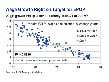
Using this analytical framework, the Fed is on the right track in normalizing monetary policy. Additional data indicates that the labor market is tighter than the market consensus, and a rise in inflation is just around the corner.
Adjusting for the opioid epidemic
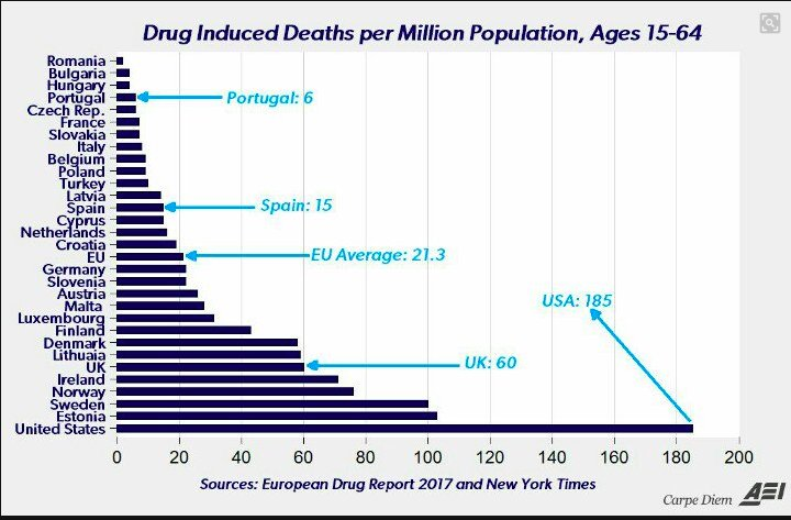
One drag on the Labor Force Participation Rate (LFPR), which affects the actual supply of labor, is the growing opioid epidemic in the United States. This chart (via Adam Toze) shows some perspective on the magnitude of the problem.
CNBC reported that Janet Yellen expressed some concerns about the effects of opioids on the LFPR in her Senate testimony:
In her testimony before the Senate Banking Committee on Thursday, Yellen said rampant opioid abuse in the U.S. is related to the decline in labor force participation among prime-age workers.
“I don’t know if it’s causal or symptomatic of long-running economic maladies that have affected these communities and particularly affected workers who have seen their job opportunities decline,” Yellen said in response to questioning from Sen. Joe Donnelly, D-Ind., on the issue.
I used a couple of ways to estimate the opioid effect on labor force dynamics. The chart below shows Adam Ozimek’s metric, the prime age non-employment rate (PNER blue line), and the disability rate for people over 16. The effects of the opioid epidemic really hit the economy at the start of the Great Financial Crisis, one way of estimating its effects is to observe the rise in disability rate during that period, which was about 2%. If we subtract 2% from PNER (red dot), we can see that it is at levels where PNER has bottomed in the last two cycles.

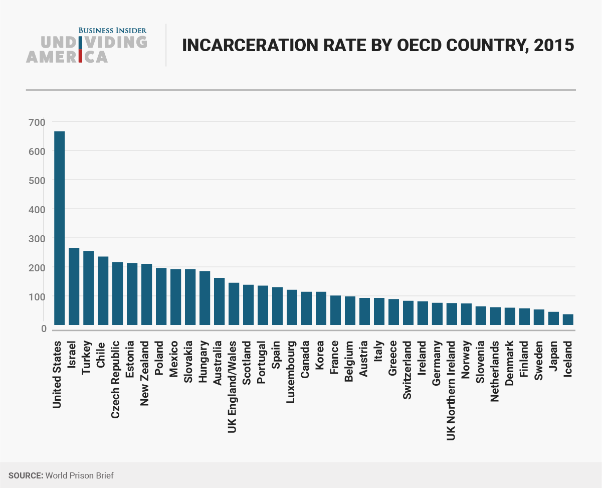
Since opioid abuse is correlated with criminality, another way of estimating the opioid effect on LFPR is to observe the criminality effect on LFPR. The Sentencing Project estimated that roughly 2.5% of the American population has been disenfranchised because they were felons and unable to vote (via Business Insider). Further research shows that American incarceration rates are exceptionally high when compared to other developed economies, and even arrest records without convictions can depress someone’s chances of getting a job (see Solving the data puzzle at the center of monetary policy).
When we subtract the 2.5% disenfranchisement rate as a ballpark estimate for the opioid effect, we arrive at a similar conclusion. In conclusion, the labor market is probably much tighter than market expectations.
Where are the wage increases?
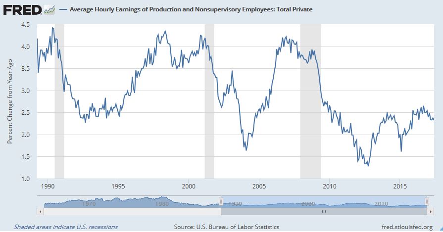
If the labor market is so tight, then where is the wage growth? Average hourly earnings stands at just over 2% and the rate of increase is decelerating.
Wage growth is where you find it, and it depends on which statistical measure you use. Matt Busigin recently observed that the 3-year rate of growth in real median weekly earnings has hit a cycle high.

Here is the same statistic, but using nominal YoY growth rates.

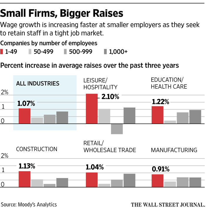
Indeed, the WSJ recently reported that small business have had to compete for talent with higher wage increases, with some handing out raises as much as 15%.
In conclusion, the US labor market is a lot tighter than expected. Don’t be surprised to see wage pressures rising in the near future, which is a development that will be a surprise for the market.
Very interesting analysis, Cam….I had seen the prison bar chart before but that drug death chart is astounding.
I see that chart and think of Portugal, where drugs have been decriminalized. And then I think about the direction we seem to be moving (i.e. Sessions’ thirst for war against marijuana), and can’t help but think we need to stop driving policy decisions based on our faiths / belief systems / principles and start considering the data.