US bond yields began to settle down last week when Fed Chair Janet Yellen stated in her Congressional testimony that the neutral rate for Fed Funds is roughly the inflation rate, which is much lower than market expectations. In addition, she allowed that the Fed is likely to re-evaluate its tightening path in light of tame inflation figures.
Even Fed Governor Lael Brainard, whose Fedspeak had recently taken on a more hawkish tone lately, sounded dovish in a speech last week:
Once that [normalization] process begins, I will want to assess the inflation process closely before making a determination on further adjustments to the federal funds rate in light of the recent softness in core PCE (personal consumption expenditures) inflation…I will want to monitor inflation developments carefully, and to move cautiously on further increases in the federal funds rate, so as to help guide inflation back up around our symmetric target.
The June CPI print came in below expectations, which reinforced the view that low inflation releases may prompt a shallower path for rate hikes in 2017 and 2018. Brainard stated on Thursday, before the CPI release, “I don’t think anybody can give a fully satisfactory answer to why we’re seeing the inflation trajectory that we see today.”
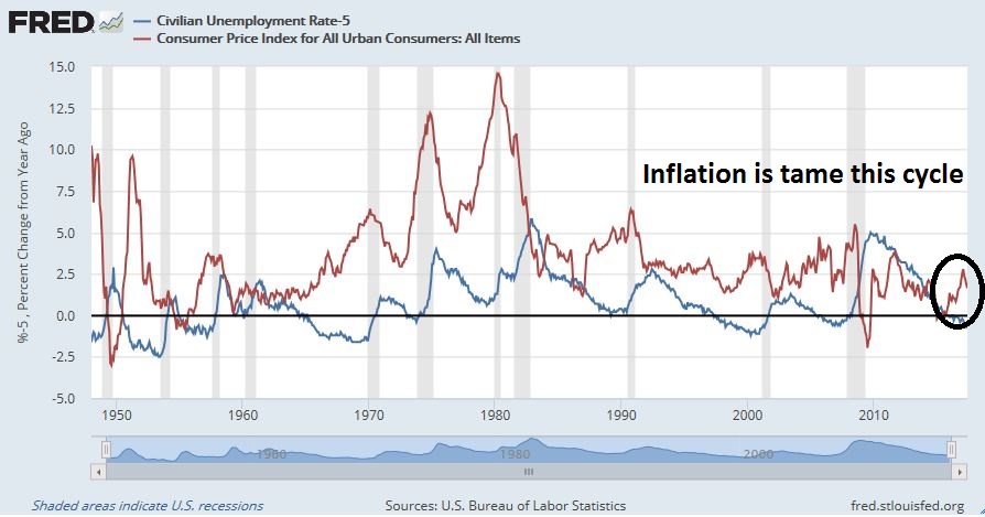
In the past, we have seen inflationary surges whenever the unemployment rate falls substantially below 5%. The graph below depicts the unemployment rate (blue line, with the zero level set at 5%), with CPI (red line). The rise in inflation has been quite tame by historical standards, which is creating a dilemma for policy makers.
The Fed’s underlying model of inflation is the Phillips Curve, which posits a trade-off between inflation and unemployment. As the chart from this Money and Banking primer shows, the inverse relationship between inflation and unemployment has been flattening since 2000. Falling unemployment should drive up wages, which is the price of labor, and put upward pressure on inflation. This time, the wage and inflation response has been muted.
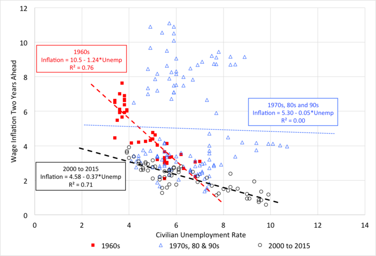
Questions are being asked at the Fed. Is the Phillips Curve broken? Why aren’t wages rising?
The answer is “no”. Fresh analysis from Moody’s shows that the Phillips Curve is alive and well. Should the Fed pause in its tightening path, it will find itself behind the inflation fighting curve. This would set the stage for a series of staccato rate hikes next year that would undoubtedly push the economy into recession.
The “right” Phillips Curve
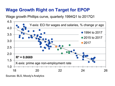
Adam Ozimek of Moody’s Analytics recently solved the wage growth mystery. Instead of comparing the unemployment rate to inflation, he found that the prime age non-employment rate was a much better fit when using the Phillips Curve as an analytical framework:
However, the unemployment rate is not the right measure of labor market slack right now. If instead we look at the prime age non-employment rate (which is 100% minus the prime aged employment rate), we see an even tighter wage Phillips curve. According to this curve, wage growth is exactly where we would expect given the level of slack in the labor market. To get to 3.5% to 4% or higher wage growth, this graph suggests another 3 percentage points of improvement in the non-employment rate will be needed.
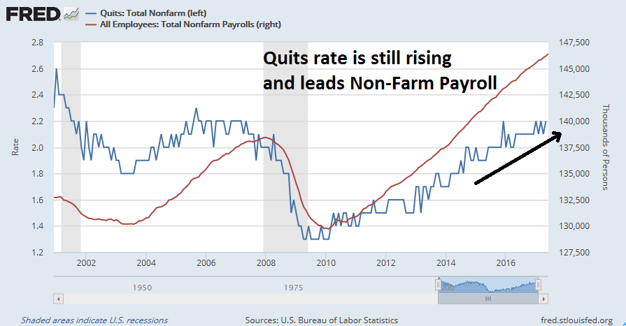
Ozimek went on to state that the prime age labor market still had some slack left before wage inflation reaches 3.5%-4.0% wage growth. As last week’s JOLTS reports showed that the all important “quits” rate continues to rise, this signals continuing labor market strength.
These trends indicate that wage pressures should begin to appear in the near future.
Investment implications
What does that mean for investors?
As an investor, I find the exercise of watching for economic statistics that show up in the rear-view mirror somewhat disconcerting. Instead, I offer some real-time, or near real-time indicators to watch.
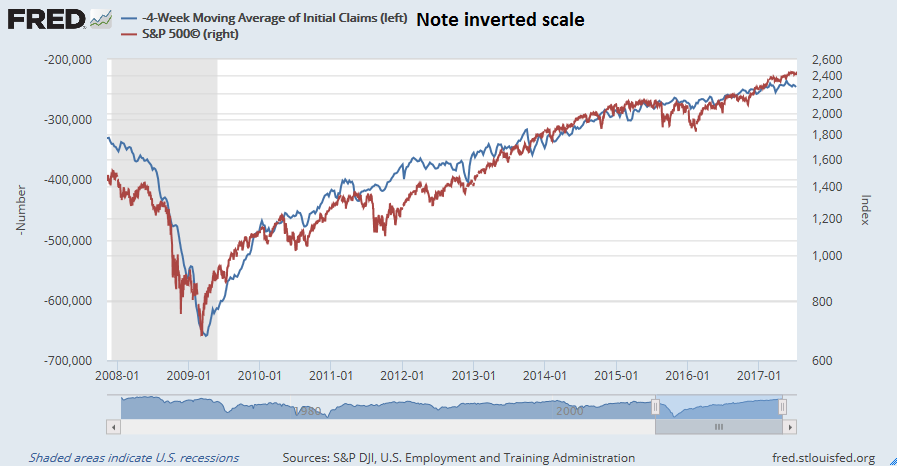
First, the S&P 500 and weekly initial unemployment claims has shown a remarkable pattern of inverse correlation during this cycle.
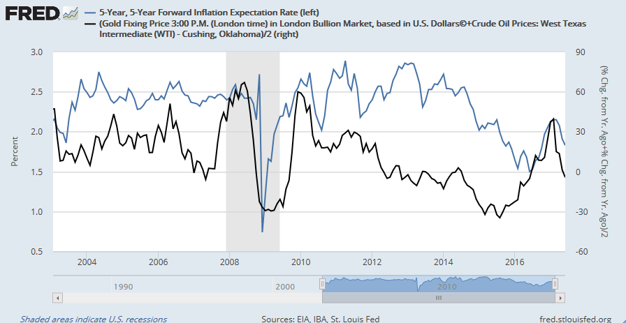
The chart below shows 5 year x 5 year inflation expectations (blue line), along with the average YoY change in oil and gold prices (black line). Commodity prices have shown themselves to be highly correlated to market based inflationary expectations. If gold and oil prices were to start turning up, rising inflationary expectations from the bond market will eventually pressure the Fed to adopt a more hawkish stance.
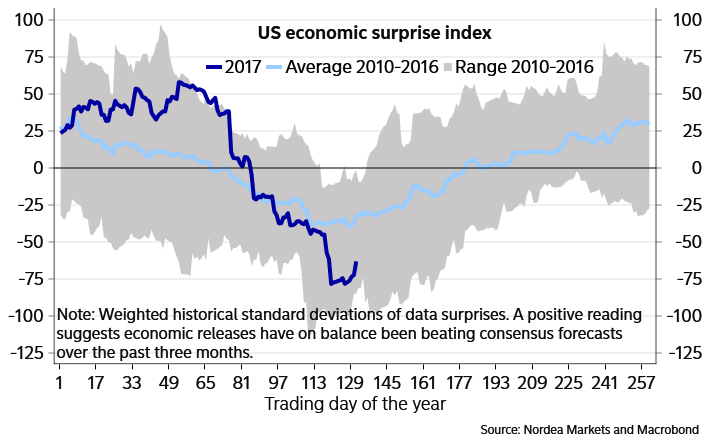
A glance at the Citigroup US Economic Surprise Index (ESI), which measures whether high frequency economic data is beating or missing expectations, shows that ESI is starting to bottom and turn up. This indicates a likely upturn in growth expectations, which should put upward pressure on commodity prices and inflationary expectations.
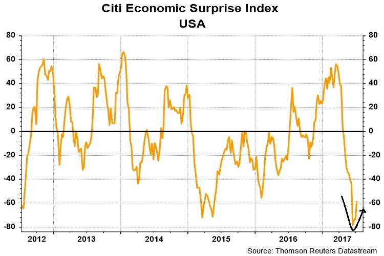
Johnny Bo Jakobsen of Nordea Markets observed that ESI typically sees a seasonal trough at about this time of year.
Too early to buy the inflation trade
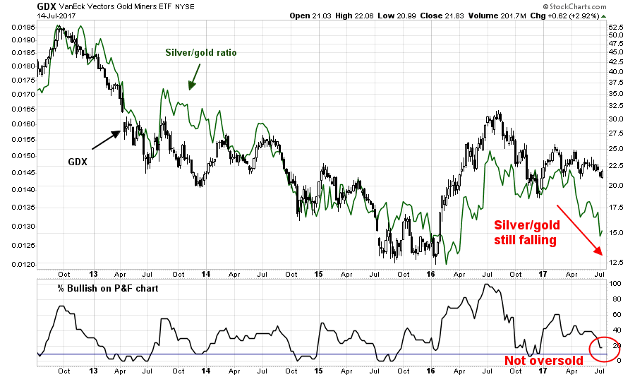
Tactically, an analysis of the breadth of gold equities show that they are not quite ready to rally just yet. The silver/gold ratio, which measures the relationship between the high beta precious metal silver against gold, is still in a downtrend. As well, the % bullish metric (bottom panel) does not appear to be sufficiently washed out to indicate a durable bottom.
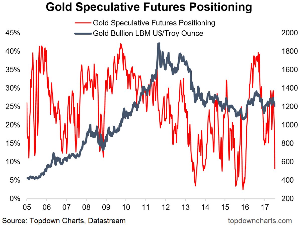
Downside risk for gold prices is limited. The latest Commitment of Traders report shows that speculative positions in gold are nearing capitulation levels, but may need a bit further to go (via Topdown Charts).
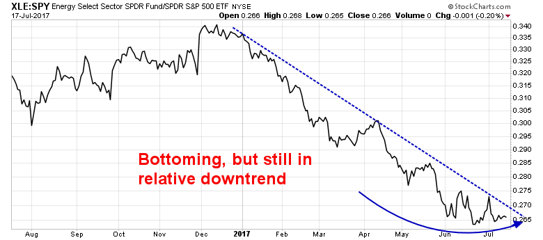
As well, energy equities remain in a relative downtrend against the market. Even though the XLE/SPY ratio shows signs of bottoming, I would prefer to see a rally through the relative downtrend line before embracing the rising inflation trade.
These trades are likely to take a few more weeks to develop. Investors can begin to accumulate positions and overweight resource sectors, while traders should watch for the upside breakout of inflationary expectations.