Preface: Explaining our market timing models
We maintain several market timing models, each with differing time horizons. The “Ultimate Market Timing Model” is a long-term market timing model based on the research outlined in our post, Building the ultimate market timing model. This model tends to generate only a handful of signals each decade.
The Trend Model is an asset allocation model which applies trend following principles based on the inputs of global stock and commodity price. This model has a shorter time horizon and tends to turn over about 4-6 times a year. In essence, it seeks to answer the question, “Is the trend in the global economy expansion (bullish) or contraction (bearish)?”
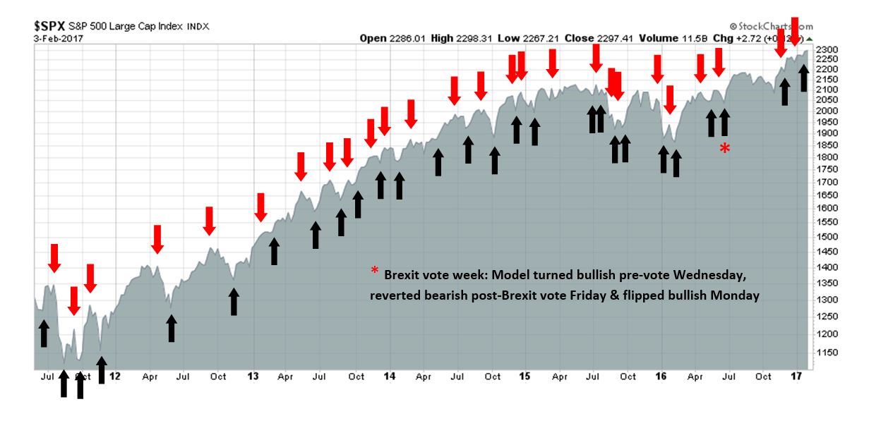
My inner trader uses the trading component of the Trend Model to look for changes in direction of the main Trend Model signal. A bullish Trend Model signal that gets less bullish is a trading “sell” signal. Conversely, a bearish Trend Model signal that gets less bearish is a trading “buy” signal. The history of actual out-of-sample (not backtested) signals of the trading model are shown by the arrows in the chart below. Past trading of the trading model has shown turnover rates of about 200% per month.
The latest signals of each model are as follows:
- Ultimate market timing model: Buy equities
- Trend Model signal: Risk-on
- Trading model: Bullish
Update schedule: I generally update model readings on my site on weekends and tweet mid-week observations at @humblestudent. Subscribers will also receive email notices of any changes in my trading portfolio.
Confusing macro cross-currents
Last week, I wrote that investors should tune out the political noise and focus on the fundamentals of growth (see A focus on growth). Still, the markets appear to be confused.
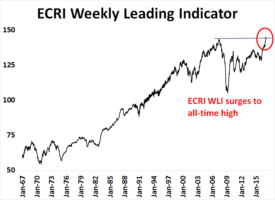
On one hand, Friday’s positive surprise from the January Jobs Report told the story of an American economy that is on a solid non-inflationary growth path. Indeed, the latest update from ECRI shows their Weekly Leading Indicator has surged to an all-time-high.
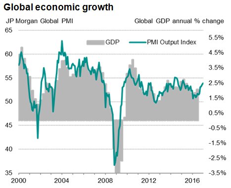
Urban Carmel pointed out that the macro outlook is strong in virtually all respects, and I agree. Moreover, the upturn is global in scope, which suggests that this recovery has staying power because of the breadth and scope of the advance.
On the other hand, the new Trump administration is starting to give Wall Street the jitters. Josh Brown summarized the anxiety well this way:
All the investment guys want the tax cuts and repatriation to happen. They want the 4% GDP growth. They want the infrastructure push to actually work. But, they’re definitely afraid. They don’t like the tweets, the executive orders, the daily mass protests or the shady people who seem to be accumulating power and influence.
I know of no conventional way to resolve the interplay between the bullish macro backdrop and bearishness from policy uncertainty. One approach to cut through the noise is to just ignore it. Instead, use technical analysis to understand what the markets are discounting.
This week, I will dispense with my usual macro and fundamental analysis and take a chartist’s tour around the world. Let’s see what the markets are telling us.
A chartist’s world tour
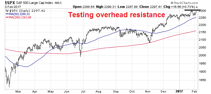
We begin with a chartist’s tour around the world using an intermediate term framework. Starting in the US, we can see that the SPX is in a solid uptrend, defined as trading above its upward sloping 50 dma and 200 dma, and testing overhead resistance.
Crossing the Atlantic, we can see that UK FTSE 100 is also in a uptrend, though it has pulled back just above its 50 dma.

Across the English Channel, the Euro STOXX 50 shows a similar picture of a pullback within an uptrend.
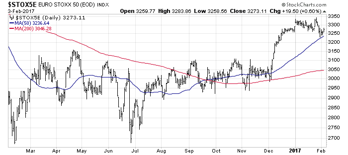
So far, so good. All of these markets are in uptrends. Each of the indices are above their 50 dma, which is above their 200 dma. In addition, the 50 and 200 dma lines are all sloping upwards.
I found an exception in Asia. The Shanghai Composite is trading below its 50 dma, but above its 200 dma. However, the stock indices of all of China’s major Asian trading partners are all above their 50 dma.

The weakness in Shanghai Composite can be somewhat discounted because the Chinese stock market functions more as a casino rather than a serious capital market. The trends seen in the other regional exchanges can be better measures of market expectations of Chinese growth.
Commodity prices are also good indicators of Chinese growth, largely because China is such a voracious consumer of raw materials. Callum Thomas of Topdown Charts found a high degree of correlation between copper prices and Chinese PMI.
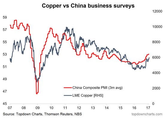
With that in mind, the chart of industrial metals, which is a broader measure of cyclical metals than just copper, shows a solid uptrend.

Similarly, the CRB Index is also trading above its 50 and 200 dma. The CRB is less reliable global cyclical indicator as it has a heavy energy weight and therefore subject to the specifics of the supply-demand dynamics of the oil market.

Healthy risk appetite
In addition, my measures of risk appetite remains bullish. As the chart below shows, equity risk appetite, as measured by high beta stocks vs. low volatility stocks, and small vs. large cap stocks, are in solid relative uptrends.

The bond market is also telling a similar story of rising risk appetite. The price performance of junk bonds against their duration equivalent Treasuries are confirming the equity uptrend.

When I put it all together, global equity and commodity markets, as well as US market internals, are telling a story of reflationary rebound. The nascent strength was indicated by last year’s MACD buy signal on the Wilshire 5000, which should be respected.

Mixed breadth reading
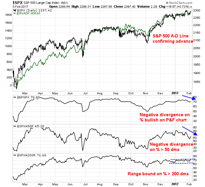
While the intermediate term investment outlook for equities looks solid, the picture is less clear for traders with a shorter term perspective. In particular, market breadth is presenting a mixed picture.
The top panel of the chart below shows the SP 500 Advance-Decline Line, which is not showing any negative divergence against the index. I prefer using this indicator over the more popular NYSE A-D Line as the former has the same components as the index and it is therefore an apples-to-apples breadth comparison. However, other breadth metrics, such as % bullish and % above their 50 dma, are exhibiting negative divergences against the index. On the other hand, the longer term % above their 200 dma is range bound. I interpret these readings as the intermediate term bull trend being intact, but the market may need to pause and consolidate its gains.
The chart below of the NYSE common-stock McClellan Summation Index (middle panel) is also flashing a cautionary signal. The index is exhibiting a negative divergence against the SPX, though that is not necessarily very worrisome as past negative divergences have not resolved bearishly. More problematical is its stochastic (top panel) not oversold enough to signal a bottom. The NYSE McClellan Summation Index (bottom panel, which includes all NYSE issues such as closed-end funds) is only starting to top out, indicating possible weakness ahead. These readings suggest that the markets are not ready to stage a sustainable rally to new highs just yet.

In addition, the latest update from Barron’s of insider activity shows that this group of “smart investors” has been selling heavily. The last episode of insider selling resolved itself with a period of sideways consolidation and minor pullback.
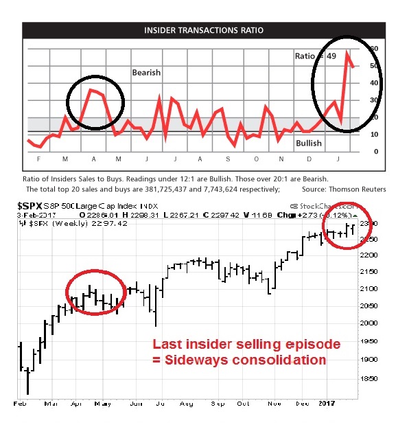
Arguably, the negative data point from insider activity is offset by the news that Warren Buffett, another “smart investor”, had bought $12b of equities since the election.
Measuring the Trump factor
Another concern I have is the fading effects of the so-called “Trump rally”. While I believe that the main reason behind the recent equity market strength is a global reflationary rebound, there is nevertheless a Trump enthusiasm effect.
One way of measuring this “Trump factor” would be through a paired trade of long Russia, which is enjoying friendlier relationship with Washington, and short Mexico, which is being pressured by Trump on trade and immigration. As the chart below shows, this pair has strengthened since the election, but it has started to roll over in early 2017.

One of the drawbacks of using a long Russia/short Mexico pair to measure the “Trump factor” is the large differences in sector weights between the stock markets of the two countries. The Russian market is heavily tilted towards energy and mining, while the Mexican market is far more diverse. Therefore any performance difference between the Russia/Mexico pair could be attributable to sector effects, in addition to the “Trump factor”.
A better paired trade might be a long Russia/short Australia position. Like Russia, Australian market is more exposed to resource extraction industries, which mitigates much of the sector effects found in the Russia/Mexico pair. In addition, Australia is highly sensitive to the Chinese economy, which is another country that is likely to come under pressure from the Trump administration. As the chart below shows, the Russia/Australia pair does not have the upward sloping bias of the Russia/Mexico pair, which may be indicative of a partial neutralization of sector effects. The pairs trade did rally in the aftermath of Trump’s electoral win, but it has steadied and it began to trade sideways starting in December.

Bottom line, the Trump rally is fading.
Rolling corrections = Consolidation?
In light of the above analysis, a case could be made for the stock market to consolidate and trade sideways as it digests its post-election gains. Under such a scenario, a rolling correction is the most likely outcome. As leadership sectors weaken, other sectors rise and take up the baton of market strength. Under these circumstances, the key to market direction would be the weights and performance of weakening sectors and emerging sectors within the index.
In a previous post, I highlighted the phenomena of the rolling sector correction (see The contrarian message from rotation analysis). As the RRG chart below shows, emerging sectors (Consumer Staples, Healthcare, and Utilities) comprise 26.2% of the weight in the index. Weakening sectors (Energy, Financials, and Industrials) comprise 32.0%. On a net basis, the index weight of the weakening sectors beat the emerging sectors by 5.8%, which argues for a bout of limited market weakness.
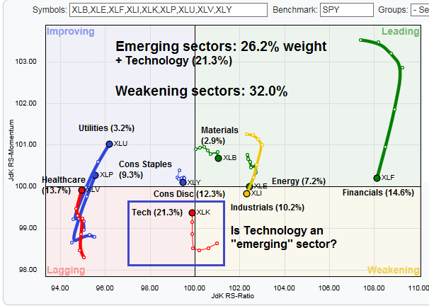
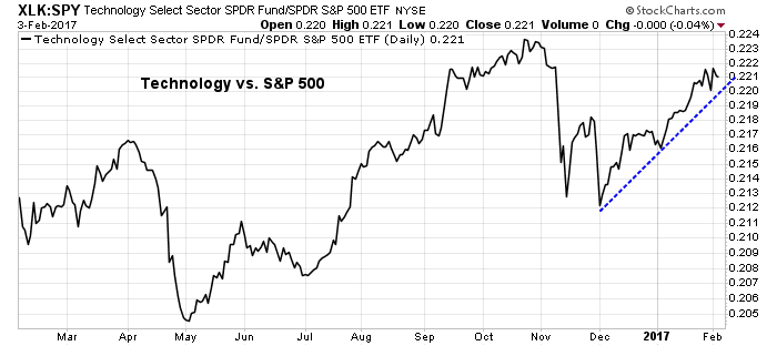
However, if the Technology sector, which is in the “lagging quadrant” and a heavyweight at 21.3% of the index, were to be re-defined as an “emerging sector”, the relative weight of rising sectors would overwhelm the relative weight of weakening sectors. In that case, the market could rally to new highs. Indeed, the relative performance of this sector appears to be highly constructive and supportive of such an outcome.
The week ahead
I have no idea what the stock market will do in the short-term. The above intermediate term analysis indicates that, barring any major White House policy or geopolitical surprises, any correction is likely to be shallow.

Here are some questions to ponder in the days ahead:
- The SPX briefly violated an uptrend line last week. Further violations will likely signal a period of sideways action or mild correction.
- The absolute level of the VIX Index (bottom panel) is low. Watch for rallies of the VIX above its upper Bollinger Band (BB) as potential short-term buy signals (see my VIX study in Watching the USD for clues to equity market direction).
- Also watch for expansion of the VIX BB. That could also be a signal of rising uncertainty and sideways choppy market action.
- Can a major sector like Technology strengthen sufficiently to take the mantle of market leadership? Can Financials turn around in light of Trump’s dismantling of the Dodd-Frank regulatory regime, or both? These heavyweight sectors have the potential to push the major market averages to new highs.
My inner investor remains bullishly positioned and he is overweight equities. My inner trader is also long the market, but he has some dry powder to buy any possible dips.
Disclosure: Long SPXL
Banks exploded higher on Friday with the executive orders around dismantling Dodd-Frank. Could be breaking out of the resent range. Brokers boomed as well when ‘fiduciary responsibility’ was dropped by Trump.
Hi Cam,
I have recently been looking at the breadth indicator #NYSEHL:XNYS (NYSE Cumulative New Highs – New Lows) to generate long term buy/sell signals . I have noticed that by using a 10 day EMA it seems to generate reasonable long term signals. For example it indicates a sell on the 25th June 2015, way before the big drop in August that year.
Any comment on using this indicator (or similar breadth indicators) for buy/sell signals?
I guess that with any long term indicator it lags a bit, especially after a major dip, so it could possibly be tweaked here with a further rule.