During periods of market turmoil like the one we are experiencing, it’s important to keep your eye on the ball and not to get overly distracted. If I had to just had to watch just one thing, it would be how forward 12-month EPS are evolving. That’s because Ed Yardeni found that forward EPS is highly correlated with coincidental economic indicators. In that context, the current market weakness makes sense because what`s really bothering the market is a lack of growth. If the growth outlook were to improve, stock prices would stabilize and start rising again.
The chart below shows the latest update from John Butters of Factset. Consensus forward EPS still looks a bit wobbly, but its weakness is nothing like the 2008 bear market (annotations in red are mine).
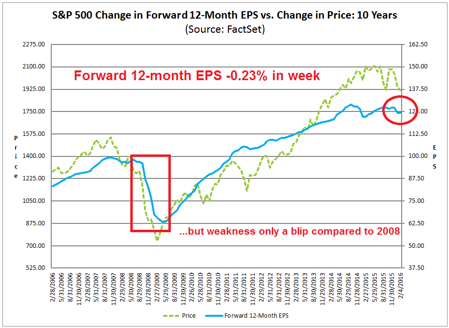
Before you write me about how annual or quarterly EPS estimates are falling as a way of bolstering the bear case, this analysis from Ed Yardeni shows that EPS estimates for any single fiscal year tend to start high and decline over time. The way to normalize the falling estimate effect is to calculate a continuous forward 12-month EPS, which is far more stable.

If you don`t have access to a database with consensus EPS estimates to calculate an aggregate forward 12-month EPS, you can get it from Factset. Unfortunately, Factset only updates their estimates weekly on Fridays. If you are impatient, there are a number of ways of monitoring how growth expectations are changing in real-time.
The yield curve as growth proxy
One simple way is to monitor the changes in the shape of the yield curve. One of the explanations for differing interest rate levels is the expectations hypothesis (via Wikipedia):
This hypothesis assumes that the various maturities are perfect substitutes and suggests that the shape of the yield curve depends on market participants’ expectations of future interest rates. It assumes that market forces will cause the interest rates on various terms of bonds to be such that the expected final value of a sequence of short-term investments will equal the known final value of a single long-term investment.
Using this, futures rates, along with the assumption that arbitrage opportunities will be minimal in future markets, and that futures rates are unbiased estimates of forthcoming spot rates, provide enough information to construct a complete expected yield curve. For example, if investors have an expectation of what 1-year interest rates will be next year, the current 2-year interest rate can be calculated as the compounding of this year’s 1-year interest rate by next year’s expected 1-year interest rate. More generally, returns (1+ yield) on a long-term instrument are assumed to equal the geometric mean of the expected returns on a series of short-term instruments:
where ist and ilt are the expected short-term and actual long-term interest rates.
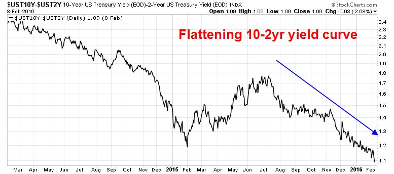
In other words, a steepening yield curve would reflect higher growth and inflationary expectations, while a flattening yield curve would indicate market expectations of slower growth and more muted future inflation.
Since the Fed and other global central banks have pushed short rates down to zero, or near zero, we use the difference between the 10-year and 2-year US Treasury yields as to measure the shape of the yield curve. As the chart below shows, the yield curve has been flattening since last summer.
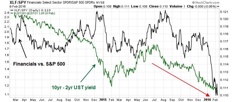
Bank stocks as a growth proxy
Another indirect way of monitoring market growth expectations is to watch the performance of bank stocks. There has been much anxiety about the dismal performance of the financial sector, both in the US and Europe. As I write these words, Bank of America (BAC) is trading at a price/book ratio of 0.5, Citigroup (C) at 0.5, Morgan Stanley (MS) at 0.7 and Goldman Sachs (GS) at 0.8. But did anyone notice how the market relative returns of the financial sector are correlated to the shape of the yield curve? In effect, the financials benefit from a steeper curve, where they can borrow short and lend long. A flat curve hurts profitability of this sector.
In Europe, there has been much hang wringing over the dire performance of Deutsche Bank (for some perspective see this Bloomberg article). Moreover, concerns are rising over the growing risk levels in the European banking sector.
Here is a puzzle for you: The chart below depicts the relative performance of European financials (black line, top panel), the Bund 10-year yield as a measure of financial anxiety (green line, top panel) and the EURUSD exchange rate. Sure, European financials have tanked on a relative basis in line with falling Bund yields, but if the eurozone banking system is in such distress, why is the euro so strong? Shouldn’t investors be buying the USD as the safety trade?
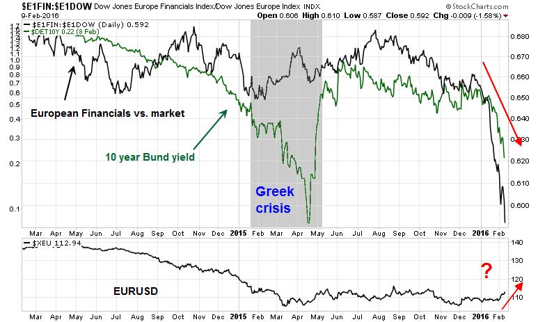
A far more simple explanation of European financial underperformance would be a combination of a flatter yield curve and the ECB`s policy of negative interest rates charged on excess reserves, both of which hurt banking profitability. In short, the banks are tanking because growth expectations are tanking. If the growth outlook were to improve, so should European bank stocks.
Bottom line: Watch for signs of growth. My preferable and most direct measure is the Street consensus forward EPS. Other real-time metrics include the shape of the yield curve and the relative performance of the financial sector. If and when those indicators stabilize or turn up, the ensuing rally is going to rip the face off the shorts.
Thanks Cam
Thanks
I take your point that the 12 month forward earnings estimate don’t look as bad (charts 1 and 2) as 2008 but they do look worst than 2011.
The proportionality of the charts suggests material market overvaluation that will surely correct now?
Not sure what you mean. Watch the direction of change in forward EPS, that will give you a clue of when the growth outlook improves. When growth improves, multiples also tends to rise.
Thank you. For those of us who do not have access to data other than Factset, are you planning to keep us updated on this one thing?
The short answer is yes. I keep an eye on in and generally highlight it in my weekend commentary.
Cam, isn’t that putting a lot of weight on the opinions of analysts, who generally know nothing at all until the company “guides” them up our down in their estimates?
I’ve met many of them over the years, and they ranged from truly stupid to seemingly smart, but really what you might call “High IQ morons,” capable of explaining in brilliant detail why they missed, say, LNKD’s recent collapse, but don’t worry, we should trust them going forward.
If (as I think possible even if you don’t) we are in the early months of a bad recession, what are the chances that the analysts will figure this out first and lower their forward EPS projections appropriately? I’ll round it off to 0%.
Even if you don’t believe in the wisdom of analysts, think of this as a momentum indicator.
The fact set earnings estimates is publicaly available at http://www.factset.com/websitefiles/PDFs/earningsinsight/
spx fwd earning is always lagging spx during 2008-2009 both on the way down and up. im not saying there is a bear mkt, just that this one is a lagging indicator.
Sorry, I guess I didn’t make myself more clear. As my other analysis has established that the likelihood of a recession-induced bear market is low, the question then becomes one of when the correction is over.
The answer is “when forward EPS starts to rise”, because it is reflective of better optimism about the growth outlook.
Jianbo: Correct. Forward estimates are lagging because analysts only project what companies tell them to project. I say “tell” them, but since Reg. FD they never do that explicitly. The analyst uses as a base case whatever the company’s projections were from the last earnings report and conference call. Then they check in with management now and then to look for what they call “body language”–nonverbal communications such as tone of voice, pained smiles, evasiveness on types of questions that they never had a problem answering before, etc., and adjust the estimates up and down accordingly. If you follow companies over many years, as I have, and get to know the management well, they inadvertently or, if they like you, almost intentionally give you this sort of information all the time, but it is nothing that will get either the manager or the analyst in trouble with FD rules.
This wouldn’t be a problem except most managers, even very good ones, are no good at predicting the company’s results. Upper management only knows what junior management tells them, and nobody likes to give the boss bad news, or be seen as “not a team player” by pointing out flaws in the company’s strategy or strengths in the competition’s efforts.
This won’t be of much help for any given company, but the weakness of truly leading indicators, such as we have seen in new orders, and the buildup of manufacturing inventories, are an indicator of a weaker economy to come this year, I believe. If that happens, company managements will find out about it later, the analysts later than that from body language (if they haven’t been too busy to check in with management toward the end of the quarter,) and then the public when the companies put out bad numbers and blame an “unexpectedly soft economy.”
Thanks for that link, Tony. Very helpful indeed.
Here is my “if I had to watch JUST ONE THING”. It is sentimentrader.com AIM (Advisor and Investor Model) indicator.
Take a look. https://www.dropbox.com/s/8q1q5p986v8r59p/20160210_aim_model.png?dl=0
The indicator swings from pessimism to optimism as markets gyrate. When it is deep in pessimism, I start looking for buys regardless of the fact I feel just as pessimistic as the rest of my fellow human investors. Fear is such a crisp thing to spot on the chart and profitable.
In all due respect to the intelligent folks that leave comments on this great blog, when the crowd (that’s all of us) are negative, we are prone to ‘confirmation bias’ of our fears to buy great bargains. Our instincts have us noticing negative things to justify our fear of acting. The above indicator tells me to start looking for reasons why the world WON’T end. I save the negative, doomsday articles for when the indicator tells me everyone is optimistic and skies are clear. That’s when I need a kick to sell when prices are high. Note on the chart that the optimism cycle is longer because greed builds slower than fear. So don’t bail on a new trend when we first hit optimism.
Hear! Hear!